你可以看看其他常用的 CSS 技巧:
- 常用的一些 CSS 技巧一
- 常用的一些 CSS 技巧三
CSS 重置盒模型
*,
*::before,
*::after {
  box-sizing: border-box;
}
当与将所有元素边距减为零的重置规则或父规则一起使用时,这会将上边距应用于其他元素后面的所有元素。这是一种快速获得垂直节奏的方法。
* + * {
  margin-top: 1.5rem;
}
如果你真的想更具选择性,那么我喜欢在以下特定情况下将其作为后代使用:
article * + h2 {
  margin-top: 4rem;
}
这类似于堆栈的思想,但更针对标题元素,以便在内容节之间提供更多的喘息空间。
清除浮动
- 使用
:after伪元素并应用content: ''以使其影响布局。 - 使用
clear: both做出明确的元素都过去左右浮动。 - 将该元素设置为
display: block块级元素才能正常运行
.clearfix::after {
  content: '';
  display: block;
  clear:both;
}注意:仅在用于
float构建布局时,此选项才有用。考虑使用更现代的方法,例如flexbox或grid布局
:focus 状态样式
.input {
  transition: 180ms box-shadow ease-in-out;
}
.input:focus {
  box-shadow: 0 0 0 3px hsla(245, 100%, calc(82%), 0.8);
  border-color: hsl(245, 100%, 42%);
  outline: 3px solid transparent;
}
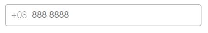
:focus-within
创建带有视觉,不可编辑前缀的输入。
- 当用户与
字段交互时,使用:focus-within伪类选择器为父元素设置样式。
+08
css 如下
.input-box {
  display: flex;
  align-items: center;
  max-width: 300px;
  background: #fff;
  border: 1px solid #a0a0a0;
  border-radius: 4px;
  padding-left: 0.5rem;
  overflow: hidden;
  font-family: sans-serif;
}

.input-box .prefix {
  font-weight: 300;
  font-size: 14px;
  color: #999;
}

.input-box input {
  flex-grow: 1;
  font-size: 14px;
  background: #fff;
  border: none;
  outline: none;
  padding: 0.5rem;
}

.input-box:focus-within {
  border-color: plum;
}
实现分割线
实现分割线的方式有很多种,这里我们使用 flex 加伪元素(::before 和 ::after)实现
.divider {
  display: flex;
  align-items: center;
}

.divider::before,
.divider::after {
  content: '';
  flex: 1;
  height: 1px;
  background: #dcdfe6;
}

.divider::before {
  margin-right: 1rem;
}

.divider::after {
  margin-left: 1rem;
}
另一种使用 grid,左右两侧为水平线的标题可以构造为具有三列的网格:
.heading {
  display: grid;
  grid-template-columns: 1fr auto 1fr;
  grid-gap: 1rem;
  text-align: center;
}
1fr auto 1fr 表示左侧和右侧列的宽度相同,它们将占用剩余的空间。
我们可以使用 ::before 和 ::after 伪元素分别表示标题的左侧和右侧:
.heading::before,
.heading::after {
  align-self: center;
  border-top: 0.25rem double #e5e7eb;
  content: '';
}
查看效果
更多方法:CSS 巧妙实现分隔线的几种方法
CSS :empty
通常,我们希望为包含内容的元素设置样式。当元素完全没有子元素或文本时,该怎么办?您可以使用 :empty 选择器:
p::before {
  font-family: 'FontAwesome';
  content: '\f240';
}

p:empty::before {
  content: '\f244';
}

p {
  color: silver;
}

p:empty {
  color: red;
}
显示空列表的占位符
通过使用 :empty 选择器,我们可以显示自定义占位符。
ul:empty::after {
  content: 'Empty';
}
如果希望占位符更灵活,而不是在 CSS 中硬编码,则可以从属性中获取占位符,例如 data-placeholder:
ul:empty::after {
  content: attr(data-placeholder);
}
如果列表包含空格或空子节点,则 :empty 选择器无效。
设置空链接的内容
对于内容为空的链接,我们可以使用 href 属性替换内容:
a[href^='http']:empty:before {
  content: attr(href);
}
CSS :only-child
如果要设置没有兄弟元素的样式,请使用 :only-child 伪类选择器
- child
- siblings
- siblings
li:only-child {
  color: DeepPink;
}
CSS :not()
不要使用两个不同的选择器来指定样式,然后使用另一个来否定使用它。:not 选择器可选择除与所传递参数匹配的元素之外的所有元素
/* ❌ */
li {
  margin-left: 10px;
}

li:first-of-type {
  margin-left: 0;
}

/* ✅ 使用 :not() 要好很多 */
li:not(:first-of-type) {
  margin-left: 10px;
}
逗号分隔列表
使列表的每项都由逗号分隔:
ul > li:not(:last-child)::after {
  content: ",";
}
因最后一项不加逗号,可以使用 :not() 伪类。
注意: 这一技巧对于无障碍,特别是屏幕阅读器而言并不理想。而且复制粘贴并不会带走 CSS 生成的内容,需要注意。
移除最后一个导航项的边框
我们经常使用 :last-child 选择器取消应用最后一项的特定样式(例如 border)。创建每个项目都有底部边框的导航通常如下所示:
li {
  border-bottom: 1px solid #e5e7eb;
}

/* 不向最后一项添加边框 */
li:last-child {
  border-bottom: none;
}
使用 :not 伪类,我们可以通过一个 CSS 声明使代码更短、更易于维护:
/* 将边框添加到除最后一个项目外的所有项目 */
li:not(:last-child) {
  border-bottom: 1px solid #e5e7eb;
}
另一种方法是使用 + 选择器:
li + li {
  border-top: 1px solid #e5e7eb;
}
隐藏没有静音、自动播放的影片
这是一个自定义用户样式表的不错的技巧。避免在加载页面时自动播放。如果没有静音,则不显示视频:
video[autoplay]:not([muted]) {
  display: none;
}
单独的项目列表
:after 选择器的内容属性可用于分隔列表项:
/* 内联项 */
span:not(:last-child):after {
  content: ' • ';
}

/* items 列表 */
li:not(:last-child):after {
  content: ',';
}
CSS 设置 ::placeholder 文本的样式
使用 ::placeholder 伪元素在 或