echarts学习之踩坑笔记
常用的配置模块有:series,xAxis,yAxis,grid,tooltip,title,legend,color。
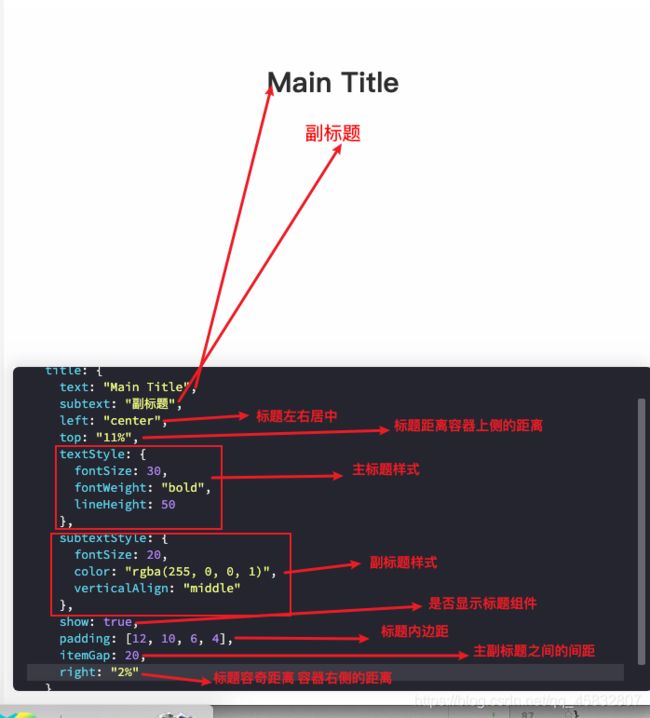
1. title(标题)
option = {
  title: {
    text: "Main Title",
    subtext: "副标题",
    left: "center",
    top: "11%",
    textStyle: {
      fontSize: 30,
      fontWeight: "bold",
      lineHeight: 50
    },
    subtextStyle: {
      fontSize: 20,
      color: "rgba(255, 0, 0, 1)",
      verticalAlign: "middle"
    },
    show: true,
    padding: [12, 10, 6, 4],
    itemGap: 20,
    right: "2%"
  }
}
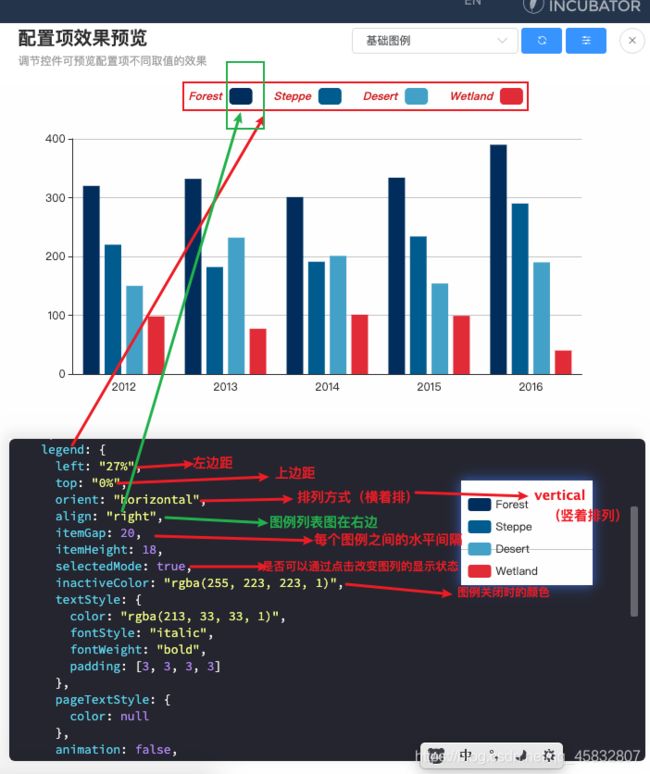
2.legend(图例列表)
option = {
  color: ["#003366", "#006699", "#4cabce", "#e5323e"],
  dataset: {
    source: [
      ["type", "2012", "2013", "2014", "2015", "2016"],
      ["Forest", 320, 332, 301, 334, 390],
      ["Steppe", 220, 182, 191, 234, 290],
      ["Desert", 150, 232, 201, 154, 190],
      ["Wetland", 98, 77, 101, 99, 40]
    ]
  },
  legend: {
    left: "27%",
    top: "0%",
    orient: "horizontal",
    align: "right",
    itemGap: 20,
    itemHeight: 18,
    selectedMode: true,
    inactiveColor: "rgba(255, 223, 223, 1)",
    textStyle: {
      color: "rgba(213, 33, 33, 1)",
      fontStyle: "italic",
      fontWeight: "bold",
      padding: [3, 3, 3, 3]
    },
    pageTextStyle: {
      color: null
    },
    animation: false,
    selectorLabel: {
      show: false
    }
  },
  xAxis: {
    type: "category",
    axisTick: {
      show: false
    }
  },
  yAxis: {},
  series: [{
    type: "bar",
    seriesLayoutBy: "row"
  }, {
    type: "bar",
    seriesLayoutBy: "row"
  }, {
    type: "bar",
    seriesLayoutBy: "row"
  }, {
    type: "bar",
    seriesLayoutBy: "row"
  }]
}
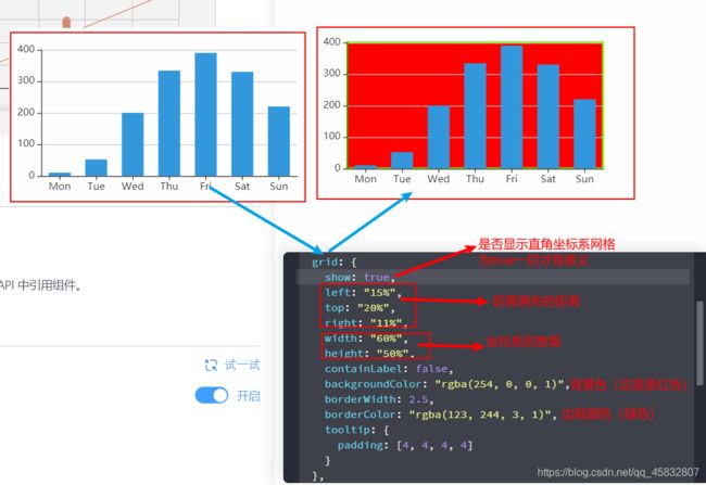
3. grid(是否显示网格)
option = {
  color: ["#3398DB"],
  tooltip: {
    trigger: "axis",
    axisPointer: {
      type: "shadow"
    }
  },
  grid: {
    show: true,
    left: "15%",
    top: "20%",
    right: "11%",
    width: "60%",
    height: "50%",
    containLabel: false,
    backgroundColor: "rgba(254, 0, 0, 1)",
    borderWidth: 2.5,
    borderColor: "rgba(123, 244, 3, 1)",
    tooltip: {
      show: true,	// 是否显示提示框(鼠标移上去显示数据)
      padding: [4, 4, 4, 4]
    }
  },
  xAxis: [{
    type: "category",
    data: ["Mon", "Tue", "Wed", "Thu", "Fri", "Sat", "Sun"],
    axisTick: {
      alignWithLabel: true
    }
  }],
  yAxis: [{
    type: "value"
  }],
  series: [{
    name: "直接访问",
    type: "bar",
    barWidth: "60%",
    data: [10, 52, 200, 334, 390, 330, 220]
  }]
}
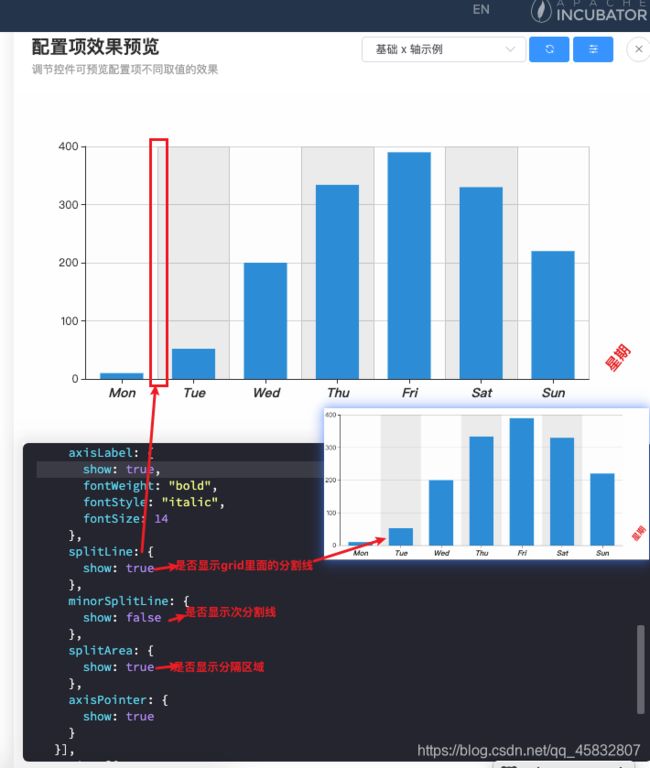
4. xAxis(x轴)【y轴一样】
option = {
  color: ["#3398DB"],
  tooltip: {
    trigger: "axis",
    axisPointer: {
      type: "shadow"
    }
  },
  grid: {},
  xAxis: [{
    type: "category",
    data: ["Mon", "Tue", "Wed", "Thu", "Fri", "Sat", "Sun"],
    show: true,
    position: "bottom",
    name: "星期",
    nameLocation: "end",
    nameTextStyle: {
      color: "rgba(235, 39, 39, 1)",
      fontWeight: "bold",
      fontSize: 16,
      align: "left",
      padding: [14, 14, 14, 14]
    },
    nameGap: 12,
    nameRotate: 50,
    inverse: false,
    minInterval: 1,
    axisLine: {
      show: true,
      onZero: true,
      symbolSize: [9, 15]
    },
    axisTick: {
      show: true,
      alignWithLabel: true
    },
    minorTick: {
      show: false
    },
    axisLabel: {
      show: true,
      fontWeight: "bold",
      fontStyle: "italic",
      fontSize: 14
    },
    splitLine: {
      show: true
    },
    minorSplitLine: {
      show: false
    },
    splitArea: {
      show: true
    },
    axisPointer: {
      show: true
    }
  }],
  yAxis: [{
    type: "value"
  }],
  series: [{
    name: "直接访问",
    type: "bar",
    barWidth: "60%",
    data: [10, 52, 200, 334, 390, 330, 220]
  }]
}


5. series系列列表(通过type决定图表的类型)
常用的有:折线图,柱状图,饼图

————————————分割线——————————————
ECharts使用五步曲:
- 下载并引入echarts.js库(图表依赖这个
js库)
npm i echarts --save
<script src="/echarts.min.js"></script>
- 准备一个具备大小的容器(生成的图标会放入这个
容器内)
<style>
	.box {
		width: 100px;
		height: 100px;
	}
style>
<div class="box">div>
- 初始化echarts实例化对象(
实例化echarts对象)
<script>
	// 初始化实例对象  echarts.init(dom容器)
	let myCharts = echarts.init(document.querySelector(".box"));
</script>
- 指定配置项和数据(根据具体需求修改
配置项选项)
option = {
    color: ['#3398DB'],
    tooltip: {
        trigger: 'axis',
        axisPointer: {            // 坐标轴指示器,坐标轴触发有效
            type: 'shadow'        // 默认为直线,可选为:'line' | 'shadow'
        }
    },
    grid: {
        left: '3%',
        right: '4%',
        bottom: '3%',
        containLabel: true
    },
    xAxis: [
        {
            type: 'category',
            data: ['Mon', 'Tue', 'Wed', 'Thu', 'Fri', 'Sat', 'Sun'],
            axisTick: {
                alignWithLabel: true
            }
        }
    ],
    yAxis: [
        {
            type: 'value'
        }
    ],
    series: [
        {
            name: '直接访问',
            type: 'bar',
            barWidth: '60%',
            data: [10, 52, 200, 334, 390, 330, 220]
        }
    ]
};
- 将配置项设置给echarts实例对象(让echarts根据修改好的配置项
生效)
myCharts.setOption(option);
——————————————————————实例分享—————————————
折线图
cpuOption = {
        title: {
            text: 'CPU负载',
            left: 'center'
        },
        tooltip: {
            // 鼠标移上去显示数据(x轴和series中都有data数据才会出现)
            trigger: 'axis'
        },
        xAxis: {
            // 数值轴,适用于连续数据
            type: 'category',
            name: '60秒',
            // x轴名称距离轴线的距离
            nameGap: 6,
            // 坐标轴两边是否留有空白(线性图一般不需要留有空白,柱状图才会需要留有空白)
            boundaryGap: false,
            axisLabel: {
                // 是否显示X轴值
                show: false
            },
            axisTick: {
                // 是否显示X轴刻度(小锯齿)
                show: false
            },
            data: ['07-30', '07-31', '08-01', '08-02', '08-03', '08-04', '08-05', '08-06', '08-07', '08-08', '08-09', '08-10', '08-11', '08-12', '08-13', '08-14', '08-15', '08-16', '08-17', '08-18', '08-19', '08-20', '08-21', '08-22', '08-23', '08-24', '08-25', '08-26', '08-27', '08-28', '08-29', '08-30', '08-31', '09-01', '09-02', '09-03', '09-04', '09-05', '09-06', '09-07', '09-08', '09-09', '09-10', '09-11', '09-12', '09-13', '09-14', '09-15', '09-16', '09-17', '09-18', '09-19', '09-20', '09-21', '09-22', '09-23', '09-24', '09-25', '09-26', '09-27', '09-28', '09-29', '09-30'],
        },
        yAxis: {
            type: 'value',
            name: '%利用率',
            axisLine: {
                // 是否显示Y轴轴线
                show: true
            },
        },
        series: [{
            // 指定数据类型 (线性图)
            type: 'line',
            // tslint:disable-next-line:max-line-length
            data: [0, 0, 0, 0, 0, 0, 0, 0, 0, 0, 0, 0, 0, 0, 0, 0, 0, 0, 0, 0, 0, 0, 0, 0, 0, 0, 0, 0, 6, 90, 4, 4, 3, 0, 3, 5, 1, 2, 1, 1, 2, 0, 0, 1, 0, 0, 0, 0, 0, 0, 0, 0, 0, 1, 0, 0, 0, 0, 1, 0, 2, 1, 1]
        }]
    };
网格图

cpuOption = {
        xAxis: {
            type: 'category',
            name: '60秒',
            nameLocation: 'start',
            data: [100, 500, 1000, 1500, 2000, 2500],
            splitLine: {
                show: true,
                lineStyle: {
                    color: ['#7db6d8'],
                    width: 1,
                    type: 'solid'
                }
            },
            axisLabel: {
                show: false
            },
            axisTick: {
                show: false
            },
            axisLine: {
                lineStyle: {
                    color: '#7db6d8'
                },
                onZero: true
            }
        },
        yAxis: {
            type: 'value',
            name: '%利用率',
            splitLine: {
                show: true,
                lineStyle: {
                    color: ['#7db6d8'],
                    width: 1,
                    type: 'solid'
                }
            },
            axisLabel: {
                show: false
            }
        },
        series: [{
            data: [0, 50, 30, 20, 40, 50, 800, 50, 0],
            type: 'line',
            symbol: 'none',
            areaStyle: {
                normal: {
                    color: '#eff4f9'
                }
            },
            lineStyle: {
                color: ['#7db6d8'],
            }
        }],
        title: [{
            left: 'center',
            text: 'CPU负载'
        }]
    }
指示线
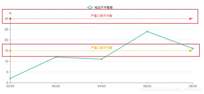
this.voltageUnbalanceOptions2 = {
          color: ['#1fbda6', '#ffdb14', '#de685f'],
          tooltip: {
              trigger: 'axis',
              axisPointer: {
                  type: 'cross',
                  label: {
                      backgroundColor: '#6a7985'
                  }
              }
          },
          legend: {
              data: ['电压不平衡度'],
          },
          grid: {
              top: '14%',
              left: '3%',
              right: '4%',
              containLabel: true
          },
          xAxis: [
              {
                  type: 'category',
                  boundaryGap: false,
                  data: ['00:00', '06:00', '04:00', '08:00', '09:00']
              }
          ],
          yAxis: [
              {
                  type: 'value',
                  name: '%',
                  axisLine: {
                      show: true
                  },
                  axisTick: {
                      show: true
                  }
              }
          ],
          series: [
              {
                  name: '电压不平衡度',
                  type: 'line',
                  stack: '总量',
                  data: [2, 12, 11, 24, 16, 30],
                  // 添加指示线及指示线的文字
                  markLine: {
                      data: [
                          {yAxis: 30, lineStyle: {color: '#fc5554'}, label: { formatter: '严重三相不平衡', position: 'middle', color: '#fc5554'}},
                          {yAxis: 15, lineStyle: {color: '#ffbc02'}, label: { formatter: '严重三相不平衡', position: 'middle', color: '#ffbc02'}}
                      ]
                  },
              }
          ]
      };
柱状图颜色渐变,自定义tooltip颜色
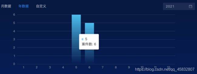
this.archiveCylindricalOptions = {
      tooltip: {
          show: true,
          // 自定义tooltip内容
          formatter: (params) => {
              return ''  + params.name + '
 ' + '案件数:  ' + params.value + '';
          }
      },
      xAxis: {
          type: 'category',
          data: this.monthDay,
          axisLine: {
              show: false,
          },
          axisTick: {
              show: false,
          },
          axisLabel: {
              color: 'rgba(255, 255, 255, 0.45)',
          },
      },
      yAxis: {
          minInterval: 1,
          type: 'value',
          splitLine: {
              show: true,
              lineStyle: {
                  color: 'rgba(255, 255, 255, 0.15)',
                  width: 1,
                  type: 'solid',
              },
          },
          axisLabel: {
              color: 'rgba(255, 255, 255, 0.45)',
          },
      },
      grid: {
          top: 8,
      },
      series: [{
          data: this.monthArchiveCount,
          type: 'bar',
          // 柱状图颜色渐变
          itemStyle: {
              color: new echarts.graphic.LinearGradient(
                  0, 0, 0, 1,   // 0,0,1,0表示从左向右    0,0,0,1表示从右向左
                  [
                      {offset: 1, color: 'rgba(86, 196, 240, 0)'},
                      {offset: 0, color: '#56C4F0'},
                  ],
              ),
          },
      }],
  };
饼图基本配置
{
            title: {
                text: '共计回路',
                subtext: '234',
                top: '45%',
                left: 'center'
            },
            legend: {
                top: 'bottom'
            },
            color: ['#1fbda6', '#f5b416', '#e55d41'],
            series: [
                {
                    name: '回路统计',
                    type: 'pie',
                    radius: ['40%', '60%'],
                    center: ['50%', '50%'],
                    labelLine: {
                        length: 45
                    },
                    data: [
                        {value: 62, name: '优秀'},
                        {value: 151, name: '合格'},
                        {value: 19, name: '不合格'}
                    ]
                }
            ]
        }
echarts图表加载动画
图表加载动画不显示 或者 图表加载动画只显示一部分
<div echarts id="deviceTotal" [options]="deviceEchartsOptions" [loading]="true">div>
import * as echarts from 'echarts';
import {EChartsOption} from 'echarts';
const archiveCylindricalOptions = {
tooltip: {
show: true,
// 自定义tooltip内容
formatter: (params) => {
return '' + params.name + '
' + '案件数: ' + params.value + '';
}
},
xAxis: {
type: 'category',
data: this.monthDay,
axisLine: {
show: false,
},
axisTick: {
show: false,
},
axisLabel: {
color: 'rgba(255, 255, 255, 0.45)',
},
},
yAxis: {
minInterval: 1,
type: 'value',
splitLine: {
show: true,
lineStyle: {
color: 'rgba(255, 255, 255, 0.15)',
width: 1,
type: 'solid',
},
},
axisLabel: {
color: 'rgba(255, 255, 255, 0.45)',
},
},
grid: {
top: 8,
},
series: [{
data: this.monthArchiveCount,
type: 'bar',
// 柱状图颜色渐变
itemStyle: {
color: new echarts.graphic.LinearGradient(
0, 0, 0, 1, // 0,0,1,0表示从左向右 0,0,0,1表示从右向左
[
{offset: 1, color: 'rgba(86, 196, 240, 0)'},
{offset: 0, color: '#56C4F0'},
],
),
},
}],
// 配置图表加载的动画
// 动画加载时长
animationDuration: 3000,
// 动画效果
animationEasing: 'cubicInOut'
};
this.drawEchart(archiveCylindricalOptions, 'ststisticsDetails');
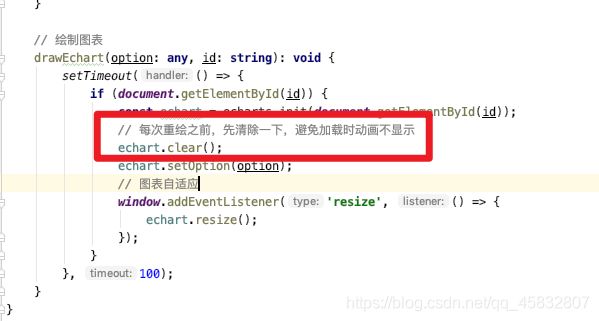
// 绘制图表(适用于柱状图和折线图,饼图自适应浏览器时, 在setOption之前添加 window.onresize = pieRiskTrend.resize; 就可以了)
drawEchart(option: any, id: string): void {
setTimeout(() => {
if (document.getElementById(id)) {
const echart = echarts.init(document.getElementById(id));
// 每次重绘之前,先清除一下,避免加载时动画不显示
echart.clear();
echart.setOption(option);
// 图表自适应
window.addEventListener('resize', () => {
echart.resize();
});
}
}, 100);
}
饼图自定义label样式

 series: [
     {
         name: '项目类别',
         type: 'pie',
         // 饼图大小
         radius: [80, 50],
         // 图形外文字线
         labelLine: {
             normal: {
                 length: 60
             }
         },
         data: [
             [],
         ],
         label: {
             normal: {
                 formatter: ' {b} \n\n {c}  \n\n',
                 textStyle: {
                     rich: {
                         // name 的文字样式
                         b: {
                             color: '#333',
                         },
                         // value 的文字样式
                         c: {
                             color: '#FF0404'
                         }
                     }
                 }
             },
         },
         emphasis: {
             itemStyle: {
                 shadowBlur: 10,
                 shadowOffsetX: 0,
                 shadowColor: 'rgba(0, 0, 0, 0.5)'
             }
         }
     }
 ]
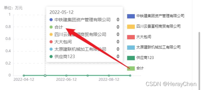
饼图处理多条数据
当图表数据过多时图例会显示很多,可以给其设置分页显示(其他图表设置方法相同) 属性:legend
legend: {
     orient: 'horizontal',
     bottom: 'bottom',
     type: 'scroll'
 },
没处理之前:

处理之后:

饼图实现一下效果
背景图:

<template>
<div id="alarmPane" class="circle">div>
template>
<script lang="ts">
import {Options, Vue} from 'vue-class-component';
import * as echarts from "echarts";
@Options({
components: {}
})
export default class AlarmPane extends Vue {
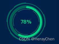
mounted(): void {
this.drawWeekOnYear();
}
drawWeekOnYear(){
// 获取echarts操作的画布
let weekOnYear = echarts.init(document.getElementById("alarmPane"));
// 给画布添加图表数据
weekOnYear.setOption( {
tooltip: {
show: false
},
title: {
text: '78%',
top: '40%',
left: 'center',
textStyle: {
color: '#30BF78',
}
},
series: [
{
name: 'Access From',
type: 'pie',
radius: ['70%', '80%'],
avoidLabelOverlap: false,
labelLine: {
show: false
},
itemStyle: {
borderRadius: 50,
},
label: {
show: false
},
color: ['#30BF78', '#00514a'],
data: [
{ value: 1048, name: 'Search Engine' },
{ value: 735, name: 'Direct' },
]
}
]
});
// 图表自适应(屏幕缩放图表不变形)
window.addEventListener('resize', () => {
weekOnYear.resize();
});
}
}
script>
<style lang="less" scoped>
.circle {
margin: 0 auto;
width: 140px;
height: 140px;
border-radius: 50%;
text-align: center;
line-height: 140px;
background: url("../../assets/imgs/complete.png") no-repeat;
background-size: cover;
}
style>
echarts 饼图每块之间添加边框
实现以下效果:

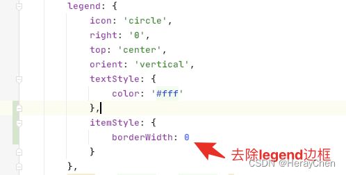
配置代码:
let chartOption = {
legend: {
icon: 'circle',
right: '0',
top: 'center',
orient: 'vertical',
textStyle: {
color: '#fff'
},
// 去除legend边框
itemStyle: {
borderWidth: 0
}
},
color: ['#5B8FF9', '#6DC8EC'],
series: [
{
name: 'Access From',
type: 'pie',
center: ['38%', '46%'],
radius: ['40%', '70%'],
labelLine: {
length: 6
},
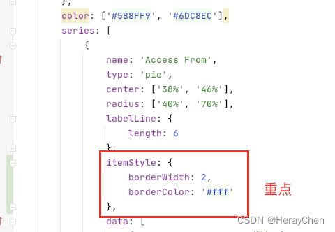
// 饼图描边
itemStyle: {
borderWidth: 2,
borderColor: '#fff'
},
data: [
{ value: 1048, name: '载波' },
{ value: 735, name: '无线' },
],
label: {
normal: {
formatter: ' {b} \n\n {c}',
textStyle: {
color: '#fff'
}
}
}
}
]
};
echarts自定义name
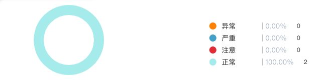
this.pieOption = {
            title: [{
                target: 'self',
                top: '39%',
                left: '19%',
                textStyle: {
                    color: '#3B82FE',
                    fontSize: 12
                }
            }],
            tooltip: {
                trigger: 'item'
            },
            color: ['#ff8c00', '#4cabce', '#e5323e', '#afeeee'],
            legend: {
                icon: 'circle',
                data: ['异常', '严重', '注意', '正常'],
                right: 30,
                top: '20%',
                orient: 'vertical',
                formatter: (name) => {
                    let value;
                    switch (name) {
                        case '异常':
                            value = serious;
                            break;
                        case '严重':
                            value = abnormal;
                            break;
                        case '注意':
                            value = beCareful;
                            break;
                        case '正常':
                            value = normal;
                            break;

                    }
                    return [
                        '{a|' + name + '}' + '{b|' + ' | ' + ((value / (serious + abnormal + beCareful + normal) * 100) ?
                            (value / (serious + abnormal + beCareful + normal) * 100) : 0).toFixed(2) + '%' + '}' + value
                    ];
                },
                textStyle: {
                    rich: {
                        a: {
                            fontSize: 14,
                            width: 65,
                        },
                        b: {
                            fontSize: 14,
                            color: '#B4BECC',
                            padding: [0, 20, 0, 10],
                        }
                    }
                }
            },
            series: [
                {
                    type: 'pie',
                    radius: ['50%', '70%'],
                    center: ['24%', '40%'],
                    avoidLabelOverlap: false,
                    label: {
                        show: false,
                        position: 'center'
                    },
                    data: [
                        {value: serious, name: '异常'},
                        {value: abnormal, name: '严重'},
                        {value: beCareful, name: '注意'},
                        {value: normal, name: '正常'},
                    ]
                }
            ]
        };

<div id="networkPane" :style="{ width: '100%', height: '147px' }">div>
mounted(): void {
    this.drawWeekOnYear();
}

drawWeekOnYear(){
    // 获取echarts操作的画布
    let weekOnYear = echarts.init(document.getElementById("networkPane"));
    const serious = 2;
    const abnormal = 6;
    const beCareful = 3;
    const normal = 12;
    const other = 1;
    // 给画布添加图表数据
    weekOnYear.setOption({
        title: [{
            target: 'self',
            top: '39%',
            left: '19%',
            textStyle: {
                color: '#3B82FE',
                fontSize: 12
            }
        }],
        tooltip: {
            trigger: 'item'
        },
        color: ['#5B95F9', '#5AD8A6', '#F6BD16', '#5D7092', '#E86452'],
        legend: {
            icon: 'circle',
            data: ['生活服务类型', '服务类型', '服务', '生活服务', '其他'],
            right: 30,
            top: '4%',
            orient: 'vertical',
            formatter: (name) => {
                let value;
                switch (name) {
                    case '生活服务类型':
                        value = serious;
                        break;
                    case '服务类型':
                        value = abnormal;
                        break;
                    case '服务':
                        value = beCareful;
                        break;
                    case '生活服务':
                        value = normal;
                        break;
                    case '其他':
                        value = other;
                        break;

                }
                return [
                    '{a|' + name + '}' + '{b|' + ' | ' + ((value / (serious + abnormal + beCareful + normal + other) * 100) ?
                        (value / (serious + abnormal + beCareful + normal + other) * 100) : 0).toFixed(2) + '%' + '}' + value
                ];
            },
            textStyle: {
                color: "#FFF",
                rich: {
                    a: {
                        fontSize: 12,
                        width: 65,
                    },
                    b: {
                        fontSize: 12,
                        padding: [0, 20, 0, 10],
                    }
                }
            }
        },
        series: [
            {
                type: 'pie',
                radius: ['50%', '70%'],
                center: ['26%', '52%'],
                avoidLabelOverlap: false,
                labelLine: {
                    normal: {
                        length: 8
                    }
                },
                label: {
                    normal: {
                        formatter: ' {b} \n {c}',
                        textStyle: {
                            color: '#fff'
                        }
                    }
                },
                data: [
                    {value: serious, name: '生活服务类型'},
                    {value: abnormal, name: '服务类型'},
                    {value: beCareful, name: '服务'},
                    {value: normal, name: '生活服务'},
                    {value: other, name: '其他'},
                ]
            }
        ]
    });
    // 图表自适应(屏幕缩放图表不变形)
    window.addEventListener('resize', () => {
        weekOnYear.resize();
    });
}
echarts修改legend样式

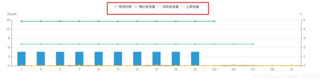
{
            color: ['#36A4DB', '#2bb76d', '#5AD8A6', '#F6BD16', '#228f8e'],
            legend: {
                data: ['等效时数', '理论发电量', '实际发电量', '上网电量'],
                icon: 'rect',
                itemHeight: 1.5,
                itemWidth: 12,
            },
            xAxis: [
                {
                    type: 'category',
                    data: ['1', '3', '5', '7', '9', '11', '13', '17', '19', '21', '23', '25', '27', '29', '31'],
                    axisPointer: {
                        type: 'shadow'
                    }
                }
            ],
            yAxis: [
                {
                    type: 'value',
                    name: '万kWh',
                    min: 0,
                    max: 15,
                    interval: 3,
                    axisLine: {
                        show: true
                    },
                    axisTick: {
                        show: true
                    }
                },
                {
                    type: 'value',
                    name: 'h',
                    min: 0,
                    max: 5,
                    interval: 1,
                    axisLine: {
                        show: true
                    },
                    axisTick: {
                        show: true
                    }
                }
            ],
            series: [
                {
                    name: '等效时数',
                    type: 'bar',
                    smooth: true,
                    data: [4.54, 4.54, 4.54, 4.54, 4.54, 4.54, 4.54, 4.54, 4.54, 4.54],
                    barWidth: 30
                },
                {
                    name: '理论发电量',
                    type: 'line',
                    smooth: true,
                    data: [14.54, 14.54, 14.54, 14.54, 14.54, 14.5, 14.54, 14.54, 14.54, 14.54, 14.54],
                    barWidth: 30
                },
                {
                    name: '实际发电量',
                    type: 'line',
                    smooth: true,
                    data: [7.05, 7.05, 7.05, 7.05, 7.05, 7.05, 7.05, 7.05, 7.05, 7.05, 7.05, 7.05, 7.05],
                    barWidth: 30
                },
                {
                    name: '上网电量',
                    type: 'line',
                    smooth: true,
                    data: [0.05, 0, 0, 0.158, 0.05, 0, 0, 0.158, 0.05, 0, 0, 0.158, 0.05, 0, 0, 0.158, 0.05],
                    barWidth: 30
                }
            ]
        }
柱状图上添加数字


label: {
  // 柱图头部显示值
  show: true,
  position: "right",
  color: "#999",
  fontSize: "12px",
  formatter: (params) => {
    return params.value;
  },
},
折线图设置缩放

拖放轴的和坐标轴的距离是通过grid来控制的。

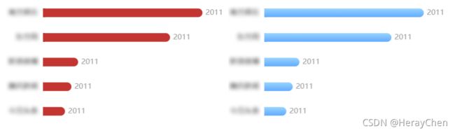
tooltip多列显示
tooltip: {
      trigger: 'axis',
      confine: true,
      formatter: (params) => {
          const autoWidth = Math.ceil(params.length / 15)
          //宽度这里autoWidth * 220代表了每列的宽度相加得到总宽度
          //高度这里因为要换行显示所以也需要计算出来(这里因为需求方的要求,数据需要竖排排序显示,所以flex-flow 为 column)
          let str = `${autoWidth * 220}px; max-width: 1000px; overflow: hidden; display: flex;flex-flow: column wrap; justify-content: flex-start;height:${Math.ceil((params.length / autoWidth)) * 22}px; ">`
          params.forEach((item) => {
              //这里算每列宽度的百分比
              str += `${((1 / autoWidth) * 100)}%;height: 22px;display: flex;flex-flow: row nowrap; justify-content: flex-start;align-items: center">
              ${item?.color};border-radius: 10px;line-height: 22px">
              ${item.seriesName}:
              ${item?.data}
              `
          })
          str += ``
          return str
      }
  },
echarts 折线图跟数据不一致
echarts 折线图跟数据不一致是在 series 中设置了 stack 导致的。
渐变不生效
不生效代码:

修改后:

自定义提示:

{
	// 自定义提示
      tooltip: {
        show: true,
        formatter: (params) => {
          return '<div><span style="display:inline-block;margin-right:5px;border-radius:10px;width:9px;height:9px;background-image: linear-gradient(to right, #56C4F0 , rgba(86, 196, 240, 0));"></span>'  + params.name + '
' + '案件数: ' + params.value + '柱状图数据过多导致x轴数据显示不全
-
倾斜坐标轴文字
axisLabel: { // 强制设置坐标轴分割间隔 interval: 0, // 文字的倾斜角度 rotate: 10 }, -
使用formatter让文字竖直显示(仅适用于x轴)

formatter(value){ return value.split("").join("\n"); } -
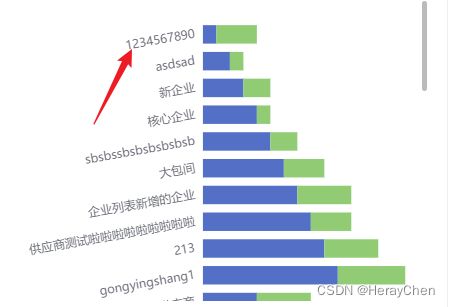
当标签文件显示过多时,我们可以通过双行显示(注意要考虑数字和字母的情况,如下代码仅适用于文字)

axisLabel: { interval: 0, formatter(value){ var ret = "";//拼接加\n返回的类目项 var maxLength = 2;//每项显示文字个数 var valLength = value.length;//X轴类目项的文字个数 var rowN = Math.ceil(valLength / maxLength); //类目项需要换行的行数 if (rowN > 1)//如果类目项的文字大于3, { for (var i = 0; i < rowN; i++) { var temp = "";//每次截取的字符串 var start = i * maxLength;//开始截取的位置 var end = start + maxLength;//结束截取的位置 //这里也可以加一个是否是最后一行的判断,但是不加也没有影响,那就不加吧 temp = value.substring(start, end) + "\n"; ret += temp; //凭借最终的字符串 } return ret; } else { return value; } } } -
通过formatter截取返回的数据
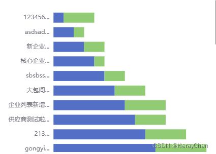
axisLabel: {
    interval: 0,
    formatter(val){
        return val.slice(0, 6) + '...';
    }
}
- 动态渲染(通过数据来确定画布的高度,使用滚动条)
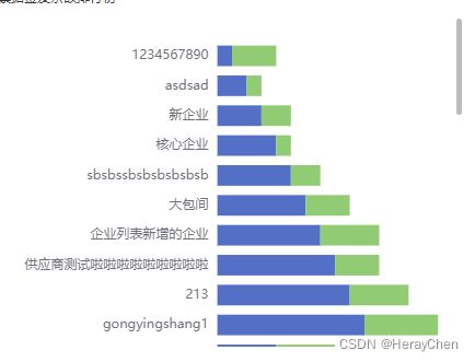
<div style="height: 300px;overflow: auto;">
  div
      ref="balanceSortChart"
      v-if="tableData.length > 0"
      :style="{height: compayGather.length * 30 + 'px'}"
  ></div>
 </div>
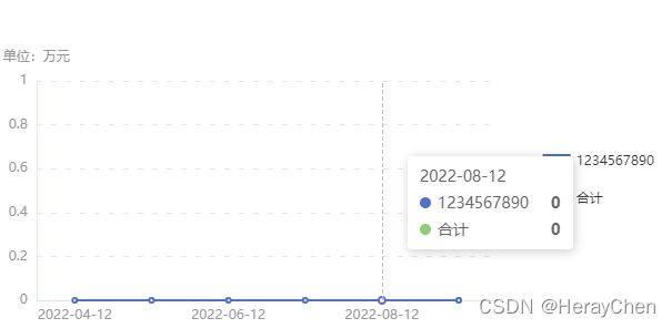
tooltip提示框溢出被遮挡
处理前: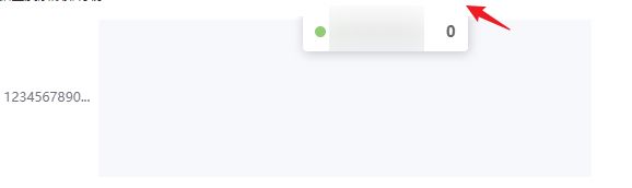
处理后:

	tooltip: {
          // 将 tooltip 框限制在图表的区域内
          confine: true
        }
    }
混合动态柱状折线图tooltip显示内容不对
显示的内容在初始化的前提上修改的
解决方法:


柱状图给每个柱子单独设置颜色

option = {
  xAxis: {
    type: 'category',
    data: ['粉尘', '火焰', '乙醇', '氢气', '线式二合一']
  },
  yAxis: {
    type: 'value'
  },
  series: [
    {
      data: [120, 200, 150, 80, 70],
      type: 'bar',
      itemStyle: {
				normal: {
					color: function(params) {
						// 给出颜色组
						var colorList = ['#F6BD16', '#E8684A', '#38A9FF', '#38DEFF', '#5AD8A6'];
                            //循环调用
						return colorList[params.dataIndex%colorList.length]
					},
				}
			}
    }
  ]
};
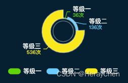
南丁格尔玫瑰图
实现以下效果
const option = {
        color: ['#4ad113', '#53c7ff', '#fae620'],
        legend: {
            icon: "path://M358.3999938964844,389.1199951171875l307.1999816894531,0l0,256L358.3999938964844,645.1199951171875ZM357.96990966796875,644.485107421875c-70.68670654296875,0,-127.99998474121094,-57.169921875,-127.99998474121094,-127.68255615234375S287.283203125,389.1199951171875,357.96990966796875,389.1199951171875M666.0198364257812,389.7651062011719c70.69696044921875,0,128,57.159698486328125,128,127.68258666992188S736.716796875,645.1199951171875,666.0198364257812,645.1199951171875",
            bottom: '0',
            textStyle: {
                color: '#fff',
            },
            itemStyle: {
                borderWidth: 0
            },
            data:[{
                "name": "等级一",
                "value": 132
            },
                {
                    "name": "等级二",
                    "value": 68
                },
                {
                    "name": "等级三",
                    "value": 36
                }]
        },
        series: [
            // 主要展示层的
            {
                radius: ['36%', '60%'],
                center: ['50%', '36%'],
                type: 'pie',
                roseType: 'radius',
                label: {
                    formatter:  function(params) {
                        return '{color0|' + params.data.name + '\n' + '}' + '{color2|' + params.data.value + '次' + '}'
                    },
                    // 设置 formatter 中文字的内容
                    rich: {
                        'color0': {
                            color: '#fff',
                            fontSize: 12
                        },
                        'color2': {
                            color: 'inherit',
                            fontSize: 10
                        }
                    }
                },
                labelLine: {
                    normal: {
                        show: true,
                        length: 6,
                        length2: 6
                    }
                },
                itemStyle: {
                  borderWidth: 2,
                  borderColor: 'rgba(250,250,250,0.3)'
                },
                name: "总量",
                data: [{
                    "name": "等级一",
                    "value": 36
                },
                    {
                        "name": "等级二",
                        "value": 136
                    },
                    {
                        "name": "等级三",
                        "value": 536
                    }],

            },
            // 内圆环
            {
                radius: ['28%', '30%'],
                center: ['50%', '36%'],
                type: 'pie',
                animation: false,
                tooltip: {
                    show: false
                },
                labelLine: {
                    normal: {
                        show: false,
                    }
                },
                data: [{
                    value: 1,
                    itemStyle: {
                        color: "rgba(250,250,250,0.3)",
                    },
                }],
            }
        ]
    };
折线图上添加数字

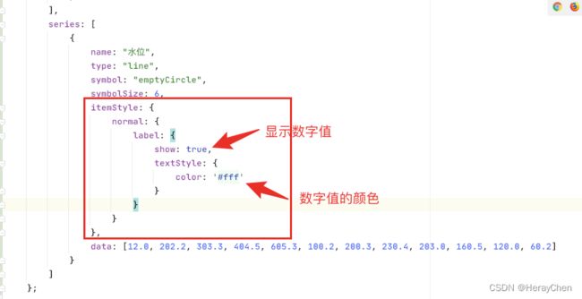
代码配置:
option = {
        tooltip: {
            trigger: "axis"
        },
        xAxis: [
            {
                type: "category",
                data: ["Mon", "Tue", "Wed", "Thu", "Fri", "Sat", "Sun"],
                axisPointer: {
                    type: "shadow"
                },
                axisLabel: {
                    color: "#fff"
                },
                axisTick: {
                    show: false
                },
                axisLine: {
                    show: true,
                    lineStyle: {
                        color: "rgba(255, 255, 255, .15)"
                    }
                }
            }
        ],
        grid: {
            top: "18%",
            bottom: "4%"
        },
        color: ["#5AD8A6"],
        yAxis: [
            {
                type: "value",
                min: 0,
                max: 1000,
                interval: 250,
                axisLabel: {
                    color: "#fff"
                },
                splitLine: {
                    show: true,
                    lineStyle: {
                        color: "#264649"
                    }
                }
            }
        ],
        series: [
            {
                name: "水位",
                type: "line",
                symbol: "emptyCircle",
                symbolSize: 6,
                itemStyle: {
                    normal: {
                        label: {
                            show: true,
                            textStyle: {
                                color: '#fff'
                            }
                        }
                    }
                },
                data: [12.0, 202.2, 303.3, 404.5, 605.3, 100.2, 200.3, 230.4, 203.0, 160.5, 120.0, 60.2]
            }
        ]
    };
多数据滚动加载
实现原理:定时器和dataZoom。

setInterval(() => {
  if (this.osmoticPressureMonitorOption.dataZoom[0].endValue == dataOption.osmoticPressureTime.length ) {
       this.osmoticPressureMonitorOption.dataZoom[0].endValue = 5;
       this.osmoticPressureMonitorOption.dataZoom[0].startValue = 0;
   } else {
       this.osmoticPressureMonitorOption.dataZoom[0].endValue = this.osmoticPressureMonitorOption.dataZoom[0].endValue + 1;
       this.osmoticPressureMonitorOption.dataZoom[0].startValue = this.osmoticPressureMonitorOption.dataZoom[0].startValue + 1;
   }
}, 2000)

osmoticPressureMonitorOption = {
        tooltip: {
            trigger: "axis"
        },
        // 重点
        dataZoom: [
            {
                xAxisIndex: 0,// 这里是从X轴的0刻度开始
                show: false, // 是否显示滑动条,不影响使用
                type: "slider", // 这个 dataZoom 组件是 slider 型 dataZoom 组件
                startValue: 0, // 从头开始。
                endValue: 5, // 一次性展示多少个。
            },
        ],
        xAxis: [
            {
                type: "category",
                data: dataOption.osmoticPressureTime,
            }
       ]
}
柱状图背景上添加数字

使用yAxis双轴实现:
sateOption = {};
created() {
    const failureData = [2, 1, 1, 1, 1];
    // copy 一下使用 reverse 会翻转原数组
    const failureData1 = [2, 1, 1, 1, 1];
    this.sateOption = {
        grid: {
            left: "5%",
            right: "5%",
            bottom: "0",
            top: "5%",
            containLabel: true
        },
        tooltip: {
            show: true,
            textStyle: {
                fontWeight: "bold",
                fontSize: 16
            }
        },
        yAxis: [
            {
                type: "category",
                inverse: true,
                axisLabel: {
                    show: true,
                    color: "#8f919e",
                    fontSize: 12
                },
                splitLine: {
                    show: false
                },
                axisLine: {
                    show: false
                },
                axisTick: {
                    show: false
                },
                data: ["光纤加工机床(JQ10083-OLD)", "philips显示器(SB2018111500001)", "带式输送机(GY-20000cs)", "正锥型提取罐(DEV2020000142)", "聚脉喷涂机(DEV2020000148)"]
            },
            {
                data: failureData1.reverse(),
                splitLine: {
                    show: false
                },
                axisLine: {
                    show: false
                },
                axisTick: {
                    show: false
                },
                axisLabel: {
                    margin: 0,
                    interval: 0,
                    inside: true,
                    padding: [0, -12, 0, 0],
                    fontSize: 12,
                    align: 'right',
                    verticalAlign: 'middle'
                }
            }
        ],
        xAxis: [
            {
                type: "value",
                axisTick: {
                    show: false
                },
                min: 0,
                axisLine: {
                    show: false
                },
                splitLine: {
                    show: false
                },
                axisLabel: {
                    show: false
                }
            }
        ],
        series: [
            {
                type: "bar",
                stack: "1",
                barWidth: 12,
                barBorderRadius: 30,
                showBackground: true,
                backgroundStyle: {
                    color: 'rgba(228, 237, 248, 1)',
                    borderRadius: 7
                },
                itemStyle: {
                    normal: {
                        barBorderRadius: 20,
                        color: '#2c90ff'
                    }
                },
                data: failureData
            }
        ]
    };
}
动态折线图
例1:
<!DOCTYPE html>
<html>
<head>
<meta charset="utf-8">
<title>第一个 ECharts 实例</title>
<script src="https://www.shulanxt.com/visualization/echarts/data-update/jquery.min.js"></script>
<!-- 引入 echarts.js -->
<script src="https://www.shulanxt.com/visualization/echarts/data-update/echarts.min.js"></script>
</head>
<body>
<!-- 为ECharts准备一个具备大小(宽高)的Dom -->
<div></div>
<script type="text/javascript">
var base = +new Date(2014, 9, 3);
var oneDay = 24 * 3600 * 1000;
var date = [];
var data = [Math.random() * 150];
var now = new Date(base);
function addData(shift) {
now = [now.getFullYear(), now.getMonth() + 1, now.getDate()].join('/');
date.push(now);
data.push((Math.random() - 0.4) * 10 + data[data.length - 1]);
if (shift) {
date.shift();
data.shift();
}
now = new Date(+new Date(now) + oneDay);
}
for (var i = 1; i < 100; i++) {
addData();
}
option = {
xAxis: {
type: 'category',
boundaryGap: false,
data: date
},
yAxis: {
boundaryGap: [0, '50%'],
type: 'value'
},
series: [
{
name:'成交',
type:'line',
smooth:true,
symbol: 'none',
stack: 'a',
areaStyle: {
normal: {}
},
data: data
}
]
};
setInterval(function () {
addData(true);
myChart.setOption({
xAxis: {
data: date
},
series: [{
name:'成交',
data: data
}]
});
}, 500);
// 基于准备好的dom,初始化echarts实例
var myChart = echarts.init(document.getElementById('main'));
myChart.setOption(option)
</script>
</body>
例2:
const base = +new Date(2021, 1, 1);
    const oneDay = 24 * 3600 * 1000;
    const date = [];
    const data = [Math.random() * 150];
    let now = new Date(base);
    function addData(shift) {
      now = [now.getFullYear(), now.getMonth() + 1, now.getDate()].join('/');
      date.push(now);
      data.push((Math.random() - 0.4) * 10 + data[data.length - 1]);
      if (shift) {
        date.shift();
        data.shift();
      }
      now = new Date(+new Date(now) + oneDay);
    }
    for (let i = 1; i < 12; i++) {
      addData();
    }
    const option = {
      tooltip: {
        trigger: 'axis'
      },
      legend: {
        show: false
      },
      color: '#0887FF',
      grid: {
        left: '3%',
        right: '4%',
        top: '10%',
        bottom: '14%',
        containLabel: true
      },
      xAxis: {
        type: 'category',
        axisTick: {
          show: false,
        },
        axisLine: {
          show: false
        },
        axisLabel: {
          textStyle: {
            color: '#999',
          }
        },
      },
      yAxis: {
        type: 'value',
        axisTick: {
          show: false,
        },
        splitLine: {
          lineStyle: {
            type: "dotted"
          }
        },
        axisLabel: {
          show: false,
        },
        axisLine:{
          show: false
        }
      },
      series: [
        {
          type: 'line',
          smooth: true,
          areaStyle:{
            color: new echarts.graphic.LinearGradient(
              0, 1, 0, 0,
              [
                {offset: 1, color: '#00A0E4'},
                {offset: 0, color: '#fbfdfe'},
              ],
            ),
          },
          label: {
            show: true,
            position: 'top',
            textStyle: {
              color: '#00b3f4',
            },
            fontSize: 12,
            lineHeight: 18,
            align: 'left',
            formatter: function() {
              let strs = '网贷逾期会不会上'.split(''); //字符串数组
              let str = '';
              for(var i = 0, s; s = strs[i++];) {
                str += s;
                if(!(i % 8)) str += '\n';
                if(i > 30)  {
                  str += '......';
                  break;
                }
              }
              return str
            }
          },
        }
      ]
    };
    // 图表
    setInterval(function () {
      addData(true);
      myChart.setOption({
        xAxis: {
          data: date
        },
        series: [{
          data: data
        }]
      });
    }, 800);
    // 基于准备好的dom,初始化echarts实例
    const myChart = echarts.init(this.$refs.trackingChart);
    myChart.setOption(option)
混合环形图

option = {
        title: {
            text: '88.6%',
            textStyle: {
                color: '#5ef899',
                fontSize: 24
            },
            subtext: '机组完好率',
            subtextStyle: {
                color: '#88B6D1',
                fontSize: 14
            },
            itemGap: 20,
            left: 'center',
            top: '34%'
        },
        angleAxis: {
            max: 100,
            // 隐藏刻度线
            show: false,
            startAngle: 80
        },
        radiusAxis: {
            type: 'category',
            show: true,
            axisLabel: {
                show: false,
            },
            axisLine: {
                show: false,

            },
            axisTick: {
                show: false
            },
        },
        polar: [{
            center: ['50%', '50%'], //中心点位置
            radius: '150%', //图形大小

        }],
        series: [{
            type: 'bar',
            z: 10,
            // 饼图的数据值
            data: [40],
            showBackground: false,
            backgroundStyle: {
                color: '#00ACFF',
                borderWidth: 10,
                width: 10
            },
            coordinateSystem: 'polar',
            barWidth: 25,
            itemStyle: {
                normal: {
                    opacity: 1,
                    color: '#4ad112',
                }
            }
        },
            {
                type: 'pie',
                name: '内层细圆环',
                radius: ['68%', '80%'],
                // 起始角度
                startAngle: 0,
                hoverAnimation: false,
                // 顺时针
                clockWise: false,
                itemStyle: {
                    normal: {
                        color: '#2a739e',
                    }
                },
                tooltip: {
                    show: false

                },
                label: {
                    show: false
                },
                data: [100]
            }
        ]
    };
echarts 图表只加载一次(切换菜单之后图表就不显示了)
试了@Watch加载、settimeout、 n e x t T i c k 、 nextTick、 nextTick、forceUpdate强制刷新都不行,最后通过vue的beforeUnmount页面销毁来解决。
把echarts示例,在data里声明。并在beforeUnmount生命周期里,对资源进行释放。

<div id="mapCharts" style="width: 100%; height: 400px">div>
mapChart = null;
mapData = [];
mapOption = {
   // 背景颜色
   backgroundColor: "#fff",
   // 提示浮窗样式
   tooltip: {
       show: true,
       trigger: 'item', //坐标轴触发,主要在柱状图,折线图等会使用类目轴的图表中使用
       axisPointer: {// 坐标轴指示器,坐标轴触发有效
           type: 'shadow' // 默认为直线,可选为:'line' | 'shadow'
       },
       alwaysShowContent: false,
       backgroundColor: "#eeeeee",
       borderColor: "rgba(0, 0, 0, 0.16);",
       triggerOn: "mousemove",
       enterable: true, //鼠标是否可进入提示框浮层中
       textStyle: {
           fontSize: "12",
           overflow: "break",
       },
       formatter: function (params) {
           let str = '';
           str = ` ` + params.name + `:` + (isNaN(params.value) ? 0 : params.value) + ``
           return str
       },
   },
   visualMap: { //分段型视觉映射组件
       show: true,
       type: 'piecewise',
       left: 50,
       bottom: 50,
       showLabel: true,
       itemWidth: 10,
       itemHeight: 10,
       inverse: true,
       // lt:小于; lte:小于等于; gt:大于; gte:大于等于;
       pieces: [
           {
               lt: 10,
               label: "<10",
               color: "#83CBAC"
           },
           {
               gte: 10,
               lte: 50,
               label: "10-50",
               color: "#55BB8A"
           },
           {
               gt: 50,
               lte: 100,
               label: "50-100ms",
               color: "#20A162"
           }
       ]
   },
   // 地图配置
   geo: {
       map: "china",
       aspectScale: 0.8, //长宽比,0.75的含义为宽是高的0.75,假如高为100,宽就只有75;0.5的含义就是宽只有高的一半,假如高为100,宽就只有50
       zoom: 1.6, //视觉比例大小,1.2即为原有大小的1.2倍
       roam: false, //是否开启鼠标缩放和平移漫游。默认不开启。可以不用设置,如果只想要开启缩放或者平移,可以设置成 'scale' 或者 'move'。
       top: '25%',
       label: {
           // 通常状态下的样式
           normal: {
               show: true,
               textStyle: {
                   color: "#0d0d0d",
               },
           },
           // 鼠标放上去的样式
           emphasis: {
               textStyle: {
                   color: "#0d0d0d",
               },
           },
       },
       // 地图区域的样式设置
       itemStyle: {
           normal: {
               borderColor: "rgba(0, 0, 0, 0.1)",
               borderWidth: 1,
           },
           // 鼠标放上去高亮的样式
           emphasis: {
               // areaColor: "rgba(0, 0, 0, 0.1)",
               borderWidth: 0,
           },
       },
   },
   series: [
       {
           selectedMode: false, //取消地图区域点击事件
           geoIndex: 0,  //将数据和第0个geo配置关联在一起
           type: 'map',
           data: [],
       },
   ],
};

created(): void {
	// 调接口处理数据
	this.mapData = [];
}

// 监听数据变化,处理数据(感觉不需要,直接在mounted里面调用下就好了)
 @Watch('mapData', {deep: true, immediate: true})
 watchMapData(val: any) {
     this.$nextTick(() => {
         this.initMapCharts();
         this.$forceUpdate();
     })
 }

// 加载图表方法
initMapCharts() {
        // 地图json要放在第一位
        // eslint-disable-next-line @typescript-eslint/no-var-requires
        echarts.registerMap("china", require('../util/china.json'));
        this.mapChart = echarts.init(document.getElementById("mapCharts"));
        this.mapChart.clear();
        this.mapChart.setOption(this.mapOption, true);
        this.mapChart.on("mouseover", () => {
            this.mapChart.dispatchAction({
                type: 'legendUnSelect'
            });
        });
        window.addEventListener('resize', () => {
            this.mapChart.resize();
        }, )
    }

// 页面销毁(重点)
beforeUnmount() {
    if (!this.mapChart) {
        return
    }
    this.mapChart.dispose();
    this.mapChart = null;
}
立体圆柱
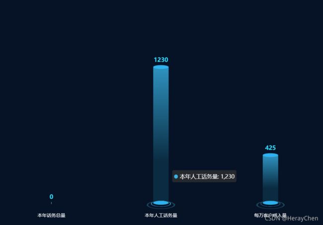
链接
xData = ['本年话务总量', '本年人工话务量', '每万客户呼入量'];
yData = [0, 1230, 425];
option = {
    backgroundColor: '#061326',
    grid: {
        top: '25%',
        left: '-5%',
        bottom: '5%',
        right: '5%',
        containLabel: true,
    },
    tooltip: {
        show: true,
    },
    animation: false,
    xAxis: [
        {
            type: 'category',
            data: xData,
            axisTick: {
                alignWithLabel: true,
            },
            nameTextStyle: {
                color: '#82b0ec',
            },
            axisLine: {
                show: false,
                lineStyle: {
                    color: '#82b0ec',
                },
            },
            axisLabel: {
                textStyle: {
                    color: '#fff',
                },
                margin: 30,
            },
        },
    ],
    yAxis: [
        {
            show: false,
            type: 'value',
            axisLabel: {
                textStyle: {
                    color: '#fff',
                },
            },
            splitLine: {
                lineStyle: {
                    color: '#0c2c5a',
                },
            },
            axisLine: {
                show: false,
            },
        },
    ],
    series: [
        {
            name: '',
            type: 'pictorialBar',
            symbolSize: [40, 10],
            symbolOffset: [0, -6], // 上部椭圆
            symbolPosition: 'end',
            z: 12,
            // "barWidth": "0",
            label: {
                normal: {
                    show: true,
                    position: 'top',
                    // "formatter": "{c}%"
                    fontSize: 15,
                    fontWeight: 'bold',
                    color: '#34DCFF',
                },
            },
            color: '#2DB1EF',
            data: yData,
        },
        {
            name: '',
            type: 'pictorialBar',
            symbolSize: [40, 10],
            symbolOffset: [0, 7], // 下部椭圆
            // "barWidth": "20",
            z: 12,
            color: '#2DB1EF',
            data: yData,
        },
        {
            name: '',
            type: 'pictorialBar',
            symbolSize: function (d) {
                return d > 0 ? [50, 15] : [0, 0]
            },
            symbolOffset: [0, 12], // 下部内环
            z: 10,
            itemStyle: {
                normal: {
                    color: 'transparent',
                    borderColor: '#2EA9E5',
                    borderType: 'solid',
                    borderWidth: 1,
                },
            },
            data: yData,
        },
        {
            name: '',
            type: 'pictorialBar',
            symbolSize: [70, 20],
            symbolOffset: [0, 18], // 下部外环
            z: 10,
            itemStyle: {
                normal: {
                    color: 'transparent',
                    borderColor: '#19465D',
                    borderType: 'solid',
                    borderWidth: 2,
                },
            },
            data: yData,
        },
        {
            type: 'bar',
            //silent: true,
            barWidth: '40',
            barGap: '10%', // Make series be overlap
            barCateGoryGap: '10%',
            itemStyle: {
                normal: {
                    color: new echarts.graphic.LinearGradient(0, 0, 0, 0.7, [
                        {
                            offset: 0,
                            color: '#38B2E6',
                        },
                        {
                            offset: 1,
                            color: '#0B3147',
                        },
                    ]),
                    opacity: 0.8,
                },
            },
            data: yData,
        },
    ],
};
立体柱状图
链接
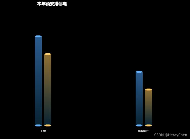
var xData = ["工单", "影响客户"];
var yData1 = [100, 60];
var yData2 = [80, 40];
var path = 'path://M214,1079l8-6h16l8,6-8,6H222Z';
option = {
    backgroundColor: 'BLACK',
    title: {
        text: '本年预安排停电',
        top: 5,
        left: '20%',
        textStyle: {
            fontSize: 18,
            color: '#fff'
        }
    },
    legend: {
        data: ['总数', '未复电数']
    },
    "grid": {
        "top": "25%",
        "left": "-5%",
        "bottom": "10%",
        "right": "5%",
        "containLabel": true
    },
    animation: false,
    "xAxis": [{
        "type": "category",
        "data": xData,
        "axisTick": {
            show: false,
            "alignWithLabel": true
        },
        "nameTextStyle": {
            "color": "#fff"
        },
        "axisLine": {
            show: false,
            "lineStyle": {
                "color": "#82b0ec"
            }
        },
        "axisLabel": {
            "textStyle": {
                "color": "#fff"
            },
            margin: 20
        }
    }],
    "yAxis": [{
        show: false,
        "type": "value",
        "axisLabel": {
            "textStyle": {
                "color": "#fff"
            },
            "formatter": "{value}%"
        },
        "splitLine": {
            "lineStyle": {
                "color": "#0c2c5a"
            }
        },
        "axisLine": {
            "show": false
        }
    }],
    "series": [{
            type: 'pictorialBar',
            symbol: path,
            symbolSize: [30, 8],
            symbolOffset: [-20, -5],
            symbolPosition: 'end',
            z: 12,
            color: "#68B4FF",
            data: yData1
        },
        {
            type: 'pictorialBar',
            symbol: path,
            symbolSize: [30, 8],
            symbolOffset: [20, -5],
            symbolPosition: 'end',
            z: 12,
            color: "#FFCE69",
            data: yData2
        },
        {
            type: 'pictorialBar',
            symbol: path,
            symbolSize: [30, 8],
            symbolOffset: [-20, 5],
            z: 12,
            color: "#68B4FF",
            data: yData1
        },
        {
            name: '',
            type: 'pictorialBar',
            symbol: path,
            symbolSize: [30, 8],
            symbolOffset: [20, 5],
            color: "#FFCE69",
            z: 12,
            data: yData2
        },
        {
            type: 'bar',
            itemStyle: {
                normal: {
                    opacity: .7
                }
            },
            barWidth: "30",
            color: new echarts.graphic.LinearGradient(0, 0, 0, 1, [{
                    offset: 0,
                    color: "#3D83CD"
                },
                {
                    offset: 1,
                    color: "#0B3147"
                }
            ]),
            data: yData1
        },
        {
            type: 'bar',
            itemStyle: {
                normal: {
                    opacity: .7
                }
            },
            barWidth: "30",
            color: new echarts.graphic.LinearGradient(0, 0, 0, 1, [{
                    offset: 0,
                    color: "#CC9F49"
                },
                {
                    offset: 1,
                    color: "#0B3147"
                }
            ]),
            data: yData2
        }
    ]
}
同环比
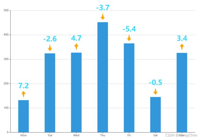
var data1 = [132, 324, 327, 452, 365, 145, 326];
var data2 = [7.2, -2.6, 4.7, -3.7, -5.4, -0.5, 3.4];
//定义两个上下箭头的矢量路径
var up = 'path://M286.031,265l-16.025,3L300,223l29.994,45-16.041-3-13.961,69Z';
var down = 'path://M216.969,292l16.025-3L203,334l-29.994-45,16.041,3,13.961-69Z'
//遍历data2里面元素的正负定义一个矢量路径的数组
var path = [up,down,up,down,down,down,up]
option = {
    color: ['#3398DB'],
    tooltip: {
        trigger: 'axis',
        axisPointer: {            // 坐标轴指示器,坐标轴触发有效
            type: 'shadow'        // 默认为直线,可选为:'line' | 'shadow'
        }
    },
    grid: {
        left: '3%',
        right: '4%',
        bottom: '3%',
        containLabel: true
    },
    xAxis: [
        {
            type: 'category',
            data: ['Mon', 'Tue', 'Wed', 'Thu', 'Fri', 'Sat', 'Sun'],
            axisTick: {
                alignWithLabel: true
            }
        }
    ],
    yAxis: [
        {
            type: 'value'
        }
    ],
    series: [
        {
            "name": "",
            type: 'pictorialBar',
            symbol: function(data,params){
                return path[params.dataIndex]
            },
            symbolSize: [20, 30],
            symbolOffset: [0, -40],
            color:'orange',
            symbolPosition: 'end',
            label: {
                show: true,
                position: "top",
                formatter:  function(params){
                    return data2[params.dataIndex]
                },
                fontSize: 30,
                fontWeight: 'bold',
                color: '#34DCFF'
            },
            data: data1
        },
        {
            name: '直接访问',
            type: 'bar',
            barWidth: '40%',
            data: data1
        }
    ]
};
关系图
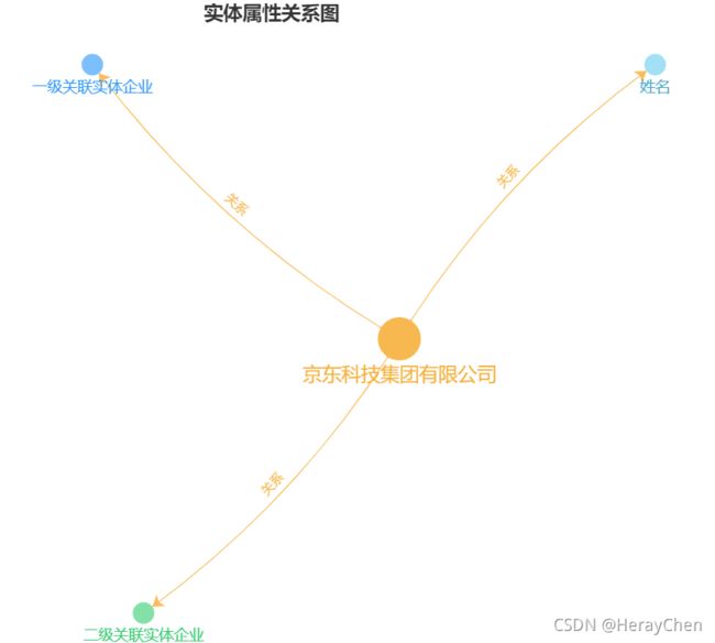
链接
let dataInfo = [{
    name: "京东科技集团有限公司",
    category: 0, // 这是种类,一级实体1二级关系2三级关系3四级关系4
    symbolSize: 40,
    draggable: true,
    fixed: true,
    value: [100, 0],
    label: {
        normal: {
            textStyle: {
                color: '#f6b03c',
                fontSize: 18
            },
        }
    }
},{
    name: "一级关联实体企业",
    category: 1,
    value: [40, 20],
    draggable: true,
    fixed: true,
    symbolSize: 20,
    label: {
        normal: {
            textStyle: {
                color: '#2595ff',
                fontSize: 14
            },
        }
    }
}, {
    name: "二级关联实体企业",
    category: 2,
    value: [50, -20],
    draggable: true,
    fixed: true,
    symbolSize: 20,
    label: {
        normal: {
            textStyle: {
                color: '#34cc6e',
                fontSize: 14
            },
        }
    }
}, {
    name: "姓名",
    category: 3,
    value: [150, 20],
    draggable: false,
    symbolSize: 20,
     label: {
        normal: {
            textStyle: {
                color: '#47a4c6',
                fontSize: 14
            },
        }
    }
}]
let dataLink = [{
    source: "京东科技集团有限公司",
    value: "关系",
    target: "一级关联实体企业",
    lineStyle: {
        color: '#f7b84f'
    }
}, {
    source: "京东科技集团有限公司",
    value: "关系",
    target: "二级关联实体企业",
     lineStyle: {
        color: '#f7b84f'
    }
}, {
    source: "京东科技集团有限公司",
    value: "关系",
    target: "姓名",
     lineStyle: {
        color: '#f7b84f'
    }
}]
option = {
    title: {
        text: "实体属性关系图",
        top: "top",
        left: "center"
    },
    itemStyle: {
        shadowBlur: 10
    },
    animationDuration: 1500,
    animationEasingUpdate: 'quinticInOut',
    xAxis: {
        show: false,
        type: 'value'
    },
    yAxis: {
        show: false,
        type: 'value'
    },
    series: [{
        type: 'graph',
        coordinateSystem: 'cartesian2d',
        legendHoverLink: false,
        hoverAnimation: true,
        nodeScaleRatio: false,
        //建头
        edgeSymbol: ['circle', 'arrow'],
        edgeSymbolSize: [2, 10],
        edgeLabel: {
            show: false,
            normal: {
                show: true,
                position: 'middle',
                textStyle: {
                    fontSize: 12
                },
                formatter: "{c}"
            }
        },
        roam: true,
        categories: [{
            name: '0级',
            itemStyle: { //可配置颜色
                normal: {
                    color: "#f7b84f",
                }
            },
        }, {
            name: '1级关系',
            itemStyle: { //可配置颜色
                normal: {
                    color: "#7cbfff",
                }
            }
        }, {
            name: '2级关系',
            itemStyle: { //可配置颜色
                normal: {
                    color: "#83e1a7",
                }
            }
        }, {
            name: '3级关系',
            itemStyle: { //可配置颜色
                normal: {
                    color: "#a3dff5",
                }
            }
        }],
        itemStyle: {
          shadowBlur: 0
        },
        //圆形上面的文字
        label: {
            normal: {
                position: "bottom",
                show: true,
                textStyle: {
                    color: '#000',
                    fontSize: 12
                },
            }
        },

        lineStyle: {
            normal: {
                opacity: 0.9,
                width: 1,
                curveness: 0.1
            }
        },
        data: dataInfo,
        links: dataLink
    }]
}
词云

链接
let colorList = [
    '#CF4645','#B580B2','#29008A','#146A90','#8956FF','#70C9A8',
    '#bfbfbf','#595959',
    '#40a9ff','#1890ff',
    '#ffd666','#ffc53d','#ffc53d','#ffc069','#ffa940','#fa8c16',
    '#eccbd9','#ffadad','#ff6392','#ffc09f','#ffcb77','#ffe066','#ffd53e','#ffda3d','#adf7b6','#a0e8af','#80ed99','#07beb8','#17c3b2','#48cae4','#97d2fb','#83bcff','#91e5f6','#9381ff']
let colorListLen = colorList.length
let fontSizeList = [
    12,12.5,13,13.5,14,14.5,
    15,15.5,16,16.5,17,17.5,
    18,18.5,19,19.5,20,20.5,
    21,22,23,
    24]
let fontSizeListLen = fontSizeList.length
let customLabel = {
    color: colorList[Math.floor(Math.random()*colorListLen)],
    fontSize: fontSizeList[Math.floor(Math.random()*fontSizeListLen)]
}
let bgColor = '#fffcf9'
let canDraggable = false
option = {
                backgroundColor: '#fffcf9',
                color: ['#37A2DA', '#32C5E9', '#67E0E3'],
                title: {
                    show: false,
                    text: '一天的时间流逝',
                    x: 'center',
                    y: 'bottom',
                    // 文字的颜色,默认 #333。
                    color: '#666',
                    fontSize: 24
                },
                toolbox: {
                    show: true,
                    feature: {
                        // dataView: {readOnly: false},
                        // magicType: {type: ['line', 'bar']},
                        restore: {},
                        // saveAsImage: {}
                    }
                },
                itemStyle: {
                    color: bgColor
                },
                series: [
                    {
                        type: 'graph',
                        layout: 'force',
                        force: {
                            repulsion: 80,
                            edgeLength: 10
                        },
                        roam: 'scale',
                        // symbol: '',
                        // symbolSize: 0,
                        label: {
                            show: true,
                            color: 'auto',
                            fontSize: 14
                        },
                        data: [
                            {
                                name: '金融',
                                value: 100,
                                draggable: canDraggable,
                                itemStyle: {
                                    color: bgColor
                                },
                                label: {
                                    color: colorList[Math.floor(Math.random()*colorListLen)],
                                    fontSize: fontSizeList[Math.floor(Math.random()*fontSizeListLen)]
                                }
                            },
                            {
                                name: '新能源',
                                value: 1,
                                draggable: canDraggable,
                                itemStyle: {
                                    color: bgColor
                                },
                                label: {
                                    color: colorList[Math.floor(Math.random()*colorListLen)],
                                    fontSize: fontSizeList[Math.floor(Math.random()*fontSizeListLen)]
                                }
                            },
                            {
                                name: '跑步',
                                value: 22,
                                draggable: canDraggable,
                                itemStyle: {
                                    color: bgColor
                                },
                                label: {
                                    color: colorList[Math.floor(Math.random()*colorListLen)],
                                    fontSize: fontSizeList[Math.floor(Math.random()*fontSizeListLen)]
                                }
                            },
                            {
                                name: '瑜伽',
                                value: 42,
                                draggable: canDraggable,
                                itemStyle: {
                                    color: bgColor
                                },
                                label: {
                                    color: colorList[Math.floor(Math.random()*colorListLen)],
                                    fontSize: fontSizeList[Math.floor(Math.random()*fontSizeListLen)]
                                }
                            },
                            {
                                name: '发呆',
                                value: 52,
                                draggable: canDraggable,
                                itemStyle: {
                                    color: bgColor
                                },
                                label: {
                                    color: colorList[Math.floor(Math.random()*colorListLen)],
                                    fontSize: fontSizeList[Math.floor(Math.random()*fontSizeListLen)]
                                }
                            },
                            {
                                name: '阅读',
                                value: 62,
                                draggable: canDraggable,
                                itemStyle: {
                                    color: bgColor
                                },
                                label: {
                                    color: colorList[Math.floor(Math.random()*colorListLen)],
                                    fontSize: fontSizeList[Math.floor(Math.random()*fontSizeListLen)]
                                }
                            },
                            {
                                name: '唱歌',
                                value: 72,
                                draggable: canDraggable,
                                itemStyle: {
                                    color: bgColor
                                },
                                label: {
                                    color: colorList[Math.floor(Math.random()*colorListLen)],
                                    fontSize: fontSizeList[Math.floor(Math.random()*fontSizeListLen)]
                                }
                            },
                            {
                                name: '跳舞',
                                value: 72,
                                draggable: canDraggable,
                                itemStyle: {
                                    color: bgColor
                                },
                                label: {
                                    color: colorList[Math.floor(Math.random()*colorListLen)],
                                    fontSize: fontSizeList[Math.floor(Math.random()*fontSizeListLen)]
                                }
                            },
                            {
                                name: '追星',
                                value: 72,
                                draggable: canDraggable,
                                itemStyle: {
                                    color: bgColor
                                },
                                label: {
                                    color: colorList[Math.floor(Math.random()*colorListLen)],
                                    fontSize: fontSizeList[Math.floor(Math.random()*fontSizeListLen)]
                                }
                            }
                        ]
                    }
                ]
            }
还可以通过echarts-wordcloud来编写:
characterCloud: (popularWordCloud) => {
    // 自定义词云中文字的颜色及大小
    let deptData = popularWordCloud;
    let dataList = [];   for (let i = 0; i < deptData.length; i++) {
      dataList.push({
        value: i == 0 ? 1000000 : Math.ceil(i * 100),
        name: deptData[i],
        textStyle: {
          color: (i < 20 ? 'rgba(8,135,255,' : 'rgba(91,181,214,') + opacityList[i] + ')',
          fontSize: fontSizeList[i]
        }
      })
    }
    // 返回的数据对象
    return {
      color: ['#37A2DA', '#32C5E9', '#67E0E3'],
      itemStyle: {
        color: '#fffcf9'
      },
      // 设置词云的最大最小缩放
      scaleLimit:{
        min: 0.5,
        max: 0.7
      },
      series: [
        {
          type: 'wordCloud',
          rotationRange: [0, 20],
          textPadding: 10,
          left: 'center',
          top: 'center',
          width: "80%",
          height: "100%",
          data: dataList
        }
      ]
    }
  },