Tailwind 练手项目
Tailwind 练手项目
用到的技巧 Tailwind CSS 速成 应该都提过了,我不记得这里有什么特别新的知识
整体完成图大概这样:
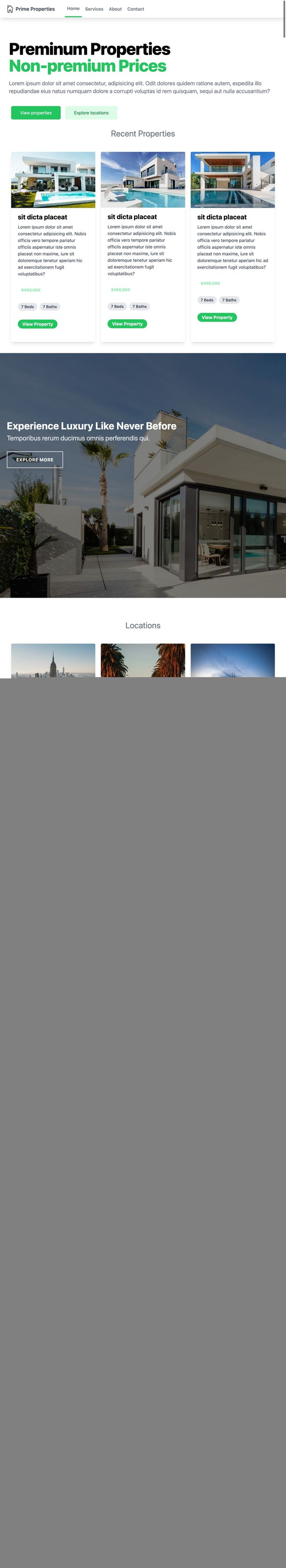
一个纯静态页面,没有做 JS 之类的特效,不过做了移动端适配,说实话我写到一半的时候改了不少……不是很喜欢这个 up 的风格,有点无意义的嵌套 div 就为了实现 CSS。
整体来说可以分成这么几个部分:
-
heading
-
site banner
这里根据移动端进行了一些字体的修改
-
banner
-
cards
几个 cards 重复性挺高的,基本上就是 cv 内容,除了 client 那里结构有点变,所以重新写了一下中间的内容
不过整体的 card 结构都差不多
-
contact
-
footer
下面就按照这几个方向拆解一下
heading
<nav class="bg-white shadow-lg">
  <div class="max-w-6xl mx-auto px-4">
    <div class="flex items-center space-x-7">
      <div class="">
        <a href="#" class="flex items-center py-4 px-2">
          <img src="images/house.png" alt="logo" class="h-8 w-8 pr-2" />
          <span class="block font-semibold text-gray-700 text-lg"
            >Prime Propertiesspan
          >
        a>
      div>
      <ul class="hidden md:flex space-x-1 items-center">
        <li class="px-2 py-4 border-green-500 border-b-4">
          <a href="" class="text-gray-500 font-semibold">Homea>
        li>
        <li class="px-2 py-4">
          <a
            href=""
            class="text-gray-500 font-semibold hover:text-green-500 transition duration-300"
            >Servicesa
          >
        li>
        <li class="px-2 py-4">
          <a
            href=""
            class="text-gray-500 font-semibold hover:text-green-500 transition duration-300"
            >Abouta
          >
        li>
        <li class="px-2 py-4">
          <a
            href=""
            class="text-gray-500 font-semibold hover:text-green-500 transition duration-300"
            >Contacta
          >
        li>
      ul>
    div>
  div>
nav>
内容看着挺多的,其实基本都是字体颜色、padding 之类的设定,以及 hover 变色之类的。
这里移动端的适配是通过 hidden md:flex,理解起来就是 md 以上的分界点使用 flex,md 以下不显示,如:
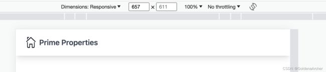
Tailwind 是一个移动优先的 CSS 库,因此所有的样式都会优先应用到小设备上,需要对大设备单独进行声明。
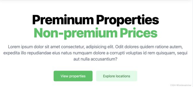
site banner
这里比较多的就是 breakpoint 的设置与修改,另外 letter-spacing,tailwind 用的是 tracking 来进行修改。
<main class="mt-10 px-4 md:mt-16 mx-auto max-w-7xl lg:mt-20 lg:px-8 xl:mt-28">
  <div class="text-center lg:text-left">
    <h1 class="tracking-tight font-extrabold text-4xl sm:text-5xl md:text-6xl">
      <span class="block xl:inline">Preminum Propertiesspan>
      <span class="block text-green-500 xl:inline">Non-premium Pricesspan>
    h1>
    <p
      class="text-base mt-3 text-gray-500 md:text-xl sm:mt-5 sm:text-lg sm:mx-auto lg:mx-0"
    >
      Lorem ipsum dolor sit amet consectetur, adipisicing elit. Odit dolores
      quidem ratione autem, expedita illo repudiandae eius natus numquam dolore
      a corrupti voluptas id rem quisquam, sequi aut nulla accusantium?
    p>
    <div class="mt-5 sm:mt-8 flex justify-center lg:justify-start">
      <div class="m-2">
        <button
          type="button"
          class="flex w-full justify-center bg-green-500 text-white px-8 py-3 rounded-md"
        >
          View properties
        button>
      div>
      <div class="m-2">
        <button
          class="flex w-full justify-center bg-green-100 text-green-700 px-8 py-3 rounded-md"
          type="button"
        >
          Explore locations
        button>
      div>
    div>
  div>
main>
整体来说知道对应的 CSS 是什么,这个 HTML 结构看起来就不会特别的吃力,移动端适配做的是将公司名换行,并且按钮居中:
card
card 用的是 grid 写的,这里主要做的就是,小屏幕显示 1 个 col,中屏幕 2 个 col,大屏幕 3 个 col,这里 tailwind 的实现胃:grid-cols-1 md:grid-cols-2 lg:grid-cols-3。
其余部分都是基础样式的修改:
<div class="mt-6 justify-center flex">
  <h2 class="text-3xl text-gray-500 mb-2">Recent Propertiesh2>
div>


<div class="grid p-10 grid-cols-1 md:grid-cols-2 lg:grid-cols-3 gap-5">

  <div class="rounded shadow-lg overflow-hidden">
    <img class="w-full" src="images/home1.jpg" alt="" />
    <div class="px-6 py-4">
      <h2 class="font-bold text-2xl mb-2">sit dicta placeath2>
      <p class="text-gray-700">
        Lorem ipsum dolor sit amet consectetur adipisicing elit. Nobis officia
        vero tempore pariatur officiis aspernatur iste omnis placeat non maxime,
        iure sit doloremque tenetur aperiam hic ad exercitationem fugit
        voluptatibus?
      p>
    div>
    <div class="px-6 pt-4 pb-2">
      <span
        class="text-green-300 font-bold text-sm px-3 py-1 mr-2 mb-2 inline-block"
        >$450,000span
      >
    div>
    <div class="px-6 pt-4 pb-2">
      <span
        class="inline-block bg-gray-200 rounded-full px-3 py-1 text-sm font-semibold text-gray-700 mr-2 mb-2"
        >7 Bedsspan
      ><span
        class="inline-block bg-gray-200 rounded-full px-3 py-1 text-sm font-semibold text-gray-700 mr-2 mb-2"
        >7 Bathsspan
      >
    div>
    <div class="px-6 pt-4 pb-10">
      <button
        class="inline-block bg-green-500 rounded-full px-4 py-1 font-bold text-white mr-2 mb-2"
      >
        View Property
      button>
    div>
  div>
  <div class="rounded shadow-lg overflow-hidden">
    <img class="w-full" src="images/home2.jpg" alt="" />
    <div class="px-6 py-4">
      <h2 class="font-bold text-2xl mb-2">sit dicta placeath2>
      <p class="text-gray-700">
        Lorem ipsum dolor sit amet consectetur adipisicing elit. Nobis officia
        vero tempore pariatur officiis aspernatur iste omnis placeat non maxime,
        iure sit doloremque tenetur aperiam hic ad exercitationem fugit
        voluptatibus?
      p>
    div>
    <div class="px-6 pt-4 pb-2">
      <span
        class="text-green-300 font-bold text-sm px-3 py-1 mr-2 mb-2 inline-block"
        >$450,000span
      >
    div>
    <div class="px-6 pt-4 pb-2">
      <span
        class="inline-block bg-gray-200 rounded-full px-3 py-1 text-sm font-semibold text-gray-700 mr-2 mb-2"
        >7 Bedsspan
      ><span
        class="inline-block bg-gray-200 rounded-full px-3 py-1 text-sm font-semibold text-gray-700 mr-2 mb-2"
        >7 Bathsspan
      >
    div>
    <div class="px-6 pt-4 pb-10">
      <button
        class="inline-block bg-green-500 rounded-full px-4 py-1 font-bold text-white mr-2 mb-2"
      >
        View Property
      button>
    div>
  div>
  <div class="rounded shadow-lg overflow-hidden">
    <img class="w-full" src="images/home3.jpg" alt="" />
    <div class="px-6 py-4">
      <h2 class="font-bold text-2xl mb-2">sit dicta placeath2>
      <p class="text-gray-700">
        Lorem ipsum dolor sit amet consectetur adipisicing elit. Nobis officia
        vero tempore pariatur officiis aspernatur iste omnis placeat non maxime,
        iure sit doloremque tenetur aperiam hic ad exercitationem fugit
        voluptatibus?
      p>
    div>
    <div class="px-6 pt-4 pb-2">
      <span
        class="text-green-300 font-bold text-sm px-3 py-1 mr-2 mb-2 inline-block"
        >$450,000span
      >
    div>
    <div class="px-6 pt-4 pb-2">
      <span
        class="inline-block bg-gray-200 rounded-full px-3 py-1 text-sm font-semibold text-gray-700 mr-2 mb-2"
        >7 Bedsspan
      ><span
        class="inline-block bg-gray-200 rounded-full px-3 py-1 text-sm font-semibold text-gray-700 mr-2 mb-2"
        >7 Bathsspan
      >
    div>
    <div class="px-6 pt-4 pb-10">
      <button
        class="inline-block bg-green-500 rounded-full px-4 py-1 font-bold text-white mr-2 mb-2"
      >
        View Property
      button>
    div>
  div>
div>
banner
banner 就是背景图,这里主要是用 inline style 写的:
<div
  class="h-screen py-20"
  style="
        background-image: linear-gradient(
            rgba(0, 0, 0, 0.5),
            rgba(0, 0, 0, 0.5)
          ),
          url('images/luxury.jpg');
      "
>
  <div class="container mx-auto px-6 mt-40">
    <h2 class="text-4xl font-bold text-white mb-2">
      Experience Luxury Like Never Before
    h2>
    <h3 class="text-gray-200 text-2xl mb-8">
      Temporibus rerum ducimus omnis perferendis qui.
    h3>
    <button
      class="text-white uppercase border-2 px-8 py-4 font-bold tracking-wider shadow-lg"
    >
      Explore More
    button>
  div>
div>
我查了一下,这个 tailwind 没有定制到图片+linear-gradient 的程度,如果要放在类名里,要用 qrbitrary values:
<div class="bg-[url('/img/hero-pattern.svg')]">

div>
contact
做的变化也不是很多,就是小屏幕下所有的 input 单独占一行,这个用 flex-wrap
做就好了:
<div class="mt-20 justify-center flex">
  <h2 class="text-3xl text-gray-500 mb-2">Contact Ush2>
div>
<div class="bg-green-300 mt-5 flex p-10 justify-center items-center">
  <form class="w-full max-w-lg">
    <div class="flex mb-6 flex-wrap">
      <div class="w-full md:w-1/2 px-3 mb-6 md:mb-0">
        <label
          for="firstname"
          class="block uppercase text-xs text-gray-700 font-bold mb-2 tracking-wider"
          >First Namelabel
        >
        <input
          type="text"
          id="firstname"
          class="block w-full border border-green-500 py-3 px-4 rounded outline-none text-gray-700"
          placeholder="Your First Name"
        />
        <p class="mt-2 text-green-500 italic text-xs">
          Please fill out this field
        p>
      div>
      <div class="w-full md:w-1/2 px-3">
        <label
          for="lastname"
          class="block uppercase text-xs text-gray-700 font-bold mb-2 tracking-wider"
          >Last Namelabel
        >
        <input
          type="text"
          id="lastname"
          class="block w-full border border-green-500 py-3 px-4 rounded outline-none text-gray-700"
          placeholder="Your Last Name"
        />
      div>
    div>
    <div class="flex mb-6">
      <div class="w-full px-3">
        <label
          for="email"
          class="block uppercase text-xs text-gray-700 font-bold mb-2 tracking-wider"
          >Your Emaillabel
        >
        <input
          type="email"
          id="email"
          class="block w-full border border-green-500 py-3 px-4 rounded outline-none text-gray-700"
          placeholder="Your Email"
        />
        <p class="mt-2 italic text-gray-700 text-xs">
          Some tips - as long as it needs
        p>
      div>
    div>
    <div class="flex mb-6">
      <div class="w-full px-3">
        <label
          for="message"
          class="block uppercase text-xs text-gray-700 font-bold mb-2 tracking-wider"
          >messagelabel
        >
        <textarea
          id="message"
          class="˝resize-none appearance-none h-48 block w-full border border-green-500 py-3 px-4 rounded outline-none text-gray-700"
          placeholder="Your Email"
        >
        textarea>
      div>
    div>

    <div class="md:flex md:items-center">
      <div class="md:w-1/3 px-3">
        <button
          type="button"
          class="shadow bg-green-500 text-white py- px-4 rounded"
        >
          Send
        button>
      div>
    div>
  form>
div>
footer
<footer class="pt-40 px-4">
  <div
    class="container flex flex-col lg:flex-row justify-between lg:justify-around mx-auto space-y-8"
  >
    <a href="" class="flex justify-center">
      <div class="flex items-center">
        <img src="images/house.png" alt="" class="h-8 w-8 mr-4" />
        <span class="font-semibold text-gray-500 text-2xl"
          >Prime Propertiesspan
        >
      div>
    a>

    <div
      class="grid grid-cols-2 sm:grid-cols-4 gap-x-3 gap-y-8 text-sm justify-center"
    >
      <div class="space-y-3">
        <h3 class="uppercase text-green-500 tracking-wide text-lg">Producth3>
        <ul class="space-y-1">
          <li><a href="#">Featuresa>li>
          <li><a href="#">Integrationsa>li>
          <li><a href="#">Pricinga>li>
          <li><a href="#">FAQa>li>
        ul>
      div>
      <div class="space-y-3">
        <h3 class="uppercase text-green-500 tracking-wide text-lg">Companyh3>
        <ul class="space-y-1">
          <li><a href="#">Featuresa>li>
          <li><a href="#">Integrationsa>li>
        ul>
      div>
      <div class="space-y-3">
        <h3 class="uppercase text-green-500 tracking-wide text-lg">
          Developers
        h3>
        <ul class="space-y-1">
          <li><a href="#">Featuresa>li>
          <li><a href="#">Integrationsa>li>
          <li><a href="#">Pricinga>li>
          <li><a href="#">FAQa>li>
        ul>
      div>
      <div class="space-y-3">
        <h3 class="uppercase text-green-500 tracking-wide text-lg">
          Social Media
        h3>
        <ul class="space-y-1 flex justify-start space-x-7 items-center">
          <li>
            <a href="#">
              <svg
                fill="#000000"
                width="30px"
                height="30px"
                viewBox="0 0 24 24"
                xmlns="http://www.w3.org/2000/svg"
              >
                <g id="SVGRepo_bgCarrier" stroke-width="0">g>
                <g
                  id="SVGRepo_tracerCarrier"
                  stroke-linecap="round"
                  stroke-linejoin="round"
                >g>
                <g id="SVGRepo_iconCarrier">
                  <path
                    d="M12 2.03998C6.5 2.03998 2 6.52998 2 12.06C2 17.06 5.66 21.21 10.44 21.96V14.96H7.9V12.06H10.44V9.84998C10.44 7.33998 11.93 5.95998 14.22 5.95998C15.31 5.95998 16.45 6.14998 16.45 6.14998V8.61998H15.19C13.95 8.61998 13.56 9.38998 13.56 10.18V12.06H16.34L15.89 14.96H13.56V21.96C15.9164 21.5878 18.0622 20.3855 19.6099 18.57C21.1576 16.7546 22.0054 14.4456 22 12.06C22 6.52998 17.5 2.03998 12 2.03998Z"
                  >path>
                g>
              svg>
            a>
          li>
          <li>
            <a href="#">
              <svg
                width="30px"
                height="30px"
                viewBox="0 -2 20 20"
                version="1.1"
                xmlns="http://www.w3.org/2000/svg"
                xmlns:xlink="http://www.w3.org/1999/xlink"
                fill="#000000"
              >
                <g id="SVGRepo_bgCarrier" stroke-width="0">g>
                <g
                  id="SVGRepo_tracerCarrier"
                  stroke-linecap="round"
                  stroke-linejoin="round"
                >g>
                <g id="SVGRepo_iconCarrier">
                  <title>twitter [#154]title>
                  <desc>Created with Sketch.desc>
                  <defs>defs>
                  <g
                    id="Page-1"
                    stroke="none"
                    stroke-width="1"
                    fill="none"
                    fill-rule="evenodd"
                  >
                    <g
                      id="Dribbble-Light-Preview"
                      transform="translate(-60.000000, -7521.000000)"
                      fill="#000000"
                    >
                      <g
                        id="icons"
                        transform="translate(56.000000, 160.000000)"
                      >
                        <path
                          d="M10.29,7377 C17.837,7377 21.965,7370.84365 21.965,7365.50546 C21.965,7365.33021 21.965,7365.15595 21.953,7364.98267 C22.756,7364.41163 23.449,7363.70276 24,7362.8915 C23.252,7363.21837 22.457,7363.433 21.644,7363.52751 C22.5,7363.02244 23.141,7362.2289 23.448,7361.2926 C22.642,7361.76321 21.761,7362.095 20.842,7362.27321 C19.288,7360.64674 16.689,7360.56798 15.036,7362.09796 C13.971,7363.08447 13.518,7364.55538 13.849,7365.95835 C10.55,7365.79492 7.476,7364.261 5.392,7361.73762 C4.303,7363.58363 4.86,7365.94457 6.663,7367.12996 C6.01,7367.11125 5.371,7366.93797 4.8,7366.62489 L4.8,7366.67608 C4.801,7368.5989 6.178,7370.2549 8.092,7370.63591 C7.488,7370.79836 6.854,7370.82199 6.24,7370.70483 C6.777,7372.35099 8.318,7373.47829 10.073,7373.51078 C8.62,7374.63513 6.825,7375.24554 4.977,7375.24358 C4.651,7375.24259 4.325,7375.22388 4,7375.18549 C5.877,7376.37088 8.06,7377 10.29,7376.99705"
                          id="twitter-[#154]"
                        >path>
                      g>
                    g>
                  g>
                g>
              svg>
            a>
          li>
          <li>
            <a href="#">
              <svg
                width="30px"
                height="30px"
                viewBox="0 0 24 24"
                fill="none"
                xmlns="http://www.w3.org/2000/svg"
              >
                <g id="SVGRepo_bgCarrier" stroke-width="0">g>
                <g
                  id="SVGRepo_tracerCarrier"
                  stroke-linecap="round"
                  stroke-linejoin="round"
                >g>
                <g id="SVGRepo_iconCarrier">
                  <path
                    fill-rule="evenodd"
                    clip-rule="evenodd"
                    d="M12 18C15.3137 18 18 15.3137 18 12C18 8.68629 15.3137 6 12 6C8.68629 6 6 8.68629 6 12C6 15.3137 8.68629 18 12 18ZM12 16C14.2091 16 16 14.2091 16 12C16 9.79086 14.2091 8 12 8C9.79086 8 8 9.79086 8 12C8 14.2091 9.79086 16 12 16Z"
                    fill="#0F0F0F"
                  >path>
                  <path
                    d="M18 5C17.4477 5 17 5.44772 17 6C17 6.55228 17.4477 7 18 7C18.5523 7 19 6.55228 19 6C19 5.44772 18.5523 5 18 5Z"
                    fill="#0F0F0F"
                  >path>
                  <path
                    fill-rule="evenodd"
                    clip-rule="evenodd"
                    d="M1.65396 4.27606C1 5.55953 1 7.23969 1 10.6V13.4C1 16.7603 1 18.4405 1.65396 19.7239C2.2292 20.8529 3.14708 21.7708 4.27606 22.346C5.55953 23 7.23969 23 10.6 23H13.4C16.7603 23 18.4405 23 19.7239 22.346C20.8529 21.7708 21.7708 20.8529 22.346 19.7239C23 18.4405 23 16.7603 23 13.4V10.6C23 7.23969 23 5.55953 22.346 4.27606C21.7708 3.14708 20.8529 2.2292 19.7239 1.65396C18.4405 1 16.7603 1 13.4 1H10.6C7.23969 1 5.55953 1 4.27606 1.65396C3.14708 2.2292 2.2292 3.14708 1.65396 4.27606ZM13.4 3H10.6C8.88684 3 7.72225 3.00156 6.82208 3.0751C5.94524 3.14674 5.49684 3.27659 5.18404 3.43597C4.43139 3.81947 3.81947 4.43139 3.43597 5.18404C3.27659 5.49684 3.14674 5.94524 3.0751 6.82208C3.00156 7.72225 3 8.88684 3 10.6V13.4C3 15.1132 3.00156 16.2777 3.0751 17.1779C3.14674 18.0548 3.27659 18.5032 3.43597 18.816C3.81947 19.5686 4.43139 20.1805 5.18404 20.564C5.49684 20.7234 5.94524 20.8533 6.82208 20.9249C7.72225 20.9984 8.88684 21 10.6 21H13.4C15.1132 21 16.2777 20.9984 17.1779 20.9249C18.0548 20.8533 18.5032 20.7234 18.816 20.564C19.5686 20.1805 20.1805 19.5686 20.564 18.816C20.7234 18.5032 20.8533 18.0548 20.9249 17.1779C20.9984 16.2777 21 15.1132 21 13.4V10.6C21 8.88684 20.9984 7.72225 20.9249 6.82208C20.8533 5.94524 20.7234 5.49684 20.564 5.18404C20.1805 4.43139 19.5686 3.81947 18.816 3.43597C18.5032 3.27659 18.0548 3.14674 17.1779 3.0751C16.2777 3.00156 15.1132 3 13.4 3Z"
                    fill="#0F0F0F"
                  >path>
                g>
              svg>
            a>
          li>
        ul>
      div>
    div>
  div>


  <div class="text-center text-green-500 text-sm py-10 border-t-2 mt-10">
    © 2023 GoldenaArcher. All rights reserved.
  div>
footer>
footer 长主要因为 svg……我应该用 fontawesome 的 icon 的(挠头
这里主要的效果就是超大屏幕下,logo 和其他的 footer 在一条线上,如第一张效果图所展示。在到 md-大屏幕的时候,logo 单独占据一行,footer 上用 grid 做了 4 个 column,到 md 以下的时候 grid 就是 22 对其了,如:
我唯一的问题就是觉得,在小屏幕下贴边太厉害了……是不是都剧中效果看起来会好很多……?
总结
如果是实际生产项目,我是不推荐这么写的。卡片里面有很多重复的代码,这些都是可以通过 directives 抽出来,封装专门的一个卡片类:
@layer components {
  .menu-button {
    @apply text-white bg-indigo-700;
  }
}
这么写,代码短还行,长的话理解起来会稍微有点麻烦。
原本的写法是小设备也会用上 breakpoint,如: sm: ,我写的时候把小设备忽略了……因为原 up 只声明了 sm,这样的话 xs 设备(也没多少 xs 设备了吧……)的实现会稍微有点不受控制。