基于pyecharts的可视化模拟(附代码)
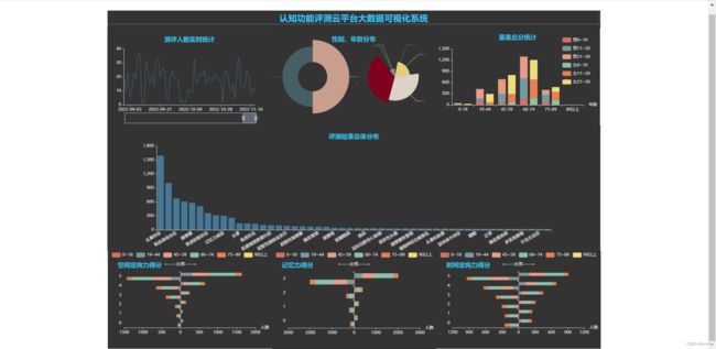
--可视化的结果如下图所示(详见附件)
1、根据业务实际分批制作所需图表
直接见代码(对pyecharts稍有了解即可)
1.1带有平移缩放的Line图(测评人数实时统计)
from pyecharts.charts import Pie,Line,Bar
from pyecharts.globals import ThemeType
from pyecharts import options as opts

def plot_now():
    Dis_Now = (
        Line(init_opts=opts.InitOpts(theme=ThemeType.DARK,width='470px',height='280px'))
        .add_xaxis([i[1] for i in daysNum])
        .add_yaxis(
            series_name="诊断人数",
            y_axis=[i[0] for i in daysNum],
            label_opts=opts.LabelOpts(is_show=False),
            symbol_size=1,
            is_smooth=True,
        )
        .set_global_opts(
            #标题
            title_opts=opts.TitleOpts(title="测评人数实时统计",pos_top='20',pos_left='center',
                                      title_textstyle_opts=opts.TextStyleOpts(color='#33C7F7',
                                                                              )),
            tooltip_opts=opts.TooltipOpts(trigger="axis"),
            legend_opts=opts.LegendOpts(is_show=False),
            #y轴
            yaxis_opts=opts.AxisOpts(
                type_="value",
                #横向参考线设置
                splitline_opts=opts.SplitLineOpts(is_show=False),
                #y轴的刻度线
                axistick_opts=opts.AxisTickOpts(is_show=True)
            ),
            #x轴
            xaxis_opts=opts.AxisOpts(type_="category",boundary_gap=False),
            #放缩与平移
            datazoom_opts=opts.DataZoomOpts(is_show=True,
                                            is_realtime=True,#是否实时更新,False则拖动完成后更新
                                            orient='horizontal',#横向展示拖动
                                            is_zoom_lock=False,#True:只能平移,不能缩放
                                            range_start=95,
                                            range_end=100
                                            )
        )
        .set_colors(['#467897'])
        #.render("Dis_Now.html")
    )
return Dis_Now1.2南丁格尔玫瑰图--Pie图(性别、年龄分布)
def plot_SexAge():
    Dis_SexAge = (
        Pie(init_opts=opts.InitOpts(theme=ThemeType.DARK,width='470px',height='280px'))
        .add(
            '性别',
            [list(z) for z in zip(['男','女'],[sexDis[0][0],sexDis[1][0]])],
            center=['25%','50%'],
            radius=["30%","75%"],
            rosetype='area',
        )
        .add(
            "年龄",
            [list(z) for z in zip(['0~18','19~44','45~59','60~74','75~89','90以上'],[numAge0_18,numAge19_44,numAge45_59,numAge60_74,numAge75_89,numAge90_])],
            center=['75%','50%'],
            radius='55%',
            rosetype='radius'
        )
        # 全局配置项
        .set_global_opts(
            #设置标题
            title_opts=opts.TitleOpts(title='性别、年龄分布',  #标题内容
                                      pos_right='center',    #左右位置
                                      pos_top="20",          #上下位置
                                      #标题文字设置
                                      title_textstyle_opts=opts.TextStyleOpts(color='#33C7F7')
                                      ),
            #设置图列
            legend_opts=opts.LegendOpts(is_show=False))
        # 系列配置项
        .set_series_opts(
            #设置提示框
            tooltip_opts=opts.TooltipOpts(
                trigger='item',formatter='{a}
 {b}: {d}%
 人数: {c}'
            ),
            #标签配置项
            label_opts=opts.LabelOpts(is_show=True,position='top',font_size=1,distance=0.01),
            #视觉引导线设置
            labelLine = {'show':True,#是否展示
                         # 'length':0.5, #长度
                         #引导线样式
                         #'lineStyle':{'opacity','width','type','clolr'...详见csdn}
                         }
        )
        .set_colors(['#C99E8C','#465E65','#467897','#E7CD79','#DCD2C6','#800020'])
        #.render("Dis_SexAge.html")
    )
return Dis_SexAge1.3两个柱子分别堆叠的柱形图--Bar图(量表总分统计)
def plot_MMSE():
    Dis_MMSE=(
        Bar(init_opts=opts.InitOpts(theme=ThemeType.DARK,width='470px',height='280px'))
        .add_xaxis(['0-18', '19-44', '45-59', '60-74', '75-89', '90以上', ])
        # 男/女分别叠加--i.e.两个柱子
        .add_yaxis("男0~10",male0_10,stack='stack1')
        .add_yaxis("男11~20",male11_20,stack='stack1')
        .add_yaxis("男21~30",male21_30,stack='stack1')
        .add_yaxis("女0~10",female0_10,stack='stack2')
        .add_yaxis("女11~20",female11_20,stack='stack2')
        .add_yaxis("女21~30",female21_30,stack='stack2')
        #系列设置
        .set_series_opts(label_opts=opts.LabelOpts(is_show=False))
        #全局设置
        .set_global_opts(title_opts=opts.TitleOpts(title="量表总分统计",pos_left="center",pos_top='5%',
                                                   title_textstyle_opts=opts.TextStyleOpts(color="#33C7F7")),
                         #xy轴名称
                         xaxis_opts=opts.AxisOpts(name="年龄"),
                         # yaxis_opts=opts.AxisOpts(name="人数",
                         #                          #参考线
                         #                          splitline_opts=opts.SplitLineOpts(is_show=True)),
                         legend_opts=opts.LegendOpts(pos_top="8%",orient='H',pos_right='5%')
                         )
        #.render("Dis_MMSE.html")
    )
return Dis_MMSE1.4缩放功能的柱形图--Bar图(评测结果总体分布)
just 组件设置(见代码注释)
def plot_AllDig():
    Dis_AllDig = (
        Bar(init_opts=opts.InitOpts(theme=ThemeType.DARK,width='1410px',height='360px'))
        .add_xaxis([i[0] for i in digResNum[:50]])
        .add_yaxis("",[i[1] for i in digResNum[:50]])
        .set_global_opts(
            #设置标题
            title_opts=opts.TitleOpts(title="评测结果总体分布",pos_left='center',pos_top='20',
                                      title_textstyle_opts=opts.TextStyleOpts(color='#33C7F7')),
            #设置x轴旋转,解决显示问题
            xaxis_opts=opts.AxisOpts(axislabel_opts=opts.LabelOpts(rotate=30)),
            # 设置提示框
            tooltip_opts=opts.TooltipOpts(
                trigger='axis',# item数据项图形触发,主要在散点图,饼图等无类目轴的图标使用;axis坐标轴触发,主要在柱状图,折线图等会使用类目轴的图表使用
                #formatter='{b}
人数: {c}',  # '{a}
 {b}: {d}%
 人数: {c}'
                trigger_on='mousemove|click',
                axis_pointer_type='shadow' #类型
            ),
            #设置展示
            datazoom_opts=opts.DataZoomOpts(type_='inside',range_start=0,range_end=100)#内部展示缩放
            #datazoom_opts=[opts.DataZoomOpts(),opts.DataZoomOpts(type_='inside')] 既有内部缩放也有平移器:slider+inside!)
        )
        .set_series_opts(
            label_opts=opts.LabelOpts(is_show=False),
        )
        .set_colors('#467897')
        #.render("Dis_AllDig.html")
    )
return Dis_AllDig1.5有点小操作的双向堆叠柱形图--Bar图(以记忆力得分为例)
age_values = ['0~18', '19~44', '45~59', '60~74', '75~89', '90以上']
def plot_JYL():
    DIS_JYL=(
        Bar(init_opts=opts.InitOpts(theme=ThemeType.DARK,width='470px',height='280px'))
        .add_xaxis([i for i in range(male_JYL.shape[0])])
        .add_yaxis(age_values[0],list(male_JYL.iloc[:,0]),stack='male')
        .add_yaxis(age_values[1],list(male_JYL.iloc[:,1]),stack='male')
        .add_yaxis(age_values[2],list(male_JYL.iloc[:,2]),stack='male')
        .add_yaxis(age_values[3],list(male_JYL.iloc[:,3]),stack='male')
        .add_yaxis(age_values[4],list(male_JYL.iloc[:,4]),stack='male')
        .add_yaxis(age_values[5],list(male_JYL.iloc[:,5]),stack='male')
        .add_yaxis(age_values[0],list(-female_JYL.iloc[:,0]),stack='female')
        .add_yaxis(age_values[1],list(-female_JYL.iloc[:,1]),stack='female')
        .add_yaxis(age_values[2],list(-female_JYL.iloc[:,2]),stack='female')
        .add_yaxis(age_values[3],list(-female_JYL.iloc[:,3]),stack='female')
        .add_yaxis(age_values[4],list(-female_JYL.iloc[:,4]),stack='female')
        .add_yaxis(age_values[5],list(-female_JYL.iloc[:,5]),stack='female')
        .reversal_axis()
        #系列设置
        .set_series_opts(
            #设置label
            label_opts=opts.LabelOpts(is_show=False),
            #设置提示框!!!
            tooltip_opts=opts.TooltipOpts(is_show=False)
                         )
        #全局设置
        .set_global_opts(
                         title_opts=opts.TitleOpts(title="记忆力得分",pos_left="5%",pos_top="10%",
                                                   title_textstyle_opts=opts.TextStyleOpts(color="#33C7F7")),
                         #xy轴
                         xaxis_opts=opts.AxisOpts(name="人数",
                                                  #is_inverse=True,
                                                  #设置此函数,使得坐标轴仍为正数!!!
                                                  axislabel_opts=opts.LabelOpts(formatter=JsCode("""
                                                  function(value){
                                                  if(value<0){
                                                    return -value;
                                                    }else{
                                                    return value;
                                                    }
                                                  }
                                                  """)),
                                                  ),

                         yaxis_opts=opts.AxisOpts(name="<——女男——>"),
                         #legend_opts=opts.LegendOpts(pos_top="7%",)
                         )
        #.render("DIS_MMSE_JYL.html")
    )
    return DIS_JYL
2、使用Page组合为一个html文件
2.1组合图像
import MMSE,MMSE_DDDXL,MMSE_SJDXL,MMSE_JYL,test

from pyecharts.components import Table
from pyecharts.charts import Page

# 1。对应第一行的标题
def make_title(v_title):
    table = Table()
    table.add(headers=[v_title], rows=[], attributes={
        "align": "center",
        "border": False,
        "padding": "2px",
        "style": "background:{}; width:1410px; height:50px; font-size:25px; color:#33C7F7;".format('#333333')
    })
    return table

# 2.逐步将图形添加到Page功能中
def page_plot():
    page = Page(layout=Page.DraggablePageLayout, page_title="认知功能评测云平台大数据可视化系统")    #使用拖拽来管理布局(在生成的html文件中)
    page.add(
        make_title(v_title='认知功能评测云平台大数据可视化系统'),
        test.plot_now(),
        test.plot_SexAge(),
        MMSE.plot_MMSE(),
        test.plot_AllDig(),
        MMSE_DDDXL.plot_DDDXL(),
        MMSE_JYL.plot_JYL(),
        MMSE_SJDXL.plot_SJDXL()
    )
    return page

# 3.一起生成html文件(在html文件中自行安排布局)
page_plot().render('BigPlot.html')
2.2将调整好布局后的图像保存为json文件,再次生成html
from pyecharts.charts import Page

# 执行之前,请确保:1、已经把json文件放到本目录下 2、把json中的title和table的id替换掉
Page.save_resize_html(
    source="BigPlot.html",
    cfg_file="chart_config.json",
    dest="认知功能评测云平台大数据可视化模拟.html"
)