数据可视化记二基础学习(Highcharts、AntV、ECharts)
目录
-
-
-
- 一、Highcharts
-
- 1.1 Highcharts JS
- 1.2 Highstock JS
- 1.3 Highmaps JS
- 二、AntV
-
- 2.1 绘制流程
-
- 2.1.1 Antv G2 绘图流程
- 2.1.2 Antv G6 绘图流程
- 2.1.3 Antv L7 绘图流程
- 三、ECharts
-
- 3.1 ECharts 绘图流程
- 3.2 概念映射对应图
-
- 3.2.1 系列(series)
- 3.2.2 组件
- 3.2.3 定位
- 3.2.4 坐标系
- 3.3 基本设置
-
- 3.3.1 主题设置
- 3.3.2 Canvas 或者 SVG 渲染
- 3.3.3 标题组件(title)
- 3.3.4 图例组件(legend)
- 3.3.5 工具栏组件(toolbox)
- 3.3.6 提示框组件(tooltip)
- 3.3.7 区域缩放(dataZoom)
- 3.3.8 直角坐标系内绘图网格(grid)
- 3.3.9 直角坐标系(xAxis、yAxis)
- 3.3.10 系列列表(series)
- 3.3.11 调色盘颜色列表(color)
- 3.4 vue-echarts与v-charts
-
- 3.4.1 vue-echarts
- 3.4.2 v-echarts
- 3.5 案例
-
- 3.5.1 案例一:多坐标系图
- 3.5.2 案例二 使用自定义系列案例
-
-
一、Highcharts
1、Highcharts 是一个用纯JavaScript编写的一个图表库, 能够很简单便捷的在web网站或是web应用程序添加有交互性的图表,并且免费提供给个人学习、个人网站和非商业用途使用。Highcharts 系列包含 Highcharts JS,Highstock JS,Highmaps JS 共三款软件,均为纯 JavaScript 编写的 HTML5 图表库。
官网地址
1.1 Highcharts JS
Highcharts 支持的图表类型有直线图、曲线图、区域图、柱状图、饼状图、散状点图、仪表图、气泡图、瀑布流图等多达 20 种图表,其中很多图表可以集成在同一个图形中形成混合图。
演示地址
1.2 Highstock JS
Highstock 是用纯 JavaScript 编写的股票图表控件,可以开发股票走势或大数据量的时间轴图表。它包含多个高级导航组件:预设置数据时间范围,日期选择器、滚动条、平移、缩放功能。
演示地址
1.3 Highmaps JS
Highmaps 是一款基于 HTML5 的优秀地图组件。Highmaps 继承了 Highcharts 简单易用的特性,利用它可以方便快捷的创建用于展现销售、选举结果等其他与地理位置关系密切的交互性地图图表。
演示地址
二、AntV
AntV 是蚂蚁金服全新一代数据可视化解决方案,致力于提供一套简单方便、专业可靠、无限可能的数据可视化最佳实践。
官网地址
	AntV 包括以下解决方案:
	- G2:可视化引擎
	- G2Plot:图表库
	- G6:图可视化引擎
	- Graphin:基于 G6 的图分析组件
	- F2:移动可视化方案
	- ChartCube:AntV 图表在线制作
	- L7:地理空间数据可视化
2.1 绘制流程
2.1.1 Antv G2 绘图流程
	1、引入 js 库
	2、编写渲染容器 DOM
	3、准备渲染数据
	4、获取渲染 DOM 对象
	5、初始化 G2 绘图对象(如:G2Plot.Line),配置绘图参数
	6、调用 render 完成渲染

<html>
  <head>
    <meta charset="utf-8">
    <script src="https://unpkg.com/@antv/g2plot@latest/dist/g2plot.js">script>
  head>
  <body>
    <div id="g2-chart">div>
    <script>
      const data = [
        { year: '1991', value: 3 },
        { year: '1992', value: 4 },
        { year: '1993', value: 3.5 },
        { year: '1994', value: 5 },
        { year: '1995', value: 4.9 },
        { year: '1996', value: 6 },
        { year: '1997', value: 7 },
        { year: '1998', value: 9 },
        { year: '1999', value: 13 },
      ];
      const chartDom = document.getElementById('g2-chart');
      const plot = new G2Plot.Line(chartDom, {
        title: { // 标题
          visible: true,
          text: 'g2折线图示例',
        },
        data, // 数据
        xField: 'year', // x轴对应值
        yField: 'value', // y轴对应值
        description: { // 副标题
          visible: true,
          text: '折线图用于表示连续时间跨度内的数据,它通常用于显示某变量随时间的变化模式。',
        },
        label: { // 节点上的值
          visible: true
        },
        color: '#FE740C', // 折现颜色
        point: { // 节点设置
          visible: true,
          size: 5, // 大小
          color: 'white', // 颜色
          style: {
            stroke: '#FE740C', // 边框颜色
            lineWidth: 2, // 边框
            fillOpacity: 0.6, // 透明色
          },
        },
        yAxis: { // Y轴设置,加单位
          formatter: (v) => {
            return v + 'k';
          },
        },
      });
      plot.render();
    script>
  body>
html>
2.1.2 Antv G6 绘图流程
	1、引入 js 库
	2、编写渲染容器 DOM
	3、准备渲染数据
	4、获取渲染 DOM 对象
	5、初始化 G6 绘图对象(如:G6.Graph),配置绘图参数
	6、调用 render 完成渲染
<html>
<head>
<meta charset="utf-8">
<script src="https://gw.alipayobjects.com/os/antv/pkg/_antv.g6-3.4.8/dist/g6.min.js">script>
head>
<body>
<div id="g6-chart">div>
<script>
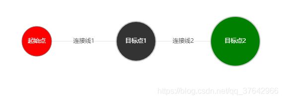
const data = {
// 点集
nodes: [
{
id: 'node1', // String,该节点存在则必须,节点的唯一标识
x: 100, // Number,可选,节点位置的 x 值
y: 200, // Number,可选,节点位置的 y 值
label: '起始点', // 节点文本
size: 60, // 元素的尺寸
labelCfg: { // 标签配置属性
position: 'center',// 标签的属性,标签在元素中的位置
style: { // 包裹标签样式属性的字段 style 与标签其他属性在数据结构上并行
fontSize: 12, // 标签的文字大小
fill: '#ffffff', // 标签的文字颜色
}
},
style: { // 包裹样式属性的字段 style 与其他属性在数据结构上并行
fill: '#ff0000', // 样式属性,元素的填充色
stroke: '#888', // 样式属性,元素的描边色
lineWidth: 1, // 节点描边粗细
}
},
{
id: 'node2', // String,该节点存在则必须,节点的唯一标识
x: 300, // Number,可选,节点位置的 x 值
y: 200, // Number,可选,节点位置的 y 值
label: '目标点1', // 节点文本
size: 80, // 元素的尺寸
labelCfg: { // 标签配置属性
position: 'center',// 标签的属性,标签在元素中的位置
style: { // 包裹标签样式属性的字段 style 与标签其他属性在数据结构上并行
fontSize: 12, // 标签的文字大小
fill: '#ffffff', // 标签的文字颜色
}
},
style: { // 包裹样式属性的字段 style 与其他属性在数据结构上并行
fill: '#333', // 样式属性,元素的填充色
stroke: '#ccc', // 样式属性,元素的描边色
lineWidth: 2, // 节点描边粗细
}
},
{
id: 'node3', // String,该节点存在则必须,节点的唯一标识
x: 500, // Number,可选,节点位置的 x 值
y: 200, // Number,可选,节点位置的 y 值
label: '目标点2', // 节点文本
size: 100, // 元素的尺寸
labelCfg: { // 标签配置属性
position: 'center',// 标签的属性,标签在元素中的位置
style: { // 包裹标签样式属性的字段 style 与标签其他属性在数据结构上并行
fontSize: 12, // 标签的文字大小
fill: '#ffffff', // 标签的文字颜色
}
},
style: { // 包裹样式属性的字段 style 与其他属性在数据结构上并行
fill: 'green', // 样式属性,元素的填充色
stroke: '#ccc', // 样式属性,元素的描边色
lineWidth: 2, // 节点描边粗细
}
}
],
// 边集
edges: [
{
source: 'node1', // String,必须,起始点 id
target: 'node2', // String,必须,目标点 id
label: '连接线1', // 边的文本
},
{
source: 'node2', // String,必须,起始点 id
target: 'node3', // String,必须,目标点 id
label: '连接线2', // 边的文本
},
],
};
const graph = new G6.Graph({
container: 'g6-chart', // String | HTMLElement,必须,在 Step 1 中创建的容器 id 或容器本身
width: 800, // Number,必须,图的宽度
height: 500, // Number,必须,图的高度
});
graph.data(data); // 读取 Step 2 中的数据源到图上
graph.render(); // 渲染图
script>
body>
html>
2.1.3 Antv L7 绘图流程
高德地图 key 获取方法
	1、引入 js 库
	2、编写渲染容器 DOM
	3、初始化地图对象 L7.Scene
	4、请求数据
	5、数据清洗
	6、初始化绘图对象(如:L7.PointLayer)
	7、调用 L7.Scene.addLayer 方法绘图

<html lang="en">
<head>
    <meta charset="UTF-8">
    <title>创建地图场景title>
    <style>
       html,body{overflow:hidden;margin:0;}
    	#map { position:absolute; top:0; bottom:0; width:100%; }
    style>
head>
<body>
<div id="map">div>
<script src="https://unpkg.com/@antv/l7">script>
<script>
  // 地图
  const scene = new L7.Scene({
    id: 'map',
    map: new L7.GaodeMap({
      style: 'dark', // 样式URL
      center: [120.19382669582967, 30.258134], // 中心点
      pitch: 0, // 看图角度
      zoom: 6, // 默认比例
      token: '***', // 高德地图Key
    }),
  });
  // 地图加载完成后
  scene.on('loaded', () => {
    fetch(
      'https://gw.alipayobjects.com/os/basement_prod/337ddbb7-aa3f-4679-ab60-d64359241955.json'
    )
      .then(res => res.json())
      .then(data => {
       	// 数据过滤
        data.features = data.features.filter(item => {
          return item.properties.capacity > 800;
        });
        // 点形状:shape('xxxx')
        // 大小:size('属性值', [ 最小尺寸, 最大尺寸 ])
        // 颜色区分 color
        // active 鼠标交互事件
        const pointLayer = new L7.PointLayer({})
          .source(data)
          .shape('circle')
          .size('capacity', [ 0, 16 ])
          .color('capacity', [
            '#34B6B7',
            '#4AC5AF',
            '#5FD3A6',
            '#7BE39E',
            '#A1EDB8',
            '#CEF8D6'
          ])
          .active(true)
          .style({
            opacity: 0.5,
            strokeWidth: 0
          });

        scene.addLayer(pointLayer);
      });
  });

script>
body>
html>
三、ECharts
官网地址
3.1 ECharts 绘图流程
	1、引入 js 库
	2、编写渲染容器 DOM,添加 width 和 height 样式属性
	3、获取渲染 DOM 对象
	4、初始化 ECharts 对象
	5、编写 option 参数
	6、调用 setOption 完成渲染
3.2 概念映射对应图
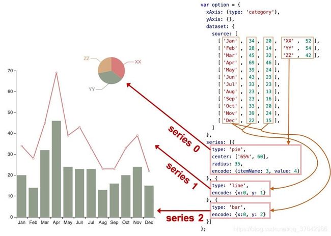
3.2.1 系列(series)
系列(series)是指:一组数值映射成对应的图

ECharts 4.0 新特性:dataset
ECharts 4 开始支持了 数据集(dataset)组件用于单独的数据集声明,从而数据可以单独管理,被多个组件复用,并且可以自由指定数据到视觉的映射。这一特性能将逻辑和数据分离,带来更好的复用,并易于理解。
3.2.2 组件
ECharts 中除了绘图之外其他部分,都可抽象为 「组件」。例如,ECharts 中至少有这些组件:xAxis(直角坐标系 X 轴)、yAxis(直角坐标系 Y 轴)、grid(直角坐标系底板)、angleAxis(极坐标系角度轴)等

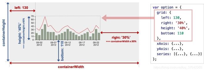
3.2.3 定位
大多数组件都提供了定位属性,我们可以采用类似 CSS absolute 的定位属性来控制组件的位置,下面这个案例可以通过修改 grid 组件定位来控制图表的位置
3.2.4 坐标系
散点图

双坐标系

多坐标系

3.3 基本设置
3.3.1 主题设置
颜色主题、颜色主题编辑器
3.3.2 Canvas 或者 SVG 渲染
Canvas 或者 SVG 渲染
3.3.3 标题组件(title)
	title: {
		text:'', // 主标题文本
		textStyle: {}, // 主标题样式
		subtext: '', // 副标题文本
		subtextStyle: {}, // 副标题样式
		top:'', // 组件离容器的距离了 left/top/right/bottom
		x: '', // x轴偏移
		y: '', // y轴偏移
		textAlign: 'center'
	}
3.3.4 图例组件(legend)
数据中含有
name属性,显示图例name内容
	legend: {
		type: 'scroll', // 图例的类型。 可选:plain(普通图例),scroll(可滚动翻页的图例)
		orient: 'horizontal', // 图例列表的布局朝向。 可选:horizontal、vertical
		height: 'auto', // 图例组件的高度
		top: '30%', // 图例组件离容器的距离 left/right/left/bottom
		textStyle: { // 图例的公用文本样式
			color: '#333' // 文字的颜色
		}
	}
3.3.5 工具栏组件(toolbox)
toolbox: {
show: true, // 是否显示工具栏组件
orient: 'horizontal', // 工具栏 icon 的布局朝向 可选值:horizontal、vertical
itemSize: 15, // 工具栏 icon 的大小
itemGap: 10 , // 工具栏 icon 每项之间的间隔。横向布局时为水平间隔,纵向布局时为纵向间隔
showTitle: true, // 是否在鼠标 hover 的时候显示每个工具 icon 的标题
feature: {
dataZoom: { // 数据区域缩放。目前只支持直角坐标系的缩放。
yAxisIndex: false // 放大时,控制所有的y轴,否者框选不到位,数据不显示。
},
dataView: { // 展现当前图表所用的数据
show: true, // 展现当前图表所用的数据
readOnly: true, // 是否不可编辑(只读)
optionToContent: function(opt) { // 自定义表格
let axisData = opt.xAxis[0].data //坐标数据
let series = opt.series //折线图数据
let tdHeads = '时间 ' //表头
let tdBodys = '' //数据
series.forEach(function(item) {
//组装表头
let name = item.name ? item.name : '数量'
tdHeads += `${name} `
})
let table = `${tdHeads} `
for (let i = 0, l = axisData.length; i < l; i++) {
for (let j = 0; j < series.length; j++) {
//组装表数据
tdBodys += `${series[j].data[i]} `
}
table += `${axisData[i]} ${tdBodys}
'
return table
}
},
magicType: { // 动态类型切换
type: ['line', 'bar', 'stack', 'tiled']
},
saveAsImage: {}, // 保存为图片
// 自定义工具
myTool: { // 注意,自定义的工具名字,只能以 my 开头
show: true,
title: '自定义扩展方法',
// 可以通过 'image://url' 设置为图片,其中 URL 为图片的链接,或者 dataURI
icon: 'image://http://echarts.baidu.com/images/favicon.png',
onclick: function() {
alert('myToolHandler')
}
},
restore: {}, // 配置项还原
}
}
// 自定义表格样式
.aem-bordered {
  width: 100%;
  tr:hover {
    background: #fbf8e9;
    -o-transition: all 0.1s ease-in-out;
    -webkit-transition: all 0.1s ease-in-out;
    -moz-transition: all 0.1s ease-in-out;
    -ms-transition: all 0.1s ease-in-out;
    transition: all 0.1s ease-in-out;
  }

  th {
    padding: 7px;
    text-align: center;
    cellspacing: 0;
  }

  td {
    padding: 7px;
    text-align: center;
    cellspacing: 0;
  }

  th {
    background-image: -webkit-gradient(linear, left top, left bottom, from(#ebf3fc), to(#dce9f9));
    background-image: -webkit-linear-gradient(top, #ebf3fc, #dce9f9);
    background-image: -moz-linear-gradient(top, #ebf3fc, #dce9f9);
    background-image: -ms-linear-gradient(top, #ebf3fc, #dce9f9);
    background-image: -o-linear-gradient(top, #ebf3fc, #dce9f9);
    background-image: linear-gradient(top, #ebf3fc, #dce9f9);
  }
  td:first-child,
  th:first-child {
    border-left: none;
  }

  tr:nth-of-type(2n) {
    background: #ffffff;
    cursor: pointer;
  }
  tr:nth-of-type(2n + 1) {
    background: #f7fafc;
    cursor: pointer;
  }

  tbody tr:hover {
    background: #fbf8e9;
    -o-transition: all 0.1s ease-in-out;
    -webkit-transition: all 0.1s ease-in-out;
    -moz-transition: all 0.1s ease-in-out;
    -ms-transition: all 0.1s ease-in-out;
    transition: all 0.1s ease-in-out;
  }
}
3.3.6 提示框组件(tooltip)
	tooltip: {
		trigger: 'item', // 触发类型 可选:item(数据项图形触发)、axis(坐标轴触发),none(不触发)
		formatter: ( params ) => {
			// params.marker 小圆点
			// 使用string字符串拼接,用
换行
			return params.data.xxxx
		}
	}
3.3.7 区域缩放(dataZoom)
	dataZoom: [{
		show: true, // 是否显示
		start: 0, // 默认区域开始比例
		end: 100 // 默认区域结束比例
	}]
3.3.8 直角坐标系内绘图网格(grid)
	// 组件离容器的距离
	// 可以是 20 这样的具体像素值,可以是像 '20%' 这样相对于容器高宽的百分比,也可以是 'left', 'center', 'right'。
	grid: {
		top: 0,
		left: 0,
		right: 0,
		bottom: 0
	}
3.3.9 直角坐标系(xAxis、yAxis)
	xAxis:{
		show: true, // 显示状态,只是坐标系不显示,数据正常展示
		type:'category', // 坐标轴类型: 'value' 数值轴,'category' 类目轴,'time' 时间轴,'log' 对数轴
		boundaryGap: true, // 坐标轴两边留白,当坐标轴不显示,此处设置为false,可以让内容更充满
		axisLine: { // 坐标轴轴线相关设置
			show: true // 是否显示坐标轴轴线
		},
		axisTick: { // 坐标轴刻度相关设置
			show: true, // 是否显示坐标轴刻度
			alignWithLabel: true, // xAxis有效, 以保证刻度线和标签对齐,如下图
			lineStyle: { // 刻度线的样式设置
			}
		},
		axisLabel: { // 坐标轴刻度标签的相关设置
		},
		splitLine: { // 坐标轴在 grid 区域中的分隔线
			show: false, // 是否显示分隔线 xAxis默认为false,yAxis默认为true
			lineStyle: {
				type: 'dotted', // 分割线样式 可选:solid、dashed、dotted
				color: '#eee', // 分隔线颜色
			}
		}
	},
	yAxis:{}

3.3.10 系列列表(series)
	// 折线图
	series: {
		type: 'line', // 类型
		data: [], // 数据
		areaStyle: { // 区域填充样式
			color: '#999', // 填充的颜色
		},
		lineStyle:{ // 标线的样式
			width: 0, // 线宽 0 时无描边
		},
		itemStyle: { // 折线拐点标志的样式
			opacity: 0, // 支持从 0 到 1 的数字,为 0 时不绘制该图形。
		},
		smooth: true, // 是否平滑曲线显示
	}
	// 柱状图
	series: [{
		type: 'bar',
		data: [],
		barWidth: '60%', // 柱条的宽度,不设时自适应。
		stack: '总量', // 数据堆叠,同个类目轴上系列配置相同的stack值可以堆叠放置
		itemStyle: { // 图形样式
			color: '#666' // 柱条的颜色
		}
	},{
		type: 'bar',
		data: [],
		stack: '总量'
	}]
	// 饼图
	series: [{
		type: 'pie',
		data: [{
			itemStyle: { // 在数据中设置当前数据的扇形样式
				color: 'rgb(128, 128, 128)'
			}
		}],
		label: { // 饼图图形上的文本标签,可用于说明图形的一些数据信息
			fontStyle: 'normal', // 文字字体的风格 可选:normal、italic、oblique
			position: 'outside', //  标签的位置 可选:outside(饼图扇区外侧)、inside(饼图扇区内部)、center(在饼图中心位置)
			// 标签内容格式器
			formatter: (params) => {
				return params.data.xxxx
			}
		},
		center: [ '50%', '50%' ], // 饼图的中心(圆心)坐标,数组的第一项是横坐标,第二项是纵坐标。
		radius: [ '20%', '50%' ], // 数组的第一项是内半径,第二项是外半径。显示成圆环图
		labelLine:{ // 标签的视觉引导线样式
			length: 5, // 视觉引导线第一段的长度
			length2: 3, // 视觉引导线第二段的长度
			smooth: false, // 是否平滑视觉引导线,默认不平滑
		},
		clockwise: true, // 扇区是否是顺时针排布
		itemStyle: { // 图形样式
			borderWidth: 4, // 边宽
			borderColor: '#fff' // 边框颜色
		}
	}]
	// 自定义
	series: [{
		type: 'custom',
		data: [],
		// 开发者自定义的图形元素渲染逻辑
		// params: 当前数据信息  api: 开发者可调用的方法集合
		renderItem: (params, api) => {
			return {
			}
		}
	}]
3.3.11 调色盘颜色列表(color)
	调色盘颜色列表。如果系列没有设置颜色,则会依次循环从该列表中取颜色作为系列颜色。
	默认为:
	 ['#c23531','#2f4554', '#61a0a8', '#d48265', '#91c7ae','#749f83',  '#ca8622', '#bda29a','#6e7074', '#546570', '#c4ccd3']
3.4 vue-echarts与v-charts
简化vue中使用echarts的开发
3.4.1 vue-echarts
使用说明
3.4.2 v-echarts
官网地址
使用场景:快速生成、v-echarts现有模板,不建议使用样式定制开发
3.5 案例
3.5.1 案例一:多坐标系图

<html>
  <head>
    <meta charset="utf-8">
    <script src="https://cdn.jsdelivr.net/npm/[email protected]/dist/echarts.min.js">script>
    <style>
      #chart {
        width: 800px;
        height: 400px;
      }
    style>
  head>
  <body>
    <div id="chart">div>
    <script>
      const chartDom = document.getElementById('chart')
      const chart = echarts.init(chartDom)
      const option = {
        legend: {},
        tooltip: {},
        xAxis: [{
          type: 'category',
          gridIndex: 0 // 对应grid的索引值
        }, {
          type: 'category',
          gridIndex: 1
        }],
        yAxis: [{
          gridIndex: 0
        }, {
          gridIndex: 1
        }],
        dataset: {
          source: [
            ['product', '2012', '2013', '2014', '2015'],
            ['Matcha Latte', 41.1, 30.4, 65.1, 53.3],
            ['Milk Tea', 86.5, 92.1, 85.7, 83.1],
            ['Cheese Cocoa', 24.1, 67.2, 79.5, 86.4]
          ]
        },
        grid: [{
          bottom: '55%'
        }, {
          top: '55%'
        }],
        series: [
          // 这几个系列会在第一个直角坐标系中,每个系列对应到 dataset 的每一行。
          { type: 'bar', seriesLayoutBy: 'row' },
          { type: 'bar', seriesLayoutBy: 'row' },
          { type: 'bar', seriesLayoutBy: 'row' },
          // 这几个系列会在第二个直角坐标系中,每个系列对应到 dataset 的每一列。
          { type: 'bar', xAxisIndex: 1, yAxisIndex: 1 },
          { type: 'bar', xAxisIndex: 1, yAxisIndex: 1 },
          { type: 'bar', xAxisIndex: 1, yAxisIndex: 1 },
          { type: 'bar', xAxisIndex: 1, yAxisIndex: 1 }
        ]
      }
      chart.setOption(option)
    script>
  body>
html>
3.5.2 案例二 使用自定义系列案例

	getOptions() {
      return {
        grid: {
          left: 0,
          right: 0,
          top: 0,
          bottom: 0
        },
        xAxis: {
          type: "value", // 横纵坐标调换
          show: false
        },
        yAxis: {
          type: "category", // 横纵坐标调换
          show: false
        },
        series: [
          {
            name: "上月平台用户数",
            type: "bar",
            stack: "总量",
            data: [150], // 分段值
            barWidth: 10,
            itemStyle: {
              color: "#45c946"
            }
          },
          {
            name: "今日平台用户数",
            type: "bar",
            stack: "总量",
            data: [200], // 最高值
            itemStyle: {
              color: "#eee"
            }
          },
          { // 使用自定义添加两个三角形
            type: "custom",
            stack: "总量",
            data: [150], // 分段值
            renderItem: (params, api) => {
              const value = api.value(0); // 获取值
              const endPoint = api.coord([value, 0]); // 获取坐标轴

              return {
                type: "group", // 分组类型
                position: endPoint, // 位置
                children: [
                  {
                    type: "path", // svg矢量图形
                    shape: {
                      d:"M1024 255.996 511.971 767.909 0 255.996 1024 255.996z", // 图标内容
                      x: -5, // x偏移量
                      y: -20, // y偏移量
                      width: 10, // 宽
                      height: 10,
                      layout: "cover" // 根据定义的矩形,缩放  cover: 拉伸为矩形的长宽比,完全填满矩形,不会超出矩形
                    },
                    style: {
                      fill: "#45c946" // 填充色
                    }
                  },
                  {
                    type: "path",
                    shape: {
                      d: "M0 767.909l512.029-511.913L1024 767.909 0 767.909z",
                      x: -5,
                      y: 10,
                      width: 10,
                      height: 10,
                      layout: "cover"
                    },
                    style: {
                      fill: "#45c946"
                    }
                  }
                ]
              };
            }
          }
        ]
      };
    }