echarts的项目总结
文章目录
- 前言
- 一、图形配置项属性查看
-
- 1.W3school
- 2.echarts 官方配置手册
- 二、常见问题(一直在更新中)
-
- 1.移除Echarts 饼图默认文字描边效果
- 三、配置想解析
-
- 1.ECharts配置title
- 2.文字大小调整
- 3.图例的属性(位置,内容,颜色...)
- 4.扇形图向外标注(视觉引导线)
- 5.饼状图的颜色
-
- a.series里面配置饼状图
- b.option下的第一个子标签设置颜色
- c.data数据里面直接配置(很直观)
- d.炫一点------随机颜色变换
- 6.南丁格尔图
- 7.圆环
- 8.坐标轴字体 倾斜
- 9.柱状图 数据显示在柱子上
- 10.内部自定义文字
- 11.渐变色
- 13.y轴详细解析
- 14.x轴详细解析
- 15.tooltip 提示框组件
- 16.折线图手把手教程
- 17.环形图自定义配置
- 总结
前言
一、图形配置项属性查看
1.W3school
WSchool的echarts入门手册
2.echarts 官方配置手册
echarts官方配置手册
二、常见问题(一直在更新中)
1.移除Echarts 饼图默认文字描边效果
问题描述:
echarts的扇形图,标签会出现加粗的情况,是这种饼状图自带的效果,那该怎么去除呢???
option = {
      series: [
          label:{
          // 设置一下  颜色就能去除这种效果
            color:"#fff"
          }
         ]
    };
三、配置想解析
1.ECharts配置title
option = {
	title: {
	   text: '薛之谦演唱会',
	   subtext: '0707',
	   left: 'center'
	 },
  }
详细解析:
title:{
    //1.标题居中
    //left的值为'left', 'center', 'right'
    left:'center',
    //默认为10

    //2.主副标题之间的间距
    itemGap:20,
    //3.标题文本样式
     text:'标题文本',
     textStyle:{
        //文字颜色
        color:'#ccc',
        //字体风格,'normal','italic','oblique'
        fontStyle:'normal',
        //字体粗细 'normal','bold','bolder','lighter',100 | 200 | 300 | 400...
        fontWeight:'bold',
        //字体系列
        fontFamily:'sans-serif',
        //字体大小
     fontSize:18
    }
    //4.副标题
    subtext:'副标题',
  //5.副标题文本样式
  subtextStyle:{
	//6.副标题样式(请参考 “3.” )
	},
   //7.grid组件离容器左侧的距离。
   // left 的值可以是像 20 这样的具体像素值,可以是像 '20%' 这样相对于容器高宽的百分比,也
   //可以是 'left', 'center', 'right'。
   //如果 left 的值为'left', 'center', 'right',组件会根据相应的位置自动对齐。
   //left:'center'
}
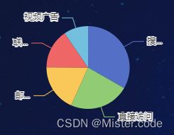
2.文字大小调整
图中‘1’的文字大小调整在 ‘legend’对象下的‘textStyle’ 属性里
图中‘2’的文字大小调整在 ‘tooltip’对象下的‘textStyle’ 属性里
图中‘3’的文字大小调整在 ‘series’对象下的‘label’ 属性里
{
"title": {
"text": "",
"subtext": "",
"x": "center",
"y": "center"
},
"tooltip": {
"trigger": "item",
//
"formatter": "{a} 3.图例的属性(位置,内容,颜色…)
结构
option = {
	legend: {

	 },
  }
源码分析:
legend: {
         orient: 'vertical',
         // 图例位置
         x: 'right',
         y: 'bottom',
         //图例文字的样式
         textStyle: {
             color: '#0b2b5e',
             fontSize: 12
         },
         // 图例的文字
         data: ['在线', '离线']
     },
详细版:
legend: {
    show: true,    // 是否显示图例
    type: 'category',    // 'plain':普通图例。缺省就是普通图例; 'scroll':可滚动翻页的图例。当图例数量较多时可以使用
    z: 2,     // 组件的所有图形的z值。控制图形的前后顺序。z值小的图形会被z值大的图形覆盖。
    top: 'auto'     // 距离容器侧边距离
    bottom: 'auto'     // 距离容器侧边距离
    left: 'auto',     // 距离容器侧边距离
    right: 'auto',     // 距离容器侧边距离
    width: 'auto',      // 图例组件的宽度。默认自适应
    height: 'auto',      // 图例组件的高度。默认自适应
    orient: 'horizontal',      // 图例列表的布局朝向; horizontal; vertical
    align: 'auto',     // 图例标记和文本的对齐。默认自动
    padding: 5,     // 图例内边距,单位px,默认各方向内边距为5,接受数组分别设定上右下左边距
    itemGap: 10,     // 图例每项之间的间隔。横向布局时为水平间隔,纵向布局时为纵向间隔
    itemWidth: 25,     // 图例标记的图形宽度
    itemHeight: 14,      // 图例标记的图形高度// 使用字符串模板,模板变量为图例名称 {name}
    formatter: function (name) {     // 使用回调函数
        return 'Legend ' + name;
    },
    inactiveColor: '#ccc',      // 图例关闭时的颜色
    textStyle: {
        color: '#FFF',     // 文字的颜色
        fontStyle: 'normal',    // 文字字体的风格('normal',无样式;'italic',斜体;'oblique',倾斜字体)
        fontWeight: 'normal',    // 文字字体的粗细('normal',无样式;'bold',加粗;'bolder',加粗的基础上再加粗;'lighter',变细;数字定义粗细也可以,取值范围100至700)
        fontSize: '20',    // 文字字体大小
        align: 'left',     // 文字水平对齐方式,默认自动('left','center','right')
        verticalAlign: 'left',    // 文字垂直对齐方式,默认自动('top','middle','bottom'
        lineHeight: '50',    // 行高 )
        backgroundColor: 'red',    // 文字块背景色,例:'#123234', 'red', 'rgba(0,23,11,0.3)'
    },
    data: [{
        name: '系列1',
        icon: 'circle',    // 强制设置图形为圆。
        textStyle: {
            color: '#FFF',     // 文字的颜色
            fontStyle: 'normal',    // 文字字体的风格('normal',无样式;'italic',斜体;'oblique',倾斜字体)
            fontWeight: 'normal',    // 文字字体的粗细('normal',无样式;'bold',加粗;'bolder',加粗的基础上再加粗;'lighter',变细;数字定义粗细也可以,取值范围100至700)
            fontSize: '20',    // 文字字体大小
            align: 'left',     // 文字水平对齐方式,默认自动('left','center','right')
            verticalAlign: 'left',    // 文字垂直对齐方式,默认自动('top','middle','bottom'
            lineHeight: '50',    // 行高 )
            backgroundColor: 'red',    // 文字块背景色,例:'#123234', 'red', 'rgba(0,23,11,0.3)'
        },
        backgroundColor: 'transparent',     // 图例背景色,默认透明
    }],
}
plus++:
legend: {
    show: true,    // 是否显示图例
    type: 'category',    // 'plain':普通图例。缺省就是普通图例; 'scroll':可滚动翻页的图例。当图例数量较多时可以使用
    z: 2,     // 组件的所有图形的z值。控制图形的前后顺序。z值小的图形会被z值大的图形覆盖。
    top: 'auto'     // 距离容器侧边距离
    bottom: 'auto'     // 距离容器侧边距离
    left: 'auto',     // 距离容器侧边距离
    right: 'auto',     // 距离容器侧边距离
    width: 'auto',      // 图例组件的宽度。默认自适应
    height: 'auto',      // 图例组件的高度。默认自适应
    orient: 'horizontal',      // 图例列表的布局朝向; horizontal; vertical
    align: 'auto',     // 图例标记和文本的对齐。默认自动
    padding: 5,     // 图例内边距,单位px,默认各方向内边距为5,接受数组分别设定上右下左边距
    itemGap: 10,     // 图例每项之间的间隔。横向布局时为水平间隔,纵向布局时为纵向间隔
    itemWidth: 25,     // 图例标记的图形宽度
    itemHeight: 14,      // 图例标记的图形高度// 使用字符串模板,模板变量为图例名称 {name}
    formatter: function (name) {     // 使用回调函数
        return 'Legend ' + name;
    },
    inactiveColor: '#ccc',      // 图例关闭时的颜色
    textStyle: {
        color: '#FFF',     // 文字的颜色
        fontStyle: 'normal',    // 文字字体的风格('normal',无样式;'italic',斜体;'oblique',倾斜字体)
        fontWeight: 'normal',    // 文字字体的粗细('normal',无样式;'bold',加粗;'bolder',加粗的基础上再加粗;'lighter',变细;数字定义粗细也可以,取值范围100至700)
        fontSize: '20',    // 文字字体大小
        align: 'left',     // 文字水平对齐方式,默认自动('left','center','right')
        verticalAlign: 'left',    // 文字垂直对齐方式,默认自动('top','middle','bottom'
        lineHeight: '50',    // 行高 )
        backgroundColor: 'red',    // 文字块背景色,例:'#123234', 'red', 'rgba(0,23,11,0.3)'
    },
    data: [{
        name: '系列1',
        icon: 'circle',    // 强制设置图形为圆。
        textStyle: {
            color: '#FFF',     // 文字的颜色
            fontStyle: 'normal',    // 文字字体的风格('normal',无样式;'italic',斜体;'oblique',倾斜字体)
            fontWeight: 'normal',    // 文字字体的粗细('normal',无样式;'bold',加粗;'bolder',加粗的基础上再加粗;'lighter',变细;数字定义粗细也可以,取值范围100至700)
            fontSize: '20',    // 文字字体大小
            align: 'left',     // 文字水平对齐方式,默认自动('left','center','right')
            verticalAlign: 'left',    // 文字垂直对齐方式,默认自动('top','middle','bottom'
            lineHeight: '50',    // 行高 )
            backgroundColor: 'red',    // 文字块背景色,例:'#123234', 'red', 'rgba(0,23,11,0.3)'
        },
        backgroundColor: 'transparent',     // 图例背景色,默认透明
    }],
}
4.扇形图向外标注(视觉引导线)

option = {
	series: [{
			itemStyle : {
			    normal : {
			        label : {
			            show : false
			        },
			        labelLine : {
			            show : false
			        }
			    },
			    emphasis : {
			        label : {
			            show : true
			        },
			        labelLine : {
			            show : true
			        }
			    }
			},
	 }],
  }
series: [{
	name: '圆环图系列名称',         // 系列名称
	type: 'pie',                    // 系列类型
	left: '0%',
	center: ['24%', '50%'],           // 饼图的中心(圆心)坐标,数组的第一项是横坐标,第二项是纵坐标。[ default: ['50%', '50%'] ]
	radius: ['30%', '40%'],         // 饼图的半径,数组的第一项是内半径,第二项是外半径。[ default: [0, '75%'] ]
	hoverAnimation: true,           // 是否开启 hover 在扇区上的放大动画效果。[ default: true ]
	color: color,                   // 圆环图的颜色
	label: {                        // 饼图图形上的文本标签,可用于说明图形的一些数据信息,比如值,名称等.
		normal: {
			show: false,             // 是否显示标签[ default: false ]
			position: 'outside',    // 标签的位置。'outside'饼图扇区外侧,通过视觉引导线连到相应的扇区。'inside','inner' 同 'inside',饼图扇区内部。'center'在饼图中心位置。
			formatter: '{b} : {c}次'  // 标签内容
		}
	},
	labelLine: {                    // 标签的视觉引导线样式,在 label 位置 设置为'outside'的时候会显示视觉引导线。
		normal: {
			show: false,             // 是否显示视觉引导线。
			length: 15,             // 在 label 位置 设置为'outside'的时候会显示视觉引导线。
			length2: 10,            // 视觉引导项第二段的长度。
			lineStyle: {            // 视觉引导线的样式
				//color: '#000',
				//width: 1
			}
		}
	},
	data: []                      // 系列中的数据内容数组。
}],
5.饼状图的颜色
a.series里面配置饼状图
option={
	series: [
		  itemStyle: {
		    normal: {
		      color: function (colors) {
		         var colorList = [
		           '#fc8251',
		           '#5470c6',
		           '#91cd77',
		           '#ef6567',
		           '#f9c956',
		           '#75bedc'
		         ];
		         return colorList[colors.dataIndex];
		       }
		    },
		 }
	 ]
}
b.option下的第一个子标签设置颜色
option= {
	color:['#3ca170','#5470c6', '#91cd77','#ef6567', '#f9c956','#75bedc'],
}
c.data数据里面直接配置(很直观)
option={
	series:[
		{

			data: [
	        { value: 917, name: '搜索引擎',itemStyle: {color:'#fc8251'}},
	        { value: 873, name: '微信朋友圈',itemStyle: {color:'#5470c6'}},
	        { value: 678, name: 'Feeds 广告',itemStyle: {color:'#91cd77'}},
	        { value: 583, name: '直接访问',itemStyle: {color:'#ef6567'}},
	        { value: 432, name: '口碑介绍',itemStyle: {color:'#f9c956'}}
      		]

		}
	]
}
d.炫一点------随机颜色变换
option={
	series:[
		{

		itemStyle: {
        color: function () {
          return (
            'rgb(' +
            [
              Math.round(Math.random() * 270),
              Math.round(Math.random() * 370),
              Math.round(Math.random() * 400)
            ].join(',') +
            ')'
          );
        },

		}
	]
}
6.南丁格尔图
每一个扇形的半径随之额数据的大小而不同,数值占比越大,扇形的半径就越大
roseType
- radius扇区圆心角展现数据的百分比,半径展现数据的大小。
- area所有扇区圆心角相同,仅通过半径展现数据大小。
选中扇区的偏移距离
- selectedOffset:50
option= {
	series:[
		{
			 roseType:'radius',
			 selectedOffset:50
		}
	]
}
7.圆环
 option = {
        series:[
            {
                type:'pie',
                data:pieData,
                radius:['25%','50%']
            }
        ]
    }
8.坐标轴字体 倾斜
 option = {
		xAxis : [
		            {
		                type : 'category',
		                //设置轴线的属性
		                 axisLine:{
		                     lineStyle:{
		                         color:'#6ab2ec',
		                     }
		                 },
		                //调整x轴的lable
		                axisLabel:{
		                    textStyle:{
		                        fontSize:10 // 让字体变小
		                    },
		                    rotate: 30,    // 字体倾斜30度
		                },
		                data : xData,
		            }
		        ],

    }
9.柱状图 数据显示在柱子上
option = {

	series: [{
		/* 显示柱子数据 */
           label: {
               normal: {
                   show: true,
                   // 数据在柱子头部显示
                   position: 'top',
                   textStyle: {
                     color: '#5475c7',
                     fontSize:16,
                   }
               }
           },


	}],
}
10.内部自定义文字
 const option = {
     title: [
       { // 第一个圆环标题
         text: '省市公司', // 主标题
         textStyle: { // 主标题样式
           color: '#333',
           fontWeight: 'bold',
           fontSize: 14
         },
         left: '24%', // 定位到适合的位置
         top: '50%', // 定位到适合的位置
         subtext: 'xxx', // 副标题
         subtextStyle: { // 副标题样式
           color: 'red',
           fontSize: 13,
           fontWeight: 'bold'
         },
         textAlign: 'center' // 主、副标题水平居中显示
       },
       {// 第二个圆环标题
         text: '县公司',
         textStyle: {
           color: '#333',
           fontWeight: 'bold',
           fontSize: 14
         },
         left: '74%',
         top: '50%',
         subtext: 'xxx',
         subtextStyle: {
           color: 'red',
           fontSize: 13,
           fontWeight: 'bold'
         },
         textAlign: 'center'
       }
     ],
     tooltip: {
       trigger: 'item'
     },
     legend: {
       top: '3%',
       left: 'center'
     },
     series: [
       { // 第一个圆环
         type: 'pie',
         radius: ['40%', '60%'],
         center: ['25%', '60%'],
         avoidLabelOverlap: false,
         itemStyle: {
           borderRadius: 10,
           borderColor: '#fff',
           borderWidth: 2
         },
         label: {
           show: true,
           position: 'inner', // 数据会显示在图形上,'center':会显示在圆环的内部
           color: '#000',
           formatter: '{c}' // 显示的数据
         },
         data: [2,4,1], //
       },
       { // 第二个圆环
         type: 'pie',
         radius: ['40%', '60%'],
         center: ['75%', '60%'],
         avoidLabelOverlap: false,
         itemStyle: {
           borderRadius: 10,
           borderColor: '#fff',
           borderWidth: 2
         },
         label: {
           show: true,
           position: 'inner',
           color: '#000',
           formatter: '{c}'
         },
         data: [1,1,1],
       }
     ]
   };
11.渐变色
option = {
	series = [

		{
               itemStyle: {
                emphasis: {
                    shadowBlur: 10,
                    shadowOffsetX: 0,
                    shadowColor: 'rgba(0, 0, 0, 0.5)'
                },
                normal: {
                    color: function(params) {
                     var colorList = [
                    {
                        c1: ' #fce5ca',  //管理
                        c2: '#FF9D62'
                    },
                    {
                        c1: ' #508DFF',  //实践
                        c2: '#26C5FE'
                    },
                    {
                        c1: '#63E587',//操作
                        c2: '#5FE2E4'
                    }]
                     return new echarts.graphic.LinearGradient(1, 0, 0, 0, [{ //颜色渐变函数 前四个参数分别表示四个位置依次为左、下、右、上

                            offset: 0,
                            color: colorList[params.dataIndex].c1
                        }, {
                            offset: 1,
                            color: colorList[params.dataIndex].c2
                        }])
                      /*  return colorList[params.dataIndex]*/
                    }
                }
            }
		}

	]
}
13.y轴详细解析
yAxis: {
    show: true,    // 是否显示 y 轴
    position: 'top',    // y 轴的位置('top','bottom')
    type: 'category',    // 坐标轴类型
    nameLocation: 'end',     // 坐标轴名称显示位置
    nameGap: 15,     // 坐标轴名称与轴线之间的距离
    nameRotate: 10,    // 坐标轴名字旋转,角度值
    inverse: false,    // 是否是反向坐标轴
    nameTextStyle: {
        color: '#333',     // 坐标轴名称的颜色
        fontStyle: 'normal',    // 文字字体的风格('normal',无样式;'italic',斜体;'oblique',倾斜字体)
        fontWeight: 'normal',    // 文字字体的粗细('normal',无样式;'bold',加粗;'bolder',加粗的基础上再加粗;'lighter',变细;数字定义粗细也可以,取值范围100至700)
        fontSize: '20',    // 文字字体大小
        align: 'left',     // 文字水平对齐方式,默认自动('left','center','right')
        verticalAlign: 'left',    // 文字垂直对齐方式,默认自动('top','middle','bottom'
        lineHeight: '50',    // 行高 )
        backgroundColor: 'red',    // 文字块背景色,例:'#123234', 'red', 'rgba(0,23,11,0.3)'
    },
    axisLine: {
        show: true,    // 是否显示坐标轴轴线
        symbol: ['none', 'arrow'],     // 轴线两端箭头,两个值,none表示没有箭头,arrow表示有箭头
        symbolSize: [10, 15],     // 轴线两端箭头大小,数值一表示宽度,数值二表示高度
        lineStyle: {
            color: '#333',    // 坐标轴线线的颜色
            width: '5',    // 坐标轴线线宽
            type: 'solid',     // 坐标轴线线的类型('solid',实线类型;'dashed',虚线类型;'dotted',点状类型)
        },
    },
    axisTick: {
        show: true,    // 是否显示坐标轴刻度
        inside: true,     // 坐标轴刻度是否朝内,默认朝外
        length: 5,    // 坐标轴刻度的长度
        lineStyle: {
            color: '#FFF',     // 刻度线的颜色
            width: 10,    // 坐标轴刻度线宽
            type: 'solid',     // 坐标轴线线的类型('solid',实线类型;'dashed',虚线类型;'dotted',点状类型)
        },
    },
    axisLabel: {
        show: true,     // 是否显示刻度标签
        interval: '0',    // 坐标轴刻度标签的显示间隔,在类目轴中有效.0显示所有
        inside: true,    // 刻度标签是否朝内,默认朝外
        rotate: 90,    // 刻度标签旋转的角度,在类目轴的类目标签显示不下的时候可以通过旋转防止标签之间重叠;旋转的角度从 -90 度到 90 度
        margin: 10,    // 刻度标签与轴线之间的距离
        // formatter 刻度标签的内容格式器,支持字符串模板和回调函数两种形式
        color: '#FFF',     // 刻度标签文字的颜色
        fontStyle: 'normal',    // 文字字体的风格('normal',无样式;'italic',斜体;'oblique',倾斜字体)
        fontWeight: 'normal',    // 文字字体的粗细('normal',无样式;'bold',加粗;'bolder',加粗的基础上再加粗;'lighter',变细;数字定义粗细也可以,取值范围100至700)
        fontSize: '20',    // 文字字体大小
        align: 'left',     // 文字水平对齐方式,默认自动('left','center','right')
        verticalAlign: 'left',    // 文字垂直对齐方式,默认自动('top','middle','bottom'
        lineHeight: '50',    // 行高 )
        backgroundColor: 'red',    // 文字块背景色,例:'#123234', 'red', 'rgba(0,23,11,0.3)'
    },
    splitLine: {
        show: true,    // 是否显示分隔线。默认数值轴显示,类目轴不显示
        interval: '0',    // 坐标轴刻度标签的显示间隔,在类目轴中有效.0显示所有
        color: ['#ccc'],    // 分隔线颜色,可以设置成单个颜色,也可以设置成颜色数组,分隔线会按数组中颜色的顺序依次循环设置颜色
        width: 3,    // 分隔线线宽
        type: 'solid',     // 坐标轴线线的类型('solid',实线类型;'dashed',虚线类型;'dotted',点状类型)
    },
    splitArea: {
        show: true,    // 是否显示分隔区域
        interval: '0',    // 坐标轴刻度标签的显示间隔,在类目轴中有效.0显示所有
        areaStyle: {
            color: ['rgba(250,250,250,0.3)','rgba(200,200,200,0.3)'],    // 分隔区域颜色。分隔区域会按数组中颜色的顺序依次循环设置颜色。默认是一个深浅的间隔色
            opacity: 1,    // 图形透明度。支持从 0 到 1 的数字,为 0 时不绘制该图形
        },
    },
    data: {
        textStyle: {
            color: '#FFF',     // 文字的颜色
            fontStyle: 'normal',    // 文字字体的风格('normal',无样式;'italic',斜体;'oblique',倾斜字体)
            fontWeight: 'normal',    // 文字字体的粗细('normal',无样式;'bold',加粗;'bolder',加粗的基础上再加粗;'lighter',变细;数字定义粗细也可以,取值范围100至700)
            fontSize: '20',    // 文字字体大小
            align: 'left',     // 文字水平对齐方式,默认自动('left','center','right')
            verticalAlign: 'left',    // 文字垂直对齐方式,默认自动('top','middle','bottom'
            lineHeight: '50',    // 行高 )
            backgroundColor: 'red',    // 文字块背景色,例:'#123234', 'red', 'rgba(0,23,11,0.3)'
        },
    },
}
14.x轴详细解析
xAxis: {
    show: true,    // 是否显示 x 轴
    position: 'top',    // x 轴的位置('top','bottom')
    type: 'category',    // 坐标轴类型
    nameRotate: 10,    // 坐标轴名字旋转,角度值
    inverse: false,    // 是否是反向坐标轴
    boundaryGap: ['20%', '20%'],    // 坐标轴两边留白策略
    splitNumber: 5,    // 坐标轴的分割段数(预估值)
    axisLine: {
        show: true,    // 是否显示坐标轴轴线
        symbol: ['none', 'arrow'],     // 轴线两端箭头,两个值,none表示没有箭头,arrow表示有箭头
        symbolSize: [10, 15],     // 轴线两端箭头大小,数值一表示宽度,数值二表示高度
        lineStyle: {
            color: '#333',    // 坐标轴线线的颜色
            width: '5',    // 坐标轴线线宽
            type: 'solid',     // 坐标轴线线的类型('solid',实线类型;'dashed',虚线类型;'dotted',点状类型)
        },
    },
    axisTick: {
        show: true,    // 是否显示坐标轴刻度
        inside: true,     // 坐标轴刻度是否朝内,默认朝外
        length: 5,    // 坐标轴刻度的长度
        lineStyle: {
            color: '#FFF',     // 刻度线的颜色
            width: 10,    // 坐标轴刻度线宽
            type: 'solid',     // 坐标轴线线的类型('solid',实线类型;'dashed',虚线类型;'dotted',点状类型)
        },
    },
    axisLabel: {
        show: true,     // 是否显示刻度标签
        interval: '0',    // 坐标轴刻度标签的显示间隔,在类目轴中有效.0显示所有
        inside: true,    // 刻度标签是否朝内,默认朝外
        rotate: 90,    // 刻度标签旋转的角度,在类目轴的类目标签显示不下的时候可以通过旋转防止标签之间重叠;旋转的角度从 -90 度到 90 度
        margin: 10,    // 刻度标签与轴线之间的距离
        // formatter 刻度标签的内容格式器,支持字符串模板和回调函数两种形式
        color: '#FFF',     // 刻度标签文字的颜色
        fontStyle: 'normal',    // 文字字体的风格('normal',无样式;'italic',斜体;'oblique',倾斜字体)
        fontWeight: 'normal',    // 文字字体的粗细('normal',无样式;'bold',加粗;'bolder',加粗的基础上再加粗;'lighter',变细;数字定义粗细也可以,取值范围100至700)
        fontSize: '20',    // 文字字体大小
        align: 'left',     // 文字水平对齐方式,默认自动('left','center','right')
        verticalAlign: 'left',    // 文字垂直对齐方式,默认自动('top','middle','bottom'
        lineHeight: '50',    // 行高 )
        backgroundColor: 'red',    // 文字块背景色,例:'#123234', 'red', 'rgba(0,23,11,0.3)'
    },
    splitLine: {
        show: true,    // 是否显示分隔线。默认数值轴显示,类目轴不显示
        interval: '0',    // 坐标轴刻度标签的显示间隔,在类目轴中有效.0显示所有
        color: ['#ccc'],    // 分隔线颜色,可以设置成单个颜色,也可以设置成颜色数组,分隔线会按数组中颜色的顺序依次循环设置颜色
        width: 3,    // 分隔线线宽
        type: 'solid',     // 坐标轴线线的类型('solid',实线类型;'dashed',虚线类型;'dotted',点状类型)
    },
    splitArea: {
        show: true,    // 是否显示分隔区域
        interval: '0',    // 坐标轴刻度标签的显示间隔,在类目轴中有效.0显示所有
        areaStyle: {
            color: ['rgba(250,250,250,0.3)','rgba(200,200,200,0.3)'],    // 分隔区域颜色。分隔区域会按数组中颜色的顺序依次循环设置颜色。默认是一个深浅的间隔色
            opacity: 1,    // 图形透明度。支持从 0 到 1 的数字,为 0 时不绘制该图形
        },
    },
    data: {
        textStyle: {
            color: '#FFF',     // 文字的颜色
            fontStyle: 'normal',    // 文字字体的风格('normal',无样式;'italic',斜体;'oblique',倾斜字体)
            fontWeight: 'normal',    // 文字字体的粗细('normal',无样式;'bold',加粗;'bolder',加粗的基础上再加粗;'lighter',变细;数字定义粗细也可以,取值范围100至700)
            fontSize: '20',    // 文字字体大小
            align: 'left',     // 文字水平对齐方式,默认自动('left','center','right')
            verticalAlign: 'left',    // 文字垂直对齐方式,默认自动('top','middle','bottom'
            lineHeight: '50',    // 行高 )
            backgroundColor: 'red',    // 文字块背景色,例:'#123234', 'red', 'rgba(0,23,11,0.3)'
        },
    },
}
15.tooltip 提示框组件
tooltip: {
    show: true,    // 是否显示提示框组件
    trigger: 'axis',    // 触发类型('item',数据项图形触发,主要在散点图,饼图等无类目轴的图表中使用;'axis',坐标轴触发,主要在柱状图,折线图等会使用类目轴的图表中使用;'none',不触发。)
    axisPointer: {
        type: 'cross',    // 指示器类型('line' 直线指示器;'shadow' 阴影指示器;'none' 无指示器;'cross' 十字准星指示器。)
        snap: false,    // 坐标轴指示器是否自动吸附到点上。默认自动判断。
        label: {
            margin: 10,    // label 距离轴的距离
            color: '#FFF',     // 文字的颜色
            fontStyle: 'normal',    // 文字字体的风格('normal',无样式;'italic',斜体;'oblique',倾斜字体)
            fontWeight: 'normal',    // 文字字体的粗细('normal',无样式;'bold',加粗;'bolder',加粗的基础上再加粗;'lighter',变细;数字定义粗细也可以,取值范围100至700)
            fontSize: '20',    // 文字字体大小
            lineHeight: '50',    // 行高
            padding = [5, 7, 5, 7],    // 内边距,单位px
            backgroundColor = 'auto',    // 文本标签的背景颜色
        },
        animation: true,     // 是否开启动画
        animationDuration: 1000,     // 初始动画时长
        animationDurationUpdate: 200,    // 数据更新动画的时长
    }
    showContent: true,     // 是否显示提示框浮层,默认显示
    alwaysShowContent: true,     // 是否永远显示提示框内容,默认情况下在移出可触发提示框区域后一定时间后隐藏
    triggerOn: 'mousemove|click',    // 提示框触发的条件('mousemove',鼠标移动时触发;'click',鼠标点击时触发;'mousemove|click',同时鼠标移动和点击时触发;'none',不在 'mousemove' 或 'click' 时触发)
    confine: true,    // 是否将 tooltip 框限制在图表的区域内
    backgroundColor: 'rgba(50,50,50,0.7)',    // 提示框浮层的背景颜色
    padding: 5,    // 提示框浮层内边距,单位px
    textStyle: {
        color: '#FFF',     // 文字的颜色
        fontStyle: 'normal',    // 文字字体的风格('normal',无样式;'italic',斜体;'oblique',倾斜字体)
        fontWeight: 'normal',    // 文字字体的粗细('normal',无样式;'bold',加粗;'bolder',加粗的基础上再加粗;'lighter',变细;数字定义粗细也可以,取值范围100至700)
        fontSize: '20',    // 文字字体大小
        lineHeight: '50',    // 行高
    },
    formatter: function (params) {
        var result = ''
        var dotHtml = ''    // 定义第一个数据前的圆点颜色
        var dotHtml2 = ''    // 定义第二个数据前的圆点颜色
        result += params[0].axisValue + "" + dotHtml + ' 数据名称 ' + params[0].data + "" + dotHtml2 + ' 数据名称 ' + params[1].data;
        return result
    }
}
16.折线图手把手教程
折线图手把手教程
17.环形图自定义配置
Echarts 环形图 自定义配置
总结
也还在路上!!!