android自定义控件_深度解析自定义属性
本文深入讲解了自定义控件的自定义属性,如有问题或疑问请大家及时私信或评论指出。
-
- 目录
- 1 什么是控件的属性(以TextView和ImageView为例源码分析)?
- 2 自定义的控件是否必须要自定义其属性?
- 3 有自定义属性需求如何自定义? 属性标签attr 的format都能接受什么样的属性值?
- 4 设置format属性值后自定义类代码中又如何才能获取到?
- 5 举例: 设置界面中每一个item格式都相似, 自定义详细过程
- 总结
- 目录
目录
1 什么是控件的属性(以TextView和ImageView为例源码分析)?
以TextView为例,在书写布局时TextView控件中layout_width,layout_height就是系统的控件属性。
 "@+id/tv_content"
        android:layout_width="wrap_content"
        android:layout_height="match_parent"
        android:layout_marginLeft="14dp"
        android:layout_toRightOf="@+id/rl_iv"
        android:gravity="center_vertical"
        android:text="组合控件1" />
我们在书写布局xml时或多或少都会有这样的疑问,为何在使用不同的控件时有不同的属性?按照业务需求自定义控件时我们可以使用哪些系统自带属性,不能用的属性又是为何?再者我们能不能自己定义一个适用自己控件的属性?原生控件的系统属性又来自于何处呢?这些疑问我们一点点的来消除。
在android 软件开发包SDK中,路径\platforms\android-xx\data\res\values\attrs.xml中包含所有系统自带的属性。源码简略如下:
<declare-styleable name="TextView">
        ..................
        <attr name="text" format="string" localization="suggested" />
        <attr name="hint" format="string" />
        <attr name="textColor" />
        <attr name="textColorHighlight" />
        <attr name="textColorHint" />
        <attr name="textSize" />
        ...................
</declare-styleable>
<declare-styleable name="ImageView">

        <attr name="src" format="reference|color" />
        <attr name="scaleType">
            <enum name="matrix" value="0" />
            <enum name="fitXY" value="1" />
            <enum name="fitStart" value="2" />
            <enum name="fitCenter" value="3" />
            <enum name="fitEnd" value="4" />
            <enum name="center" value="5" />
            <enum name="centerCrop" value="6" />
            <enum name="centerInside" value="7" />
        </attr>
        ..................
</declare-styleable>

<declare-styleable name="LinearLayout">
     ..................
    <attr name="orientation" />
    <attr name="gravity" />
    <attr name="baselineAligned" format="boolean" />
    ..................
 </declare-styleable>
也就是说我们常用的原生控件属性都来于此,并且以declare-styleable分组,declare-styleable旁边有一个name属性,这个name的取值就是对应所定义的控件类名;组内attr就指属性,name值是属性名称,format限定当前定义的属性值。
比如TextView:
属性定义:
属性使用:
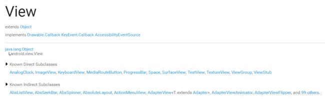
由于View是所有控件的基类,所以其名下的属性适用于所有控件,也就是说继承关系中所有的子类都可以使用父类定义的属性同时子类自己还有单独扩展的一些属性,这里想必大家都能理解。下面是整理的一份android常用控件的关系图,供大家参考。

来源依据:
综上所述,由于自定义控件必然继承于View或者View子类,所以也就只能使用控件父类所具有的属性。如果自定义的控件想扩展使用其他属性(除父类属性外)就必须自定义属性了。
2 自定义的控件是否必须要自定义其属性?
自定义了控件并不一定要自定义其属性。比如TextView在xml中没有使用 android:text=”组合控件1 ” 属性,但是在代码中可以调用setText()方法赋值,同理自定义的控件有时也是。举个自定义组合控件的列子,类似微信底部4个button,点击时图标和文字同时变化,自定义类Mybutton简略代码如下:
public class MyButton extends LinearLayout {
    private TextView btnText;
    private ImageView imageView;

    private boolean isSelected = false;
    private int imageDefault;
    private int imageSelected;
    private String text;
    public MyButton(Context context) {
        super(context);
        init(context, null);
    }
    public MyButton(Context context, @Nullable AttributeSet attrs) {
        super(context, attrs);
        init(context, attrs);
    }
    public MyButton(Context context, @Nullable AttributeSet attrs, int defStyleAttr) {
        super(context, attrs, defStyleAttr);
        init(context, attrs);
    }
    /**
     * 初始化 根据布局文件填充控件
     *
     * @param context
     * @param attrs
     */
    private void init(Context context, AttributeSet attrs) {
        //inflate 函数有3个参数 参数一是填充的布局文件 参数二 本布局添加到父控件中 作用类似于addView
        View butttonView = LayoutInflater.from(context).inflate(R.layout.layout_mybutton, this, true);
        imageView = (ImageView) butttonView.findViewById(R.id.mybtn_img);
        btnText = (TextView) butttonView.findViewById(R.id.mybtn_txt);
    }
    /**
     * 使用控件先初始化
     *
     * @param imageDefault 默认图标
     * @param imageSelected 点击之后的图标
     * @param text  底部名称
     */
    public void setButtonView(int imageDefault, int imageSelected, String text) {
        this.imageDefault = imageDefault;
        this.imageSelected = imageSelected;
        this.text = text;
        imageView.setImageResource(imageDefault);
        btnText.setText(text);
    }
使用时:
 <com.yezhu.myapplication.MyButton
      android:id="@+id/btn_text"
      android:layout_width="match_parent"
      android:layout_height="wrap_content" />
找到id后:
 MyButton myButton = findViewById(R.id.btn_text);
        //调用setButtonView初始化
        myButton.setButtonView(R.drawable.icon_account, R.drawable.icon_account_selected, "账单");
        myButton.setOnClickListener(new View.OnClickListener() {
            @Override
            public void onClick(View view) {
               。。。。。。。。
            }
        });
效果如图:

当然自定义属性的话肯定也可以实现,而且比这样的方式看上去更专业更便利。自定义属性不需要java代码去实现,写在xml中比较简洁,java代码做对应的业务逻辑就行,这样MVC结构层次分明! 综上所述,当你自定义一个控件并不意味着一定要自定义其属性,因为系统自带的属性可能已经完全够用了。
3 有自定义属性需求如何自定义? 属性标签attr 的format都能接受什么样的属性值?
系统自带的属性attr.xml放于/res/values/文件夹中,同样我们在项目工程中也存在一样的目录结构,因此需自定义属性的时候在项目res/values中新建attrs.xml,然后仿着系统属性格式书写,比如我创建的适用于自定义控件SettingItemView ,自定义属性attrs.xml文件代码如下:
<resources>


    <declare-styleable name="SettingItemView">

        <attr name="content" format="string" />

        <attr name="showLeftImage" format="boolean" />

        <attr name="imagesrc" format="reference|color" />

        <attr name="showTurnOnToggle" format="boolean" />

        <attr name="turnOnToggle" format="boolean" />

        <attr name="showJump" format="boolean" />

        <attr name="backgroundshape">
            <enum name="top" value="100" />
            <enum name="middle" value="101" />
            <enum name="bottom" value="102" />
        attr>
    declare-styleable>
resources>
使用时:
<com.yezhu.myapplication.SettingItemView
android:id="@+id/siv_see"
android:layout_width="match_parent"
android:layout_height="wrap_content"
android:clickable="true"
yezhu:backgroundshape="top"
yezhu:content="看一看"
yezhu:imagesrc="@drawable/setting_qqqun"
yezhu:showJump="true"
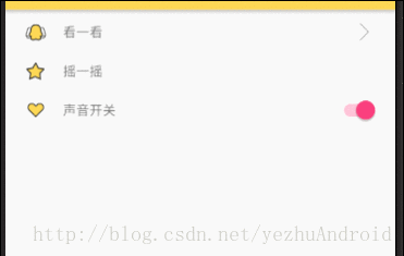
yezhu:showLeftImage="true" />效果图:
在书写属性时,如
总会存在疑问fomat到底支持什么类型的属性值?自定义的时候该怎么选择呢?简单的归纳如下:
reference:引用资源
举例说明ImageView:
属性定义:
属性使用:string:字符串
举例说明TextView :
属性定义:
Color:颜色
举例说明TextView:
属性定义:
属性使用:boolean:布尔值
属性定义:
属性使用:- dimension:尺寸值
属性定义:
属性使用: - float:浮点型
属性定义:
属性使用: integer:整型
属性定义:
属性使用:fraction:百分数(动画常用,以平移动画为例)
属性定义:
 <declare-styleable name="TranslateAnimation">
        <attr name="fromXDelta" format="float|fraction" />
        <attr name="toXDelta" format="float|fraction" />
        <attr name="fromYDelta" format="float|fraction" />
        <attr name="toYDelta" format="float|fraction" />
    declare-styleable>
属性使用: TranslateAnimation 类的构造中使用到。
 public TranslateAnimation(float fromXDelta, float toXDelta, float fromYDelta, float toYDelta) {
        throw new RuntimeException("Stub!");
}- enum:枚举类型
属性定义:
"ImageView">
         "scaleType">
            <enum name="matrix" value="0" />
            <enum name="fitXY" value="1" />
            <enum name="fitStart" value="2" />
            <enum name="fitCenter" value="3" />
            <enum name="fitEnd" value="4" />
            <enum name="center" value="5" />
            <enum name="centerCrop" value="6" />
            <enum name="centerInside" value="7" />
属性使用:
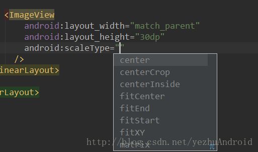
 <ImageView
            android:layout_width="match_parent"
            android:layout_height="30dp"
            android:scaleType="center" />
图示:
- flag:位或运算
属性定义:
属性使用:
注:android:showDividers 添加分割线。
以上讲述了如何自定义属性以及format支持的属性类型。
最后补充一点 命名空间 的问题。
通常来说,命名空间是唯一识别的一套名字,这样当对象来自不同的地方但是名字相同的时候就不会含糊不清了。使用扩展标记语言的时候,XML的命名空间是所有元素类别和属性的集合。元素类别和属性的名字是可以通过唯一XML命名空间来唯一。 —— [ 百度百科 ]
在使用系统属性时都带着android:,这里的android:就是在根布局中引入的命名空间xmlns:android="http://schemas.android.com/apk/res/android"意味着到android系统中查找该属性来源。只有引入了命名空间,xml文件才知道控件该去哪里找属性。这就提醒我们自定义属性时要引入命名空间,有2种方式
- 1)
xmlns:yezhu="http://schemas.android.com/apk/res-auto",res-auto是自动帮你查找; - 2)
xmlns:yezhu="http://schemas.android.com/apk/com.yezhu.myapplication"com.yezhu.myapplication是包名,直接指出到我们应用程序下查找。
4 设置format属性值后自定义类代码中又如何才能获取到?
在此问题之前,大家肯定用过LayoutInflate.from(上下文).inflate(参数)这个方法,如下:
View settingView = LayoutInflater.from(context).inflate(R.layout.layout_item_setting, this, true); 那么这个方法到底是如何解析视图的呢?如何把布局xml文件转换为View?曾看过一个博主分析其过程(文章末附有链接),解析过程大体如下:
1)使用Pull解析方式遍历xml文件中的所有节点
2)遍历到具体结点时,根据节点名称生成对应的View对象
3)在生成View对象是,将AttributeSet(属性集)以及Context传递给View对象的构造方法,在构造方法中,View或者其子类将通过AttributeSet获取自身的属性列表,并用来初始化View。
一语中的,总结的非常到位。
那么,我们自定义控件时同理,在xml布局文件中引用控件时,走的是两个参数的构造,控件属性都于AttributeSet集中,要想获得控件的自定义属性也是从参数attributeSet中获取。获取属性之后根据属性值再具体代码实现。举例代码如下:
 private void initView(Context context, AttributeSet attrs) {
        //初始化时 把布局文件转换成view并填充
        View settingView = LayoutInflater.from(context).inflate(R.layout.layout_item_setting, this, true);
        tvContent = (TextView) settingView.findViewById(R.id.tv_content);
        scToggle = (SwitchCompat) settingView.findViewById(R.id.sc_toggle);

        TypedArray attributes = context.obtainStyledAttributes(attrs, R.styleable.SettingItemView);
        String content = attributes.getString(R.styleable.SettingItemView_content);
        tvContent.setText(content);
        //布局文件中 默认是否打开开关
        boolean turnOnToggle = attributes.getBoolean(R.styleable.SettingItemView_turnOnToggle, false);
        boolean showTurnOnToggle = attributes.getBoolean(R.styleable.SettingItemView_showTurnOnToggle, false);
        if (showTurnOnToggle) {
            scToggle.setVisibility(View.VISIBLE);
            scToggle.setChecked(turnOnToggle);
        } else {
            scToggle.setVisibility(GONE);
        }
    }
关于AttributeSet和TypedArray:
构造函数中有个参数是AttributeSet attrs,api文档中如此定义AttributeSet :
A collection of attributes, as found associated with a tag in an XML document. if you use AttributeSet directly then you will need to manually check for resource references (with getAttributeResourceValue(int, int)) and do the resource lookup yourself if needed.
简译:与XML文档相关联的属性集合。如果直接使用AttributeSet,则需要手动检查资源引用。
XmlPullParser parser = resources.getXml(myResource);
AttributeSet attributes = Xml.asAttributeSet(parser);
深究的话 AttributeSet 内部是一个pull解析器,解析xml中的控件的属性,并以键值对形式保存,通过AttributeSet 源码就可以看到:
public interface AttributeSet {
    int getAttributeCount();
    String getAttributeName(int var1);
    String getAttributeValue(int var1);

    ........
    int getAttributeListValue(String var1, String var2, String[] var3, int var4);
    boolean getAttributeBooleanValue(String var1, String var2, boolean var3);
    int getAttributeResourceValue(String var1, String var2, int var3);
    int getAttributeIntValue(String var1, String var2, int var3);

    .........
}
于是便可以通过下面的代码来获取控件属性:
       //测试属性
        int attributeCount = attrs.getAttributeCount();
        for (int i = 0; i < attributeCount; i++) {
            String attrName = attrs.getAttributeName(i);
            String attrVal = attrs.getAttributeValue(i);
            Log.e("SettingItemView", "attrName = " + attrName + " , attrVal = " + attrVal);
        }
log输出:
03-02 14:51:11.393 16226-16226/com.yezhu.myapplication E/SettingItemView: attrName = id , attrVal = @2131427437
03-02 14:51:11.393 16226-16226/com.yezhu.myapplication E/SettingItemView: attrName = clickable , attrVal = true
03-02 14:51:11.393 16226-16226/com.yezhu.myapplication E/SettingItemView: attrName = layout_width , attrVal = -1
03-02 14:51:11.393 16226-16226/com.yezhu.myapplication E/SettingItemView: attrName = layout_height , attrVal = -2
03-02 14:51:11.393 16226-16226/com.yezhu.myapplication E/SettingItemView: attrName = content , attrVal = 看一看
03-02 14:51:11.393 16226-16226/com.yezhu.myapplication E/SettingItemView: attrName = showLeftImage , attrVal = true
03-02 14:51:11.393 16226-16226/com.yezhu.myapplication E/SettingItemView: attrName = imagesrc , attrVal = @2130837608
03-02 14:51:11.393 16226-16226/com.yezhu.myapplication E/SettingItemView: attrName = showJump , attrVal = true
03-02 14:51:11.393 16226-16226/com.yezhu.myapplication E/SettingItemView: attrName = backgroundshape , attrVal = 100
毫无疑问,通过AttributeSet可以获得布局文件中定义的所有属性的key和value。但是log这一条:attrName = imagesrc , attrVal = @2130837608 拿到的引用变成了@数字,这看不懂啊,我本将心向明月,奈何明月照沟渠啊。然而通过typeArray获取可以直接获取到引用,如下:
03-02 15:05:03.463 17799-17799/com.yezhu.myapplication I/System.out: --typedArray2130837608拿到这样的引用我们可以直接使用。因为android所有资源文件在R文件中都会对应一个整型常量,通过此整型常量ID值就可以拿到资源文件。区别在哪呢?使用AttributeSet 去获取属性值,第一步先拿到id,第二步再去解析id;TypedArray正是简化了此过程。
5 举例: 设置界面中每一个item格式都相似, 自定义详细过程
先看一下效果,如图,上中下三个按钮background是shape,点击有select效果;布局文件中可以写明是否需要左侧icon、右侧toggle或者跳转箭头。动图:

SettingItemView类:
/**
 * 一般是设置页面 中
 */

public class SettingItemView extends RelativeLayout {

    private TextView tvContent;
    private SwitchCompat scToggle;
    private ImageView ivIcon;
    private ImageView ivTump;
    private RelativeLayout rlRoot;
    private static final int TOP = 100;
    private static final int MID = 101;
    private static final int BOTTOM = 102;

    public SettingItemView(Context context) {
        this(context, null);

    }

    public SettingItemView(Context context, AttributeSet attrs) {
        this(context, attrs, 0);
    }

    public SettingItemView(Context context, AttributeSet attrs, int defStyleAttr) {
        super(context, attrs, defStyleAttr);
        initView(context, attrs);
    }

    /**
     * 初始化布局
     *
     * @param context
     * @param attrs
     */
    @SuppressLint("WrongConstant")
    private void initView(Context context, AttributeSet attrs) {

        //初始化时 把布局文件转换成view并填充
        View settingView = LayoutInflater.from(context).inflate(R.layout.layout_item_setting, this, true);
        rlRoot = (RelativeLayout) settingView.findViewById(R.id.rl_root);
        tvContent = (TextView) settingView.findViewById(R.id.tv_content);
        scToggle = (SwitchCompat) settingView.findViewById(R.id.sc_toggle);
        ivIcon = (ImageView) settingView.findViewById(R.id.iv_icon);
        ivTump = (ImageView) settingView.findViewById(R.id.iv_tump);

        TypedArray attributes = context.obtainStyledAttributes(attrs, R.styleable.SettingItemView);

        String content = attributes.getString(R.styleable.SettingItemView_content);
        tvContent.setText(content);

        //布局文件中 默认是否打开开关
        boolean turnOnToggle = attributes.getBoolean(R.styleable.SettingItemView_turnOnToggle, false);
        boolean showTurnOnToggle = attributes.getBoolean(R.styleable.SettingItemView_showTurnOnToggle, false);
        if (showTurnOnToggle) {
            scToggle.setVisibility(View.VISIBLE);
            scToggle.setChecked(turnOnToggle);
        } else {
            scToggle.setVisibility(GONE);
        }

        //布局文件中 是否显示左侧的icon
        boolean showLeftImage = attributes.getBoolean(R.styleable.SettingItemView_showLeftImage, false);
        int resourceId = attributes.getResourceId(R.styleable.SettingItemView_imagesrc, 0);
        if (showLeftImage) {
            ivIcon.setVisibility(View.VISIBLE);
            ivIcon.setImageResource(resourceId);
        } else {
            ivIcon.setVisibility(View.GONE);
        }

        //布局文件中 是否显示右侧跳转图片
        boolean showJump = attributes.getBoolean(R.styleable.SettingItemView_showJump, false);
        if (showJump) {
            ivTump.setVisibility(VISIBLE);
        } else {
            ivTump.setVisibility(GONE);
        }

        //布局文件中 当前item的shape和selector效果
        int bgShape = attributes.getInt(R.styleable.SettingItemView_backgroundshape, MID);
        switch (bgShape) {
            case TOP:
                rlRoot.setBackgroundResource(R.drawable.top_layout_selector);
                break;

            case MID:
                rlRoot.setBackgroundResource(R.drawable.mid_layout_selector);
                break;

            case BOTTOM:
                rlRoot.setBackgroundResource(R.drawable.bottom_layout_selector);
                break;

            default:

                break;
        }

//
//        //测试属性
//        int attributeCount = attrs.getAttributeCount();
//        for (int i = 0; i < attributeCount; i++) {
//            String attrName = attrs.getAttributeName(i);
//            String attrVal = attrs.getAttributeValue(i);
//            Log.e("--attributes", "attrName = " + attrName + " , attrVal = " + attrVal);
//        }
//        System.out.println("--------------------");
//
//        System.out.println("--typedArray" + resourceId);

    }
}
int bgShape = attributes.getInt(R.styleable.SettingItemView_backgroundshape, MID)是根据布局中定义的Top(有圆角)、Middle(无圆角)和Bottom(有圆角)分别设置不同shape背景。
属性文件:
<LinearLayout xmlns:android="http://schemas.android.com/apk/res/android"
    xmlns:tools="http://schemas.android.com/tools"
    xmlns:yezhu="http://schemas.android.com/apk/res-auto"
    android:layout_width="match_parent"
    android:layout_height="match_parent"
    android:padding="3dp"
    tools:context="com.yezhu.myapplication.MainActivity">

    <LinearLayout
        android:layout_width="match_parent"
        android:layout_height="match_parent"
        android:orientation="vertical">


        <com.yezhu.myapplication.SettingItemView
            android:id="@+id/siv_see"
            android:layout_width="match_parent"
            android:layout_height="wrap_content"
            android:clickable="true"
            yezhu:backgroundshape="top"
            yezhu:content="看一看"
            yezhu:imagesrc="@drawable/setting_qqqun"
            yezhu:showJump="true"
            yezhu:showLeftImage="true" />

        <View
            android:layout_width="match_parent"
            android:layout_height="1dp"
            android:background="@color/border" />

        <com.yezhu.myapplication.SettingItemView
            android:id="@+id/siv_shake"
            android:layout_width="match_parent"
            android:layout_height="wrap_content"
            android:clickable="true"
            yezhu:backgroundshape="middle"
            yezhu:content="摇一摇"
            yezhu:imagesrc="@drawable/setting_pingfen"
            yezhu:showLeftImage="true"
            yezhu:showTurnOnToggle="false" />

        <View
            android:layout_width="match_parent"
            android:layout_height="1dp"
            android:background="@color/border" />

        <com.yezhu.myapplication.SettingItemView
            android:id="@+id/siv_sound_open"
            android:layout_width="match_parent"
            android:layout_height="wrap_content"
            android:clickable="true"
            yezhu:backgroundshape="bottom"
            yezhu:content="声音开关"
            yezhu:imagesrc="@drawable/setting_tuijian"
            yezhu:showLeftImage="true"
            yezhu:showTurnOnToggle="true"
            yezhu:turnOnToggle="true" />
    LinearLayout>

LinearLayout>
activity中引用:
 @Override
    protected void onCreate(Bundle savedInstanceState) {
        super.onCreate(savedInstanceState);
        setContentView(R.layout.activity_main);
        findViewById(R.id.siv_see).setOnClickListener(new View.OnClickListener() {
            @Override
            public void onClick(View view) {
                startActivity(new Intent(MainActivity.this, SeeSomethingActivity.class));
            }
        });
布局文件:
<LinearLayout xmlns:android="http://schemas.android.com/apk/res/android"
    xmlns:tools="http://schemas.android.com/tools"
    xmlns:yezhu="http://schemas.android.com/apk/res-auto"
    android:layout_width="match_parent"
    android:layout_height="match_parent"
    android:padding="3dp"
    tools:context="com.yezhu.myapplication.MainActivity">

    <LinearLayout
        android:layout_width="match_parent"
        android:layout_height="match_parent"
        android:orientation="vertical">


        <com.yezhu.myapplication.SettingItemView
            android:id="@+id/siv_see"
            android:layout_width="match_parent"
            android:layout_height="wrap_content"
            android:clickable="true"
            yezhu:backgroundshape="top"
            yezhu:content="看一看"
            yezhu:imagesrc="@drawable/setting_qqqun"
            yezhu:showJump="true"
            yezhu:showLeftImage="true" />

        <View
            android:layout_width="match_parent"
            android:layout_height="1dp"
            android:background="@color/border" />

        <com.yezhu.myapplication.SettingItemView
            android:id="@+id/siv_shake"
            android:layout_width="match_parent"
            android:layout_height="wrap_content"
            android:clickable="true"
            yezhu:backgroundshape="middle"
            yezhu:content="摇一摇"
            yezhu:imagesrc="@drawable/setting_pingfen"
            yezhu:showLeftImage="true"
            yezhu:showTurnOnToggle="false" />

        <View
            android:layout_width="match_parent"
            android:layout_height="1dp"
            android:background="@color/border" />

        <com.yezhu.myapplication.SettingItemView
            android:id="@+id/siv_sound_open"
            android:layout_width="match_parent"
            android:layout_height="wrap_content"
            android:clickable="true"
            yezhu:backgroundshape="bottom"
            yezhu:content="声音开关"
            yezhu:imagesrc="@drawable/setting_tuijian"
            yezhu:showLeftImage="true"
            yezhu:showTurnOnToggle="true"
            yezhu:turnOnToggle="true" />
    LinearLayout>

LinearLayout>
最后效果如上图所示。
代码地址:点击下载代码_android深度解析自定义属性
总结
学习总结自定义控件的过程,主要能熟悉
- 自定义属性
- xml与View的关系
- 事件分发机制
东西有点多,花费了好多精力才理清楚、梳理明白,大家有问题或疑问可以留言或者私信我。回首向来萧瑟处,也无风雨也无晴。麻烦点个赞可好?