封装一个elementui的table组件
如何封装Table组件
由于最近在写一个测试网站,很多页面都需要用到表格,就做了一个表格封装的(根据自己需要的功能,仅列出部分)
以下两个表格用了同一个组件
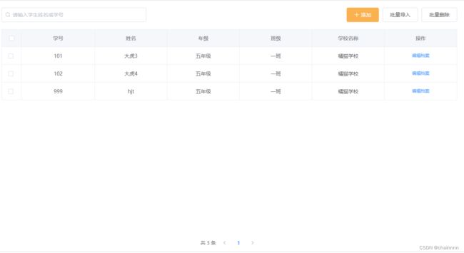
表一功能:可模糊查询、多选、分页、跳转详情
表二:标签、分页、表内文字样式不一样

父组件
需要在父组件定义好数据之后传到子组件中:
  <Table
        :tableData="cpSchool || []"
        :config="config"
        :tableLabel="tableLabel"
      ></Table>
表格内容形式:
  tableLabel: [
        {
          prop: "_id", //prop
          label: "编号", //label
          type: "common", //种类
          class: null, //额外样式
          scope: false, //template
          scopeLabel: null, //template里面用的模板
        },
        {
          prop: "label", //prop
          label: "学校名称", //label
          type: "div", //种类
          method: "SMDeatil",
          className: "label", //额外样式
          scope: true, //template
          scopeLabel: "div", //template里面用的模板
        },
        {
          prop: "level", //prop
          label: "学校类别", //label
          type: "common", //种类
          class: null, //额外样式
          scope: false, //template
          scopeLabel: null, //template里面用的模板
        },
        {
          prop: "review", //prop
          label: "状态", //label
          type: "el-tag", //种类
          class: null, //额外样式
          scope: true, //template
          scopeLabel: "el-tag", //template里面用的模板
          scopeLabelName: ["已认证", "待审核"],
          scopeLabelType: ["primary", "warning"],
        },
        {
          fixed: "right",
          label: "操作", //label
          type: "el-button", //种类
          class: null, //额外样式
          scope: true, //template
          scopeLabel: "fixed", //template里面用的模板
          scopeLabelName: "年级班级设置",
        },
      ],
配置:选择是否分页、模糊搜索功能、多选
      config: {
        paging: true, //开启分页
        curPage: 1, // 当前页码,可选
        pageSize: 1, //每页的数据条数,可选
        search: false, //开启查询功能
        selection: false, //多选开启
      },
子组件
在子组件的props中接收父组件传过来的数据
 props: {
    tableData: {
      type: [Array, Object],
      required: true,
    },
    tableLabel: {
      type: [Array, Object],
      required: true,
    },
    config: {
      type: [Object],
      required: false,
    },
    search: {
      type: [String],
      required: false,
    },
  },
表头配置会稍微复杂一点,因为没办法更改props中的数据,所以我就直接将数据过滤的处理写在了表头内
给data赋值的情况有4种:1.同时开启搜索和分页 2.只开启搜索 3.只开启分页 4.不做任何过滤
2.搜索过滤
tableData.filter(
                (data) =>
                  !search ||
                  data[config.searchName[0]]
                    .toLowerCase()
                    .includes(search.toLowerCase()) ||
                  data[config.searchName[1]]
                    .toLowerCase()
                    .includes(search.toLowerCase())
              )
3.分页的过滤是
tableData.slice(
                (config.curPage - 1) * config.pageSize,
                config.curPage * config.pageSize
              )
结合一下就是以下形式:
  <el-table
        :data="
          config.search && config.paging
            ? tableData
                .filter(
                  (data) =>
                    !search ||
                    data[config.searchName[0]]
                      .toLowerCase()
                      .includes(search.toLowerCase()) ||
                    data[config.searchName[1]]
                      .toLowerCase()
                      .includes(search.toLowerCase())
                )
                .slice(
                  (config.curPage - 1) * config.pageSize,
                  config.curPage * config.pageSize
                )
            : config.search
            ? tableData.filter(
                (data) =>
                  !search ||
                  data[config.searchName[0]]
                    .toLowerCase()
                    .includes(search.toLowerCase()) ||
                  data[config.searchName[1]]
                    .toLowerCase()
                    .includes(search.toLowerCase())
              )
            : config.paging
            ? tableData.slice(
                (config.curPage - 1) * config.pageSize,
                config.curPage * config.pageSize
              )
            : tableData
        "
        border
        ref="multipleTable"
        @selection-change="handleSelectionChange"
        :cell-style="{ 'text-align': 'center', padding: '8px 0px' }"
        :header-cell-style="{
          background: '#f5f7fa',
          'text-align': 'center',
        }"
        tooltip-effect="dark"
        style="width: 100%"
      >
行内配置:这里只配置了几种类型(普通、更改表格内容样式(需要将className传过来并且提前在组件写好样式)、根据不同字段显示不同的el-tag、操作)
  <el-table-column v-if="config.selection" type="selection" width="55">
        </el-table-column>
        <template v-for="(column, i) in tableLabel">
          <!-- 普通类型 -->
          <el-table-column
            v-if="column.type === 'common'"
            :prop="column.prop"
            :label="column.label"
            :key="i"
          >
          </el-table-column>
          <!-- template里为div的,可加样式 -->
          <el-table-column
            v-if="column.scopeLabel === 'div'"
            :prop="column.prop"
            :label="column.label"
            :key="i"
          >
            <template slot-scope="scope">
              <div
                :class="column.className"
                @click="bindMethod(column.method, scope.row)"
              >
                {{ scope.row[column.prop] }}
              </div>
            </template>
          </el-table-column>
          <!-- template里为el-tag -->
          <el-table-column
            v-if="column.scopeLabel === 'el-tag'"
            :prop="column.prop"
            :label="column.label"
            :key="i"
          >
            <template slot-scope="scope">
              <el-tag
                :type="
                  scope.row[column.prop]
                    ? column.scopeLabelType[0]
                    : column.scopeLabelType[1]
                "
                disable-transitions
              >
                {{
                  scope.row[column.prop]
                    ? column.scopeLabelName[0]
                    : column.scopeLabelName[1]
                }}
              </el-tag>
            </template>
          </el-table-column>
          <el-table-column
            v-if="column.label === '操作'"
            :label="column.label"
            :key="i"
            :fixed="column.fixed"
          >
            <template slot-scope="scope">
              <el-button
                type="text"
                size="small"
                @click="operation(scope.$index, scope.row)"
                >{{ column.scopeLabelName }}</el-button
              >
            </template>
          </el-table-column>
        </template>
动态绑定方法
可以给每一行添加一个你想要的方法,首先将方法名从数据中传递过来,接着在子组件中定义一个方法,这个方法接收这个父组件传过来的参数,例如以下的bindMethod接收了传递过来的参数
  <el-table-column
            v-if="column.scopeLabel === 'div'"
            :prop="column.prop"
            :label="column.label"
            :key="i"
          >
            <template slot-scope="scope">
              <div
                :class="column.className"
                @click="bindMethod(column.method, scope.row)"
              >
                {{ scope.row[column.prop] }}
              </div>
            </template>
          </el-table-column>
    bindMethod(methodName, row) {
      this[methodName](row);
    },
子组件调用父组件的方法并且传值
- 非常方便的一个方法
- 子组件方法SMDeatil,通过this. p a r e n t 调 用 父 组 件 的 方 法 并 且 传 参 , 但 是 要 注 意 t h i s . parent调用父组件的方法并且传参,但是要注意this. parent调用父组件的方法并且传参,但是要注意this.parent并不是该组件的父组件,而是 Element ui 的组件
    SMDeatil(row) {
      this.$parent.pSMDeatil(row);
    },
当你在父组件引用子组件的时候还在外面套了多层 UI 组件导致报错
TypeError:this.parent.xxx is not a function
例如以下就会报错
			<el-tabs v-model="activeName" @tab-click="handleClick">
				<Table></Table>
 				</el-tabs>
这样写不会报错
<div>
 	<Table></Table>
</div>