Flutter——最详细(CustomScrollView)使用教程
CustomScrollView简介
创建一个 [ScrollView],该视图使用薄片创建自定义滚动效果。
[SliverList],这是一个显示线性子项列表的银子列表。
[SliverFixedExtentList],这是一种更高效的薄片,它显示沿滚动轴具有相同范围的子级的线性列表。
[SliverGrid],这是一个显示子项 2D 数组的薄片。
[SliverPadding],这是一个在另一个薄片周围添加空白空间的薄片。
[SliverAppBar],这是一个显示标题的条形,该标题可以在滚动视图滚动时展开和浮动。[ScrollNotification]
和 [NotificationListener],可用于在不使用 [ScrollController] 的情况下监视滚动位置。[索引语义]
,它允许使用滚动公告的索引来批注子列表。
使用场景:
当列表高度超出屏幕,则需要使用该组件,进而实现布局上下滑动。
我们需要注意的是 slivers 这个数组必须使用带Sliver开头的组件。
| 属性 | 作用 |
|---|---|
| scrollDirection | 滑动方向 |
| reverse | 数据列表反向显示 |
| controller | 滑动列表参数配置 |
| primary | 自行查看 |
| physics | 滑动到底部之后的滑动动画 |
| scrollBehavior | 自行查看 |
| shrinkWrap | 确定滚动视图的高度 |
| cacheExtent | 设置缓存范围 |
| semanticChildCount | 设置子视图的个数 |
| keyboardDismissBehavior | 键盘关闭模式 |
| clipBehavior | 布局裁剪模式 |
| slivers | 它是数组格式,填充Widget |
SliverPadding组件:相当于一个Padding组件,设置内边距;
 SliverPadding(
            padding: EdgeInsets.all(20.w),
            sliver: SliverToBoxAdapter(
              child: Container(
                color: Colors.black54,
                child: Text("SliverToBoxAdapter"),
              ),
            ),
          )
绿色外部红色内部则是设置的padding间距

SliverToBoxAdapter组件:相当于一个Container布局容器;
SliverToBoxAdapter(
            child: Container(
              color: Colors.black54,
              child: Text("SliverToBoxAdapter"),
            ),
          )
SliverGrid组件:相当于一个GridView网格布局容器;
分为:SliverGrid.extent()、SliverGrid.count()、 SliverGrid.builder()、这几个属性可以自行去源码查看
 SliverGrid.builder(
            gridDelegate: SliverGridDelegateWithFixedCrossAxisCount(
              crossAxisCount: 3,
              childAspectRatio: 1,
            ),
            itemCount: data.length,
            itemBuilder: (BuildContext context, int index) {
              var item = data[index];
              return Card(
                elevation: 1,
                clipBehavior: Clip.hardEdge,
                child: Text(
                  item.toString(),
                  style: TextStyle(
                    color: Colors.blueAccent,
                    fontSize: 26,
                  ),
                ),
              );
            },
          )
绿色部分是 SliverGrid组件实现

SliverList组件:相当于一个ListView网格布局容器;
分为:SliverList.separated()、SliverList.list()、 SliverList.builder()、这几个属性可以自行去源码查看
     SliverList(
            delegate: SliverChildBuilderDelegate(
              (BuildContext context, int index) {
                return ListTile(
                  title: Text('SliverList Item $index'),
                );
              },
              childCount: 10, // 列表项的个数
            ),
          ),

SliverFixedExtentList组件:相当于一个ListView网格布局容器;多了一个itemExtent固定item高度属性。可以提高滑动效率。
分为:SliverFixedExtentList.list()、 SliverFixedExtentList.builder()、这几个属性可以自行去源码查看
         SliverFixedExtentList(
            itemExtent: 50, // 列表项的高度
            delegate: SliverChildBuilderDelegate(
                  (BuildContext context, int index) {
                return ListTile(
                  title: Text('FixedExtent Item $index'),
                );
              },
              childCount: 10, // 列表项的个数
            ),
          ),

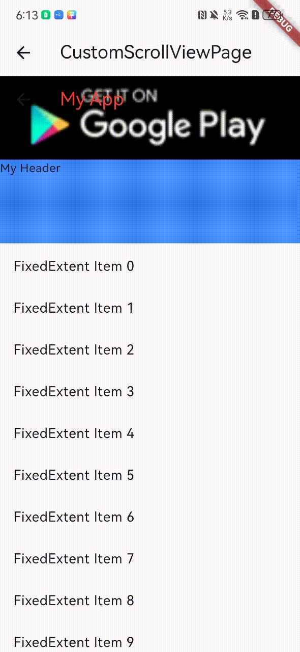
SliverAppBar组件:相当于一个AppBar容器;
- title:指定应用栏的标题部分。 floating:当向上滚动时,设置为true会将应用栏固定在屏幕顶部。默认值为false。
- pinned:设置为true时,应用栏始终可见,无论向上滚动多少。默认值为false。
- expandedHeight:设置应用栏展开的高度。
- flexibleSpace:可以将FlexibleSpaceBar作为应用栏的子项,以添加背景图像、渐变效果等。
SliverAppBar、SliverPersistentHeader、SliverFixedExtentList三个组件同时使用;
SliverPersistentHeader(
delegate: MyPersistentHeaderDelegate(), // 委托对象,控制头部视图的行为和外观
pinned: true, // 是否始终显示头部视图,无论向上滚动多少
),
SliverFixedExtentList(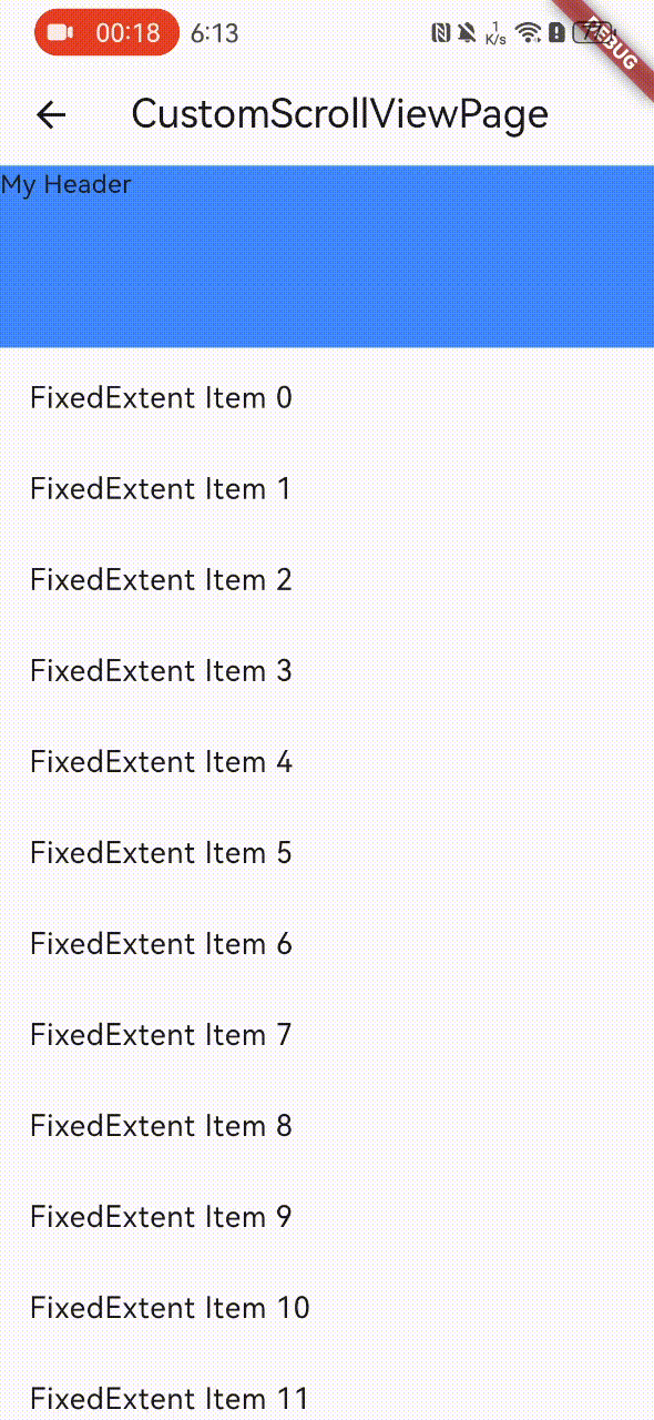
itemExtent: 50, // 列表项的高度
delegate: SliverChildBuilderDelegate(
(BuildContext context, int index) {
return ListTile(
title: Text('FixedExtent Item $index'),
);
},
childCount: 20, // 列表项的个数
),
),
SliverAppBar(
            title: Text(
              'My App',
              style: TextStyle(color: Colors.red),
            ),
            floating: true,
            // 当向上滚动时,是否将应用栏固定在屏幕顶部
            pinned: true,
            // 是否始终显示应用栏,无论向上滚动多少
            expandedHeight: 100,
            // 展开的高度
            flexibleSpace: FlexibleSpaceBar(
              background:
                  Image.asset('assets/googleplay.png', fit: BoxFit.cover),
            ),
          ),
          SliverPersistentHeader(
            delegate: MyPersistentHeaderDelegate(), // 委托对象,控制头部视图的行为和外观
            pinned: true, // 是否始终显示头部视图,无论向上滚动多少
          ),
          SliverFixedExtentList(
            itemExtent: 50, // 列表项的高度
            delegate: SliverChildBuilderDelegate(
                  (BuildContext context, int index) {
                return ListTile(
                  title: Text('FixedExtent Item $index'),
                );
              },
              childCount: 20, // 列表项的个数
            ),
          ),
SliverOpacity 对应组件:Opacity
SliverAnimatedOpacity 对应组件: AnimatedOpacity
SliverFadeTransition 对应组件:FadeTransition
SliverIgnorePointer 对应组件:IgnorePointer
SliverLayoutBuilder 对应组件:LayoutBuilder
SliverOffstage 对应组件:Offstage
SliverPadding 对应组件:Padding
SliverReorderableList 对应组件:ReorderableList
SliverSafeArea 对应组件:SafeArea
SliverVisibility 对应组件:Visibility
这些具体使用请看源码自行了解;