AntV G6 初入门(react中的使用)
一.G6文档链接
AntV G6
经官网介绍,G6内部绝大多数都是基于 React 技术栈的,所以官方也仅提供一个 G6 在 React 中使用的 Demo。
在 React 中使用 G6,和在 HTML 中使用基本相同,唯一比较关键的区分就是在实例化 Graph 时,要保证 DOM 容器渲染完成,并能获取到 DOM 元素。
二.使用步骤
(1).下载
npm install --save @antv/g6
(2).在js文件中引入
import G6 from '@antv/g6';
(3).使用方式
首先,我们来了解一下G6的核心概念

需要具备以下几点之后才可以开始进行画图
a.创建容器
b.数据准备
c.创建关系图
d.配置数据源,渲染
import React from "react";

import G6 from '@antv/g6';

 // 定义数据源
 const data = {
    // 点集
    nodes: [
       {
        id: 'node1',
        x: 100,
        y: 200,
        label: '起始点', // 节点文本
      },
      {
        id: 'node2',
        x: 300,
        y: 200,
        label: '目标点1', // 节点文本
      },
      {
        id: 'node3',
        x: 400,
        y: 200,
        label: '目标点2', // 节点文本
      },
    ],
    // 边集
    edges: [
      // 表示一条从 node1 节点连接到 node2 节点的边
      {
        source: 'node1',
        target: 'node2',
        label: '我是连线1', // 边的文本
      },
      {
        source: 'node2',
        target: 'node3',
        label: '我是连线2', // 边的文本
      },
    ],
  };
export default class Treeg extends React.Component {
    constructor(){
        super()

    }

    componentDidMount(){
        // 创建 G6 图实例
      const graph = new G6.Graph({
        container: 'mountNode', // 指定图画布的容器 id,与第 9 行的容器对应
        // 画布宽高
        width: 800,
        height: 500,
        fitView: true,//超出适配
 		fitViewPadding: [20, 40, 50, 20],//页面留白宽度
      });
      // 读取数据
      graph.data(data);
      // 渲染图
      graph.render();
    }

    render(){
        return(


        )
    }

}
在需要展示的页面进行相应的引入即可使用
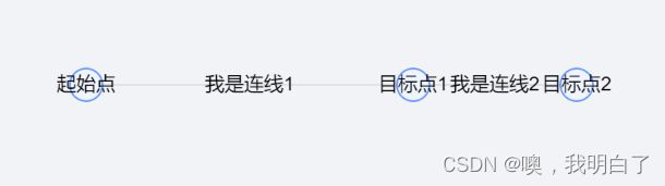
页面展示:
常用配置项如下:
| 配置项 | 类型 | 选项 / 示例 | 默认 | 说明 |
|---|---|---|---|---|
| fitView | Boolean | true / false | false | 是否将图适配到画布大小,可以防止超出画布或留白太多。 |
| fitViewPadding | Number / Array | 20 / [ 20, 40, 50, 20 ] | 0 | 画布上的四周留白宽度。 |
| animate | Boolean | true / false | false | 是否启用图的动画。 |
| modes | Object | {default: [ ‘drag-node’, ‘drag-canvas’ ]} | null | 图上行为模式的集合。 |
| defaultNode | Object | {type: ‘circle’,color: ‘#000’,style: { …}} | null | 节点默认的属性,包括节点的一般属性和样式属性(style)。 |
| defaultEdge | Object | {type: ‘polyline’, color: ‘#000’,style: {…}} | null | 边默认的属性,包括边的一般属性和样式属性(style)。 |
| nodeStateStyles | Object | { hover: { …},select: {…} | null | 节点在除默认状态外,其他状态下的样式属性(style)。例如鼠标放置(hover)、选中(select)等状态 |
| edgeStateStyles | Object | { hover: { …},select: {…} | null | 边在除默认状态外,其他状态下的样式属性(style)。例如鼠标放置(hover)、选中(select)等状态。 |