python 可视化
Python相关的开发工作,很难绕过数据这一关,无论是做数据分析与挖掘,还是机器学习、计算机视觉。因此,一款好用的Python可视化工具,可以让开发效率得到极大的提升。下面介绍四中python可视化工具
matplotlib
pip install matplotlib
在使用matplotlib画图之前,要先解决matplotlib坐标轴无法中文的问题,下载SimHei.ttf
方案1:
    1.安装字体
        linux下:
            sudo cp SimHei.ttf /usr/share/fonts/SimHei.ttf
        windows和mac下:双击安装
    2.删除~/.matplotlib中的缓存文件
        cd ~/.matplotlib
        rm -r *
    3.修改配置文件matplotlibrc
        vi ~/.matplotlib/matplotlibrc
        将文件内容修改为:
        font.family         : sans-serif
        font.sans-serif         : SimHei
        axes.unicode_minus  : False
方案2:
    from pylab import mpl
    # 设置显示中文字体
    mpl.rcParams["font.sans-serif"] = ["SimHei"]
建议方案1,一劳永逸解决问题

from matplotlib import pyplot as plt
import numpy as np
plt.hist(np.random.randn(1000),100)
plt.xlabel('Heights')
plt.ylabel('Frequency')
plt.title('Height of Students')

matplotlib官网
plotly
pip install plotly
import plotly
import numpy as np
import pandas as pd
from plotly import graph_objects as go
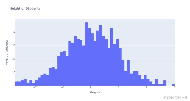
plotly.offline.iplot(go.Figure(data=[go.Histogram(x=np.random.randn(1000), nbinsx=100)], layout=go.Layout(title='Height of Students', xaxis_title=dict(text='Heights'), yaxis_title=dict(text='Height of Students'))), filename='r./test.html')
plotly官网
之前做项目的时候碰到一个需求,就是把数据分组之后做成两个下拉框的形式展示,由于官网也没有找到这个,后面自己摸索写出来了。
import random
import plotly
import numpy as np
import pandas as pd
from plotly import graph_objects as go
trace1 = go.Scatter({
"line": {"color": "rgba(31,119,180,100)"},
"mode": "lines + markers",
"y": [random.randint(0, 10) for i in range(5)],
"opacity": 1,
"visible": True,
'name': 'name1'
})
trace2 = go.Scatter({
"line": {"color": "rgba(31,119,180,100)"},
"mode": "lines + markers",
"y": [random.randint(0, 20) for i in range(5)],
"opacity": 1,
"visible": False,
'name': 'name2'
})
trace3 = go.Scatter({
"line": {"color": "rgba(31,119,180,100)"},
"mode": "lines + markers",
"y": [random.randint(0, 30) for i in range(5)],
"opacity": 1,
"visible": False,
'name': 'name3'
})
trace4 = go.Scatter({
"line": {"color": "rgba(31,119,180,100)"},
"mode": "lines + markers",
"y":[random.randint(0, 40) for i in range(5)],
"opacity": 0,
"visible": True,
'name': 'name4'
})
trace5 = go.Scatter({
"line": {"color": "rgba(31,119,180,100)"},
"mode": "lines + markers",
"y": [random.randint(0, 50) for i in range(5)],
"opacity": 0,
"visible": False,
'name': 'name5'
})
trace6 = go.Scatter({
"line": {"color": "rgba(31,119,180,100)"},
"mode": "lines + markers",
"y": [random.randint(0, 60) for i in range(5)],
"opacity": 0,
"visible": False,
'name': 'name6'
})
trace7 = go.Scatter({
"line": {"color": "rgba(31,119,180,100)"},
"mode": "lines + markers",
"y": [random.randint(0, 70) for i in range(5)],
"opacity": 0,
"visible": True,
'name': 'name7'
})
trace8 = go.Scatter({
"line": {"color": "rgba(31,119,180,100)"},
"mode": "lines + markers",
"y": [random.randint(0, 80) for i in range(5)],
"opacity": 0,
"visible": False,
'name': 'name8'
})
trace9 = go.Scatter({
"line": {"color": "rgba(31,119,180,100)"},
"mode": "lines + markers",
"y": [random.randint(0, 90) for i in range(5)],
"opacity": 0,
"visible": False,
'name': 'name9'
})

data = [trace1, trace2, trace3, trace4, trace5, trace6, trace7, trace8, trace9]


layout = {
"title": "双下拉框demo",
"xaxis":{"title":"水平x值"},
"yaxis":{"title":"纵轴y值"},
"updatemenus": [
    {
    "x": -0.05,
    "y": 1,
    "buttons": [
        {
        "args": ["visible", [True, False, False, True, False, False, True, False, False]],
        "label": "group: A",
        "method": "restyle"
        },
        {
        "args": ["visible", [False, True, False, False, True, False, False, True, False]],
        "label": "group: B",
        "method": "restyle"
        },
        {
        "args": ["visible", [False, False, True, False, False, True, False, False, True]],
        "label": "group: C",
        "method": "restyle"
        }
    ]
    },
    {
    "x": -0.05,
    "y": 0.8,
    "buttons": [
        {
                    "args": ["opacity", [1, 1, 1, 0, 0, 0, 0, 0, 0]],
                    "label": "sort_values: 25",
                    "method": "restyle"
                },
                {
                    "args": ["opacity", [0, 0, 0, 1, 1, 1, 0, 0, 0]],
                    "label": "sort_values: 35",
                    "method": "restyle"
                },
                {
                    "args": ["opacity", [0, 0, 0, 0, 0, 0, 1, 1, 1]],
                    "label": "sort_values: 45",
                    "method": "restyle"
                },

    ]
    }
]
}

fig = Figure(data=data, layout=layout)
py.offline.plot(fig,filename=r'./test.html')

seaborn
pip install seaborn

import pandas as pd
import numpy as np
import seaborn as sns
import matplotlib as mpl
import matplotlib.pyplot as plt

sn = sns.histplot(np.random.normal(0, 1, 1000), bins=100)
sn.set_title('Height of Students')
sn.set_xlabel('Heights')
sn.set_ylabel('Height of Students')
plt.show()

图片是不是和matplotlib的很像,其实seaborn就是对matplotlib的封装,交互性不如plotly
seaborn官网
pyecharts
echarts是百度开源的一个可视化工具,后来百度将它捐赠给了apache基金会,python与echarts的结合就形成了pyecharts
pip install pyecharts

from pyecharts import options as opts
from pyecharts.charts import Bar

c = (
    Bar()
    .add_xaxis(
        [
            "名字很长的X轴标签1",
            "名字很长的X轴标签2",
            "名字很长的X轴标签3",
            "名字很长的X轴标签4",
            "名字很长的X轴标签5",
            "名字很长的X轴标签6",
        ]
    )
    .add_yaxis("商家A", [10, 20, 30, 40, 50, 40])
    .add_yaxis("商家B", [20, 10, 40, 30, 40, 50])
    .set_global_opts(
        xaxis_opts=opts.AxisOpts(axislabel_opts=opts.LabelOpts(rotate=-15)),
        title_opts=opts.TitleOpts(title="Bar-旋转X轴标签", subtitle="解决标签名字过长的问题"),
    )
    .render("bar_rotate_xaxis_label.html")
)

pyecharts官网
发现一个问题就是pyecharts里面没有正太分布图。如果大家了解前端的话,完全可以直接去echarts官网,那里的图更加完整,也更炫酷。
开始绘制南丁格尔图

echarts官网