React+G2 + G2plot 踩坑
参与图表组件库开发(要求使用Echarts或G2)
因为这两个都没用过,翻阅多篇文章,最终选择入坑G2,要用就用新技术!所以特此记录一些常用的,方便以后避坑。Echarts或G2对于我这样没用过的人来说API实在太多了没法记,所以我也不喜欢一点一点去看官方文档,更多是了解了基础原理直接看官网例子代码,不知道有人和我一样么?所以常用的我都会在下面代码注释中体现到底是干什么的。不会将某个属性展开说,什么包含那些等,遇到问题知道去找那个属性关键词就可以了
G2核心概念视觉通道
在 G2 中我们实现了如下类型的视觉通道(也称图形属性):、
- position(位置),二维坐标系内可以映射到 x,y,三维坐标系可以映射到 x,y,z。
- color(颜色),包含了色调、饱和度和亮度。
- size(大小),不同的图形对大小的定义有所差异。
- shape(形状),图形的形状决定了某个图表类型的表现方式。例如 点图,可以使用圆点、三角形、小 的图片表示;线图可以使用折线、曲线、点线等表现形式。
G2 图表组成

1.G2在react中的写法,看了各种写法,个人更加偏爱这种:
//写在useEffect当中我是觉得方便一些,但是有缺陷就是在外面找不到chart实例,没法对chart做操作
//所以有知道的大佬可以说一下一般标准的写法是怎么写的
useEffect(() => {
    const chart = new Chart({
      container: container,
      autoFit: true,
      height: 500,
    });
    ...
    chart.interval().position('type*value')
	...
    chart.render();
    },[ ])
2.示例图加注释:
a.圆形柱状图?(颜色随数据改变)
我做的:

要求的:

//图片中渐变边框我选择用css实现,G2应该也可以实现但是很麻烦
//可以理解为两个极坐标的柱状图,一深一浅重叠
const used=68;   //使用率 假数据
let colors=['#D3EAFF', '#2495FF'];   //颜色假数据
const data1: object[] = [];       //深色假数据
    for (let i = 0; i < 20; i++) {		 //控制柱状个数
      data1.push({
        type: i + '',
        value: 10,
      });
    }
    let data2: object[]= [];  //浅色假数据
    for (let i = 0; i < 20; i++) {
      const item = { type: '', value: 1 };
      item.type = i + '';
      item.value = 10;
      let transused = used / 5;  //100为满,20个柱子所以/5 转换
      if (i >= transused) {
        item.value = 0;
      }
      data2.push(item);}
    const chart = new Chart({      //创建Chart实例
      container: container,      //容器id名称
      autoFit: true,      //是否随着屏幕自适应宽高
      height: 500,        //也可以单独设置宽高
    });
    chart.legend(false); //不显示图例
    chart.tooltip(false); //不显示提示  就是鼠标滑过时的文字

    const view1 = chart.createView();   //创建view实例,View 是图层容器的概念,和ps中图层差不多,重叠顺序,没有重叠的图直接用chart就行
    view1.data(data1);  //绑定数据源
    view1.axis(false);  //不显示坐标轴
    view1.coordinate('polar', {      //坐标类型:极坐标
      innerRadius: 0.7,   //极坐标内半径
      radius: 100,  //极坐标半径  innerRadius,radius,以及假数据的20个数,可以调整其比例达到自己想要的间隙或者柱子宽度
    });
    view1
      .interval()   //Geom几何标记类型,interval:使用矩形或者弧形,用面积来表示大小关系的图形,一般构成柱状图、饼图等图表。
      //下面都是图形属性
      .position('type*value')  //坐标系映射
      .color(String(used), (cValue) => {   //颜色,支持字符串和这种写法,不接受变量,我试过了
        if (Number(cValue) >= 90) {
          return '#FBDBD9';
        } else if (Number(cValue) >= 70) {
          return '#FEF1DD';
        }
        return colors[0];
      })
      // .color('value',String(colors[0]))
      .size(6);  //大小
    const view2 = chart.createView();   //图层二 同上
    view2.data(data2);
    view2.axis(false);
    view2.coordinate('polar', {
      innerRadius: 0.7,
      radius: 100,
    });
    view2
      .interval()
      .position('type*value')
      // .color(String(colors[1]))
      .color(String(used), (cValue) => {
        if (Number(cValue) >= 90) {
          return '#EF5C52';
        } else if (Number(cValue) >= 70) {
          return '#F8B755';
        }
        return colors[1];
      })
      .size(6);
    chart.render();    //渲染
  }, []);
b.柱状图(y轴分割线虚线,重叠,隔行显示文字)

const data = [
      { type: 'this', info: '人脸搜索', value: 760 },
      { type: 'this', info: '人体搜索', value: 520 },
      { type: 'this', info: '机动车搜索', value: 820 },
      { type: 'this', info: '非机动车搜索', value: 300 },
    ];
    let max = 0;   //用来计算y坐标轴最高数值
    data.forEach((item) => {
      if (item.value > max) {
        max = item.value;
      }
    });
    let data1 = data.map((item) => {     //阴影灰色柱状图
      return { type: 'all', info: item.info, value: Math.ceil(max / 600) * 600 - item.value };
    });
    data.unshift(...data1);
    const chart = new Chart({
      container: 'container',
      autoFit: true,
    });

    chart.data(data);   //导入数据
    chart
      .interval()
      .position('info*value')
      .size(12)
      .label('value', (xValue) => {    //显示文本内容
        return {
          content: xValue + '次',
        };
      })
      .color('type', ['#EEEEEE', '#2495FF'])
      //重叠
      .adjust('stack');  //设置数据调整方式,stack:层叠,第一个那个图表应该也可以用这个实现,稍微简单一点
    chart.axis('value', {      //坐标轴
      title: null,     // 不展示 xField 对应坐标轴的标题
      label: {       //隔行展示坐标轴文本
        formatter: (val) => {     // 使用 formatter 回调函数
          if ((Number(val) / 300) % 2 !== 0) {
            return '';
          } else {
            return val;
          }
        },
      },
      //网格虚线
      grid: {
        line: {
          style: {
            stroke: '#d9d9d9',
            lineWidth: 1,
            lineDash: [2, 2],
          },
        },
      },
    });
    chart.scale('value', {   //度量(Scale)用于定义数据的类型和展示方式
      nice: true,   //自动调整 min、max 。
      tickInterval: 300,    //控制间隔
    });
    //所有提示都不展示
    chart.tooltip(false);
    //所有图例都不展示
    chart.legend(false);
    //交互:鼠标在画布上移动是,对应的区域出现背景框
    chart.interaction('active-region');
    chart.render();
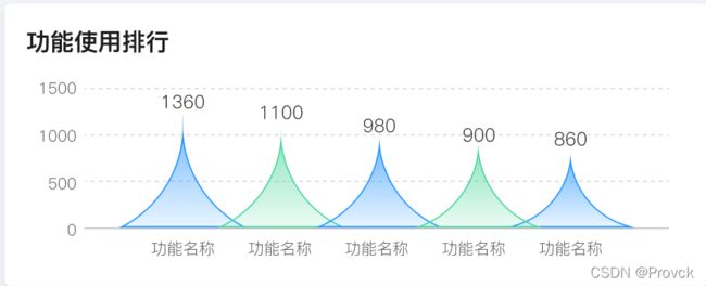
c.自定义图形柱状图(渐变,隔行换色,最大的感受G2文档太少了,不详细)
按照下面写法没法实现,我也不知道为什么,而且无法自适应了,奈何文档资料有限,百度都百度不到,没办法耗了半天天打算用Echarts重写…,但是G2写法也亮出来,请大家看看问题在哪里
G2:
import { Chart,registerShape } from '@antv/g2';
registerShape('interval', 'triangle', {   //注册自定义shape接口
      getPoints(cfg:any) {        //  定义关键点
        const x = cfg.x;
        const y = cfg.y;
        const y0 = cfg.y0;
        const width = cfg.size;
        return [
          { x: x - width / 2, y: y0 },
          { x: x, y: y },
          { x: x + width / 2, y: y0 },
        ];
      },
      // 2. 绘制
      draw(cfg, group) {
        const points = this.parsePoints(cfg.points); // 将0-1空间的坐标转换为画布坐标
       //添加自定义shape ,实测其中image,dom类型,没法用,查不到为什么,官网也没有,那位大佬可以说一下为什么么?具体地址:https://g.antv.vision/zh/docs/api/canvas
        group.addShape('path', {     //采用路径方式
          attrs: {
          //这个路径就是< svg >< path d="............" >< /svg >  d中的值
            path:'M2.08269 86.5C28.1667 72.8126 45.3971 46.8239 48 17.6787C50.6029 46.8239 67.8333 72.8126 93.9173 86.5H2.08269Z',
            stroke:cfg.color,   //线条颜色
            lineWidth:2,   //线条宽度
            fill:cfg.color,  //填充颜色
          },
        });
        return group;
      },
    });
    const data = [
          { type: 'this', info: '功能名称1', value: 1360 },
          { type: 'this', info: '功能名称2', value: 1000 },
          { type: 'this', info: '功能名称3', value: 980 },
          { type: 'this', info: '功能名称4', value: 900 },
          { type: 'this', info: '功能名称5', value: 860 },
        ];
        let max = 0;
        data.forEach((item) => {
          if (item.value > max) {
            max = item.value;
          }
        });
        const chart = new Chart({
          container: 'container',
          autoFit: true,
        });

        chart.data(data);
        chart
          .interval()
          .position('info*value')
          .label('value', (xValue) => {
            return {
              content: xValue + '次',
            };
          })
          .size(100)
          .color('info',(cVal)=>{
            let count=0;
            data.forEach((item,index)=>{
              if(item.info===cVal){
                count=index+1
              }
            });
            //隔行变色
            if(count%2!==0){
                 //渐变写法
                  return 'l(90) 0:rgba(36, 149, 255, 0.7) 1:rgba(36, 149, 255, 0.1)'
                }else{
                  return 'l(90) 0:rgba(75, 215, 157, 0.7) 1:rgba(75, 215, 157, 0.1)'
                }
          })
          .shape('triangle');
        //坐标轴
        chart.axis('value', {
          // 不展示 xField 对应坐标轴的标题
          title: null,
          //网格虚线
          grid: {
            line: {
              style: {
                stroke: '#d9d9d9',
                lineWidth: 1,
                lineDash: [2, 2],
              },
            },
          },
        });
        //控制间隔
        chart.scale('value', {
          nice: true,
          tickInterval: 500,
        });
        //所有提示都不展示
        chart.tooltip(false);
        //所有图例都不展示
        chart.legend(false);
        //交互:鼠标在画布上移动是,对应的区域出现背景框
        chart.interaction('active-region');
        chart.render();
Echarts:
import EchartsReact from 'echarts-for-react';
const Chart5e1 =()=>{
type data={name:string,value:number}[]
let data:data = [
{name:'指挥中心',value:770},
{name:'科信',value:450},
{name:'刑侦',value:300},
{name:'XXX',value:255},
{name:'情报',value:203},
]
let xAxisData:any=[];
let seriesData:any=[];
let max=0;
//因为边框也需要隔行变色,但是borderColor属性不支持函数方式,所以只能加到data中
data.forEach((item: any, index: number) => {
if (item.value > max) {
max = item.value;
}
if (index % 2 !== 0) {
seriesData.push({
value: item.value,
itemStyle: {
borderColor: 'rgba(75, 215, 157, 0.7)',
},
});
} else {
seriesData.push({
value: item.value,
itemStyle: {
borderColor: 'rgba(36, 149, 255, 0.7)',
},
});
}
xAxisData.push(item.name);
});
const option = {
tooltip : {
trigger: 'axis',
axisPointer : { // 坐标轴指示器,坐标轴触发有效
type : 'none' // 默认为直线,可选为:'line' | 'shadow'
},
backgroundColor:'#405685',
textStyle : {
color: '#E5EDF5',
decoration: 'none',
fontSize: 12,
},
formatter:function(param){
let tip = '';
tip = param[0].name+': '+ param[0].value;
return tip
}
},
grid: { //图表与外层div间距,可以理解为padding
top: '8%',
right: '10%',
left: '15%',
bottom: '15%'
},
xAxis: {
type: 'category',
data: xAxisData,
axisLine: {
lineStyle: {
color: '#C3C8CC'
}
},
axisTick: {show: false},
axisLabel: {
color: '#000',
textStyle: {
fontSize: 12
},
formatter:function(value){
var ret = "";//拼接加\n返回的类目项
var maxLength = 4;//每项显示文字个数
var valLength = value.length;//X轴类目项的文字个数
var rowN = Math.ceil(valLength / maxLength); //类目项需要换行的行数
if (rowN > 1)//如果类目项的文字大于5,
{
var temp = "";//每次截取的字符串
var start = 0;//开始截取的位置
var end = maxLength;//结束截取的位置
temp = value.substring(start, end)+'\n'+value.substring(end, valLength)
ret += temp; //凭借最终的字符串
return ret;
}
else{
return value;
}
},
},
splitLine: {
show: false,
}
},
yAxis: {
type: 'value',
axisLabel: {
formatter: function (value: any) {
return parseInt(value);
},
color: '#000',
},
max:Math.ceil(max/500)*500,
interval:500,
axisLine:{show:false},
axisTick: {show: false},
splitLine: {
lineStyle: {
type:'dashed',
// 使用深浅的间隔色
color: '#273858'
}
},
},
series: [{
data: seriesData,
type: 'pictorialBar',
barCategoryGap: '-20%',
symbol: 'path://M2.08269 86.5C28.1667 72.8126 45.3971 46.8239 48 17.6787C50.6029 46.8239 67.8333 72.8126 93.9173 86.5H2.08269Z',
itemStyle: {
normal: {
//图形的间隔变色,渐变
color:function(params){
if(params.dataIndex % 2 == 0){
return {
type: 'linear',
x: 0,
y: 0,
x2: 0,
y2: 1,
colorStops: [{
offset: 0, color: 'rgba(36, 149, 255, 0.7)' // 0% 处的颜色
}, {
offset: 1, color: 'rgba(36, 149, 255, 0.1)' // 100% 处的颜色
}],
globalCoord: false // 缺省为 false
}
}else{
return {
type: 'linear',
x: 0,
y: 0,
x2: 0,
y2: 1,
colorStops: [{
offset: 0, color: 'rgba(75, 215, 157, 0.7)' // 0% 处的颜色
}, {
offset: 1, color: 'rgba(75, 215, 157, 0.1)' // 100% 处的颜色
}],
globalCoord: false // 缺省为 false
}
}
}
// color:{
// type: 'linear',
// x: 0,
// y: 0,
// x2: 0,
// y2: 1,
// colorStops: [{
// offset: 0, color: 'rgba(36, 149, 255, 0.7)' // 0% 处的颜色
// }, {
// offset: 1, color: 'rgba(36, 149, 255, 0.1)' // 100% 处的颜色
// }],
// globalCoord: false // 缺省为 false
// }
},
},
label: {
normal: {
show: true,
position:'top',
color:'#000',
fontSize:14,
formatter: function(params){
var str = '';
str = params.value;
return str
},
fontFamily: 'DINPro'
},
},
z: 10
},
{
name: 'glyph',
type: 'pictorialBar',
barGap: '-100%',
symbolPosition: 'end',
symbolSize: 50,
symbolOffset: [0, '-120%'],
}]
};
return 效果:

d.水波图组件(G2plot实现,个人感觉和G2没有太大区别)

组件:
import { useEffect, useRef, useState } from 'react';
import { Liquid } from '@antv/g2plot';
                              //唯一id,颜色,数值,文本,大小
const LiquidChart=({ids,color,percent,textinfo,size})=>{
    const [liquidPlot,setLiquidPlot]=useState(null)
    useEffect(()=>{
        //数值更新销毁重绘
        if(liquidPlot!==null){
            liquidPlot.destroy()
        }
        const liquidPlot1 = new Liquid('sbchart'+ids, {    //新建
            percent: percent,  //百分比
            width:size,
            height:size,
            liquidStyle:{    //水波样式
                fill:color,
                stroke:color
            },
            statistic :{      //文本配置
                title:{
                    formatter:(v)=>{
                        return v.percent*100+'%'
                    },
                    style:{
                        fontSize:size/9,
                        color: '#093049'
                    }
                },
                content:{
                    content:textinfo,
                    style:{
                        fontSize:size/15,
                        color: '#093049'
                    }
                }
            }
          });
          liquidPlot1.render();
          setLiquidPlot(liquidPlot1)
    },[color,percent,textinfo,size])
    return
}
export default LiquidChart
使用
e.曲线面积图表组件(G2plot实现)

组件
import { useEffect, useRef, useState } from 'react';
import { Line } from '@antv/g2plot';
const LineChart=({data,height,ids,legend=true,width,xAxis=true,yAxis=true})=>{
    const [linePlot1,setLinePlot1]=useState(null)
    useEffect(()=>{
        //数值更新销毁重绘
        if(linePlot1!==null){
            linePlot1.destroy()
        }
        const linePlot = new Line('box'+ids, {
            data,
            padding:'auto',
            xField: 'date',  //x轴映射
            yField: 'value',   //y轴映射
            height:height,
            seriesField: 'name',           //拆分字段,在分组条形图下同 groupField、colorField,在堆积条形图下同 stackField、colorField。
            width:width,
            yAxis: yAxis?{
              label: {
                formatter: (v) => `${v}`,
              },
              grid:{
                  line:{
                      style:{
                        lineDash:[4,5]          //设置轴线为虚线
                      }
                  }
              }
            }:false,
            xAxis: xAxis? {
                range: [0, 1],    //从x轴起点开始画,画到最后,不会存在与y轴存在间距
                label: {
                    formatter: (v) => {
                            return v
                    },
                  },
              }:false,
            legend: legend?{
              position: 'top-left',     //设置图例位置
            }:false,
            tooltip: {
                formatter: (datum) => {
                  return { name: datum.name, value: datum.value + 'Mbps' };   //设置提示
                },
              },
            smooth: true,
            // 配置折线趋势填充
            area: {
              style: ({ name }) => {
                const { colors10 } = linePlot.chart.getTheme();
                return {
                  fill:
                    name === '接入宽带'
                      ? `l(90) 0.3:${colors10[0]} 1:rgba(255,255,255,0.2)`
                      : `l(90) 0.3:${colors10[1]}  1:rgba(255,255,255,0.2)`,
                };
              },
            },
            animation: {
              appear: {
                animation: 'wave-in',
                duration: 3000,
              },
            },
          });
          linePlot.render();
          setLinePlot1(linePlot)
    },[data])
    return
}
export default LineChart
使用
const dataarr=[
{
	name: "输入宽带",
	date:'1s',
	value: 82
 },
 {
	name: "输出宽带",
	date:'1s',
	value: 150
 },
 {
	name: "输入宽带",
	date:'2s',
	value: 96
 },
 {
	name: "输出宽带",
	date:'2s',
	value:126
 },
]
f.双向柱状图(G2plot实现)
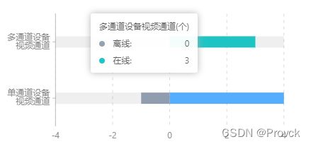
const [max,setMax]=useState(0)
const devicedata = [
{ type: `单通道设备视频通道`, sales: 150,aname:1 },
{ type: `单通道设备视频通道`, sales: -15,aname:0 },
{ type: `多通道设备视频通道`, sales: 120,aname:2 },
{ type: `多通道设备视频通道`, sales: -120,aname:0 }
]
let max=0
devicedata.forEach(item=>{
    if(Math.abs(item.sales)>max){
         max=Math.abs(item.sales)
        }
  })
setMax(max)
useEffect(()=>{
          if(bar1!==null){
            bar1.destroy()
          }
          const bar = new Bar('container', {
            data:devicedata,
            xField: 'sales',
            yField: 'type',
            meta: {                  // sales映射的最大最小值
                sales: {
                  max: max,
                  min: -max,        //防止出现数据只有正值,导致负值的半轴不显示
                }
              },
            legend: {
              position: 'top-left',
            },
            width:500,
            yAxis:{
                label:{
                    formatter: (v) => {
                        if(v==="多通道设备视频通道"){     //y轴文本换行
                            return `多通道设备
                                    视频通道`
                        }
                        return `单通道设备
                                视频通道`
                      },
                },
            },
            xAxis:{
                grid:{
                    line:{
                        style:{
                            lineDash:[4,5]     //x轴线虚线
                    }
                }
            },
            barWidthRatio:0.2,  //柱子宽度
            seriesField: 'aname', // 部分图表使用 seriesField
            //设置正值不同类颜色不同,负值都为灰色
            color: ({ aname }) => {
                if(aname === 0){
                  return '#8E9DAF';
                }else if(aname===1){
                  return '#4DAAFF';
                }
                return '#13C2C2';
              },
            tooltip:{
                formatter: (datum) => {
                    return { name: datum.aname!==0?'在线':'离线', value: Math.abs(datum.sales) };
                  },
                title:(v)=>{
                    return v.trim()+'(个)'
                }
            },
            legend:false,
            barBackground: {
              style: {
                fill: 'rgba(0,0,0,0.1)',
                borderRadius:50
              },
            },
            interactions: [{ type: 'active-region', enable: false }],
          });

          bar.render();
          setbar1(bar)
    },[devicedata,max])
**
g.曲线图(自定义面积渐变,自定义图例,自定义x绘画区域,边框)


const AreasplineChart = ({id,className}:{id:string,className?:string}) => {
    const data = [
        {
          "year": "1",
          "value": 4055,
          "category": "人脸"
        },
        {
          "year": "1",
          "value": 1756,
          "category": "人体"
        },
        {
          "year": "1",
          "value": 5664,
          "category": "机动车"
        },
        {
          "year": "1",
          "value": 6004,
          "category": "非机动车"
        },
        {
          "year": "2",
          "value": 2106,
          "category": "人脸"
        },
        {
          "year": "2",
          "value": 1783,
          "category": "人体"
        },
        {
          "year": "2",
          "value": 5019,
          "category": "机动车"
        },
        {
          "year": "2",
          "value": 1005,
          "category": "非机动车"
        },
		....	........
      ]
      const fillcolor = [
        {
            type:'人脸',
            color:'l(90) 0.1:rgba(77, 170, 255, 0.3)  1:rgba(255,255,255,0.1)',
        },
        {
            type:'人体',
            color:'l(90) 0.1:rgba(165, 149, 254, 0.3)  1:rgba(255,255,255,0.1)',
        },
        {
            type:'机动车',
            color:'l(90) 0.1:rgba(32, 203, 206, 0.3)  1:rgba(255,255,255,0.1)',
        },
        {
            type:'非机动车',
            color:'l(90) 0.1:rgba(255, 170, 91, 0.3)  1:rgba(255,255,255,0.1)'
        }
      ]
      useEffect(()=>{
        const line = new Line('container'+id, {
            data,
            xField: 'year',
            yField: 'value',
            seriesField: 'category',
            appendPadding:[24,0,0,0],
            height:220,
            xAxis:{
            	//去除x轴的刻度线
                tickLine:null
                //定义画图区域,默认从第一个刻度开始,这样设置会从0开始画
                //range: [0, 1],
            },
            yAxis: {
              label: {
                // 数值格式化为千分位
                formatter: (v) => `${v}`.replace(/\d{1,3}(?=(\d{3})+$)/g, (s) => `${s},`),
              },
              //y轴值的间隔
              tickInterval:2000,
              grid:{
                line:{
                    style:{
                      lineDash:[4,5]          //设置轴线为虚线
                    }
                }
              }
            },
            legend: {
                position: 'top-left',
                itemWidth:80,
                //自定义图例的图标形状
                marker:{
                	//内置类型
                  symbol:'square',
                  style:(value)=>{
                    return {
                      fill: value.stroke,
                      lineJoin: "round",
                      lineWidth: 6,
                      r: 2,
                      stroke: value.stroke,
                    }
                  }
                }
            },
            //是否为圆滑曲线,false为折线图
            smooth: true,
            //设置线颜色
            color:['rgba(77, 170, 255, 1)','rgba(165, 149, 254, 1)','rgba(32, 203, 206, 1)','rgba(255, 170, 91, 1)'],
            // 配置折线趋势填充
            area: {
                style: ({category}) => {
                  return {
                    fill: fillcolor.filter(v=>v.type===category)[0].color
                  };
                },
              },
          });
          line.render();
      },[])
    return (

    )
}
h.折线图(自定义背景,自定义节点样式)

const StockPendingChart = ({id}:{id:string}) => {
    let data:object[]=[]
    for(let i=0;i<24;i++){
        data.push(
            {
                "year": `${i<10?'0'+i : i}:00`,
                "value": Math.random()*10000,
                "category": "人脸"
            }
        );
        data.push(
            {
                "year": `${i<10?'0'+i : i}:00`,
                "value": Math.random()*10000,
                "category": "人体"
            }
        );
        data.push(
            {
                "year": `${i<10?'0'+i : i}:00`,
                "value": Math.random()*10000,
                "category": "机动车"
            }
        );
        data.push(
            {
                "year": `${i<10?'0'+i : i}:00`,
                "value": Math.random()*10000,
                "category": "非机动车"
            }
        );
    }
      const [typechart,setTypechart]=useState(null)
      useEffect(()=>{
        const line = new Line('container'+id, {
            data,
            xField: 'year',
            yField: 'value',
            seriesField: 'category',
            height:200,
            //可以理解为图表与图例之间那些的间距
            appendPadding:[24,0,0,0],
            xAxis: {
                nice: true,
                label: {
                  formatter: (name) => name,
                },
                // 坐标轴线的配置项 null 表示不展示
                tickLine:null,
                grid: {
                  line: {
                    style: {
                    //设置x轴的那个灰色背景
                      lineWidth:42,
                      stroke: 'rgba(239, 242, 244, 0.5)',
                    },
                  },
                },
              },
            yAxis: {
              label: {
                // 数值格式化为千分位
                formatter: (v) => `${v}`.replace(/\d{1,3}(?=(\d{3})+$)/g, (s) => `${s},`),
              },
              tickInterval:2000,
              grid:{
                line:{
                    style:{
                      lineDash:[4,5]          //设置轴线为虚线
                    }
                }
              }
            },
            legend: {
                position: 'top-left',
                marker:{
                  symbol:'square',
                  style:(value)=>{
                    return {
                      fill: value.stroke,
                      lineJoin: "round",
                      lineWidth: 6,
                      r: 2,
                      stroke: value.stroke,
                    }
                  }
                }
            },
            //配置折线图每个节点的样式
            point: {
                size: 5,
                style: {
                  lineWidth: 1,
                  fillOpacity: 1,
                },
                shape: 'circle'
              },
            // 配置折线线条颜色
            color:['rgba(77, 170, 255, 1)','rgba(165, 149, 254, 1)','rgba(32, 203, 206, 1)','rgba(255, 170, 91, 1)'],
          });
          line.render();
      },[])
    return (

    )
}
I.环图(自定义图例样式,G2plot ,G2分别实现)

//G2plot 实现
import React, { useEffect, useState } from "react";
import { Pie } from "@antv/g2plot";
import { TransNumber } from "@src/pages/utils";

export interface chartdata {
    type: string;
    value: number;
}

const PieChart = ({ id, datasouce }: { id: string, datasouce: chartdata[] }) => {
    const [typechart, setTypechart] = useState(null)
    useEffect(() => {
        if (typechart) {
            typechart.destroy()
        }

        const piePlot = new Pie('container'+id, {
            data:datasouce,
            height:260,
            legend:{
                //图例项水平布局
              layout: 'horizontal',
              position: 'right',
              offsetX:-20,
              //是否分页
               flipPage:false,
               //图例项水平间距
               itemSpacing:24,
               //图例项垂直间距
               itemMarginBottom:34,
               //图例与图形的占比
               maxWidthRatio:0.6,
               //图例图标
               marker:{
                 symbol:'square'
               },
               itemWidth:120,
               //图例名
               itemName:{
                style:{
                    fontSize:14
                }
               },
               //图例值
               itemValue:{
                //水平居右
                alignRight:true,
                formatter(text) {
                    return TransNumber(datasouce?.filter(item=>item.type===text)[0].value)
                },
                style:{
                    fontSize:14
                }
               }
            },
            //空白间距
            pieStyle:{
              lineWidth:6
            },
            angleField: 'value',
            colorField: 'type',
            radius: 0.6,
            innerRadius: 0.6,
            label: false,
            interactions: [{ type: 'element-selected' }, { type: 'element-active' }],
            statistic: undefined,
          });

          piePlot.render();
        setTypechart(piePlot)
    }, [datasouce])
    return (

    )
}

export default PieChart
//G2 实现
const ChildrenTypeChart = () => {
      const [typechart,setTypechart]=useState(null)
      useEffect(()=>{
        if(typechart!==null){
          typechart.destroy()
      }
        const data = [
            { type: '消费连接异常', value: 15 },
            { type: '任务启动异常', value: 15 },
            { type: '网络连接异常', value: 10 },
            { type: '数据库异常', value: 10 },
            { type: '服务自身异常', value: 10 },
            { type: '其他', value: 10 },
          ];

          // 可以通过调整这个数值控制分割空白处的间距,0-1 之间的数值
          const sliceNumber = 0.01;

          // 自定义 other 的图形,增加两条线
          registerShape('interval', 'slice-shape', {
            draw(cfg, container) {
              const points= cfg.points;
              let path = [];
              path.push(['M', points[0].x, points[0].y]);
              path.push(['L', points[1].x, points[1].y - sliceNumber]);
              path.push(['L', points[2].x, points[2].y - sliceNumber]);
              path.push(['L', points[3].x, points[3].y]);
              path.push('Z');
              path = this.parsePath(path);
              return container.addShape('path', {
                attrs: {
                  fill: cfg.color,
                  path,
                },
              });
            },
          });

          const chart = new Chart({
            container: 'container',
            autoFit: true,
            height: 300,
            width:270
          });
          chart.legend({
            flipPage:false,
            itemWidth:120
          });
          chart.data(data);
          chart.coordinate('theta', {
            radius: 0.55,
            innerRadius: 0.65,
          });
          chart.tooltip({
            showTitle: false,
            showMarkers: false,
          });
          chart
            .interval()
            .adjust('stack')
            .position('value')
            .color('type')
            .shape('slice-shape');

          chart.render();
          setTypechart(chart)
      },[])
    return (

    )
}
J.柱状图(自定义背景)

import React, { useEffect, useState } from "react";
import { Column } from '@antv/g2plot';
export interface chartdata {
    name: string;
    value: number;
    type: string;
}
const ClounmChart = ({ id, datasouce }: { id: string, datasouce: chartdata[] }) => {
    const [typechart, setTypechart] = useState(null)
    useEffect(() => {
        if (typechart) {
            typechart.destroy()
        }
        const stackedColumnPlot = new Column('container' + id, {
            data: datasouce,
            isStack: true, //是否累叠
            xField: 'name',
            height: 240,
            appendPadding:[20,0,0,0],
            yField: 'value',
            legend: {
                position: 'top-right',
            },
            xAxis: {
                nice: true,
                // 坐标轴线的配置项 null 表示不展示
                tickLine: null,
                grid: {
                    line: {
                        style: {
                            lineWidth: 36, //背景宽度
                            lineDash: [4, 4],  //背景虚线,不要这个就是第二张图
                            stroke: 'rgba(238, 239, 243, 1)',  //背景颜色
                        },
                    },
                },
            },
            yAxis: {
                label: {
                    // 数值格式化为千分位
                    formatter: (v) => `${v}`.replace(/\d{1,3}(?=(\d{3})+$)/g, (s) => `${s},`),
                },
                // tickInterval:2000,
                grid: {
                    line: {
                        style: {
                            lineDash: [4, 5]          //设置轴线为虚线
                        }
                    }
                }
            },
            seriesField: 'type',
            columnWidthRatio: 0.2,
        });

        stackedColumnPlot.render();
        setTypechart(stackedColumnPlot)
    }, [datasouce])
    return (

    )
}

export default ClounmChart
K.分组柱状图(自定义形状样式,间距等)
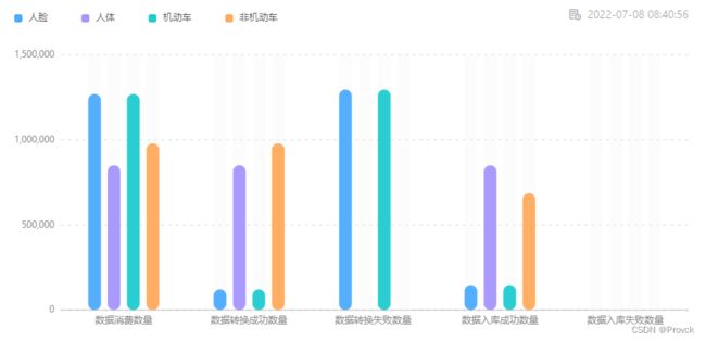
import { useEffect, useState } from "react";
import { Column } from '@antv/g2plot';
const ColumnGroupChart = ({ id, currentDetail }: { id: string, currentDetail: any }) => {
  const [currentChart, setCurrentChart] = useState(null)
  const types = ['数据消费数量', '数据转换成功数量', '数据转换失败数量 ', '数据入库成功数量', '数据入库失败数量']
  useEffect(() => {
    let data: any[] = []
    currentDetail?.detailData?.forEach((item: any) => {
      data.push({
        type: types[item.type-1],
        datatype: "人脸",
        value: item?.faceCount
      })
      data.push({
        type: types[item.type-1],
        datatype: "人体",
        value: item?.bodyCount
      })
      data.push({
        type: types[item.type-1],
        datatype: "机动车",
        value: item?.faceCount
      })
      data.push({
        type: types[item.type-1],
        datatype: "非机动车",
        value: item?.nomotorVehicleCount
      })
    });
    if (currentChart) {
      currentChart.destroy()
    }
    const column = new Column('container' + id, {
      data: data,
      xField: 'type',
      yField: 'value',
      height: 400,
      seriesField: 'datatype',
      isGroup: true,
      appendPadding: [24, 0, 0, 0],
      // intervalPadding:160,
      maxColumnWidth: 16,
      xAxis: {
        tickLine: null,
      },
      yAxis: {
        label: {
          // 数值格式化为千分位
          formatter: (v) => `${v}`.replace(/\d{1,3}(?=(\d{3})+$)/g, (s) => `${s},`),
        },
        grid: {
          line: {
            style: {
              lineDash: [4, 5]          //设置轴线为虚线
            }
          }
        }
      },
      legend: {
        position: 'top-left',
        marker: {
          symbol: 'square',
          style: (value) => {
            return {
              fill: value.fill,
              lineJoin: "round",
              lineWidth: 6,
              r: 2,
              stroke: value.fill,
            }
          }
        }
      },
      columnStyle: {
        radius: [20, 20, 20, 20],
      },
      columnBackground: {
        style: {
          fill: 'rgba(245, 245, 245, 1)'
        }
      },
      color: ['rgba(77, 170, 255, 1)', 'rgba(165, 149, 254, 1)', 'rgba(32, 203, 206, 1)', 'rgba(255, 170, 91, 1)'],
    });

    column.render();
    setCurrentChart(column)
  // eslint-disable-next-line react-hooks/exhaustive-deps
  }, [])
  return
}
export default ColumnGroupChart
L.区间柱状图

import { Column } from '@antv/g2plot';

const data = [
  { type: '分类一', type1:'lon',values: [76, 100] },
  { type: '分类一', type1:'bon',values: [0, 72] },
   { type: '分类1', type1:'lon',values: [88, 168] },
  { type: '分类1', type1:'bon',values: [0, 84] },
   { type: '分类3', type1:'lon',values: [42, 196] },
  { type: '分类3', type1:'bon',values: [0, 38] },
   { type: '分类4', type1:'lon',values: [99, 111] },
  { type: '分类4', type1:'bon',values: [0, 95] },
   { type: '分类5', type1:'lon',values: [62, 160] },
  { type: '分类5', type1:'bon',values: [0, 58] },
];

const barPlot = new Column('container', {
  data,
  xField: 'type',
  yField: 'values',
  isRange: true,
  maxColumnWidth:32,
  seriesField: 'type1',
});

barPlot.render();