javaEE -12(12000字CSS入门级教程)
css即层叠样式表 (Cascading Style Sheets).
CSS 能够对网页中元素位置的排版进行像素级精确控制, 实现美化页面的效果. 能够做到页面的样式和结构分离.
CSS基本语法规范:
选择器 + {一条/N条声明}
- 选择器决定针对谁修改 (找谁)
- 声明决定修改啥. (干啥)
- 声明的属性是键值对. 使用 ; 区分键值对, 使用 : 区分键和值.
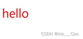
hello
这是CSS样式表的一部分,用于设置元素的样式。具体来说,该代码将元素的字体颜色设置为红色(color: red),字体大小设置为30像素(font-size: 30px)。所以,你会在浏览器中看到一个红色字体、大小为30像素的"hello"文本。
注意:
- CSS 要写到 style 标签中(后面还会介绍其他写法)
- style 标签可以放到页面任意位置. 一般放到 head 标签内.
- CSS 使用 /* */ 作为注释. (使用 ctrl + / 快速切换) .
一:引入方式
当我们在HTML文档中使用CSS来定义样式时,有三种不同的引入方式可以选择:内部样式表、行内样式和外部样式表。
1.1 内部样式表
- 内部样式表
内部样式表是通过