python 3d大数据可视化_其它绘图样式和 3D 图表
$ sudo pip3 install notebook
$ ipython3 notebook
散点图
import numpy as np
import matplotlib as mpl
import matplotlib.pyplot as plt
%matplotlib inline
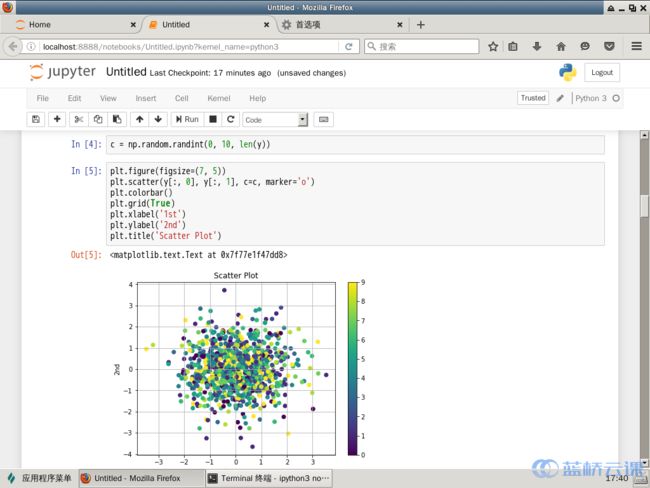
y = np.random.standard_normal((1000, 2))
plt.figure(figsize=(7, 5))
plt.plot(y[:, 0], y[:, 1], 'ro')
plt.grid(True)
plt.xlabel('1st')
plt.ylabel('2nd')
plt.title('Scatter Plot')

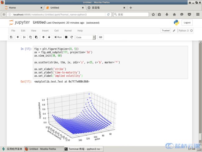
fig = plt.figure(figsize=(8, 5))
ax = fig.add_subplot(111, projection='3d')
ax.view_init(30, 60)
ax.scatter(strike, ttm, iv, zdir='z', s=25, c='b', marker='^')
ax.set_xlabel('strike')
ax.set_ylabel('time-to-maturity')
ax.set_zlabel('implied volatility')
c = np.random.randint(0, 10, len(y))
fig = plt.figure(figsize=(8, 5))
ax = fig.add_subplot(111, projection='3d')
ax.view_init(30, 60)
ax.scatter(strike, ttm, iv, zdir='z', s=25, c='b', marker='^')
ax.set_xlabel('strike')
ax.set_ylabel('time-to-maturity')
ax.set_zlabel('implied volatility')
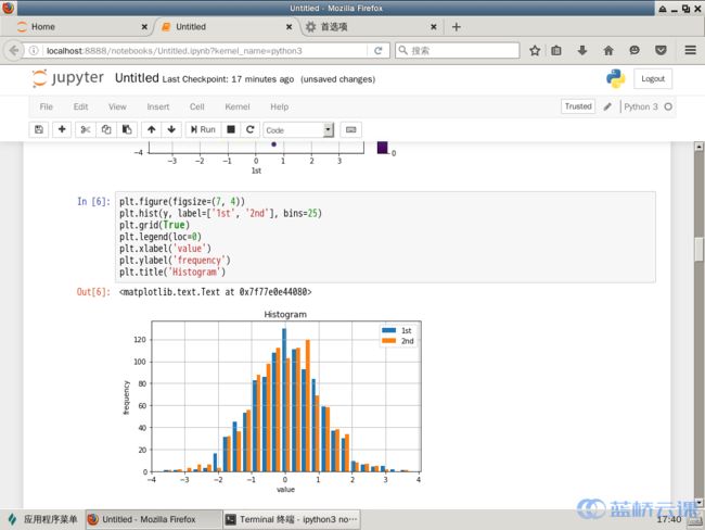
直方图
plt.figure(figsize=(7, 4))
plt.hist(y, label=['1st', '2nd'], bins=25)
plt.grid(True)
plt.legend(loc=0)
plt.xlabel('value')
plt.ylabel('frequency')
plt.title('Histogram')
y = np.random.standard_normal((1000, 2))
plt.figure(figsize=(7, 4))
plt.hist(y, label=['1st', '2nd'], color=['b', 'g'], stacked=True, bins=20)
plt.grid(True)
plt.legend(loc=0)
plt.xlabel('value')
plt.ylabel('frequency')
plt.title('Histogram')

箱形图
fig, ax = plt.subplots(figsize=(7,4))
plt.boxplot(y)
plt.grid(True)
plt.setp(ax, xticklabels=['1st', '2nd'])
plt.xlabel('data set')
plt.ylabel('value')
plt.title('Boxplot')

数学示例
from matplotlib.patches import Polygon
def func(x):
return 0.5 * np.exp(x) + 1
a, b = 0.5, 1.5
x = np.linspace(0, 2)
y = func(x)
fig, ax = plt.subplots(figsize=(7, 5))
plt.plot(x, y, 'b', linewidth=2)
plt.ylim(ymin=0)
Ix = np.linspace(a, b)
Iy = func(Ix)
verts = [(a, 0)] + list(zip(Ix, Iy)) + [(b, 0)]
poly = Polygon(verts, facecolor='0.7', edgecolor='0.5')
ax.add_patch(poly)
plt.text(0.5 * (a + b), 1, r"$\int_a^b fx\mathrm{d}x$", horizontalalignment='center', fontsize=20)
plt.figtext(0.9, 0.075, '$x$')
plt.figtext(0.075, 0.9, '$f(x)$')
ax.set_xticks((a, b))
ax.set_xticklabels(('$a$', '$b$'))
ax.set_yticks([func(a), func(b)])
ax.set_yticklabels(('$f(a)$', '$f(b)$'))
plt.grid(True)

3D 绘图
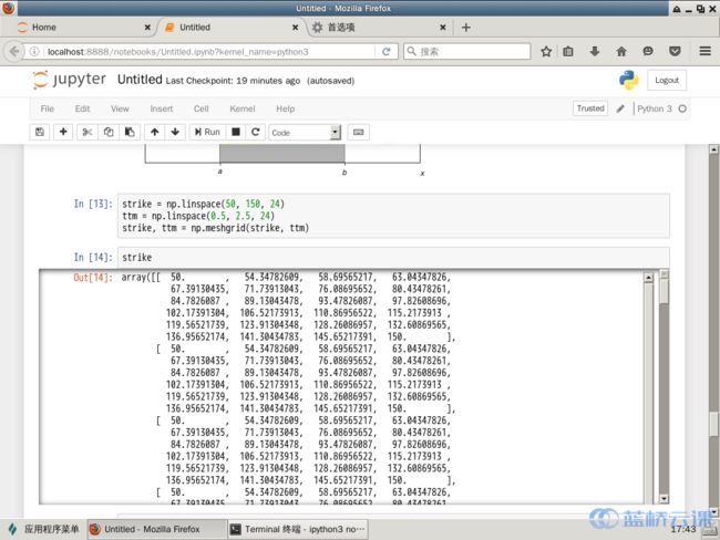
strike = np.linspace(50, 150, 24)
ttm = np.linspace(0.5, 2.5, 24)
strike, ttm = np.meshgrid(strike, ttm)
iv = (strike - 100) ** 2 / (100 * strike) / ttm
from mpl_toolkits.mplot3d import Axes3D
fig = plt.figure(figsize=(9,6))
ax = fig.gca(projection='3d')
surf = ax.plot_surface(strike, ttm, iv, rstride=2, cstride=2, cmap=plt.cm.coolwarm, linewidth=0.5, antialiased=True)
ax.set_xlabel('strike')
ax.set_ylabel('time-to-maturity')
ax.set_zlabel('implied volatility')
fig.colorbar(surf, shrink=0.5, aspect=5)
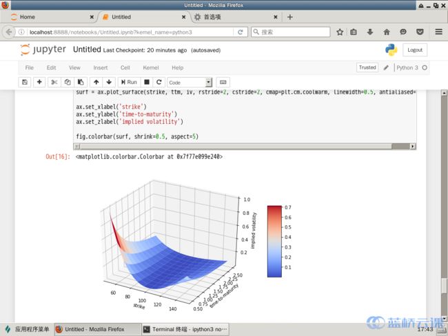
fig = plt.figure(figsize=(8, 5))
ax = fig.add_subplot(111, projection='3d')
ax.view_init(30, 60)
ax.scatter(strike, ttm, iv, zdir='z', s=25, c='b', marker='^')
ax.set_xlabel('strike')
ax.set_ylabel('time-to-maturity')
ax.set_zlabel('implied volatility')