01 matplotlib绘图初体验
matplotlib 可以绘制什么图?
- 前言
- 一、折线图
-
- 1.1 折线图的介绍
- 1.2 代码及运行结果
- 二、散点图
-
- 2.1 散点图的介绍
- 2.2 代码及运行结果
- 三、饼图
-
- 3.1 饼图的介绍及使用要求
- 3.2 代码及运行结果
- 四、条形图
-
- 4.1 条形图的介绍及使用情景
- 4.2 代码及运行结果
- 五、直方图
-
- 5.1 直方图的介绍
- 5.2 代码及运行结果
- 六、箱线图
-
- 6.1 箱线图的介绍
- 6.2 代码及运行结果
- 七、参考资料
前言
本文仅初步体验matplotlib绘图,无须深究代码。希望大家对matplotlib绘图有初步的了解,认识各种图形的应用情景,免用图于不当之处,适得其反。同时对于疏漏之处,希望大佬们不吝赐教。
一、折线图
1.1 折线图的介绍
A line chart or line plot or line graph or curve chartis a type of chart which displays information as a series of data points called ‘markers’ connected by straight line segments.It is a basic type of chart common in many fields. It is similar to a scatter plot except that the measurement points are ordered(typically by their x-axis value) and joined with straight line segments. A line chart is often used to visualize a trend in data over intervals of time – a time series – thus the line is often drawn chronologically. In these cases they are known as run charts.1
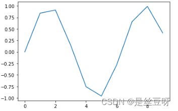
1.2 代码及运行结果
x = np.arange(10)
y = np.sin(x)
fig, ax = plt.subplots()
ax.plot(x, y)
plt.show()
二、散点图
2.1 散点图的介绍
A scatter plot (also called a scatterplot, scatter graph, scatter chart, scattergram, or scatter diagram) is a type of plot or mathematical diagram using Cartesian coordinates to display values for typically two variables for a set of data. If the points are coded (color/shape/size), one additional variable can be displayed. The data are displayed as a collection of points, each having the value of one variable determining the position on the horizontal axis and the value of the other variable determining the position on the vertical axis.2
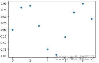
2.2 代码及运行结果
x = np.arange(10)
y = np.sin(x)
fig, ax = plt.subplots()
ax.scatter(x, y)
plt.show()
三、饼图
3.1 饼图的介绍及使用要求
- 饼图的介绍
A pie chart (or a circle chart) is a circular statistical graphic, which is divided into slices to illustrate numerical proportion. In a pie chart, the arc length of each slice (and consequently its central angle and area), is proportional to the quantity it represents. 3
- 饼图的使用要求
- 每个数值代表一个类别
- 要绘制的数值没有负值
- 要绘制的数值机会没有零值
- 类别数目无限制
- 各类别分别代表整个饼图的一部分
- 各个部分需要标注百分比4
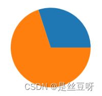
3.2 代码及运行结果
data = [0.3, 0.7]
fig, ax = plt.subplots()
ax.pie(data)
plt.show()
四、条形图
4.1 条形图的介绍及使用情景
- 条形图的介绍
A bar chart or bar graph is a chart or graph that presents categorical data with rectangular bars with heights or lengths proportional to the values that they represent. The bars can be plotted vertically or horizontally. A vertical bar chart is sometimes called a column chart.5
A bar graph shows comparisons among discrete categories. One axis of the chart shows the specific categories being compared, and the other axis represents a measured value. Some bar graphs present bars clustered in groups of more than one, showing the values of more than one measured variable.5
- 条形图的使用情景
Bar charts have a discrete domain of categories, and are usually scaled so that all the data can fit on the chart. When there is no natural ordering of the categories being compared, bars on the chart may be arranged in any order. Bar charts arranged from highest to lowest incidence are called Pareto charts.5
Bar graphs/charts provide a visual presentation of categorical data. Categorical data is a grouping of data into discrete groups, such as months of the year, age group, shoe sizes, and animals. These categories are usually qualitative. In a column bar chart, the categories appear along the horizontal axis; the height of the bar corresponds to the value of each category.5
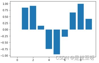
4.2 代码及运行结果
x = np.arange(10)
y = np.sin(x)
fig, ax = plt.subplots()
ax.bar(x, y)
plt.show()
五、直方图
5.1 直方图的介绍
直方图(Histogram),又称质量分布图,是一种统计报告图,由一系列高度不等的纵向条纹或线段表示数据分布的情况。 一般用横轴表示数据类型,纵轴表示分布情况。
直方图是数值数据分布的精确图形表示。 这是一个连续变量(定量变量)的概率分布的估计,并且被卡尔·皮尔逊(Karl Pearson)首先引入。它是一种条形图。 为了构建直方图,第一步是将值的范围分段,即将整个值的范围分成一系列间隔,然后计算每个间隔中有多少值。 这些值通常被指定为连续的,不重叠的变量间隔。 间隔必须相邻,并且通常是(但不是必须的)相等的大小。
直方图也可以被归一化以显示“相对”频率。 然后,它显示了属于几个类别中的每个案例的比例,其高度等于1。6
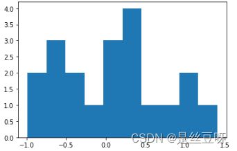
5.2 代码及运行结果
x = [1, 1, 2, 3, 3, 3, 4]
fig, ax = plt.subplots()
ax.hist(x)
plt.show()
六、箱线图
6.1 箱线图的介绍
箱线图(Boxplot)也称箱须图(Box-whisker Plot),是利用数据中的五个统计量:最小值、第一四分位数、中位数、第三四分位数与最大值来描述数据的一种方法,它也可以粗略地看出数据是否具有有对称性,分布的分散程度等信息,特别可以用于对几个样本的比较。7
6.2 代码及运行结果
x = [1, 1, 2, 3, 3, 3, 4, 4]
fig, ax = plt.subplots()
ax.boxplot(x)
plt.show()

七、参考资料
https://encyclopedia.thefreedictionary.com/line+chart ↩︎
https://encyclopedia.thefreedictionary.com/scatter+plot ↩︎
https://encyclopedia.thefreedictionary.com/pie+chart ↩︎
https://baike.baidu.com/item/%E9%A5%BC%E5%9B%BE/10816566 ↩︎
https://encyclopedia.thefreedictionary.com/bar+chart ↩︎ ↩︎ ↩︎ ↩︎
https://baike.baidu.com/item/%E7%9B%B4%E6%96%B9%E5%9B%BE/1103834 ↩︎
https://wiki.mbalib.com/wiki/%E7%AE%B1%E7%BA%BF%E5%9B%BE ↩︎