Web前端—移动Web第四天(vw适配方案、vw和vh的基本使用、综合案例-酷我音乐)
版本说明
当前版本号[20231122]。
| 版本 | 修改说明 |
|---|---|
| 20231122 | 初版 |
本课程的笔记已经更新完毕,各位可以通过点击《黑马程序员2023新版前端Web开发HTML5+CSS3+移动web视频教程,前端web入门首选》学习笔记总目录查看所有知识点,同时也能免费下载学习笔记和配套资料。
目录
文章目录
- 版本说明
- 目录
- 移动 Web 第四天
-
- 01-vw适配方案
-
- vw和vh基本使用
- vw布局
- vh布局
- 混用问题
- 02-综合案例-酷我音乐
-
- 准备工作
- 头部布局
- 头部内容
- 搜索区域
- banner 区域
- 标题公共样式
- 排行榜内容
- 推荐歌单布局
- 推荐歌单内容
- 下载区域
- 头部固定
移动 Web 第四天
01-vw适配方案
vw和vh基本使用
vw和vh是相对单位,相对视口尺寸计算结果,可以直接实现移动端适配效果。
- vw:viewport width(1vw = 1/100视口宽度 )
- vh:lviewport height ( 1vh = 1/100视口高度 )
vw布局
vw单位的尺寸 = px 单位数值 / ( 1/100 视口宽度 )
-
确定设计稿对应的vw尺寸 (1/100视口宽度)
- 查看设计稿宽度 → 确定参考设备宽度 (视口宽度) → 确定 vw 尺寸 (1/100 视口宽度
-
vw单位的尺寸 = px 单位数值 / ( 1/100 视口宽度 )
vh布局
-
确定设计稿对应的vh尺寸 (1/100视口高度)
- 查看设计稿宽度 → 确定参考设备高度 (视口高度) → 确定 vh 尺寸 (1/100 视口高度)
-
vh单位的尺寸 = px 单位数值 / ( 1/100 视口高度 )
混用问题
注:是否可以 vw 和 vh 混用呢?
vh是1/100视口高度,全面屏视口高度尺寸大,如果混用可能会导致盒子变形
02-综合案例-酷我音乐

准备工作
- HTML 结构
<link rel="stylesheet" href="./iconfont/iconfont.css">
<link rel="stylesheet" href="./css/index.css">
-
less 样式
要注意:
// out: ../css/要在第一行,才会生效。如果放到非第一行去, css 文件就会与 less文件放在一起。
// out: ../css/

@import "./base";

头部布局
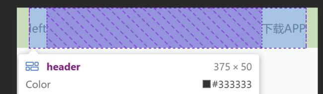
- HTML 结构
<header>
  <div class="left">leftdiv>
  <a href="#">下载APPa>
header>
- less 样式
body {
  background-color: #f9fafb;
}

@vw:3.75vw;

// 头部
header {
  display: flex;
  justify-content: space-between;
  align-items: center;
  padding: 0 (15 / @vw);
  height: (50 / @vw);
  background-color: #fff;
}
1、把头部区域圈出来。
<body>

    <header>1header>
body>
body{
    background-color: #f9fafb;
}

// 头部
header{
    background-color: #fff;
}
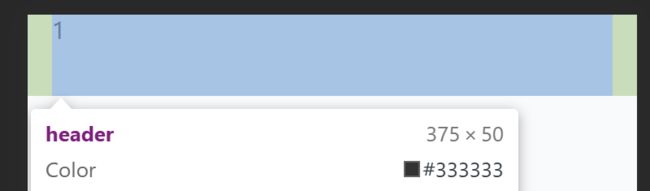
2、给头部区域加上内外边距。
@vw:3.75vw;
// 头部
header{
    padding: 0 (15 / @vw);
    height: (50 / @vw);
    background-color: #fff;
}
3、分成左右两部分,并设置Flex容器中项目的垂直对齐方式。
    <header>
        <div class="left">leftdiv>
        <a href="#">下载APPa>
    header>
@vw:3.75vw;
// 头部
header{
    display: flex;
    justify-content: space-between;
    align-items: center;
    padding: 0 (15 / @vw);
    height: (50 / @vw);
    background-color: #fff;
}
头部内容
- less 样式
header {
  // 左边
  .left {
    width: (235 / @vw);
    height: (50 / @vw);
    background-image: url(../assets/head.png);
    background-size: contain;
    background-repeat: no-repeat;
  }
  a {
    width: (80 / @vw);
    height: (30 / @vw);
    background-color: #ffe31b;
    border-radius: (15 / @vw);
    text-align: center;
    line-height: (30 / @vw);
    font-size: (14 / @vw);
  }
}
1、添加上背景图片,并设置背景图像的尺寸和重复方式。
- 背景图像会保持其原始尺寸,同时可能被拉伸或压缩以适应容器的大小。
- 设置为
no-repeat时,背景图像不会在水平方向上重复,也不会在垂直方向上重复。这意味着背景图像只会显示一次,并且不会随着容器的大小变化而自动调整。
// 左边
    .left{
        height: (50 / @vw);
        width: (235 / @vw);
        background-image: url(../assets/head.png);
        background-size: contain;
        background-repeat: no-repeat;
    }

2、设置“下载APP”的背景框,让文本会在水平方向上居中对齐。
 // 右边
    a{
        width: (80 / @vw);
        height: (30 / @vw);
        background-color: #ffe31b;
        text-align: center;
        line-height: (30 / @vw);
        border-radius: (15 / @vw);
        font-size: (14 / @vw);
    }

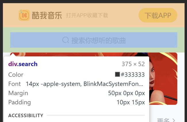
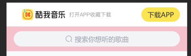
搜索区域
- HTML 结构
<div class="search">
  <div class="txt">
    <span class="iconfont icon-sousuo">span>
    <span>搜索你想听的歌曲span>
  div>
div>
- less 样式
// 搜索
.search {
  padding: (10 / @vw) (15 / @vw);
  height: (52 / @vw);
  // background-color: pink;
  .txt {
    height: (32 / @vw);
    background-color: #f2f4f5;
    border-radius: (16 / @vw);
    text-align: center;
    line-height: (32 / @vw);
    color: #a1a4b3;
    font-size: (14 / @vw);
    .iconfont {
      font-size: (16 / @vw);
    }
  }
}
1、列出搜索区域。
// 搜索区域
.search{
    padding: (10 / @vw) (15 / @vw);
    height: (42 / @vw);
    background-color: pink;
}

2、对文本的区域设置边距。
 .txt{
        height: (32 / @vw);
        background-color: #f2f4f5;
        border-radius: (16 / @vw);
    }

3、在框内添加字体图标和搜索提示词。
    <div class="search">
        <div class="txt">
            <span class="iconfont icon-sousuo">span>
            <span>搜索你想听的歌曲span>
        div>
    div>
.txt{
        height: (32 / @vw);
        background-color: #f2f4f5;
        border-radius: (16 / @vw);
        text-align: center;
        line-height: (32 / @vw);
        color: #a1a4b3;
    }
4、设置字体图标的大小。
.txt{
        height: (32 / @vw);
        background-color: #f2f4f5;
        border-radius: (16 / @vw);
        text-align: center;
        line-height: (32 / @vw);
        color: #a1a4b3;
        font-size: (14 / @vw);

        .iconfont{
            font-size: (16 / @vw);
        }
    }

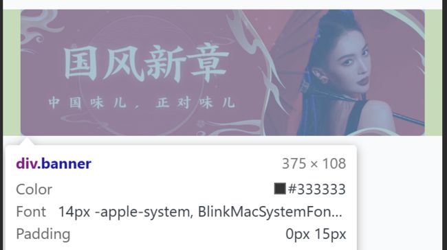
banner 区域
- HTML 结构
<div class="banner">
  <ul>
    <li><a href="#"><img src="./assets/banner01.jpeg" alt="">a>li>
  ul>
div>
- less 样式
// banner
.banner {
  padding: 0 (15 / @vw);
  height: (108 / @vw);
  // background-color: pink;
  ul {
    li {
      width: (345 / @vw);
      height: (108 / @vw);
      img {
        width: 100%;
        height: 100%;
        // cover完全覆盖
        // 缩放img,图片比例跟父级盒子比例不同,避免图片挤压变形
        object-fit: cover;
        border-radius: (5 / @vw);
      }
    }
  }
}
1、给banner区域腾出位置。
<div class="banner">1div>
// banner区域
.banner{
    padding: 0 (15 / @vw);
    height: (108 / @vw);
    background-color: pink;
}

2、插入图片,并且让图片完全覆盖,当图片比例与父级盒子比例不同时,就缩放img,避免图片因挤压而产生变形。
    <div class="banner">
        <ul>
            <li><a href="#"><img src="./assets/banner01.jpeg" alt="">a>li>
        ul>
    div>
// banner区域
.banner{
    padding: 0 (15 / @vw);
    height: (108 / @vw);
    background-color: pink;

    ul{
        li{
            width: (345 / @vw);
            height: (108 / @vw);

            img{
                width: 100%;
                height: 100%;
                // cover代表图片是完全覆盖的
		// 当图片比例与父级盒子比例不同时,缩放img,避免图片挤压变形
                object-fit: cover;
            }
        }
    }
}

注:
  // cover代表图片是完全覆盖的
		// 当图片比例与父级盒子比例不同时,缩放img,避免图片挤压变形
                object-fit: cover;
3、再把背景色去掉。
border-radius: (5 / @vw);
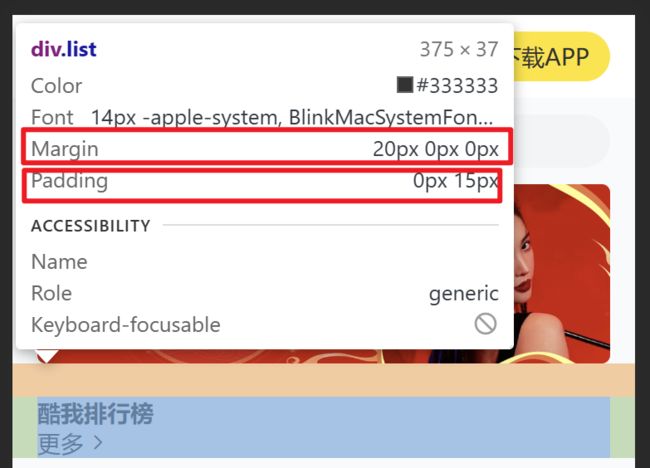
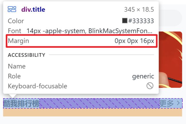
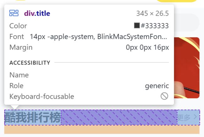
标题公共样式
- HTML 结构
<div class="list">

  <div class="title">
    <h4>酷我排行榜h4>
    <a href="#">更多<span class="iconfont icon-right">span>a>
  div>
div>
- less 样式
// 排行榜
.list {
  margin-top: (20 / @vw);
  padding: 0 (15 / @vw);
}

// 标题 → 公共样式
.title {
  display: flex;
  justify-content: space-between;
  margin-bottom: (16 / @vw);
  line-height: (25 / @vw);
  h4 {
    font-size: (20 / @vw);
  }
  a {
    font-size: (12 / @vw);
    color: #a1a4b3;
  }
}
1、对 排行榜 区域进行设置。
    <div class="list">

        <div class="title">
            <h4>酷我排行榜h4>
            <a href="#">更多<span class="iconfont icon-right">span>a>
        div>
    div>
// 排行榜
.list{
    margin-top: (20 / @vw);
    padding: 0 (15 / @vw);
}
2、设置排行榜标题区域为水平对齐方式。元素之间会平均分配空间,并且两端的元素分别靠近容器的开始和结束位置。
// 标题
.title{
    display: flex;
    justify-content: space-between;
    margin-bottom: (16 / @vw);
}
3、改变文字的样式。
// 标题
.title{
    display: flex;
    justify-content: space-between;
    margin-bottom: (16 / @vw);
    line-height: (25 / @vw);

    h4{
        font-size: 20px;
    }

    a{
        font-size: 12px;
        color: #a1a4b3;
        text-align: center;
    }
}
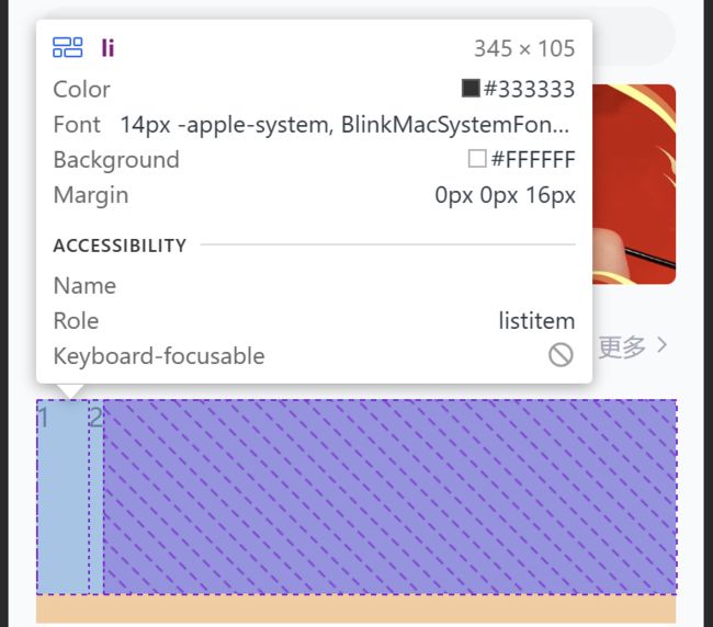
排行榜内容
- HTML 结构
<div class="content">
  <ul>
    <li>
      <div class="pic"><img src="./assets/icon_rank_hot.png" alt="">div>
      <div class="txt">
        <a href="#" class="more">酷我热歌榜<span class="iconfont icon-right">span>a>
        <a href="#">1.樱花树下的约定(完整版) - 旺仔小乔a>
        <a href="#">2.就让这大雨全都落下 - 容祖儿a>
        <a href="#">3.缺氧 - 轩姨(相信光)a>
      div>
    li>
    <li>
      <div class="pic"><img src="./assets/icon_rank_new.png" alt="">div>
      <div class="txt">
        <a href="#" class="more">酷我新歌榜<span class="iconfont icon-right">span>a>
        <a href="#">1.樱花树下的约定(完整版) - 旺仔小乔a>
        <a href="#">2.就让这大雨全都落下 - 容祖儿a>
        <a href="#">3.缺氧 - 轩姨(相信光)a>
      div>
    li>
    <li>
      <div class="pic"><img src="./assets/icon_rank_rise.png" alt="">div>
      <div class="txt">
        <a href="#" class="more">酷我飙升榜<span class="iconfont icon-right">span>a>
        <a href="#">1.樱花树下的约定(完整版) - 旺仔小乔a>
        <a href="#">2.就让这大雨全都落下 - 容祖儿a>
        <a href="#">3.缺氧 - 轩姨(相信光)a>
      div>
    li>
  ul>
div>
- less 样式
// 排行榜
.list {
  margin-top: (20 / @vw);
  padding: 0 (15 / @vw);
  li {
    display: flex;
    margin-bottom: (16 / @vw);
    height: (105 / @vw);
    background-color: #fff;
    border-radius: (10 / @vw);
    .pic {
      margin-right: (20 / @vw);
      img {
        width: (105 / @vw);
        height: (105 / @vw);
        border-radius: (10 / @vw);
      }
    }
    .txt {
      a {
        display: block;
        font-size: (12 / @vw);
        color: #a1a4b3;
        line-height: 1.8;
      }

      .more {
        font-size: (14 / @vw);
        color: #333;
        .iconfont {
          font-size: (16 / @vw);
        }
      }
    }
  }
}
1、设置三个li标签。
    <div class="list">

        <div class="title">
            <h4>酷我排行榜h4>
            <a href="#">更多<span class="iconfont icon-right">span>a>
        div>


        <div class="content">
            <ul>
                <li>1li>
                <li>2li>
                <li>3li>
            ul>
        div>
    div>
// 排行榜
.list{
    margin-top: (20 / @vw);
    padding: 0 (15 / @vw);

    li{
        margin-bottom: (16 / @vw);
        height: (105 / @vw);
        background-color: #fff;
        border-radius: (10 / @vw);
    }
}

2、将每个li标签分为两部分,图片及文字。
<li>
                    <div class="pic">1div>
                    <div class="txt">2div>
                li>
li{
        display: flex;
        margin-bottom: (16 / @vw);
        height: (105 / @vw);
        background-color: #fff;
        border-radius: (10 / @vw);

        .pic{
            margin-right: (20 / @vw);
        }
    }
3、插入图片。
<li>
                    <div class="pic">
                        <img src="./assets/icon_rank_hot.png" alt="">
                    div>
                    <div class="txt">2div>
                li>
 .pic{
            margin-right: (20 / @vw);

            img{
                width: (105 / @vw);
                height: (105 / @vw);
                border-radius: (10 / @vw);
            }
        }

4、将文字区域设置成 display: block; ,是为了让每个 a 标签都可以换行。
<li>
                    <div class="pic">
                        <img src="./assets/icon_rank_hot.png" alt="">
                    div>
                    <div class="txt">
                        <a href="#" class="more">酷我热歌榜<span class="iconfont icon-right">span>a>
                        <a href="#">1.樱花树下的约定(完整版) - 旺仔小乔a>
                        <a href="#">2.就让这大雨全都落下 - 容祖儿a>
                        <a href="#">3.缺氧 - 轩姨(相信光)a>
                    div>
                li>
.txt{
           a{
            display: block;
           }
        }

5、改变右边区域的样式。
.txt{
           a{
            display: block;
            line-height: 1.8;
            font-size: (12 / @vw);
            color: #a1a4b3;
           }

           .more{
            font-size: (14 / @vw);
            color: #333;

            .iconfont{
                font-size: (16 / @vw);
            }
           }
        }

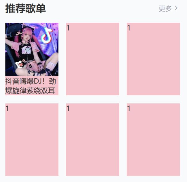
推荐歌单布局
- HTML 结构
<div class="recommend">

  <div class="title">
    <h4>推荐歌单h4>
    <a href="#">更多<span class="iconfont icon-right">span>a>
  div>

  <div class="content">
    <ul>
      <li>1li>
      <li>1li>
      <li>1li>
      <li>1li>
      <li>1li>
      <li>1li>
    ul>
  div>
div>
- less 样式
// 推荐歌单
.recommend {
  padding: 0 (15 / @vw);
  ul {
    display: flex;
    flex-wrap: wrap;
    justify-content: space-between;
    li {
      margin-bottom: (16 / @vw);
      width: (105 / @vw);
      height: (143 / @vw);
      background-color: pink;
    }
  }
}
1、设置歌单区域的内边距。
<div class="recommend">1div>
// 推荐歌单
.recommend{
    padding: 0 (15 / @vw);
}

2、按照之前设置标题的套路,在这里继续使用。
    <div class="recommend">

        <div class="title">
            <h4>推荐歌单h4>
            <a href="#">更多<span class="iconfont icon-right">span>a>
        div>
    div>

3、分6个li标签,当容器宽度不足以容纳所有元素时,元素自动换行并均匀分布,同时保持两端元素靠边的效果。
    <div class="recommend">


        <div class="title">
            <h4>推荐歌单h4>
            <a href="#">更多<span class="iconfont icon-right">span>a>
        div>


        <div class="content">
            <ul>
                <li>1li>
                <li>1li>
                <li>1li>
                <li>1li>
                <li>1li>
                <li>1li>
            ul>
        div>

    div>
// 推荐歌单
.recommend{
    padding: 0 (15 / @vw);

    ul{
        display: flex;
        flex-wrap: wrap;
        justify-content: space-between;

        li{
            width: (105 / @vw);
            height: (143 / @vw);
            margin-bottom: (16 / @vw);
            background-color: pink;
        }
    }
}

推荐歌单内容
- HTML 结构
<li>
<div class="pic">
<img src="./assets/song01.jpeg" alt="">
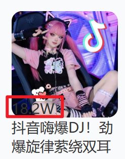
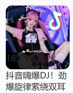
<div class="cover">18.2Wdiv>
div>
<div class="txt">抖音嗨爆DJ!劲爆旋律萦绕双耳div>
li>
<li>
<div class="pic">
<img src="./assets/song02.jpeg" alt="">
<div class="cover">18.2Wdiv>
div>
<div class="txt">抖音嗨爆DJ!劲爆旋律萦绕双耳div>
li>
<li>
<div class="pic">
<img src="./assets/song03.jpeg" alt="">
<div class="cover">18.2Wdiv>
div>
<div class="txt">抖音嗨爆DJ!劲爆旋律萦绕双耳div>
li>
<li>
<div class="pic">
<img src="./assets/song02.jpeg" alt="">
<div class="cover">18.2Wdiv>
div>
<div class="txt">抖音嗨爆DJ!劲爆旋律萦绕双耳div>
li>
<li>
<div class="pic">
<img src="./assets/song03.jpeg" alt="">
<div class="cover">18.2Wdiv>
div>
<div class="txt">抖音嗨爆DJ!劲爆旋律萦绕双耳div>
li>
<li>
<div class="pic">
<img src="./assets/song01.jpeg" alt="">
<div class="cover">18.2Wdiv>
div>
<div class="txt">抖音嗨爆DJ!劲爆旋律萦绕双耳div>
li>
- less 样式
// 图片
.pic {
  position: relative;
  width: (105 / @vw);
  height: (105 / @vw);
  img {
    width: 100%;
    height: 100%;
    object-fit: cover;
    border-radius: (10 / @vw);
  }
  .cover {
    position: absolute;
    left: 0;
    bottom: 0;
    width: (70 / @vw);
    height: (28 / @vw);
    background-color: rgba(0,0,0,0.8);
    border-radius: 0 (10 / @vw) 0 (10 / @vw);
    text-align: center;
    line-height: (28 / @vw);
    color: #fff;
    font-size: (14 / @vw);
  }
}
// 文字
.txt {
  font-size: (14 / @vw);
}
1、给每个li标签添加图片及文字。
 <li>
                    <div class="pic"><img src="./assets/song01.jpeg" alt="">div>
                    <div class="txt">抖音嗨爆DJ!劲爆旋律萦绕双耳div>
                li>
 li{
            width: (105 / @vw);
            height: (143 / @vw);
            margin-bottom: (16 / @vw);
            background-color: pink;

            // 图片
            .pic{
                width: (105 / @vw);
                height: (105 / @vw);

                img{
                    width: 100%;
                    height: 100%;
                    object-fit: cover;
                }
            }
        }
2、改变文字大小并把底色注销掉。
// 文字
            .txt{
                font-size: (14 / @vw);
            }

3、插入左下角的表数值的框。
<div class="cover">18.2Wdiv>
// 图片
            .pic{
                position: relative;
                width: (105 / @vw);
                height: (105 / @vw);

                img{
                    width: 100%;
                    height: 100%;
                    object-fit: cover;
                    border-radius: (10 / @vw);
                }

                .cover{
                    position: absolute;
                    left: 0;
                    bottom: 0;
                }
            }
4、改变背景透明度及圆角显示。
 .cover{
                    position: absolute;
                    left: 0;
                    bottom: 0;
                    width: (70 / @vw);
                    height: (28 / @vw);
                    background-color: rgba(0, 0, 0, 0.8);
                    border-radius: 0 (10 / @vw) 0 (10 / @vw);
                }
5、设置里面的数字位置水平及垂直居中。
// 里面的数字
                    text-align: center;
                    line-height: (28 / @vw);
                    color: #fff;

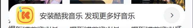
下载区域
- HTML 结构
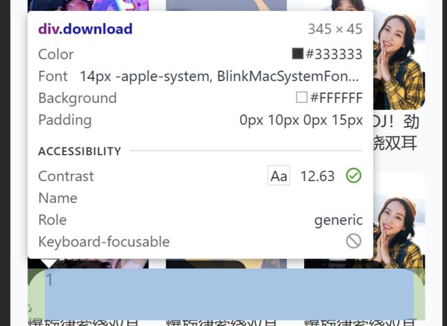
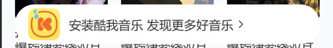
<div class="download">
  <img src="./assets/logo.png" alt="">
  <p>安装酷我音乐 发现更多好音乐p>
  <span class="iconfont icon-right">span>
div>
- less 样式
// 下载
.download {
  position: fixed;
  left: (15 / @vw);
  bottom: (30 / @vw);

  display: flex;
  align-items: center;
  padding: 0 (10 / @vw) 0 (15 / @vw);
  width: (345 / @vw);
  height: (45 / @vw);
  background-color: #fff;
  border-radius: (22 / @vw);
  img {
    margin-right: (10 / @vw);
    width: (36 / @vw);
    height: (36 / @vw);
  }
  p {
    flex: 1;
    font-size: (14 / @vw);
  }
  span {
    width: (32 / @vw);
    height: (32 / @vw);
    background-color: #f2f3f5;
    border-radius: 50%;
    text-align: center;
    line-height: (32 / @vw);
    font-size: (16 / @vw);
  }
}
1、给下载区域描出框的位置。
<div class="download">1div>
// 下载区域
.download{
    width: (345 / @vw);
    height: (45 / @vw);
    padding: 0 (10 / @vw) 0 (15 / @vw);
    color: #333;
}

2、进一步修改细节。
// 下载区域
.download{
    position: fixed;
    left: (15 / @vw);
    bottom: (30 / @vw);
    width: (345 / @vw);
    height: (45 / @vw);
    padding: 0 (10 / @vw) 0 (15 / @vw);
    color: #fff;
}

3、设置元素的边框圆角半径。
background-color: #fff;
border-radius: (22 / @vw);
4、将区域中的图片、文字和字体图标加上去。
    <div class="download">
        <img src="./assets/logo.png" alt="">
        <p>安装酷我音乐 发现更多好音乐p>
        <span class="iconfont icon-right">span>
    div>
.download{
    display: flex;
    ……
        img{
            width: (36 / @vw);
            height: (36 / @vw);
        }
}

5、设置区域中的内容垂直对齐。
// 下载区域
.download{
    ……
    align-items: center;

    img{
        width: (36 / @vw);
        height: (36 / @vw);
        margin: 0 (10 / @vw) 0 0;
    }
}
6、修改文字的大小。flex: 1;为设置Flex容器中项目的弹性伸缩比例。当设置为 1 时,项目会平均分配可用空间。在这里当分配好图标和字体图标完后,剩下的空间均为 p 所用。
p{
        flex: 1;
        font-size: (14 / @vw);
    }

7、设置"span"的元素样式为一个圆形的容器,并具有指定的宽度、高度、背景颜色、边框圆角半径、行高和文本对齐方式。
span{
        width: (32 / @vw);
        height: (32 / @vw);
        background-color: #f2f3f5;
        border-radius: 50%;
        line-height: (32 / @vw);
        text-align: center;
    }
头部固定
问题:
1、宽度不够
2、搜索栏没了
- less 样式
// 头部
header {
  position: fixed;
  left: 0;
  top: 0;
  display: flex;
  justify-content: space-between;
  align-items: center;
  padding: 0 (15 / @vw);
  // 固定定位的盒子,宽度靠内容撑开,希望宽度100%
  width: 100%;
  height: (50 / @vw);
  background-color: #fff;
}

// 搜索
.search {
  // 头部固定定位,脱标不占位,搜索去最顶了,加上外边距挤下来即可
  margin-top: (50 / @vw);
  padding: (10 / @vw) (15 / @vw);
  height: (52 / @vw);
}
1、设置头部固定。
header{
    position: fixed;
    left: 0;
    top: 0;
    // 固定定位的盒子,宽度靠内容撑开,所以我们希望宽度为100%
    width: 100%;
    ……
}

2、我们会发现,搜索框没有显示出来了,是因为固定头部的区域把其给覆盖了。我们只需要添加上边距,让搜索框下来,这样我们就能看到了。
// 搜索区域
.search{
    // 头部固定定位,拖标不定位,搜索去最顶处了,加上外边距挤下来即可
    margin-top: (50 / @vw);
    ……
}