QT绘制饼图+柱状图+折线图
项目需要使用到不同的统计图案的方法来显示统计数据
包括:饼图、柱状图、折线图。
饼图的实现
具体实现代码如下:
首先需要一个QChartView来存放饼图,实现如下:
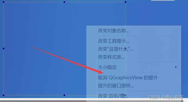
拖拽一个QGraphicsView,并且将其提升为QChartView,

 	  QPieSeries* series = new QPieSeries();            // 创建一个饼图对象(设置孔径就是圆环)
    series->append("Y1", 1);                          // 添加饼图切片
    series->append("Y2", 2);
    series->append("Y3", 3);
    series->append("Y4", 4);
    series->append("Y5", 5);
    series->setHoleSize(0);//饼图中间是否需要填洞
    series->setPieSize(1);//设置大小:这里的大小就是占据整个view的大小

    QPieSlice* slice;       // 获取饼图中某一个切片(在绘制圆环图Demo中是通过appent函数获取,这里换一种方式)
    QFont font("Arial", 5);

//    slice->setExploded();                            // 将切片分离饼图
//    slice->setLabelVisible();                        // 显示当前切片的标签
//    slice->setPen(QPen(Qt::darkGreen, 2));           // 设置画笔颜色和粗细
//    slice->setBrush(Qt::green);                      // 设置切片背景色

    QChart* chart = ui->chartViewPie->chart();           // 获取QChartView中默认的QChart
    chart->addSeries(series);                        // 将创建好的饼图对象添加进QChart
    chart->setTitle("饼图标题");                      // 设置图表标题

    for(int i=0;i<5;i++)
    {
        slice = series->slices().at(i);
        slice->setLabel(QString::asprintf("%.0f人,%.1f",slice->value(),slice->percentage()));
        slice->setLabelPosition(QPieSlice::LabelInsideNormal);
        connect(slice,&QPieSlice::hovered,this,&MainWindow::on_slice_highlight);
        slice->setLabelFont(font);
    }
    chart->addSeries(series);
    chart->legend()->setAlignment(Qt::AlignRight);
    ui->chartViewPie->chart()->setTheme(QChart::ChartThemeLight);
    ui->chartViewPie->setStyleSheet("background-color:#1964C8");
    chart->setBackgroundVisible(true);  //去背景

柱状图的实现
同上:
首先需要一个QChartView来存放饼图,实现如下:拖拽一个QGraphicsView,并且将其提升为QChartView,
    QLinearGradient gradient(0, 0, 0, 400);
    gradient.setColorAt(0, QColor(25, 100, 200,70));
    ui->customPlot_2->setBackground(QBrush(gradient));


    QCPAxis *keyAxis = ui->customPlot_2->xAxis;
    QCPAxis *valueAxis = ui->customPlot_2->yAxis;//纵向显示


    QCPBars *fossil = new QCPBars(keyAxis, valueAxis);  // 使用xAxis作为柱状图的key轴,yAxis作为value轴

    fossil->setAntialiased(false); // 为了更好的边框效果,关闭抗齿锯
   //fossil->setName("Fossil fuels"); // 设置柱状图的名字,可在图例中显示
    fossil->setPen(QPen(QColor(0, 168, 140).lighter(130))); // 设置柱状图的边框颜色
    fossil->setBrush(QColor(0, 168, 140));  // 设置柱状图的画刷颜色

    // 为柱状图设置一个文字类型的key轴,ticks决定了轴的范围,而labels决定了轴的刻度文字的显示
    QVector<double> ticks;
    QVector<QString> labels;
    ticks << 1 << 2 << 3 << 4 << 5 << 6 << 7;
    labels << "USA" << "Japan" << "Germany" << "France" << "UK" << "Italy" << "Canada";
    QSharedPointer<QCPAxisTickerText> textTicker(new QCPAxisTickerText);
    textTicker->addTicks(ticks, labels);

    keyAxis->setTicker(textTicker);        // 设置为文字轴
    keyAxis->setTickLabelRotation(60);     // 轴刻度文字旋转60度
    keyAxis->setSubTicks(false);           // 不显示子刻度
    keyAxis->setTickLength(0, 4);          // 轴内外刻度的长度分别是0,4,也就是轴内的刻度线不显示
    keyAxis->setRange(0, 8);               // 设置范围
   // keyAxis->setUpperEnding(QCPLineEnding::esSpikeArrow);

    keyAxis->setBasePen(QPen(Qt::white));
    keyAxis->setTickPen(QPen(Qt::white));
    keyAxis->setTickLabelColor(Qt::white);
    keyAxis->setLabelColor(Qt::white);

    valueAxis->setRange(0, 12.1);
    valueAxis->setPadding(35);             // 轴的内边距,可以到QCustomPlot之开始(一)看图解
    valueAxis->setSubTicks(false);           // 不显示子刻度
    valueAxis->setLabel("Power Consumption in\nKilowatts per Capita (2007)");
    //valueAxis->setUpperEnding(QCPLineEnding::esSpikeArrow);

    valueAxis->setBasePen(QPen(Qt::white));
    valueAxis->setTickPen(QPen(Qt::white));
    valueAxis->setTickLabelColor(Qt::white);
    valueAxis->setLabelColor(Qt::white);
    QVector<double> fossilData;
    fossilData  << 0.86*10.5 << 0.83*5.5 << 0.84*5.5 << 0.52*5.8 << 0.89*5.2 << 0.90*4.2 << 0.67*11.2;
    fossil->setData(ticks, fossilData);
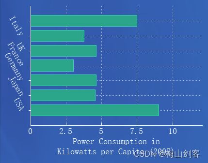
绘制结果如下:
纵向显示

需要横向显示,将坐标轴替换即可。
    QCPAxis *keyAxis = ui->customPlot->yAxis;
    QCPAxis *valueAxis = ui->customPlot->xAxis;//横向显示
折线图的实现
同上:
首先需要一个QChartView来存放饼图,实现如下:拖拽一个QGraphicsView,并且将其提升为QChartView,
绘制折线图的是时候,需要添加QCustomplot文件,通过该库函数来绘制折线图。
QLinearGradient gradient1(0, 0, 0, 400);
    gradient1.setColorAt(0, QColor(25, 100, 200,70));
    ui->customPlot_3->setBackground(QBrush(gradient1));
    QVector<double> x(101), y(101); // initialize with entries 0..100
    for (int i=0; i<101; ++i)
    {
      x[i] = i/50.0 - 1; // x goes from -1 to 1
      y[i] = x[i]*x[i];  // let's plot a quadratic function
    }
    // create graph and assign data to it:
    //添加第一条曲线
    ui->customPlot_3->addGraph();
    ui->customPlot_3->graph(0)->setData(x, y);
    // give the axes some labels:
    ui->customPlot_3->xAxis->setLabel("x");
    ui->customPlot_3->yAxis->setLabel("y");
    // set axes ranges, so we see all data:
    ui->customPlot_3->xAxis->setRange(-10, 20);
    ui->customPlot_3->yAxis->setRange(0, 3);

    QVector<double> u(201), z(201); // initialize with entries 0..100
    z<<1<<2<<1<<2<<1<<2<<1<<2<<1<<2<<1<<2<<1<<2<<1<<2;
    u<<1<<2<<3<<4<<5<<6<<7<<8<<9<<10<<11<<12<<13<<14<<15<<16;
    //添加第二条曲线
    ui->customPlot_3->addGraph(); // blue line
    ui->customPlot_3->graph(1)->setData(u, z);
    ui->customPlot_3->graph(1)->setPen(QPen(QColor(40, 255, 255)));
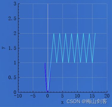
实现效果如下:
绘制柱状分组图
    //第三张图
    gradient.setColorAt(0.5, QColor(25, 100, 200,70));
    ui->customPlot->setBackground(QBrush(gradient));
    // create empty bar chart objects:
    QCPBars *regen = new QCPBars(ui->customPlot->xAxis, ui->customPlot->yAxis);
    QCPBars *nuclear = new QCPBars(ui->customPlot->xAxis, ui->customPlot->yAxis);
    QCPBars *fossil1 = new QCPBars(ui->customPlot->xAxis, ui->customPlot->yAxis);
    regen->setAntialiased(false); // gives more crisp, pixel aligned bar borders
    nuclear->setAntialiased(false);
    fossil1->setAntialiased(false);
    // set names and colors:
    fossil1->setName("Fossil fuels");
    fossil1->setPen(QPen(QColor(111, 9, 176).lighter(170)));
    fossil1->setBrush(QColor(111, 9, 176));
    nuclear->setName("Nuclear");
    nuclear->setPen(QPen(QColor(250, 170, 20).lighter(150)));
    nuclear->setBrush(QColor(250, 170, 20));
    regen->setName("Regenerative");
    regen->setPen(QPen(QColor(0, 168, 140).lighter(130)));
    regen->setBrush(QColor(0, 168, 140));

    // prepare x axis with country labels:
    QVector<double> ticks1;
    QVector<QString> labels1;
    ticks1 << 1 << 2 << 3 << 4 << 5 << 6 << 7;
    labels1 << "USA" << "Japan" << "Germany" << "France" << "UK" << "Italy" << "Canada";
    QSharedPointer<QCPAxisTickerText> textTicker1(new QCPAxisTickerText);
    textTicker1->addTicks(ticks1, labels1);
    ui->customPlot->xAxis->setTicker(textTicker1);
    ui->customPlot->xAxis->setTickLabelRotation(60);
    ui->customPlot->xAxis->setSubTicks(false);
    ui->customPlot->xAxis->setTickLength(0, 4);
    ui->customPlot->xAxis->setRange(0, 8);
    ui->customPlot->xAxis->setBasePen(QPen(Qt::white));
    ui->customPlot->xAxis->setTickPen(QPen(Qt::white));
    ui->customPlot->xAxis->grid()->setVisible(true);
    ui->customPlot->xAxis->grid()->setPen(QPen(QColor(130, 130, 130), 0, Qt::DotLine));
    ui->customPlot->xAxis->setTickLabelColor(Qt::white);
    ui->customPlot->xAxis->setLabelColor(Qt::white);
    // prepare y axis:
    ui->customPlot->yAxis->setRange(0, 12.1);
    ui->customPlot->yAxis->setPadding(5); // a bit more space to the left border
    ui->customPlot->yAxis->setLabel("Power Consumption in\nKilowatts per Capita (2007)");
    ui->customPlot->yAxis->setBasePen(QPen(Qt::white));
    ui->customPlot->yAxis->setTickPen(QPen(Qt::white));
    ui->customPlot->yAxis->setSubTickPen(QPen(Qt::white));
   // ui->customPlot->yAxis->grid()->setSubGridVisible(true);
    ui->customPlot->yAxis->setTickLabelColor(Qt::white);
    ui->customPlot->yAxis->setLabelColor(Qt::white);
    ui->customPlot->yAxis->grid()->setPen(QPen(QColor(130, 130, 130), 0, Qt::SolidLine));
    ui->customPlot->yAxis->grid()->setSubGridPen(QPen(QColor(130, 130, 130), 0, Qt::DotLine));
    // Add data:
    QVector<double> fossil1Data, nuclearData, regenData;
    fossil1Data  << 0.86*10.5 << 0.83*5.5 << 0.84*5.5 << 0.52*5.8 << 0.89*5.2 << 0.90*4.2 << 0.67*11.2;
    nuclearData << 0.08*10.5 << 0.12*5.5 << 0.12*5.5 << 0.40*5.8 << 0.09*5.2 << 0.00*4.2 << 0.07*11.2;
    regenData   << 0.06*10.5 << 0.05*5.5 << 0.04*5.5 << 0.06*5.8 << 0.02*5.2 << 0.07*4.2 << 0.25*11.2;
    fossil1->setData(ticks, fossilData);
    nuclear->setData(ticks, nuclearData);
    regen->setData(ticks, regenData);
在上面的代码中添加如下代码,实现柱状图的分组。
 //柱状分组图
    QCPBarsGroup *group = new QCPBarsGroup(ui->customPlot);
    QList<QCPBars*> bars;
    bars<<fossil1<<nuclear<<regen;
    foreach (QCPBars *bar, bars) {
    // 设置柱状图的宽度类型为以key坐标轴计算宽度的大小,其实默认就是这种方式
        bar->setWidthType(QCPBars::wtPlotCoords);
        bar->setWidth(bar->width() / bars.size()); // 设置柱状图的宽度大小
        group->append(bar);  // 将柱状图加入柱状图分组中
    }
    group->setSpacingType(QCPBarsGroup::stAbsolute);  // 设置组内柱状图的间距,按像素
    group->setSpacing(2);     // 设置较小的间距值,这样看起来更紧凑
    ui->customPlot->setInteractions(QCP::iRangeDrag | QCP::iRangeZoom| QCP::iSelectPlottables);
实现效果如下:
