CoordinatorLayout(一)—— 基本使用
一、CoordinatorLayout
CoordinatorLayout 是一个功能强大的 FrameLayout,它遵循 Material Design 风格,可以用作一个或多个子 View 间交互的容器。通过为 CoordinatorLayout 的子 View 设置 Behavior,可以实现不同的交互效果。通常会与 AppbarLayout、CollapsingToolbarLayout 结合使用。
Behavior
Behavior 是 CoordinatorLayout 的子 View 之间交互的一个插件,它指定了 CoordinatorLayout 的直接子 View(必须是直接的,间接的即使指定了也无效)在交互时的行为,如拖动、滑动、闪动或任何其它手势,并且是以非侵入式的方式实现这种交互。
指定 CoordinatorLayout 直接子 View 的 Behavior 通常有三种方式:通过代码绑定(LayoutParams 的 setBehavior())、通过 XML 绑定、通过注解自动绑定(在类上打 @CoordinatorLayout.DefaultBehavior(Behavior.class) 注解)。通常我们使用 XML 绑定的方式指定,如 app:layout_behavior=“@string/appbar_scrolling_view_behavior” 其实就是指定了对应 AppBarLayout.ScrollingViewBehavior 这个类的行为。
二、AppBarLayout
AppBarLayout 是 LinearLayout 的子类,必须在它的子 View 上设置 app:layout_scrollFlags 属性或者是在代码中调用 setScrollFlags() 设置这个属性。该属性有 7 个值:noScroll(0x0)、scroll(0x1)、enterAlwaysCollapsed(0x2)、enterAlways(0x4)、exitUntilCollapsed(0x8)、snap(0x10) 和 snapMargins(0x20),下面我们分别介绍这几个值的效果。
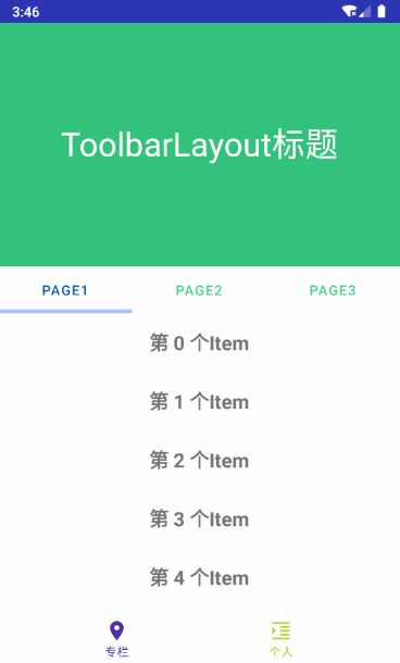
先介绍一下布局情况:

布局代码:
<androidx.coordinatorlayout.widget.CoordinatorLayout xmlns:android="http://schemas.android.com/apk/res/android"
    xmlns:app="http://schemas.android.com/apk/res-auto"
    android:layout_width="match_parent"
    android:layout_height="match_parent">

    <com.google.android.material.appbar.AppBarLayout
        android:id="@+id/appbar"
        android:layout_width="match_parent"
        android:layout_height="wrap_content"
        android:theme="@style/ThemeOverlay.AppCompat.Dark.ActionBar">

        <com.google.android.material.appbar.CollapsingToolbarLayout
            android:id="@+id/collapsing_toolbar_layout"
            android:layout_width="match_parent"
            android:layout_height="wrap_content"
            app:contentScrim="@color/color_005eaa"
            app:expandedTitleGravity="center"
            app:layout_scrollFlags="scroll|exitUntilCollapsed|snap"
            app:statusBarScrim="@android:color/holo_red_dark"
            app:titleEnabled="true">

            <ImageView
                android:id="@+id/banner"
                android:layout_width="match_parent"
                android:layout_height="250dp"
                android:background="@color/color_31c27c" />

            <androidx.appcompat.widget.Toolbar
                android:id="@+id/toolbar"
                android:layout_width="match_parent"
                android:layout_height="?attr/actionBarSize"
                app:layout_collapseMode="parallax"
                app:layout_collapseParallaxMultiplier="0.1"
                app:popupTheme="@style/AppTheme.AppBarOverlay" />
        com.google.android.material.appbar.CollapsingToolbarLayout>
    com.google.android.material.appbar.AppBarLayout>

    <LinearLayout
        android:layout_width="match_parent"
        android:layout_height="match_parent"
        android:orientation="vertical"
        app:layout_behavior="@string/appbar_scrolling_view_behavior">

        <com.google.android.material.tabs.TabLayout
            android:id="@+id/tab"
            android:layout_width="match_parent"
            android:layout_height="wrap_content"
            app:tabIndicatorColor="@color/colorAccent"
            app:tabIndicatorHeight="4dp"
            app:tabSelectedTextColor="@color/color_005eaa"
            app:tabTextColor="@color/color_43d28d" />

        <androidx.viewpager.widget.ViewPager
            android:id="@+id/view_pager"
            android:layout_width="match_parent"
            android:layout_height="match_parent" />
    LinearLayout>

    <com.google.android.material.bottomnavigation.BottomNavigationView
        android:id="@+id/bottom_nav"
        android:layout_width="match_parent"
        android:layout_height="?attr/actionBarSize"
        android:layout_gravity="bottom"
        app:itemIconTint="@drawable/bottom_nav"
        app:itemTextColor="@drawable/bottom_nav"
        app:layout_behavior=".coordinator.BottomNavBehavior"
        app:menu="@menu/bottom_nav" />
androidx.coordinatorlayout.widget.CoordinatorLayout>
noScroll & scroll
noScroll:会禁用掉该 View 的滑动,这个 flag 不能与其它任何 flag 搭配使用。
scroll:所有想滚动出屏幕的 View 都需要设置这个 flag, 没有设置这个 flag 的 View 将被固定在屏幕顶部。
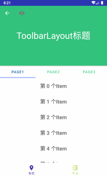
给 AppBarLayout 的子 View CollapsingToolbarLayout 设置了 app:layout_scrollFlags=“scroll”,才能使得其可以滚动出屏幕:

假如我们在 AppBarLayout 内部,CollapsingToolbarLayout 的下面增加一个 TextView,并且不给它设置 app:layout_scrollFlags 属性,那么它就不会滚动出屏幕,而是停留在屏幕顶端:

可以借助这一点实现 View 的吸顶效果。
enterAlways
让任意向下的滚动都会导致该 View 变为可见,启用快速“返回模式”(enter 理解为进入屏幕,只有在下滑的时候才能体现出完全不可见 -> 部分可见 -> 完全可见这个进入屏幕的过程,always 表示总是,合在一起就是只要下滑就可见的意思)。
给 CollapsingToolbarLayout 设置 app:layout_scrollFlags=“scroll|enterAlways”,效果如下:

在向下拉的过程中,是设置了 enterAlways 属性的 CollapsingToolbarLayout 先向下展示出来,完全展现之后,才继续向下拉 RecyclerView。跟前面的图对比一下,向下拉的时候是先下拉 RecyclerView,滑到顶之后再滑 CollapsingToolbarLayout。
可以理解为一个滑动优先级,没有设置 enterAlways 属性,按照默认顺序滑动(先 RecyclerView 再 CollapsingToolbarLayout),设置了 enterAlways 之后,CollapsingToolbarLayout 先开始滑动。
enterAlwaysCollapsed
enterAlwaysCollapsed 是 enterAlways 的附加状态,使用该属性需要先使用 enterAlways 作为前提。向下滑动时分为两个阶段,先将该 View 滑动到预先设定好的“折叠高度”(一个阈值),然后去滑动其它的 Scrolling View,当 Scrolling View 滑到尽头后,再回头向下滑动设置了 enterAlwaysCollapsed 的 View 到完全展现。效果图:

“折叠高度”如何设置?看过很多资料都说是 minHeight 这个值,本质上这句话应该也不算错吧,但是在做过测试和查看源码后发现这里有个陷阱需要注意。基于前面贴出的布局文件代码,给 CollapsingToolbarLayout 设置 android:minHeight 属性为各种值,你会发现向下滑时并没有效果变化,还是与上面的效果一样。但是把 CollapsingToolbarLayout 内的 Toolbar 移除掉,android:minHeight 设置的值才发挥作用:

造成这种现象的原因要看下源码,在 CollapsingToolbarLayout 内有 Toolbar 的情况下,先看它是如何找到 Toolbar 的:
#CollapsingToolbarLayout:

	private int toolbarId;
    @Nullable private Toolbar toolbar;
    @Nullable private View toolbarDirectChild;

	private void ensureToolbar() {
        if (!refreshToolbar) {
            return;
        }

        // First clear out the current Toolbar
        this.toolbar = null;
        toolbarDirectChild = null;

		// 如果在布局文件中给 CollapsingToolbarLayout 通过 app:toolbarId 属性指定了 Toolbar 的
		// 话,那么就通过 findViewById() 找到这个 Toolbar,并且找到它的直接父容器(是父,不是子)
        if (toolbarId != -1) {
            this.toolbar = findViewById(toolbarId);
            if (this.toolbar != null) {
                toolbarDirectChild = findDirectChild(this.toolbar);
            }
        }

		// 如果没有通过 app:toolbarId 指定 Toolbar,那么就遍历所有直接子 View 找出 Toolbar
        if (this.toolbar == null) {
            Toolbar toolbar = null;
            // 一层循环,只找直接子 View 中是否有 Toolbar
            for (int i = 0, count = getChildCount(); i < count; i++) {
                final View child = getChildAt(i);
                if (child instanceof Toolbar) {
                    toolbar = (Toolbar) child;
                    break;
                }
            }
            this.toolbar = toolbar;
        }

        updateDummyView();
        refreshToolbar = false;
    }

	/**
     * Returns the direct child of this layout, which itself is the ancestor of the given view.
     */
    @NonNull
    private View findDirectChild(@NonNull final View descendant) {
        View directChild = descendant;
        // 传进来一个 Toolbar,如果 Toolbar 的直接父容器就是 CollapsingToolbarLayout,不满足
        // p != this 这个条件,所以这种情况下 for 循环压根就没走,方法返回的就是传入的 Toolbar
        for (ViewParent p = descendant.getParent(); p != this && p != null; p = p.getParent()) {
            if (p instanceof View) {
                directChild = (View) p;
            }
        }
        return directChild;
    }
findDirectChild() 从名字上看似乎是找直接子 View,但实际上它是向上找参数 descendant 的父容器甚至祖先容器,如果没有 p != this && p != null 这个限制条件可能就直接得到 DecorView 了……那么在我们使用了 AppBarLayout -> CollapsingToolbarLayout -> Toolbar 这种布局的条件下,通过 findDirectChild() 得到的 toolbarDirectChild 还是那个 Toolbar(具体原因看上面注释)。
接下来看 onLayout():
	@Override
    protected void onLayout(boolean changed, int left, int top, int right, int bottom) {
        super.onLayout(changed, left, top, right, bottom);
        ......
        // Set our minimum height to enable proper AppBarLayout collapsing
        if (toolbar != null) {
        	// collapsingTitleEnabled 通过 app:titleEnabled 设置,默认为 true,
        	// collapsingTextHelper.getText() 在通过 CollapsingToolbarLayout 的
			// setTitle(title) 设置过之后就不为空了,例子中已经设置了。
            if (collapsingTitleEnabled && TextUtils.isEmpty(collapsingTextHelper.getText())) {
                // 如果 CollapsingToolbarLayout 还没设置 title,就用 Toolbar 上的设置
                setTitle(toolbar.getTitle());
            }

			// 给 CollapsingToolbarLayout 设置最小高度为 Toolbar/toolbarDirectChild 的高度
            if (toolbarDirectChild == null || toolbarDirectChild == this) {
                setMinimumHeight(getHeightWithMargins(toolbar));
            } else {
                setMinimumHeight(getHeightWithMargins(toolbarDirectChild));
            }
        }
    }
在 Toolbar 是 CollapsingToolbarLayout 的直接子 View 时,相当于将 CollapsingToolbarLayout 的最小高度设置成 Toolbar 的高度了,这就是为什么在有 Toolbar 的情况下,无论怎样给 CollapsingToolbarLayout 设置 minHeight 都无效的原因了。
exitUntilCollapsed
exit 与前面的 enter 相对,表示退出,其实就是向上滑动,一直(Until)滑动到折叠(Collapsed)时的高度,即向上滑动直到折叠。
被设置了 exitUntilCollapsed 的 View,当向上滑动退出屏幕时,滑动到“折叠高度”后,就停止滑动。“折叠高度”的含义与 enterAlwaysCollapsed 中的相同,如果设置了 minHeight 那么“折叠高度”就取 minHeight 的值,否则系统内部会自己计算出一个合适的高度。效果如下:
snap & snapMargins
当一个滚动事件结束,如果视图是部分可见的,那么它将被自动滚动到完全收缩或完全展开。例如,如果视图只有底部25%显示,它将折叠。相反,如果它的底部75%可见,那么它将完全展开。效果图:

注意观察 CollapsingToolbarLayout 在自动回弹时,鼠标并没有滑动的动作,处于静止状态,当鼠标松开后,它自动完成了“完全展现”、“完全隐藏”的操作。
snapMargins 则是 snap 的附加 flag,需要与 snap 一同使用,自动回弹到 marginTop 或 marginBottom 的位置。
监听器
除了以上属性,还可以给 AppBarLayout 设置监听器 AppBarLayout.OnOffsetChangedListener,根据 AppBarLayout 内部的位移变化设置不同的 UI 效果。比如在完全折叠的情况下才显示标题,否则就隐藏标题:
		mAppBarLayout.addOnOffsetChangedListener(new AppBarLayout.OnOffsetChangedListener() {
            @Override
            public void onOffsetChanged(AppBarLayout appBarLayout, int verticalOffset) {
                // verticalOffset 取值范围[0,-appBarLayout.getTotalScrollRange()],展开时取0,
                // 折叠时取 -appBarLayout.getTotalScrollRange()
                Log.d("Frank", "onOffsetChanged: " + verticalOffset + "/" + appBarLayout.getTotalScrollRange());
                if (Math.abs(verticalOffset) < appBarLayout.getTotalScrollRange()) {
                    mCollapsingToolbarLayout.setTitle("");
                } else {
                    mCollapsingToolbarLayout.setTitle("CollapsingToolbarLayout 标题");
                }
            }
        });
三、CollapsingToolbarLayout
CollapsingToolbarLayout 继承自 FrameLayout,它是作为 AppBarLayout 的直接子 View 被设计出来的,作用是提供一个可折叠的 Toolbar。给 CollapsingToolbarLayout 设置 layout_scrollFlags,它可以控制包含在 CollapsingToolbarLayout 中的控件在响应 layout_behavior 事件时作出相应的 scrollFlags 滚动事件(移出屏幕或固定在屏幕顶端)。这些通过上面的演示已经看的非常清楚了。
属性设置
除了上述功能之外,它还可以通过 app:contentScrim 设置折叠时工具栏布局的颜色(默认为 colorPrimary),通过 app:statusBarScrim 设置折叠时状态栏的颜色(默认为colorPrimaryDark)。通过 app:expandedTitleGravity、app:expandedTitleMargin 等属性设置扩展标题(就是那个 ToolbarLayout 标题)的位置。
折叠模式
此外,CollapsingToolbarLayout 的子布局有3种折叠模式,通过 app:layout_collapseMode 来设置:
- off:默认属性,布局将正常显示,无折叠行为。
- pin:CollapsingToolbarLayout 折叠后,此布局将固定在顶部。
- parallax:CollapsingToolbarLayout 折叠时,此布局也会有视差折叠效果。如果设置了此值,还可以使用 app:layout_collapseParallaxMultiplier 设置视差滚动因子,值为 0~1。
先演示 pin 的折叠效果,先调用 setDisplayHomeAsUpEnabled(true) 和 setLogo() 两个方法分别使能 Toolbar 的 navigation 并添加了 Logo 图片:
 app:layout_collapseMode="none" app:layout_collapseMode="none"
|
 app:layout_collapseMode="pin" app:layout_collapseMode="pin"
|
左图是为 Toolbar 添加了 navigation 和 logo 后的滑动效果,可以看到 Toolbar 上的图标在刚一开始向上滑动的时候就滑出了屏幕,而右侧给 Toolbar 设置了 app:layout_collapseMode=“pin” 的 Toolbar 在滑动初始阶段是固定在屏幕顶部的,直到整个 CollapsingToolbarLayout 滑出屏幕时它才跟随者滑出屏幕。
至于 parallax 的视差折叠效果,需要与 app:layout_collapseParallaxMultiplier 属性结合使用。我们给 CollapsingToolbarLayout 的子 ImageView 换一个背景图片,因为纯色背景无法看出视差效果。然后设置其 app:layout_collapseMode=“parallax”,app:layout_collapseParallaxMultiplier 分别为 1.0、0.5、0.0,效果如下:
 1.0 1.0
|
 0.5 0.5
|
 0.0 0.0
|
图1与其它两幅图片的差别显而易见,在手指向上滑动时,图1并没有跟随向上滑动,而另外两幅图是跟随向上滑动了。而图3的跟随滑动速度要比图2快(背景图消失时,图2是大概滑动到皮卡丘眼睛的位置,而图3中皮卡丘的眼睛已经滑出屏幕,说明图3更快一点)。
至于 app:layout_collapseParallaxMultiplier 设置的这个视差滚动因子具体是什么,可以看一下这篇文章 layout_collapseParallaxMultiplier的含义,以及里面贴的 StackOverflow 的帖子连接。提炼一下,就是我们需要将这个背景图片分成两部分看,上半部分是随着手指滑动,滑出屏幕顶端的那部分,其余的下半部分则是没有滚出屏幕但是被隐藏的部分。视差因子正是下半部分占整个图片高度的百分比,即:
视差因子 = 下半部分高度 / 整个背景图高度
所以在图1中我们设置 app:layout_collapseParallaxMultiplier=“1.0” 时,下半部分占满了整个背景图,并没有出现滚动。
以上关于视差因子的描述肯定还有不够准确的地方,如果想要完全准确的掌握它,可以去看看源码。在 CollapsingToolbarLayout 中的 onOffsetChanged() 中,偏移量发生变化时会对所有子 View 偏移量进行重新设置,当子 View 的 collapseMode 是 COLLAPSE_MODE_PARALLAX 时(就是设置了 app:layout_collapseMode=“parallax”),会通过 ViewOffsetHelper 的 setTopAndBottomOffset(offset) 对该子 View 的偏移量进行设置,其中参数 offset 就需要用视差因子进行计算。有兴趣的可以自己去看看源码,这里就不再展开了。
下一篇将介绍 CoordinatorLayout 的工作原理以及如何自定义 Behavior CoordinatorLayout(二)—— 原理分析与自定义 Behavior