【python海洋专题四十九】500hpa位势高度异常场
【python海洋专题四十九】500hpa位势高度异常场


# -*- coding: utf-8 -*-
# ---导入数据读取和处理的模块-------
import ast
import pandas as pd
from netCDF4 import Dataset
from pathlib import Path
import xarray as xr
from datetime import datetime
import numpy as np
# ------导入画图相关函数--------
import matplotlib.pyplot as plt
from matplotlib.font_manager import FontProperties
import matplotlib.ticker as ticker
from cartopy import mpl
import cartopy.crs as ccrs
import cartopy.feature as feature
from cartopy.mpl.ticker import LongitudeFormatter, LatitudeFormatter
from pylab import *
# -----导入颜色包---------
# -----导入颜色包---------
filename = 'D:\matlab_work\函数名为colormore的颜色索引表制作\R_color_txt\R_color_single\\gray80.txt'
file = open(filename, 'r')
lines = file.readlines()
file.close()
data1 = []
for line in lines:
data1.append(float(line.strip()))
gray = np.array(data1)
# ---read_data---
fu = xr.open_dataset(r'D:\pycharm_work\data\hgt.nc')
lat = fu['lat'].data
lon = fu['lon'].data
hgt = fu['hgt'].data
time = fu['time'].data # 1948-01-01--2021-07-01
# time2 = fu.variables['time'][:]
# # print(type(time2))
level = fu['level'].data
# # ----画全球范围的500hpa的hgt_ano-
# # --find level==500
le = np.where(level == 500)[0]
# # --find time==2000---
time1 = str(time)
# 去除换行
text = time1.replace('\n', '')
# 添加 ','
xs11 = re.sub('\s+', ',', text)
xs1 = xs11[1:-2]
xs2 = xs1.split(",")
time_new = []
for ii in range(0, len(xs2)):
t11 = xs2[ii]
str11 = "".join(t11)
time_new.append(str11[1:5])
time_new = np.array(time_new, dtype=int)
ti = np.where(time_new == 2020)[0]
## ---2000--500hpa--
hgt_500 = hgt[ti, le, :, :]
# print(hgt_500.ndim)
hgt_500_mean = nanmean(hgt_500, axis=0)
# ---- --- all -- time --mean--
hgt_all_mean = nanmean(hgt[:, le, :, :].squeeze(1), axis=0)
# hgt_all_mean.squeeze(0)
# hgt-500hpa-ano
hgt_500_ano = hgt_500_mean - hgt_all_mean
# meshgrid
X, Y = np.meshgrid(lon, lat)
# --plot---
scale = '50m'
plt.rcParams['font.sans-serif'] = ['Times New Roman'] # 设置整体的字体为Times New Roman
# 设置显示中文字体
mpl.rcParams["font.sans-serif"] = ["SimHei"]
mpl.rcParams["mathtext.fontset"] = 'cm' # 数学文字字体
matplotlib.rcParams['axes.unicode_minus']=False
mpl.rcParams["font.size"] = 12 # 字体大小
mpl.rcParams["axes.linewidth"] = 1 # 轴线边框粗细(默认的太粗了)
fig = plt.figure(dpi=300, figsize=(3, 2), facecolor='w', edgecolor='blue') # 设置一个画板,将其返还给fig
ax = fig.add_axes([0.05, 0.08, 0.92, 0.8], projection=ccrs.PlateCarree(central_longitude=180))
ax.set_extent([0, 360, -90, 90], crs=ccrs.PlateCarree()) # 设置显示范围
land = feature.NaturalEarthFeature('physical', 'land', scale, edgecolor='face',
facecolor=feature.COLORS['land'])
ax.add_feature(land, facecolor='0.8', alpha=0.2)
ax.add_feature(feature.COASTLINE.with_scale('10m'), lw=0.5, color=gray/256) # 添加海岸线:关键字lw设置线宽; lifestyle设置线型
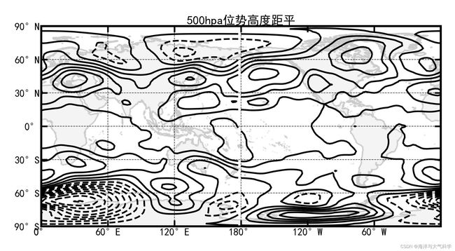
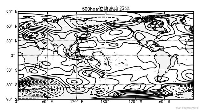
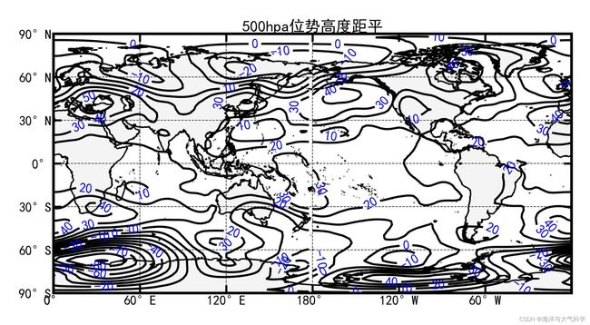
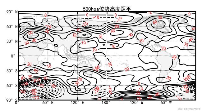
cs = ax.contour(X, Y, hgt_500_ano, levels=np.arange(-90, 90, 10), colors='k', linestyles='-',
linewidths=0.8, zorder=5)
plt.clabel(cs, inline=True, fontsize=5, colors='r')
# --------------添加标题----------------
ax.set_title('500hpa位势高度距平', loc="center", fontsize=6, pad=1)
# ------------------利用Formatter格式化刻度标签-----------------
ax.set_xticks(np.arange(0, 361, 60), crs=ccrs.PlateCarree()) # 添加经纬度
ax.set_xticklabels(np.arange(0, 361, 60), fontsize=4)
ax.set_yticks(np.arange(-90, 91, 30), crs=ccrs.PlateCarree())
ax.set_yticklabels(np.arange(-90, 91, 30), fontsize=4)
ax.xaxis.set_major_formatter(LongitudeFormatter())
ax.yaxis.set_major_formatter(LatitudeFormatter())
ax.tick_params(axis='x', top=True, which='major', direction='in', length=3, width=0.8, labelsize=5, pad=0.8,
color='k') # 刻度样式 pad代表标题离轴的远近
ax.tick_params(axis='y', right=True, which='major', direction='in', length=3, width=0.8, labelsize=5, pad=0.8,
color='k') # 更改刻度指向为朝内,颜色设置为蓝色
gl = ax.gridlines(crs=ccrs.PlateCarree(), draw_labels=False, xlocs=np.arange(0, 361, 60), ylocs=np.arange(-90, 91, 30),
linewidth=0.25, linestyle='--', color='k', alpha=0.8) # 添加网格线
gl.top_labels, gl.bottom_labels, gl.right_labels, gl.left_labels = False, False, False, False
plt.savefig('hgt_500_ano7.jpg', dpi=600, bbox_inches='tight', pad_inches=0.1) # 输出地图,并设置边框空白紧密
plt.show()
# -*- coding: utf-8 -*-
# ---导入数据读取和处理的模块-------
import ast

import pandas as pd
from netCDF4 import Dataset
from pathlib import Path
import xarray as xr
from datetime import datetime
import numpy as np
# ------导入画图相关函数--------
import matplotlib.pyplot as plt
from matplotlib.font_manager import FontProperties
import matplotlib.ticker as ticker
from cartopy import mpl
import cartopy.crs as ccrs
import cartopy.feature as feature
from cartopy.mpl.ticker import LongitudeFormatter, LatitudeFormatter
from pylab import *
# -----导入颜色包---------
filename = 'D:\matlab_work\函数名为colormore的颜色索引表制作\R_color_txt\R_color_single\\gray80.txt'
file = open(filename, 'r')
lines = file.readlines()
file.close()
data1 = []
for line in lines:
    data1.append(float(line.strip()))
gray = np.array(data1)

# ---read_data---
fu = xr.open_dataset(r'D:\pycharm_work\data\hgt.mon.mean(1).nc')
lat = fu['lat'].data
lon = fu['lon'].data
hgt = fu['hgt'].data
time = fu['time'].data  # 1948-01-01--2021-07-01
# time2 = fu.variables['time'][:]
# # print(type(time2))
level = fu['level'].data
# # ----画全球范围的500hpa的hgt_ano-
# # --find level==500
le = np.where(level == 500)[0]
# # --find time==2000---
time1 = str(time)
# 去除换行
text = time1.replace('\n', '')
# 添加 ','
xs11 = re.sub('\s+', ',', text)
xs1 = xs11[1:-2]
xs2 = xs1.split(",")
time_new = []
for ii in range(0, len(xs2)):
    t11 = xs2[ii]
    str11 = "".join(t11)
    time_new.append(str11[1:5])

time_new = np.array(time_new, dtype=int)
ti = np.where(time_new == 2020)[0]
## ---2000--500hpa--
hgt_500 = hgt[ti, le, :, :]
# print(hgt_500.ndim)
hgt_500_mean = nanmean(hgt_500, axis=0)
#  meshgrid
X, Y = np.meshgrid(lon, lat)
# --plot---
scale = '50m'
plt.rcParams['font.sans-serif'] = ['Times New Roman']  # 设置整体的字体为Times New Roman
# 设置显示中文字体
mpl.rcParams["font.sans-serif"] = ["SimHei"]
mpl.rcParams["mathtext.fontset"] = 'cm'  # 数学文字字体
mpl.rcParams["font.size"] = 12  # 字体大小
mpl.rcParams["axes.linewidth"] = 1  # 轴线边框粗细(默认的太粗了)
fig = plt.figure(dpi=300, figsize=(3, 3), edgecolor='blue')  # 设置一个画板,将其返还给fig
ax = fig.add_axes([0.05, 0.08, 0.92, 0.8], projection=ccrs.PlateCarree(central_longitude=180))
ax.set_extent([0, 360, -90, 90], crs=ccrs.PlateCarree())  # 设置显示范围
land = feature.NaturalEarthFeature('physical', 'land', scale, edgecolor='face',
                                   facecolor=feature.COLORS['land'])
ax.add_feature(land, facecolor='0.8', alpha=0.2)
ax.add_feature(feature.COASTLINE.with_scale('10m'), lw=0.5, color=gray/256)  # 添加海岸线:关键字lw设置线宽; lifestyle设置线型
cs = ax.contour(X, Y, hgt_500_mean, levels=np.arange(4900, 5870, 100), colors='k', linestyles='-',
                linewidths=0.5, zorder=5)
plt.clabel(cs, inline=True, fontsize=5, colors='k')
cs = ax.contour(X, Y, hgt_500_mean, levels=np.arange(5860, 5900, 10), colors='k', linestyles='-',
                linewidths=0.5, zorder=5)
plt.clabel(cs, inline=True,  fontsize=5, colors='k')
# --------------添加标题----------------
ax.set_title('500hpa位势高度场', loc="center", fontsize=6, pad=1)
# ------------------利用Formatter格式化刻度标签-----------------
ax.set_xticks(np.arange(0, 361, 60), crs=ccrs.PlateCarree())  # 添加经纬度
ax.set_xticklabels(np.arange(0, 361, 60), fontsize=4)
ax.set_yticks(np.arange(-90, 91, 30), crs=ccrs.PlateCarree())
ax.set_yticklabels(np.arange(-90, 91, 30), fontsize=4)
ax.xaxis.set_major_formatter(LongitudeFormatter())
ax.yaxis.set_major_formatter(LatitudeFormatter())
ax.tick_params(axis='x', top=True, which='major', direction='in', length=3, width=0.8, labelsize=5, pad=0.8,
               color='k')  # 刻度样式  pad代表标题离轴的远近
ax.tick_params(axis='y', right=True, which='major', direction='in', length=3, width=0.8, labelsize=5, pad=0.8,
               color='k')  # 更改刻度指向为朝内,颜色设置为蓝色
gl = ax.gridlines(crs=ccrs.PlateCarree(), draw_labels=False, xlocs=np.arange(0, 361, 60), ylocs=np.arange(-90, 91, 30),
                  linewidth=0.25, linestyle='--', color='k', alpha=0.8)  # 添加网格线
gl.top_labels, gl.bottom_labels, gl.right_labels, gl.left_labels = False, False, False, False
plt.savefig('hgt_5001.jpg', dpi=600, bbox_inches='tight', pad_inches=0.1)  # 输出地图,并设置边框空白紧密
plt.show()