Vue + Echarts(v5.版本)的简单组件封装(折线图、柱状图、散点图、饼/环形图、仪表盘、雷达图)
项目中展示图表的地方很多,不想每次都写一长串的 options配置,就整合了一下常用的配置项,简单封装了一下,也能保证整个系统的图表风格统一,需要调整样式的时候也不用改很多地方
2022-11-07:legendData 改为数组,以支持多 legend的场景;添加 dataZoom组件
一、效果图(数据不足,示例图可能比较秃)
| 折线图 | 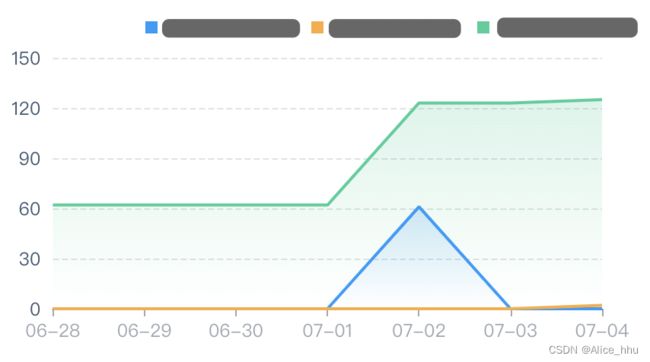 |
柱状图 | 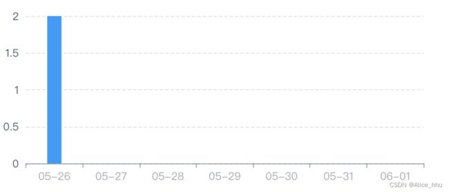 |
| 散点图 | 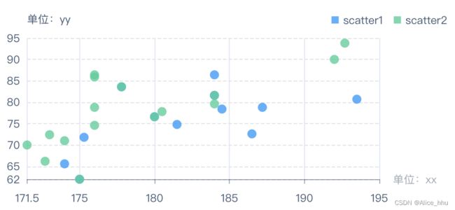 |
饼图 |  |
| 环形图 | 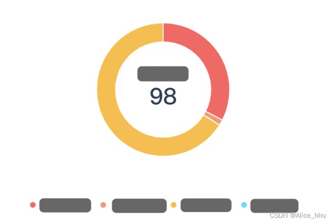 |
嵌套环形图 |  |
| 仪表盘 |  |
雷达图 | 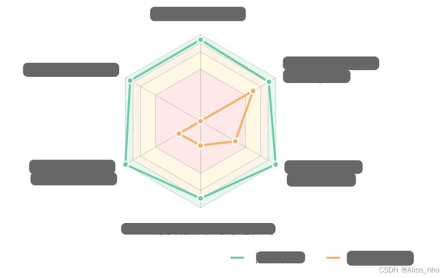 |
二、代码
文件目录结构

* mixin文件:Chart.js
/*
  echarts组件封装
  id:元素id ,唯一
  chartStyle:容器样式
  colors:颜色
  legendData:图例
  seriesData:所需数据
  xData:X轴显示的数据
  yData:Y轴显示的数据
*/
export default {
  props: {
    // 此处id切记不可传重复
    id: {
      type: String,
      default: '',
    },
    // 样式
    chartStyle: {
      type: Object,
      default: () => {},
    },
    // 标题
    titleData: {
      type: Object,
      default: () => {},
    },
    // 副标题
    subtitleData: {
      type: Object,
      default: () => {},
    },
    // 网格
    gridData: {
      type: Object,
      default: () => {},
    },
    // 颜色
    colors: {
      type: Array,
      default: () => [],
    },
    // 提示框
    tooltipData: {
      type: Object,
      default: () => {},
    },
    // 图例
    legendData: {
      type: Array,
      default: () => [],
    },
    // series
    seriesData: {
      type: Array,
      default: () => [],
    },
    // x 轴
    xData: {
      type: Array,
      default: () => [],
    },
    // x 轴样式
    xStyle: {
      type: Object,
      default: () => {},
    },
    // y 轴
    yData: {
      type: Array,
      default: () => [],
    },
    // 缩放
    dataZoomData: {
      type: Array,
      default: () => [],
    },
    // 是否有点击事件
    clickable: {
      type: Boolean,
      default: false,
    },
  },
  data() {
    return {
      chartsDom: null,
      option: null,
      resizeTimer: null,
      tooltipConfig: {
        backgroundColor: 'rgba(0, 0, 0, 0.7)',
        borderColor: '#333',
        // borderRadius: 10,
        borderWidth: 0,
        shadow: false,
        textStyle: {
          color: '#FFFFFF',
          fontSize: 12,
        },
      },
    };
  },
  watch: {
    // 监听 series变化
    seriesData: {
      handler(newVal) {
        if (newVal) {
          this.$nextTick(() => {
            if (this.chartsDom) {
              // 先销毁,释放内存
              this.chartsDom.dispose();
            }
            this.init();
          });
        }
      },
      deep: true, // 对象内部属性的监听,关键。
    },
  },
  mounted() {
    // 部分暂时隐藏的 chart图,在显示的时候监听不到 seriesData的变化,需由 mounted来调用
    this.$nextTick(() => {
      if (this.chartsDom) {
        // 先销毁,释放内存
        this.chartsDom.dispose();
      }
      this.init();
    });
    window.addEventListener('resize', this.resize);
  },
  beforeDestroy() {
    // 解除监听
    window.removeEventListener('resize', this.resize);
    // 销毁 echart实例
    if (this.chartsDom) {
      this.chartsDom.dispose();
    }
  },
  methods: {
    // 尺寸变化自适应
    resize() {
      if (this.resizeTimer) { clearTimeout(this.resizeTimer); }
      this.resizeTimer = setTimeout(() => { this.chartsDom.resize(); }, 200);
    },
  },
};
>> 折线图:LineChart.vue
<template>
  <div :id="id" :style="chartStyle"></div>
</template>

<script>
import Chart from './mixins/Chart';

export default {
  mixins: [Chart],
  props: {},
  data() {
    return {
    };
  },
  methods: {
    init() {
      this.chartsDom = this.$echarts.init(document.getElementById(this.id));
      // 每次数据更新都清空一次实例,以便页面重新渲染,否则更新数据没有变化,页面看起来像没动
      document.getElementById(this.id).removeAttribute('_echarts_instance_');
      this.option = {
        grid: {
          left: 0,
          right: 20, // 设置 0的话最后一个x轴标签会被截断
          top: 35',
          bottom: (this.dataZoomData && this.dataZoomData.length) ? 50 : 0,
          containLabel: true,
          ...this.gridData,
        },
        tooltip: {
          trigger: 'axis',
          ...this.tooltipConfig,
          ...this.tooltipData,
        },
        legend: this.legendData.map((v) => ({
          top: 0,
          right: 0,
          icon: 'rect',
          itemWidth: 8,
          itemHeight: 8,
          itemGap: 12,
          textStyle: {
            fontSize: 12,
            color: '#455A74',
          },
          ...v,
        })),
        dataZoom: [...this.dataZoomData],
        color: this.colors,
        xAxis: [
          {
            type: 'category',
            boundaryGap: false,
            axisTick: { // 刻度点
              lineStyle: {
                color: 'rgba(45, 62, 83, 0.45)',
              },
            },
            data: this.xData,
            axisLabel: {
              interval: 'auto',
              rotate: 0, // 旋转角度
              margin: 12, // 标签文字到轴的距离
              align: 'center',
              lineHeight: 17,
              color: '#455A74',
            },
            axisLine: {
              lineStyle: {
                color: 'rgba(45, 62, 83, 0.45)',
              },
            },
            ...this.xStyle,
          },
        ],
        yAxis: this.yData.length === 0 ? [] : this.yData.map((item) => (
          {
            type: 'value',
            nameTextStyle: {
              color: '#455A74',
              align: 'left',
            },
            // min: 'dataMin',
            splitLine: {
              show: true,
              lineStyle: {
                color: 'rgba(45, 62, 83, 0.15)',
                type: 'dashed',
              },
            },
            axisLine: {
              show: false,
            },
            axisTick: false,
            axisLabel: {
              color: '#455A74',
              // margin: 12,
            },
            ...item,
          }
        )),
        series: this.seriesData.map((item, index) => (
          {
            type: 'line',
            showSymbol: false,
            areaStyle: {
              color: {
                type: 'linear',
                x: 0,
                y: 0,
                x2: 0,
                y2: 1,
                colorStops: this.getColorStopsByColor(this.colors[index]),
                global: false, // 缺省为 false
              },
            },
            ...item,
          }
        )),
      };

      this.chartsDom.setOption(this.option);

      // 绑定点击事件
      this.chartsDom.on('click', (param) => {
        this.$emit('chartClick', param);
      });
    },
    getColorStopsByColor(color) {
      let color0;
      let color1;
      switch (color) {
        case '#169BFA':
          color0 = 'rgba(22, 155, 250, 0.3)';
          color1 = 'rgba(22, 155, 250, 0)';
          break;
        case '#31CF9A':
          color0 = 'rgba(49, 207, 154, 0.3)';
          color1 = 'rgba(49, 207, 154, 0)';
          break;
        case '#FBAD3B':
          color0 = 'rgba(251, 173, 59, 0.3)';
          color1 = 'rgba(251, 173, 59, 0)';
          break;
        default:
          color0 = 'rgba(255, 255, 255, 0)';
          color1 = 'rgba(255, 255, 255, 0)';
          break;
      }
      const colorStops = [{
        offset: 0, color: color0, // 0% 处的颜色
      }, {
        offset: 1, color: color1, // 100% 处的颜色
      }];
      return colorStops;
    },
  },
};
</script>
【使用示例】
<template>
  <LineChart id="myLine" v-bind="myLine" />
</template>

<script>
import LineChart from '@/components/Charts/LineChart';

export default {
  components: { LineChart },
  data() {
    return {
    	myLine: {
	        chartStyle: {
	          height: '220px',
	        },
	        colors: ['#169BFA', '#FBAD3B', '#31CF9A'],
	        legendData: [{ data: ['line1', 'line2', 'line3'] }],
	        xData: ['2022-07-01 10:00', '2022-07-01 10:30', '2022-07-01 11:00', '2022-07-01 11:30'],
	        xStyle: {
	        	axisLabel: {
			        formatter: (params) => params.substr(5),
		      	},
	        },
	        yData: [{ name: '单位:xx' }],
	        seriesData: [
	          { name: 'line1', data: [20, 50, 70, 100] },
	          { name: 'line2', data: [30, 60, 90, 40] },
	          { name: 'line3', data: [80, 40, 70, 20] },
	        ],
	      },
    };
  },
</script>
>> 柱状图:BarChart.vue(其实这里的柱状图和折线图都是二维坐标图,很多配置都是相似的,可以合并)
<template>
  <div :id="id" :style="chartStyle"></div>
</template>

<script>
import Chart from './mixins/Chart';

export default {
  mixins: [Chart],
  props: {},
  data() {
    return {
    };
  },
  methods: {
    init() {
      this.chartsDom = this.$echarts.init(document.getElementById(this.id));
      // 每次数据更新都清空一次实例,以便页面重新渲染,否则更新数据没有变化,页面看起来像没动
      document.getElementById(this.id).removeAttribute('_echarts_instance_');
      this.option = {
        grid: {
          left: 0,
          right: 20,
          top: 35,
          bottom: (this.dataZoomData && this.dataZoomData.length) ? 50 : 0,
          containLabel: true,
          ...this.gridData,
        },
        tooltip: {
          trigger: 'axis',
          ...this.tooltipConfig,
          ...this.tooltipData,
        },
        legend: this.legendData.map((v) => ({
          top: 0,
          right: 0,
          icon: 'rect',
          itemWidth: 8,
          itemHeight: 8,
          itemGap: 12,
          textStyle: {
            fontSize: 12,
            color: '#455A74',
          },
          ...v,
        })),
        dataZoom: [...this.dataZoomData],
        color: this.colors,
        xAxis: [
          {
            type: 'category',
            boundaryGap: true,
            axisTick: { // 刻度点
              lineStyle: {
                color: 'rgba(45, 62, 83, 0.45)',
              },
            },
            data: this.xData,
            axisLabel: {
              interval: 'auto',
              rotate: 0, // 旋转角度
              margin: 12, // 标签文字到轴的距离
              align: 'center',
              lineHeight: 17,
              color: '#455A74',
            },
            axisLine: {
              lineStyle: {
                color: 'rgba(45, 62, 83, 0.45)',
              },
            },
            ...this.xStyle,
          },
        ],
        yAxis: this.yData.length === 0 ? [] : this.yData.map((item) => (
          {
            type: 'value',
            nameTextStyle: {
              color: '#455A74',
            },
            splitLine: {
              show: true,
              lineStyle: {
                color: 'rgba(45, 62, 83, 0.15)',
                type: 'dashed',
              },
            },
            axisLine: {
              show: false,
            },
            axisTick: false,
            axisLabel: {
              color: '#455A74',
              // margin: 12,
            },
            ...item,
          }
        )),
        series: this.seriesData.map((item) => (
          {
            barWidth: 16,
            type: 'bar',
            ...item,
          }
        )),
      };

      this.chartsDom.setOption(this.option);

      // 绑定点击事件
      this.chartsDom.on('click', (param) => {
        this.$emit('chartClick', param);
      });
    },
  },
};
</script>
【使用示例】
(与折线图类似)
>> 散点图:ScatterChart.vue(其实与折线图、柱状图的配置差不多,只是数据格式略有差异)
<template>
  <div :id="id" :style="chartStyle"></div>
</template>

<script>
import Chart from './mixins/Chart';

export default {
  mixins: [Chart],
  props: {},
  data() {
    return {
    };
  },
  methods: {
    init() {
      this.chartsDom = this.$echarts.init(document.getElementById(this.id));
      // 每次数据更新都清空一次实例,以便页面重新渲染,否则更新数据没有变化,页面看起来像没动
      document.getElementById(this.id).removeAttribute('_echarts_instance_');
      this.option = {
        grid: {
          left: 0,
          right: 80, // 设置 0的话最后一个x轴标签会被截断
          top: 35,
          bottom: 0,
          containLabel: true,
          ...this.gridData,
        },
        tooltip: {
          trigger: 'axis',
          ...this.tooltipConfig,
          ...this.tooltipData,
        },
        legend: this.legendData.map((v) => ({
          top: 0,
          right: 0,
          icon: 'rect',
          itemWidth: 8,
          itemHeight: 8,
          itemGap: 12,
          textStyle: {
            fontSize: 12,
            color: '#455A74',
          },
          ...v,
        })),
        color: this.colors,
        xAxis: [
          {
            type: 'value',
            min: 'dataMin',
            boundaryGap: false,
            axisTick: { // 刻度点
              lineStyle: {
                color: 'rgba(45, 62, 83, 0.45)',
              },
            },
            axisLabel: {
              interval: 'auto',
              rotate: 0, // 旋转角度
              margin: 12, // 标签文字到轴的距离
              align: 'center',
              lineHeight: 17,
              color: '#455A74',
            },
            axisLine: {
              lineStyle: {
                color: 'rgba(45, 62, 83, 0.45)',
              },
            },
            ...this.xStyle,
          },
        ],
        yAxis: this.yData.length === 0 ? [] : this.yData.map((item) => (
          {
            type: 'value',
            min: 'dataMin',
            nameTextStyle: {
              color: '#455A74',
              align: 'left',
            },
            splitLine: {
              show: true,
              lineStyle: {
                color: 'rgba(45, 62, 83, 0.15)',
                type: 'dashed',
              },
            },
            axisLine: {
              show: false,
            },
            axisTick: false,
            axisLabel: {
              color: '#455A74',
            },
            ...item,
          }
        )),
        series: this.seriesData.map((item, index) => (
          {
            type: 'scatter',
            ...item,
          }
        )),
      };

      this.chartsDom.setOption(this.option);

      // 绑定点击事件
      this.chartsDom.on('click', (param) => {
        this.$emit('chartClick', param);
      });
    },
  },
};
</script>
【使用示例】
<template>
  <ScatterChart id="myScatter" v-bind="myScatter" />
</template>

<script>
import ScatterChart from '@/components/Charts/ScatterChart';

export default {
  components: { ScatterChart },
  data() {
    return {
    	myScatter: {
	        chartStyle: {
	          height: '220px',
	        },
	        colors: ['#169BFA', '#31CF9A'],
	        legendData: [{ data: ['scatter1', 'scatte2'] }],
	        xStyle: { name: '单位:xx' },
	        yData: [{ name: '单位:yy' }],
	        seriesData: [
	          {
	          	name: 'scatter1',
	          	data: [
	              [174, 65.6],
	              [175.3, 71.8],
	              [193.5, 80.7],
	              [186.5, 72.6],
	              [187.2, 78.8],
	              [181.5, 74.8],
	              [184, 86.4],
	              [184.5, 78.4],
	              [175, 62],
	              [184, 81.6],
	              [180, 76.6],
	              [177.8, 83.6],
	          	],
	          },
	          {
	          	name: 'scatter2',
	          	data: [
	              [175, 62],
	              [184, 81.6],
	              [180, 76.6],
	              [177.8, 83.6],
	              [192, 90],
	              [176, 74.6],
	              [174, 71],
	              [184, 79.6],
	              [192.7, 93.8],
	              [171.5, 70],
	              [173, 72.4],
	              [176, 85.9],
	              [176, 78.8],
	              [180.5, 77.8],
	              [172.7, 66.2],
	              [176, 86.4],
	          	],
	          },
	        ],
	      },
    };
  },
</script>
>> 饼图/环形图/嵌套环形图:PieChart.vue(环形图都是饼图演变来的)
<template>
  <div :id="id" :style="chartStyle"></div>
</template>

<script>
import Chart from './mixins/Chart';

export default {
  mixins: [Chart],
  props: {
    // 提示框
    tooltipData: {
      type: Object,
      default() {
        return {
          formatter: '{b}: {c} ({d}%)',
        };
      },
    },
    // 是否是环形
    isRing: {
      type: Boolean,
      default: false,
    },
    // 是否显示延长线标签
    hasPieLabel: {
      type: Boolean,
      default: true,
    },
  },
  data() {
    return {
    };
  },
  methods: {
    init() {
      this.chartsDom = this.$echarts.init(document.getElementById(this.id));
      // 每次数据更新都清空一次实例,以便页面重新渲染,否则更新数据没有变化,页面看起来像没动
      document.getElementById(this.id).removeAttribute('_echarts_instance_');
      this.option = {
        title: {
          subtextStyle: {
            color: '#2D3E53',
            fontSize: 24,
            lineHeight: 32,
            fontWeight: 500,
          },
          textStyle: {
            color: '#7B93A7',
            fontSize: 12,
            lineHeight: 16,
          },
          left: 'center',
          top: 60,
          itemGap: 2,
          ...this.titleData,
        },
        grid: {
          ...this.gridData,
        },
        tooltip: {
          ...this.tooltipConfig,
          ...this.tooltipData,
        },
        legend: this.legendData.map((v) => ({
          top: 0,
          right: 0,
          icon: 'rect',
          itemWidth: 8,
          itemHeight: 8,
          itemGap: 12,
          textStyle: {
            fontSize: 12,
            color: '#455A74',
          },
          ...v,
        })),
        color: this.colors,
        series: [],
      };
      // 处理 series
      this.seriesData.forEach((item) => {
        const { data = [] } = item;
        const dataTemp = data.map((v) => ({ ...v, value: v.value || '' }));
        const serie = {
          type: 'pie',
          minAngle: 5,
          radius: this.isRing ? ['50', '70'] : ['0', '70'],
          center: ['50%', '92'],
          label: {
            show: this.hasPieLabel,
            formatter: '{b} {c} ({d}%)',
            fontSize: 12,
            color: '#455A74',
          },
          itemStyle: {
            borderColor: '#FFFFFF',
            borderWidth: 1,
          },
          ...item,
          data: dataTemp,
        };
        this.option.series.push(serie);
      });
      this.chartsDom.setOption(this.option);
    },
  },
};
</script>
【使用示例】
- 饼图
<template>
  <PieChart id="myPie" v-bind="myPie" />
</template>

<script>
import PieChart from '@/components/Charts/PieChart';

export default {
  components: { PieChart },
  data() {
    return {
    	myPie: {
	        chartStyle: {
	          height: '220px',
	        },
	        colors: ['#169BFA', '#FBAD3B', '#31CF9A'],
	        legendData: [{ data: ['pie1', 'pie2', 'pie3'] }],
	        seriesData: [{
	          data: [
	            { name: 'pie1', value: 5 },
	            { name: 'pie2', value: 10 },
	            { name: 'pie3', value: 15 },
	          ],
	        }],
	     },
    };
  },
</script>
- 环形图
<template>
  <PieChart id="myPie" v-bind="myPie" />
</template>

<script>
import PieChart from '@/components/Charts/PieChart';

export default {
  components: { PieChart },
  data() {
    return {
    	myPie: {
    		isRing: true,
	        chartStyle: {
	          height: '220px',
	        },
	        titleData: {
	          subtext: '100',
	          text: '标题',
	        },
	        colors: ['#169BFA', '#FBAD3B', '#31CF9A'],
	        legendData: [{ data: ['pie1', 'pie2', 'pie3'] }],
	        seriesData: [{
	          data: [
	            { name: 'pie1', value: 5 },
	            { name: 'pie2', value: 10 },
	            { name: 'pie3', value: 15 },
	          ],
	        }],
        	hasPieLabel: false,
	      },
    };
  },
</script>
- 嵌套环形图
<template>
  <PieChart id="myPie" v-bind="myPie" />
</template>

<script>
import PieChart from '@/components/Charts/PieChart';

export default {
  components: { PieChart },
  data() {
    return {
    	myPie: {
    		isRing: true,
	        chartStyle: {
	          height: '220px',
	        },
	        colors: ['#169BFA', '#FBAD3B', '#31CF9A'],
	        legendData: [{ data: ['pie1', 'pie2', 'pie3'] }],
	        seriesData: [
	          { name: 'pie1', radius: [45, 50], center: ['50%', 60],
	          	data: [
	          		{ name: 'pie1', value: 60 },
	          		{ value: 100 - 60, itemStyle: { color: '#F6F6F6' }, emphasis: { disabled: true } }
	          	],
	          },
	          { name: 'pie2', radius: [35, 40], center: ['50%', 60],
	          	data: [
	          		{ name: 'pie1', value: 40 },
	          		{ value: 100 - 40, itemStyle: { color: '#F6F6F6' }, emphasis: { disabled: true } }
	          	],
	          },
	          { name: 'pie3', radius: [25, 30], center: ['50%', 60],
	          	data: [
	          		{ name: 'pie1', value: 80 },
	          		{ value: 100 - 80, itemStyle: { color: '#F6F6F6' }, emphasis: { disabled: true } }
	          	],
	          },
	        ],
	        hasPieLabel: false,
	      },
    };
  },
</script>
>> 自定义仪表盘:GaugeChart.vue(如果是v4.版本的 Echarts,这种样式用原始的 gauge做不出来,需要加极坐标之类的做改造,见下)
<template>
  <div :id="id" :style="chartStyle"></div>
</template>

<script>
import Chart from './mixins/Chart';

export default {
  mixins: [Chart],
  props: {
    // 进度条
    progressData: {
      type: Object,
      dedault: () => {},
    },
  },
  data() {
    return {
    };
  },
  methods: {
    init() {
      this.chartsDom = this.$echarts.init(document.getElementById(this.id));
      // 每次数据更新都清空一次实例,以便页面重新渲染,否则更新数据没有变化,页面看起来像没动
      document.getElementById(this.id).removeAttribute('_echarts_instance_');
      this.option = {
        series: [
          {
            type: 'gauge',
            center: ['50%', '60%'],
            progress: {
              show: true,
              width: 10,
              roundCap: true,
              itemStyle: {
                // color: 'red' // 进度条颜色
              },
              ...this.progressData,
            },
            axisLine: {
              roundCap: true,
              lineStyle: {
                width: 10,
                color: [[1, '#EBEBEB']],
              },
            },
            splitNumber: 4, // 分割段数
            splitLine: { // 分割线样式
              distance: -24,
              length: 5,
              lineStyle: {
                width: 2,
                color: '#A0A0A0',
              },
            },
            axisTick: { // 刻度样式
              distance: -21,
              length: 3,
              lineStyle: {
                width: 1,
                color: '#A0A0A0',
              },
            },
            axisLabel: { // 刻度文字样式
              distance: -10,
              color: '#455A74',
              fontSize: 10,
            },
            anchor: { // 指针固定点
              show: false,
            },
            pointer: { // 指针
              show: false,
            },
            title: { // 文字样式
              fontSize: 18,
              offsetCenter: [0, '80%'],
              // color: 'red'
              ...this.titleData,
            },
            detail: { // 数值样式
              valueAnimation: true,
              fontSize: 24,
              offsetCenter: [0, 0],
              formatter: (value) => `${value}%`,
            },
            data: this.seriesData.map((item) => (
              {
                ...item,
              }
            )),
          },
        ],
      };
      this.chartsDom.setOption(this.option);
    },
  },
};
</script>
【使用示例】
<template>
  <GaugeChart id="myGauge" v-bind="myGauge" />
</template>

<script>
import GaugeChart from '@/components/Charts/GaugeChart';

export default {
  components: { GaugeChart },
  data() {
    return {
    	myGauge: {
	        chartStyle: {
	          width: '180px',
	          height: '180px',
	        },
	        progressData: {
	          itemStyle: {
	            color: '#59D38C',
	          }
	        },
			seriesData: [{
	          name: '优',
	          value: 80,
	        }],
	      },
    };
  },
</script>
v4.版本实现
<template>
  <div :id="id" :style="chartStyle"></div>
</template>

<script>
import Chart from './mixins/Chart'

export default {
  mixins: [Chart],
  props: {
    // 区间颜色
    grade: {
      type: Object,
      default () {
        return {}
      }
    }
  },
  methods: {
    init () {
      this.chartsDom = this.$echarts.init(document.getElementById(this.id))
      // 每次数据更新都清空一次实例,以便页面重新渲染,否则更新数据没有变化,页面看起来像没动
      document.getElementById(this.id).removeAttribute('_echarts_instance_')
      const seriesValue = (this.seriesData && this.seriesData.length) ? this.seriesData[0]?.data : 0
      const option = {
        tooltip: {
          ...this.tooltipConfig,
          ...this.tooltipData
        },
        angleAxis: {
          show: false,
          max: (100 * 360) / 270, // -45度到225度,二者偏移值是270度除360度
          type: 'value',
          startAngle: 225 // 极坐标初始角度
        },
        barMaxWidth: 8, // 圆环宽度
        radiusAxis: {
          show: false,
          type: 'category'
        },
        // 极坐标系 圆环位置和大小
        polar: {
          center: ['50%', 105],
          radius: 130
        },
        series: [
          // 下层圆环,显示最大值 // 写在上层配置前,如果写在后面,需要设置 z属性(相当于z-index)来区分层级
          {
            type: 'bar',
            name: '当日负荷均值',
            data: [
              {
                value: 100, // 最大值
                itemStyle: {
                  color: '#eee'
                }
              }
            ],
            barGap: '-100%', // 柱间距离,上下两层圆环重合
            coordinateSystem: 'polar', // 对应极坐标系
            roundCap: true // 两端圆角
          },
          // 上层圆环,显示数据
          {
            type: 'bar',
            data: [
              {
                value: seriesValue,
                itemStyle: {
                  color: this.grade.color
                }
              }
            ],
            barGap: '-100%',
            coordinateSystem: 'polar',
            roundCap: true
          },
          // 仪表盘
          {
            type: 'gauge',
            center: ['50%', 105],
            radius: 80,
            detail: { // 补充文字
              formatter: this.grade.text,
              offsetCenter: [0, 18],
              fontSize: 18,
              color: this.grade.color
            },
            data: [
              {
                name: `${seriesValue}%` // 对应 title的设置
              }
            ],
            title: { // 居中文字
              color: '#455A74',
              fontSize: 28,
              offsetCenter: [0, -12]
            },
            min: 0,
            max: 100,
            splitNumber: 4, // 分割段数
            pointer: {
              show: false
            },
            splitLine: { // 分割线样式
              length: 5,
              lineStyle: {
                width: 1,
                color: '#ccc'
              }
            },
            axisTick: { // 刻度样式
              length: 2,
              lineStyle: {
                color: '#ccc'
              }
            },
            axisLine: { // 刻度盘样式
              show: false
            },
            axisLabel: { // 刻度标签
              distance: -25, // 设置为负数,在刻度线外侧
              fontSize: 12,
              color: '#455A74',
              formatter: (value) => {
                // 显示 优良中差
                switch (String(value)) {
                  case '0':
                    return '0'
                  case '25':
                    return '25'
                  case '50':
                    return '50'
                  case '75':
                    return '75'
                  case '100':
                    return '100'
                  default:
                    return ''
                }
              }
            }
          }
        ]
      }
      this.chartsDom.setOption(option)
    }
  }
}
</script>
【使用示例】
<template>
  <GaugeChart id="myGauge" v-bind="myGauge" />
</template>

<script>
import GaugeChart from '@/components/Charts/GaugeChart';

export default {
  components: { GaugeChart },
  data() {
    return {
    	myGauge: {
	        chartStyle: {
	          height: '180px',
	        },
	        seriesData: [{
	          name: 'xxx',
	          value: 80,
	        }],
	        grade: {
	          color: '#31CF9A',
	          text: '优',
	        }
	      },
    };
  },
</script>
>> 雷达图
<template>
  <div :id="id" :style="chartStyle"></div>
</template>

<script>
import Chart from './mixins/Chart';

export default {
  mixins: [Chart],
  props: {},
  data() {
    return {
    };
  },
  methods: {
    init() {
      // 初始化
      this.chartsDom = this.$echarts.init(document.getElementById(this.id));
      // 每次数据更新都清空一次实例,以便页面重新渲染,否则更新数据没有变化,页面看起来像没动
      document.getElementById(this.id).removeAttribute('_echarts_instance_');
      // 处理 indicator
      let indicator = [];
      if (this.seriesData && this.seriesData.length > 0) {
        // 防止数据缺失
        const validData = this.seriesData.find(
          (item) => (item.data && item.data.length > 0),
        );
        indicator = validData ? validData.data.map(
          (item) => ({ name: item.name, min: 0, max: 1 }),
        ) : [{}, {}, {}, {}, {}, {}];
      } else {
        for (let i = 0; i < 6; i += 1) {
          indicator.push(
            { name: '', min: 0, max: 1 },
          );
        }
      }
      this.option = {
        tooltip: {
          trigger: 'item',
          ...this.tooltipConfig,
          ...this.tooltipData,
        },
        legend: this.legendData.map((v) => ({
          bottom: 0,
          right: 20,
          icon: 'rect',
          itemStyle: {
            borderColor: '#FFFFFF',
            borderWidth: 12,
          },
          inactiveBorderColor: '#FFFFFF',
          ...v,
        })),
        radar: {
          indicator,
          center: ['50%', '115'],
          radius: 85,
          splitNumber: 10,
          splitArea: {
            areaStyle: {
              color: [
                'rgba(255, 95, 95, 0.15)',
                'rgba(255, 95, 95, 0.15)',
                'rgba(255, 95, 95, 0.15)',
                'rgba(255, 95, 95, 0.15)',
                'rgba(255, 95, 95, 0.15)',
                'rgba(255, 95, 95, 0.15)',
                'rgba(255, 209, 25, 0.15)',
                'rgba(255, 209, 25, 0.15)',
                'rgba(255, 172, 76, 0.15)',
                'rgba(49, 207, 154, 0.15)',
              ],
            },
          },
          splitLine: {
            lineStyle: {
              color: [
                'rgba(0, 0, 0, 0)',
                'rgba(0, 0, 0, 0)',
                'rgba(0, 0, 0, 0)',
                'rgba(0, 0, 0, 0)',
                'rgba(0, 0, 0, 0)',
                'rgba(0, 0, 0, 0)',
                'rgba(45, 62, 83, 0.15)',
                'rgba(0, 0, 0, 0)',
                'rgba(45, 62, 83, 0.15)',
                'rgba(45, 62, 83, 0.15)',
                'rgba(45, 62, 83, 0.15)',
              ],
            },
          },
          axisLine: {
            lineStyle: {
              color: 'rgba(45, 62, 83, 0.15)',
            },
          },
          name: {
            fontSize: 12,
            color: '#455A74',
            /* width: 50,
            overflow: 'breakAll', */
            formatter: (params) => {
              let text = params;
              if (text !== indicator[0].name && text !== indicator[3].name && text.length > 8) {
                const splitIndex = Math.ceil(text.length / 2);
                text = `${params.substr(0, splitIndex)}\n${params.substr(splitIndex)}`;
              }
              return text;
            },
          },
        },
        series: [],
      };
      // 处理 series
      this.seriesData.forEach((item) => {
        this.option.series = [
          ...this.option.series,
          ...this.handleSeries(item),
        ];
        // if (item.data && item.data.length > 0) {
        // }
      });
      this.chartsDom.setOption(this.option);
    },
    handleSeries(serie) {
      const { name, color, data } = serie;
      const dataList = data.map((item, index) => {
        const arr = new Array(data.length);
        arr.splice(index, 1, item);
        return arr;
      });
      return [data, ...dataList].map((item, index) => {
        return {
          type: 'radar',
          name,
          symbol: index === 0 ? 'circle' : 'none',
          symbolSize: 6,
          itemStyle: {
            color,
            borderColor: '#FFFFFF',
            borderWidth: 0.5,
          },
          lineStyle: {
            color: index === 0 ? color : 'transparent',
          },
          z: index === 0 ? 1 : 2,
          data: [item],
        };
      });
    },
  },
};
</script>
【使用示例】
<template>
  <RadarChart id="myRadar" v-bind="myRadar" />
</template>

<script>
import RadarChart from '@/components/Charts/RadarChart';

export default {
  components: { RadarChart },
  data() {
    return {
    	myRadar: {
	        chartStyle: {
	          height: '220px',
	        },
	        colors: ['#31CF9A', '#FFAC4C'],
	        legendData: [{ data: ['radar1', 'radar2'] }],
	        seriesData: [
	          { name: 'radar1', color: '#31CF9A', data: [0.8, 0.9, 1, 0.9, 0.9] },
	          { name: 'radar2', color: '#FFAC4C', data: [0.4, 0.5, 0.6, 0.5, 0.6] },
	        ],
	      },
    };
  },
</script>