R: Data visualization: ggplot
# (for personal learning, anyone can take it as a reference)
1. Introduction
it has four layers: 1) data 2) aesthetics 3) geometries 4) theme
aes()
aes = aesthetics
-- color, size, shape
library(ggplot2)
ggplot2(mtcars, aes(wt, mpg, color =disp, size = disp)) +
    geom_point()
geom_*()
geom = geometries
2. Aesthetics
2.1 visible aesthetics

notes: shape and size can be only used for categorical data
e.g.
ggplot(mtcars, aes(wt, mpg, color = fcyl)) +
# Set the shape and size of the points
geom_point(shape = 1, size = 4)
str(diamonds)
ggplot(diamonds, aes(carat, price, color = clarity)) +
    geom_point(alpha = 0.4) +
geom_smooth()geom_point(): adds points (as in a scatter plot), 可以在里面添加内容, alpha = * (* ranges 0-1)
geom_smooth(): adds a smooth trend curve3
e.g.
# Establish the base layer
plt_mpg_vs_wt <- ggplot(mtcars, aes(x=wt, y=mpg))
# Map fcyl to size
plt_mpg_vs_wt +
  geom_point(aes(size = fcyl))

e.g.
# Base layer
plt_mpg_vs_wt <- ggplot(mtcars, aes(wt, mpg))
# Use text layer and map fcyl to label
plt_mpg_vs_wt +
  geom_text(aes(label = fcyl))
geom_text(aes(label=***)): 直接不显示point,而是显示值

2.2 position, scale, lab, color, lim, etc functions
position
--- identity, dodge, stack, fill, jitter, jitterdodge, nudge
1) position = “identify” (default)
2) position = "jitter"
we can first define "*** <- position_jitter()" (arugment), then "position = ***" as a function
3) position = "fill"
the y-axis will be filled
scale functions
scale_x_*(), scale_y_*()
scale_color_*()
scale_fill_*()
scale_linetype_*()
scale_size_*()
......
lab, color
添加标签
labs(x = "Number of Cylinders", y = "Count")设置填充颜色和位置
palette <- c(automatic = "#377EB8", manual = "#E41A1C")
# Set the position
ggplot(mtcars, aes(fcyl, fill = fam)) +
  geom_bar(position = "dodge") +
  labs(x = "Number of Cylinders", y = "Count")
  scale_fill_manual("Transmission", values = palette)
make univariate plot
add a fake axis by mapping x/y to zero
ggplot(mtcars, aes(mpg, 0)) +
  geom_jitter()
设置图片上下限
for example, set the limit of the y-axis to (-2, 2)
+ ylim(-2, 2)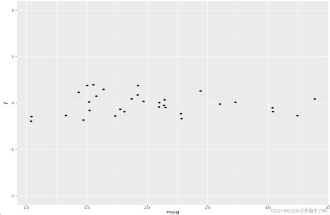
2.3 Form follows function
1) Function
- primary
- accurate and efficient representations
- secondary
- visually appealing, beautiful plots
2) Guiding principles
- never
- misrepresent or obscure data
- confuse viewers with complexity
- always
- consider the audience and purpose of every plot
2.4 The best choices for aesthetics
- efficient: provides a faster overview than numeric summaries
- accurate: minimizes information loss
for continuous variable

for categorical variables

color is always a good choice for categorical data
3. Geometries
3.1 overview
48 geometries


3.2 scatter plot
3.3 bar plot
geom_histogram():
geom_bar(): count the number of cases at each x position
geom_col(): plot actual values
3.4 line plot
linetype aesthetic
size aesthetic

color aesthetic
 Fill aesthetic with geom_area()
 Using position = "fill"

geom_ribbon()
force the y-min to be 0

4. Themes
4.1 themes from scratch
the theme layer controls all the non-data ink on the plot
three types:

arguments of theme layer function:
1) text elements

2) line elements

3) rect elements

4) element_blank()
to remove any items

例题:
T1. position
---- remove the legend
plt_prop_unemployed_over_time +
  theme(legend. Position = "none")
--- Update the plot to position the legend at the bottom of the plot
plt_prop_unemployed_over_time +
  theme(legend. Position = "bottom")
--- Position the legend inside the plot, with x-position 0.6 and y-position 0.1.
plt_prop_unemployed_over_time +
  theme(legend. Position = c(0.6, 0.1))
T2: element_xxx
plt_prop_unemployed_over_time +
  theme(
    # For all rectangles, set the fill color to grey92
    rect = element_rect(fill = "grey92"),
    # For the legend key, turn off the outline
    legend.key = element_rect(color = NA)
    # Turn off axis ticks
    axis.ticks = element_blank(),
    # Turn off the panel grid
    panel.grid = element_blank()
    # Add major y-axis panel grid lines back
    panel.grid.major.y = element_line(
      # Set the color to white
      color = "white",
      # Set the size to 0.5
      size = 0.5,
      # Set the line type to dotted
      linetype = "dotted"
    ),
    # Set the axis text color to grey25
    axis.text = element_text(color = "grey25"),
    # Set the plot title font face to italic and font size to 16
   plot.title = element_text(size = 16, face = "italic")
  )
T3: unit and margin
To set a single whitespace value, use unit(x, unit), where x is the amount and unit is the unit of measure.
Borders require you to set 4 positions, so use margin(top, right, bottom, left, unit). To remember the margin order, think TRouBLe.
for example:
- Give the axis tick length, axis.ticks.length, a unit of 2 "lines".
plt_mpg_vs_wt_by_cyl +
  theme(
    # Set the axis tick length to 2 lines
    axis.ticks.length = unit(2, "lines")
)- Set the legend.margin to 20 points ("pt") on the top, 30 pts on the right, 40pts on the bottom, and 50pts on the left.
plt_mpg_vs_wt_by_cyl +
  theme(
    # Set the legend margin to (20, 30, 40, 50) points
    legend.margin = margin(20, 30, 40, 50,"pt")
  )
4.2 theme flexibility
define the theme -> reuse the theme
ways to use themes
- From scratch
- Theme layer object
- built-in themes (packages: ggplot2 or ggthemes)
- update / set default theme
using built-in themes
theme_*()
z +
    theme_classic()
library(ggthemes)
z +
theme_tufte()the tufte theme removes all non-data ink and sets the font to a serif typeface
合并主题
theme_tufte_recession <- theme_tufte() + theme_recession将主题设成默认(无需+theme了)
theme_set(theme_tufte_recession)4.3 effective explanatory plots
use intuitive and attractive geoms / add text labels to plot / remove non-data ink / add threshold line / add informative text
For example:
T1: using geoms to explanatory plot
初步设置
# Add a geom_segment() layer
ggplot(gm2007, aes(x = lifeExp, y = country, color = lifeExp)) +
  geom_point(size = 4) +
  geom_segment(aes(xend = 30, yend = country), size = 2)
继续美化
( 1.添加label 2.设置scales, 3. 添加title和caption)
# Set the color scale
palette <- brewer.pal(5, "RdYlBu")[-(2:4)]

ggplot(gm2007, aes(x = lifeExp, y = country, color = lifeExp)) +
  geom_point(size = 4) +
  geom_segment(aes(xend = 30, yend = country), size = 2) +
  geom_text(aes(label = round(lifeExp,1)), color = "white", size = 1.5) +
  scale_x_continuous("", expand = c(0,0), limits = c(30,90), position = "top") +
  scale_color_gradientn(colors = palette) +
  labs(title = "Highest and lowest life expectancies, 2007", caption = "Source: gapminder")
T2: using annotate() for embellishment
1) add a vertical line
# Add a vertical line
plt_country_vs_lifeExp +
  step_1_themes +
  geom_vline(xintercept = global_mean, color = "grey40", linetype = 3)
2) add a "text" geom as an annotation
plt_country_vs_lifeExp +
  step_1_themes +
  geom_vline(xintercept = global_mean, color = "grey40", linetype = 3) +
  annotate(
    "text",
    x = x_start, y = y_start,
    label = "The\nglobal\naverage",
    vjust = 1, size = 3, color = "grey40"
  )
3) annotate the plot with an arrow connecting your text to the line
plt_country_vs_lifeExp +
  step_1_themes +
  geom_vline(xintercept = global_mean, color = "grey40", linetype = 3) +
  step_3_annotation +
  annotate(
    "curve",
    x = x_start, y = y_start,
    xend = x_end, yend = y_end,
    arrow = arrow(length = unit(0.2, "cm"), type = "closed"),
    color = "grey40"
  )