Python实战:从12306官网获取全国火车票代售点信息,并通过Pyecharts可视化。
Python实战:从12306官网获取全国火车票代售点信息,并通过Pyecharts画出柱状图、折线图、饼图、漏斗图,分析各省火车票代售点数量分布。
通过本文,可以获取12306对于全国省的编码,获取全国 3253 个火车票代售点信息,通过Pyecharts可视化分析,画出柱状图、折线图、饼图、漏斗图。
分析网页
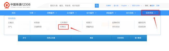
打开 12306 官网,https://www.12306.cn/,点击“信息查询”下面的“代售点”。
键盘 F12 快捷键,或者鼠标右击“检查”打开浏览器的检查页面,刷新网页,在检查页面可以看到allProvince这个请求。(本文首发在“程序员coding”公众号)

在allProvince请求 response 的 data 值就是全国的省。

获取全国的省名称:
编写 Python 代码主要用到的库是 requests 和 pandas,首先 requests 库发送请求,获取 response,转换为 json 格式。然后用 pandas 库的 json_normalize 函数将 json 数据展平。最后用 pandas 库将数据保存到 excel 表格内。
完整代码如下:
import requests
import pandas as pd
import time
from datetime import datetime

url = "https://kyfw.12306.cn/otn/userCommon/allProvince"

headers = {
    "Cookie": "Cookie",
    "User-Agent": "User-Agent"
}

content_json = requests.get(url=url, headers=headers).json()
print("等待3s")
time.sleep(3)  # 防止被检测(不要低于3)
print(content_json)  # 用于观察
# df = pd.DataFrame(content_json['data'])
content_list = pd.json_normalize(content_json['data'], errors='ignore')

if __name__ == '__main__':
    # 当前时间作为文件名后缀
    curr_time = datetime.now()
    timestamp = datetime.strftime(curr_time, '%Y-%m-%d %H-%M-%S')
    # time = time.time()  # 时间

    # 将 DataFrame 保存为 excel 文件
    content_list.to_excel(f"全国火车票代售点的省-{timestamp}.xlsx", index=False)
    print("保存完成!")

    # 查看 DataFrame 的行数和列数。
    rows = content_list.shape
    print("请求得到的表格行数与列数:", rows)
生成的 excel 表如下:(本文首发在“程序员coding”公众号)

获取全国火车票代售点
在“所在地区”的输入框内任意选择一个省份。
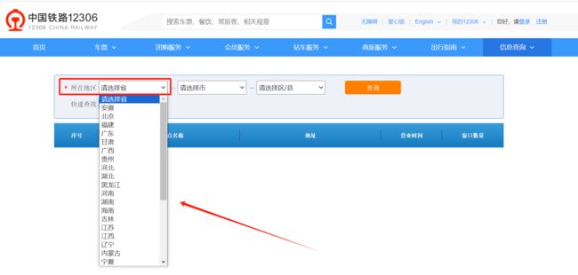
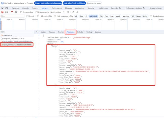
在检查页面可以看到query?province这个请求。
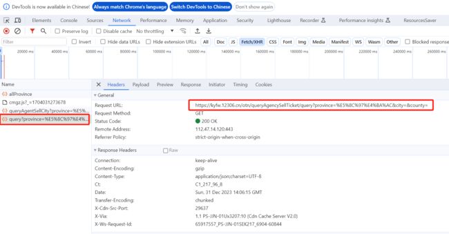
在query?province请求 response 的 data 值就是这个省的全部代售点信息。
获取全国火车票代售点
接下来就可以构建代码,使用 pandas 读取全国的省 excel 表,用表中的省这一列执行 apply 函数,获取全国火车票代售点:
完整代码如下:
`import requests
import pandas as pd
import time
from datetime import datetime
from tqdm import tqdm

content_list = []


def ticket_sale_agency(province):
    url = "https://kyfw.12306.cn/otn/queryAgencySellTicket/query"

    headers = {
    "Cookie": "Cookie",
    "User-Agent": "User-Agent"
    }
    data = {
        "province": province,
        "city": "",
        "county": "",

    }

    content_json = requests.get(url=url, headers=headers, params=data).json()
    print("等待3s")
    time.sleep(3)  # 防止被检测(不要低于3)
    print(content_json)  # 用于观察
    # df = pd.DataFrame(content_json['data'])
    df = pd.json_normalize(content_json['data']['datas'], errors='ignore')
    content_list.append(df)


if __name__ == '__main__':
    df = pd.read_excel("./全国火车票代售点的省-2023-12-29 18-12-23.xlsx")


    tqdm.pandas(desc='获取全国火车票代售点进度条', unit="请求")  # tqdm显示进度条
    df.progress_apply(lambda x: ticket_sale_agency(x['chineseName']), axis=1)
    # 调用函数,批量获取地址经纬度,使用tqdm时,将pandas中apply操作替换为progress_apply,并且每个单独的progress_apply前要先执行tqdm.pandas()

    # concat合并Pandas数据
    df = pd.concat(content_list)

    # 将 DataFrame 保存为 excel 文件
    # 当前时间作为文件名后缀
    curr_time = datetime.now()
    timestamp = datetime.strftime(curr_time, '%Y-%m-%d %H-%M-%S')
    # time = time.time()  # 时间
    df.to_excel(f"全国火车票代售点-{timestamp}.xlsx", index=False)
    print("保存完成!")

    # 查看 DataFrame 的行数和列数。
    rows = df.shape
    print("请求得到的表格行数与列数:", rows)
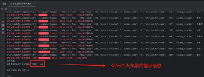
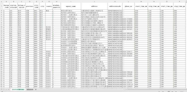
pycharm 控制台输出如下,成果获取全国 3253 个火车票代售点信息,全部字段如下:bureau_code、station_telecode、belong_station、province、city_code、city、county、windows_quantity、agency_name、address、addressencode、phone_no、start_time_am、stop_time_am、start_time_pm、stop_time_pm
生成的 excel 表如下:
可视化
Python 常用的可视化库主要包括 Matplotlib、Seaborn、Pyecharts 等,其中 Pyecharts 是我国开发人员开发的,相比较 Matplotlib、Seaborn 等可视化库,Pyecharts 十分符合国内用户的使用习惯,生成的图的可视化效果非常好,其凭借良好的交互性,精巧的图表设计,得到了众多开发者的认可。
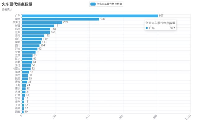
接下来,我将通过 Pyecharts 库实现统计各省火车票代售点数量,画出柱状图、折线图、饼图、漏斗图。
在这个过程中,强烈推荐看一下官方文档快速入门案例,理解 Pyecharts 的“链式调用”和 “一切皆 Options 配置”这两个思想。
柱状图
import numpy as np
import pandas as pd
from collections import Counter
from pyecharts.charts import Bar
from pyecharts import options as opts
from pyecharts.globals import ThemeType

# 导入excel数据
df = pd.read_excel("全国火车票代售点-2023-12-29 18-24-34.xlsx")

# 统计频率,并降序排序,freq数据类型是Series
freq = df["province"].value_counts().sort_values(ascending=True)

# 生成柱状图
bar = (
    # 创建柱状图对象
    Bar(init_opts=opts.InitOpts(theme=ThemeType.LIGHT,
                                width='1000px', height='600px',
                                page_title="各省火车票代售点数量"))
    # 设置 x 轴数据
    .add_xaxis(province_list)  # freq的index索引转为列表
    # 设置 y 轴数据
    .add_yaxis("各省火车票代售点数量", count_list, label_opts=opts.LabelOpts(position="top"))  # freq的值转为列表
    # # 翻转 x 轴 / y 轴
    # .reversal_axis()
    # 使用 options 配置项
    .set_global_opts(title_opts=opts.TitleOpts(title="火车票代售点数量", subtitle="按省统计"),
                     xaxis_opts=opts.AxisOpts(name_rotate=60, axislabel_opts={"rotate": 45}))

)
# 生成柱状图
bar.render("各省火车票代售点数量-柱状图.html")

翻转 x 轴 / y 轴后,柱状图显示效果如下:(本文首发在“程序员coding”公众号)
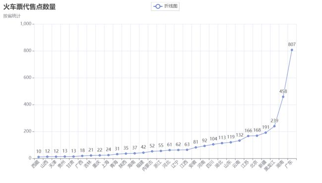
折线图
from pyecharts.charts import Line
from pyecharts import options as opts
from pyecharts.globals import ThemeType
# 折线图
line = (
    Line()
    .add_xaxis(xaxis_data=province_list)
    .add_yaxis(
        series_name="折线图",
        y_axis=count_list,
        symbol="emptyCircle",
        is_symbol_show=True,
        label_opts=opts.LabelOpts(is_show=True),
    )
    .set_global_opts(
        tooltip_opts=opts.TooltipOpts(is_show=False),
        xaxis_opts=opts.AxisOpts(type_="category", name_rotate=60, axislabel_opts={"rotate": 45}),
        yaxis_opts=opts.AxisOpts(
            type_="value",
            axistick_opts=opts.AxisTickOpts(is_show=True),
            splitline_opts=opts.SplitLineOpts(is_show=True),

        ),
    )
)
line.render("各省火车票代售点数量-折线图.html")
饼图
from pyecharts.charts import Pie
from pyecharts import options as opts
from pyecharts.globals import ThemeType
# 饼图
pie = (
    # 初始化配置项,参考 `global_options.InitOpts`
    Pie()
    .add(series_name="各省火车票代售点数量",  # 系列名称
         data_pair=data_pair_temp,  # 馈入数据
         radius="35%",  # 饼图半径比例
         center=["50%", "50%"],  # 饼图中心坐标
         label_opts=opts.LabelOpts(is_show=False, position="center"),  # 标签位置
         )
    .set_global_opts(title_opts=opts.TitleOpts(title="各省火车票代售点数量", pos_left="center"),
                     legend_opts=opts.LegendOpts(is_show=True, pos_left="right", orient="vertical"))
    .set_series_opts(label_opts=opts.LabelOpts(formatter="{b}:{c} {d}%"))  # {d}%为百分比

)
pie.render("各省火车票代售点数量-饼图.html")

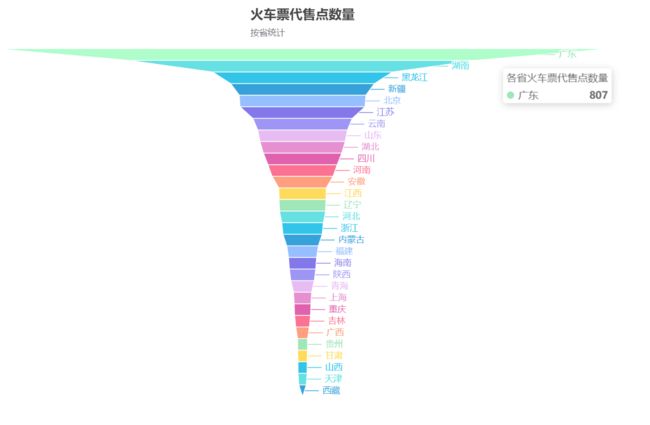
漏斗图
from pyecharts.charts import Funnel
from pyecharts import options as opts
from pyecharts.globals import ThemeType
`# 漏斗图
funnel = (
    Funnel(init_opts=opts.InitOpts(theme=ThemeType.LIGHT,
                                   width='1000px', height='600px',
                                   page_title="各省火车票代售点数量"))
    .add("各省", [list(data) for data in zip(province_list, count_list)])
    .set_global_opts(
        title_opts=opts.TitleOpts(title="火车票代售点数量", subtitle="按省统计", pos_left="center"),
        legend_opts=opts.LegendOpts(is_show=False, pos_left="right", orient="vertical")
    )

)
funnel.render("各省火车票代售点数量-漏斗图.html")