Thingworx自定义扩展开发(二)- Widget Demo Coding
系列
- Thingworx自定义扩展开发(一)- 开发环境搭建、Extension Demo Coding
- Thingworx自定义扩展开发(二)- Widget Demo Coding
- Thingworx自定义扩展开发(三)- echarts集成
Create A Mashup Widget Extension
官方地址:https://developer.thingworx.com/en/resources/guides/create-mashup-widget-extension
Overview
Quickly Build Mashup Widget Extensions and Extend Application Functionality with the Eclipse Plugin.
GUIDE CONCEPT
Extensions enable you to quickly and easily add new functionality to an IoT solution. Mashup widget extensions can be utilized to enhance a user’s experience, your ability to develop robust applications, and make development easier as you move forward with your IoT development.
The Eclipse Plugin for ThingWorx Extension Development (Eclipse Plugin) is designed to streamline and enhance the creation of extensions for the ThingWorx Platform. The plugin makes it easier to develop and build extensions by automatically generating source files, annotations, and methods as well as updating the metadata file to ensure the extension can be imported.
These features allow you to focus on developing functionality in your extension, rather than spend unnecessary time getting the syntax and format of annotations and the metadata file correct.
THINGS USED IN THIS GUIDE
Environment:
This guide may be completed in any environment that has access to the ThingWorx Foundation server. This guide is based on the Extension SDK version 8.3.
This includes both the hosted evaluation server, as well as the downloadable trial.
Before you start, ensure you have the following software installed.
- Download Eclipse ThingWorx Plugin.
- Download Java Development Kit: jdk1.8.
- Download Eclipse Mars (4.5) for Java Developers.
Completed Example:
You are provided a complete example to use as a reference as you progress through this guide and for more insight into how steps are completed.
NOTE: If you use Gradle as the build tool, in your Eclipse application, download the Gradle STS IDE plugin from Help->Eclipse Marketplace, then restart your workspace.
Step 1 Completed Example
Download the completed files for this tutorial: Custom Mashup Widget Example.
The MashupWidgetSamples.zip file provided to you contains a completed example of a simple Widget project and examples of more advanced widget source code. Utilize this file to see a finished example and return to it as a reference if you become stuck during this guide and need some extra help or clarification.
Keep in mind, this download uses the exact names for Entities used in this tutorial. If you would like to import this example and also create Entities on your own, change the names of the Entities you create.
Step 2 Create Mashup Widget Extension Project
To create a new extensions projects in the ThingWorx Extension Perspective, follow the steps below to get started:
- Go to File->New->Project.
- Click ThingWorx->ThingWorx Extension Project.

- Click Next.
- Enter the Project Name (for example, MyAwesomeExtension).
- Select Ant as your build framework. Gradle can be used if you are using a version of Eclipse that supports Gradle STS.
- Enter the SDK location by browsing to the directory where the Extension SDK zip is stored.
- Enter the Vendor information (for example, ThingWorx Labs).
- Change the default package version from 1.0.0 to support extension dependency.
- Click Next then click Finish. Your newly created project is added to the Package Explorer tab.
Creating Widgets
The ThingWorx Extensions SDK allows for easier development and in a shorter timeframe. The SDK provides steps for creating widgets, starting with an initial setup. Follow the steps below to get started on your own widget creation.
- Choose the ThingWorx menu and select New Widget.

- Select the parent project, in this case MyAwesomeExtension.
- Enter SimpleWidget for the name and A simple example of Widget creation. for description.

- Click Finish.
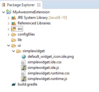
A new folder under the /ui folder is created and contains the JavaScript and CSS files for the widget. The metadata.xml file under the configfiles directory is updated automatically. The generated JavaScript files contain a minimal implementation of the functions needed to produce a working widget.
Adding Third-Party JAR Files
There are scenarios in which a 3rd party JAR file might be required. None will be needed for this scenario, but take note of how to do it below.
- Choose the Widget menu and select New Jar Resource.
- Select the parent project.
- Browse to and select the JAR file you want to add, and enter a description.
- Click Finish.
The JAR file is added to the /lib folder and the metadata.xml file is updated automatically.
Adding Third-Party Resources and JavaScript Libraries
Third-party libraries, images, and other web artifacts needed for the widget should be placed in the /ui/ folder or subfolders of that location. The *.ide.js and *.runtime.js files can then reference any of those artifacts via the relative path of:
…/Common/extensions//ui//
For example, to include a third-party JavaScript library and CSS into your widget code, one would do the following:
    if (!jQuery().qtip) {
      $("body").append('');
      $("head").append('');
    }
Step 3 Widget Lifecycle in the Mashup Builder
A widget has the following lifecycle stages within the Mashup Builder. During each lifecycle stage, the specified functions on the widget are called by the Mashup Builder.
Discovered
The widget is being loaded into index.html and added to the Widget toolbar/palette.
widgetProperties() - Called to get information about each widget (such as display name and
description)
widgetEvents() - Called to get information about the events each widget exposes
widgetServices() - Called to get information about the services each widget exposes
Created
The widget is dragged onto a Mashup panel.
afterload() - Called after your object is loaded and properties have been restored from the file, but before your object has been rendered
Appended
The widget is appended to the workspace DOM element.
renderHtml() - Called to get an HTML fragment that will be inserted into the Mashup DOM element
afterRender() - Called after the HTML fragment representing the widget has been inserted into the Mashup DOM element and a usable element ID has been assigned to the DOM element holding the widget content. The DOM element is then ready to be manipulated.
Updated
The widget is resized or updated in the Widget property window.
beforeSetProperty() - Called before any property is updated
afterSetProperty() - Called after any property is updated
Destroyed
The widget is deleted from the mashup.
beforeDestroy() - Called right before the widget’s DOM element is removed and the widget is detached from its parent widget and deallocated. You should clean up resources (such as plugins and event handlers) acquired during the lifetime of the widget.
Step 4 Widget Coding Examples
The [widgetname].ide.js file must implement several functions to work correctly in the Mashup Builder using its API. Widgets can declare widget properties, services, and events in functions.
Mashup Builder Code
Below is sample code for a widget named SimpleWidget with a bindable string property named DisplayText.
TW.IDE.Widgets.simplewidget = function () {
this.widgetIconUrl = function() {
return "../Common/extensions/MyAwesomeExtension/ui/simplewidget/SimpleWidget.ide.png";
};
this.widgetProperties = function () {
return {
name : "SimpleWidget",
description : "A simple example of Widget creation.",
category : ["Common"],
properties : {
DisplayText: {
baseType: "STRING",
defaultValue: "Hello, Awesome User!",
isBindingTarget: true
}
}
}
};
this.renderHtml = function () {
var mytext = this.getProperty('SimpleWidget Property');
var config = {
text: mytext
}
var widgetTemplate = _.template(
''
);
return widgetTemplate(config);
};
this.afterSetProperty = function (name, value) {
return true;
};
};
Runtime Coding
To handle the widget at runtime, you need methods to do the following:
- Render the HTML at runtime
- Set up bindings after rendering the HTML
- Handle property updates
Below is sample code of what the [widgetname].runtime.js may look like:
TW.Runtime.Widgets.simplewidget = function () {
var valueElem;
this.renderHtml = function () {
var mytext = this.getProperty('SimpleWidget Property');
var config = {
text: mytext
}
var widgetTemplate = _.template(
''
);
return widgetTemplate(config);
};
this.afterRender = function () {
valueElem = this.jqElement.find(".DisplayText");
valueElem.text(this.getProperty("DisplayText"));
};
this.updateProperty = function (updatePropertyInfo) {
if (updatePropertyInfo.TargetProperty === "DisplayText") {
valueElem.text(updatePropertyInfo.SinglePropertyValue);
this.setProperty("DisplayText", updatePropertyInfo.SinglePropertyValue);
}
};
};
Advanced Examples
If you have a local installation of the ThingWorx Composer, you can find examples of widgets in the Tomcat_Installation_Folder/webapps/Thingworx/Common/thingworx/widgets directory. DO NOT EDIT THESE FILES!. You will be able to mimic widgets you like to use them as a basis for new widgets. Or, just take notes on these items which will be covered more in-depth later in this guide.
Additional Features
You can incorporate the following features into your widgets:
- Services that can be bound to events (such as Click of a Button, Selected Rows Changed, or Service Completed)
- Events that can be bound to various services (for example, invoke a service and navigate to a mashup)
- Properties that can be bound out
You can access the full power of JavaScript and HTML in your widget code at runtime. Anything that can be accomplished using HTML and JavaScript is available in your widget.
Step 5 Mashup Builder API
The following APIs can be accessed by a widget in the context of the Mashup Builder:
| API | Description |
|---|---|
| this.jqElementId | This is the DOM element ID of your object after renderHtml(). |
| this.jqElement | This is the jquery element. |
| this.getProperty(name) / this.setProperty(name,value) | Note that every call to this function will call afterSetProperty() if it’s defined in the widget. |
| this.updatedProperties() | This function should be called anytime properties are changed in the widget so that the Mashup Builder can update the widget properties window, the connections window, and so on. |
| this.getInfotableMetadataForProperty(propertyName) | If you need the infotable metadata for a property that you bound, you can get it by calling this API; it returns undefined if it is not bound. |
| this.resetPropertyToDefaultValue(propertyName) | This call resets the named property to its default value. |
| this.removeBindingsFromPropertyAsTarget(propertyName) | This call removes target data bindings from the propertyName. Use it only when the user has initiated an action that invalidates the property. |
| this.removeBindingsFromPropertyAsSource(propertyName) | This call removes source data bindings from the propertyName. Use this only when the user has initiated an action that invalidates the property. |
| this.isPropertyBoundAsTarget(propertyName) | This call returns a result that indicates if the property has been bound as a target. You can use it to determine if a property has been set or bound. |
| this.isPropertyBoundAsSource(propertyName) | This call returns a result that indicates if the property has been bound as a source. You can use it to determine if a property has been bound to a target. |
Example of the Checkbox Widget’s validate() function:
this.validate = function () {
    var result = [];
    if (!this.isPropertyBoundAsSource('State') && !this.isPropertyBoundAsTarget('State')) {
        result.push({ severity: 'warning',
        message: 'State for {target-id} is not bound' });
    }

    return result;
}
Example of the Blog Widgets validate() function:
this.validate = function () {
    var result = [];
    var blogNameConfigured = this.getProperty('Blog');

    if (blogNameConfigured === '' || blogNameConfigured === undefined) {
        if (!this.isPropertyBoundAsTarget('Blog')) {
            result.push({ severity: 'warning', message: 'Blog is not bound for {target-id}' });
        }
    }

    return result;
}
Step 6 Mashup Builder Callbacks
The following widget functions are called by the Mashup Builder to control the widget’s behavior.
widgetProperties() - Returns a JSON structure that defines the properties of the widget. Listed are the possible properties of the widget:
Required Property
The only required property is:
- name - The user-friendly widget name, as shown in the widget toolbar
Optional Properties
There are a number of optional properties that can be contained in the returned JSON structure.
| Property | Description |
|---|---|
| description | A description of the widget, used for its tooltip. iconImage - File name of the widget icon/image |
| category | An array of strings for specifying one or more categories to which the widget belongs (such as “Common”, “Charts”, “Data”, “Containers”, and “Components”), enabling widgets to be filtered by type/category. |
| isResizable | true (default) or false |
| defaultBindingTargetProperty | Name of the property to use as the data/event binding target |
| borderWidth | If the widget has a border, set this property to the width of the border. This property ensures pixel-perfect WYSIWG between design and runtime. If you set a border of one pixel on the widget-content element at design time, you are making the widget two pixels taller and two pixels wider (one pixel on each side). To account for this discrepancy, set the borderWidth property to make the design-time widget the same number of pixels smaller. This property places the border inside the widget that you created and makes the width and height in the widget properties accurate. |
| isContainer | true or false (default). Controls whether an instance of the widget can be a container for other widget instances. |
| customEditor | The name of the custom editor dialog for entering and editing the widget configuration. The system assumes there is a dialog you created named TW.IDE.Dialogs.. |
| customEditorMenuText | The text that appears on the flyout menu of the widget and the tooltip text for the Configure Widget Properties button. For example, “Configure Grid Columns.” |
| allowPositioning | true (default) or false |
| supportsLabel | true or false (default). If true, the widget exposes a label property used to create a text label that appears next to the widget in the Composer and at runtime. |
| supportsAutoResize | true or false (default). If true, the widget can be placed in responsive containers (such as columns, rows, responsive tabs, responsive mashups). |
| properties | A collection of JSON objects for the widget that describe the properties of the widget that can be modified when the widget is added to a mashup. These properties are displayed in the Properties window of the Mashup Builder - the name of each object is used as the property name and the corresponding attributes control how the property value is set. |
| afterLoad() | Called after the object is loaded and properties have been restored from the file, but before the object has been rendered |
| renderHtml() [required] | Returns HTML fragment that the Composer will place in the screen; the widget’s content container (e.g. div) must have a ‘widget-content’ class specified. After this container element is appended to the DOM, it becomes accessible via jqElement and its DOM element ID will be available in jqElementId |
| widgetEvents() | A collection of events. |
| warnIfNotBound | true or false; If true, the property will be checked by Composer to determine whether it is bound, then generate a to-do item if/when it is not. |
| widgetServices() | A collection of services. |
| warnIfNotBound | true or false; If true, the property will be checked by the Composer to determine whether it is bound, then generate a to-do item if/when it is not. |
| afterRender() | Called after the HTML fragment is inserted into the DOM. |
| beforeDestroy() | Called right before the widget’s DOM element gets removed and the widget is detached from its parent widget and delocated; this is the place in which to perform any clean-up of resources (e.g. plugins, event handlers) acquired throughout the lifetime of the widget. |
| beforeSetProperty(name,value) [Mashup Builder only - not at runtime] | Called before any property is updated within Composer; this is a good place to perform validation on the new property value before it is committed. If a message string is returned, then the message will be displayed to the user, and the new property value will not be committed. If nothing is returned, then the value is assumed to be valid. |
| afterSetProperty(name,value) [Mashup Builder only - not at runtime] | Called after any property is updated within Composer. Return true to have the widget re-rendered in Composer. |
| afterAddBindingSource(bindingInfo) | Whenever data is bound to the widget, you will call back with this (if you implemented it … it’s optional). The only field in bindingInfo is targetProperty which is the propertyName that was just bound. |
| validate() | Called when Composer refreshes its to-do list. The call must return an array of result objects with severity (optional and not implemented) and message (required) properties. The message text may contain one or more pre-defined tokens, such as {target-id}, which will contain a hyperlink that allows the user to navigate to or select the specific widget that generated the message. |
Properties Section Breakdown
The following attributes can be specified for each property object:
| Aspect | Description |
|---|---|
| description | A description of the widget, which is used for its tooltip. |
| baseType | The system base type name - if the baseType value is FIELDNAME the widget property window displays a dropdown list of fields available in the INFOTABLE bound to the sourcePropertyName value based on the baseTypeRestriction. |
| mustImplement | If the baseType is THINGNAME and you specify “mustImplement”, the Mashup Builder will restrict popups to those implementing the specified EntityType and EntityName [by calling QueryImplementingThings against said EntityType and EntityName]. |
| baseTypeInfotableProperty | If baseType is RENDERERWITHFORMAT, baseTypeInfotableProperty specifies which property’s infotable is used for configuration. |
| sourcePropertyName | When the property’s baseType is FIELDNAME, this attribute is used to determine which INFOTABLE’s fields are to be used to populate the FIELDNAME dropdown list. |
| baseTypeRestriction | When specified, this value is used to restrict the fields available in the FIELDNAME dropdown list. |
| tagType | If the baseType is TAGS this can be ‘DataTags’ (default) or ‘ModelTags.’ |
| defaultValue | Default undefined; used only for ‘property’ type. |
| isBindingSource | true or false; Allows the property to be a data binding source, default to false. |
| isBindingTarget | true or false; Allows the property to be a data binding target, default to false. |
| isEditable | true or false; Controls whether the property can be edited in Composer, default to true. |
| isVisible | true or false; Controls whether the property is visible in the properties window, default to true. |
| isLocalizable | true or false; Only important if baseType is STRING - controls whether the property can be localized or not. |
| selectOptions | An array of value / (display) text structures. |
| warnIfNotBoundAsSource | true or false; If true, the property will be checked by Composer to determine whether it is bound and generate a to-do item if/when it is not. |
| warnIfNotBoundAsTarget | true or false; If true, the property will be checked by Composer to determine whether it is bound and generate a to-do item if/when it is not. |
Other Special BaseType
Additional special baseTypes:
- STATEDEFINITION - Picks a StateDefinition
- STYLEDEFINITION - Picks a StyleDefinition
- RENDERERWITHSTATE - Displays a dialog and allows you to select a renderer and formatting. Note: You can set a default style by entering the string with the default style name in the defaultValue. When your binding changes, you should reset it to the default value, as shown in the code below:
this.afterAddBindingSource = function (bindingInfo) {
    if(bindingInfo['targetProperty'] === 'Data') {
        this.resetPropertyToDefaultValue('ValueFormat');
    }
};
- STATEFORMATTING - Displays a dialog and allows you to pick a fixed style or state-based style. Note: You can set a default style by entering the string with the default style name in the defaultValue. When your binding changes, you should reset it to the default value as shown in the code above for RENDERERWITHSTATE.
- VOCABULARYNAME - Will pick a DataTag vocabulary
Some Examples
An example of the properties property:
properties: {
    Prompt: {
        defaultValue: 'Search for...',
        baseType: STRING,
        isLocalizable: true
    },

    Width: {
        defaultValue: 120
    },

    Height: {
        defaultValue: 20,
        isEditable: false
    },
}
An example of mustImplement:
'baseType': 'THINGNAME',
'mustImplement': {
    'EntityType': 'ThingShapes',
    'EntityName': 'Blog'
}
An example of selectOptions:
[
    {value: ‘optionValue1’, text: ‘optionText1’},
    {value: ‘optionValue2’, text: ‘optionText2’}
]
An example of validate function that allows you to navigate/select the specific widget that generated the message:
this.validate = function () {
    var result = [];
    var srcUrl = this.getProperty('SourceURL');

    if (srcUrl === '' || srcUrl === undefined) {
        result.push({ severity: 'warning', message: 'SourceURL is not defined for {target-id}'});
    }

    return result;
}
Step 7 Widget Lifecycle at Runtime
When a Widget is first created, the runtime will obtain any declared Properties by calling the runtimeProperties() function.
- The property values that were saved in the Mashup definition will be loaded into your object without your code being called in any way.
- After the Widget is loaded but before it’s displayed on the screen, the runtime will call renderHtml() for you to return the HTML for your object. The runtime will render that HTML into the appropriate place in the DOM.
- Immediately after that HTML is added to the DOM, you will be called with afterRender(). This is the time to do the various jQuery bindings (if you need any). It is only at this point that you can reference the actual DOM elements, and you should only do this using code such as:
    // note that this is a jQuery object
    var widgetElement = this.domElement;
This is important because the runtime actually changes your DOM element ID (domElementId) and you should never rely on any ID other than the ID returned from this.
If you have defined an event that can be bound, whenever that event occurs, you should call the following:
    var widgetElement = this.domElement;
    // change ‘Clicked’ to be whatever your event name is that
    // you defined in your runtimeProperties that people bind to widgetElement.triggerHandler('Clicked');
- If you have any properties bound as data targets, you will be called with updateProperty(). You are expected to update the DOM directly if the changed property affects the DOM - this is likely, otherwise why would the data be bound.
- If you have properties that are defined as data sources and they are bound, you can be called with getProperty_{propertyName}() …. If you don’t define this function, the runtime will simply get the value from the property bag.
Step 8 Runtime APIs available to Widgets
The following APIs can be accessed by a Widget in the context of the runtime:
- this.jqElementId - This is the DOM element ID of your object after renderHtml().
- this.jqElement - This is the jquery element.
- this.getProperty(name) - Accessor.
- this.setProperty(name,value) - Modifier.
- this.updateSelection(propertyName, selectedRowIndices) - Call this anytime your Widget changes selected rows on data that is bound to a certain propertyName. For example, in a callback for an event like onSelectStateChanged(), you would call this API and the system will update any other Widgets relying on selected rows.
Step 9 Runtime Callbacks
The following functions on the widget are called by the runtime.
runtimeProperties() - [optional] Returns a JSON structure defining the properties of this widget. Optional properties are:
- isContainer - true or false (default to false); Controls whether an instance of this widget can be a container for other widget instances.
- needsDataLoadingAndError - true or false (defaults to false) - Set to true if you want your widget to display the standard 25% opacity when no data has been received and to turn red when there is an error retrieving data.
- borderWidth - If your widget provides a border, set this to the width of the border. This helps ensure pixel-perfect WYSIWG between builder and runtime.
- supportsAutoResize- If your widget supports auto-resize, set this to true.
- propertyAttributes – If you have STRING properties that are localizable, list them here. For example, if TooltipLabel1 is localizable:
this.runtimeProperties = function () {
    return {
        'needsDataLoadingAndError': true,
        'propertyAttributes': {
            'TooltipLabel1': {'isLocalizable': true}
        }
    }
};
renderHtml() [required] - Returns HTML fragment that runtime will place on the screen; the widget’s content container (e.g. div) must have a ‘widget- content’ class specified. After this container element is appended to the DOM, it becomes accessible via jqElement and its DOM element ID will be available in jqElementId.
afterRender() [optional] - Called after the widget HTML fragment is inserted into the DOM. Use this domElementId to find the DOM element ID. Use this jqElement to use the jQuery reference to this DOM element.
beforeDestroy() [optional but highly recommended] - This is called anytime the widget is unloaded. This is where to:
- unbind any bindings
- clear any data set with .data()
- destroy any third-party libraries or plugins, call their destructors, etc.
- free any memory you allocated or are holding onto in closures by setting the variables to null
There is no need to destroy the DOM elements inside the widget, they will be destroyed for you by the runtime.
resize(width,height) [optional – Only useful if you declare supportsAutoResize: true] - This is called anytime the widget is resized. Some widgets don’t need to handle this, for example, if the widget’s elements and CSS auto-scale. But others (most widgets) need to actually do something to accommodate the widget changing size.
handleSelectionUpdate(propertyName, selectedRows, selectedRowIndices) - Called whenever selectedRows has been modified by the data source you’re bound to on that PropertyName. selectedRows is an array of the actual data and selectedRowIndices is an array of the indices of the selected rows. Note: To get the full selectedRows event functionality without having to bind a list or grid widget, this function must be defined.
serviceInvoked(serviceName)- serviceInvoked() - Called whenever a service you defined is triggered.
updateProperty(updatePropertyInfo) - updatePropertyInfo An object with the following JSON structure:
{
    DataShape: metadata for the rows returned
    ActualDataRows: actual Data Rows
    SourceProperty: SourceProperty
    TargetProperty: TargetProperty
    RawSinglePropertyValue: value of SourceProperty in the first row of ActualDataRows
    SinglePropertyValue: value of SourceProperty in the first row of ActualDataRows converted to the defined baseType of the target property [not implemented yet],
    SelectedRowIndices: an array of selected row indices
    IsBoundToSelectedRows: a Boolean letting you know if this is bound to SelectedRows
}
For each data binding, the widget’s updateProperty() will be called every time the source data is changed. You need to check updatePropertyInfo. TargetProperty to determine what aspect of the widget needs to be updated. An example from thingworx.widget.image.js:
this.updateProperty = function (updatePropertyInfo) {
    // get the img inside our widget in the DOM
    var widgetElement = this.jqElement.find('img');
    // if we're bound to a field in selected rows
    // and there are no selected rows, we'd overwrite the
    // default value if we didn't check here

    if (updatePropertyInfo.RawSinglePropertyValue !== undefined) {
        // see which TargetProperty is updated

        if (updatePropertyInfo.TargetProperty === 'sourceurl') {
// SourceUrl updated - update the 
NOTE: In the code above, we set a local copy of the property in our widget object, so if that property is bound as a data source for a parameter to a service call (or any other binding) - the runtime system can simply get the property from the property bag. Alternately, we could supply a custom getProperty_ {propertyName} method and store the value some other way.
getProperty_{propertyName}() - Anytime that the runtime needs a property value, it checks to see if the widget implements a function that overrides and gets the value of that property. This is used when the runtime is pulling data from the widget to populate parameters for a service call.
Step 10 Building and Importing
After you’ve completed your code updates, it’s time to build and import! Below are instructions for building with the framework you have set for the project.
Build Extension with Ant
- Go to the Package explorer view.
- Right click on build-extension.xml.
- Hover over Run As and select Ant Build.

- Your console output will indicate BUILD SUCCESSFUL. This will build your project and create the extension zip in the your_project->build->distributions folder of your project.
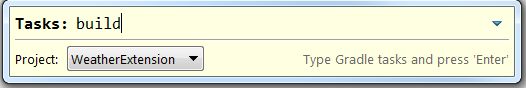
Build Extension with Gradle
- Right click on your project ->Gradle (STS)->Tasks Quick Launcher.

- Set Project from the drop-down menu to your project name and type Tasks as build.
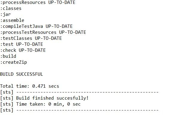
- Press Enter.
- Your console window will display BUILD SUCCESSFUL. Your extension has been created and stored as a zip file in your_project->build->distributions folder.
Import Extension
-
Go to ThingWorx Composer. In the lower left, click Import/Export, then select Import under.
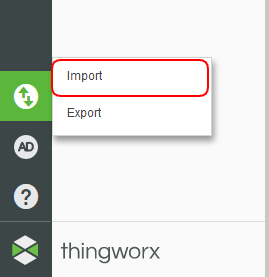
-
Select Extension for the type of import.

-
Choose the zip file in the distributions folder under the build directory. Click Import.
-
Click Close on the prompt to refresh your Composer instance.
After you have imported your new widget and refreshed Composer, you will see your new widget as an option on the Mashup Design tab.

Step 11 Tips
When a new version of an extension contains model changes for one or more of its entities, the previous version of the extension and any entities created from that extension must be deleted before installing the new version of the extension. To avoid having to recreate the entities after the new extension is installed, you can include an extension migrator with the extension that imports the entities created with the previous version.
Adding an Extension Migrator
To create a migrator class for your extensions, follow these steps:
- Choose the ThingWorx menu and select New Extension Migrator.
- Select or enter your source folder and package.
- Enter a name, such as CustomMigrator.
- Click Finish.
The Java source file is created and the configfiles/metadata.xml file is updated automatically.
NOTE: If a migrator has already been created, the previous migrator class name will be replaced in the metadata.xml file with the new migrator class name. The previous migrator Java file will not be changed.
Element Selection
Use this.jqElement to limit your element selections. This will reduce the chance of introducing unwanted behaviors in the application when there might be duplicate IDs and/or classes in the DOM.
///Don’t do the following:
$('.add- btn').click(function(e){...do something...});

///Do this:
this.jqElement.find('.add-btn').click(function(e){ ...do something...});
Logging
We recommend that you use the following methods to log in the Mashup Builder and runtime environment:
TW.log.trace(message[,message2,...][,exception])
TW.log.debug(message[,message2,...][,exception])
TW.log.info(message[,message2,...][,exception])
TW.log.warn(message[,message2,...][,exception])
TW.log.error(message[,message2,...][,exception])
TW.log.fatal(message[,message2,...][,exception])
You can view the log messages in the Mashup Builder by opening the log window via the Help->Log menu item; in the Mashup runtime, you can now click on the Show Log button on the top left corner of the page to show log window. If the browser you use supports console.log(), then the messages will also appear in the debugger console.
Formatting
If you have a property with baseType of STYLEDEFINITION, you can get the style information by calling:
    var formatResult = TW.getStyleFromStyleDefinition(
    widgetProperties['PropertyName']);
If you have a property of baseType of STATEFORMATTING:
var formatResult = TW.getStyleFromStateFormatting({
    DataRow: row,
    StateFormatting: thisWidget.properties['PropertyName']
});
In both cases formatResult is an object with the following defaults:
{
   image: '',
   backgroundColor: '',
   foregroundColor: '',
   fontEmphasisBold: false,
   fontEmphasisItalic: false,
   fontEmphasisUnderline: false,
   displayString: '',
   lineThickness: 1,
   lineStyle: 'solid',
   lineColor: '',
   secondaryBackgroundColor: '',
   textSize: 'normal'
};
Step 12 Next Steps
Congratulations! You’ve successfully completed the Create A Mashup Widget Extension tutorial. You’ve learned how to:
- Utilize the Eclipse Plugin and Extension SDK
- Create and configure an Extension project
- Create a mashup widget Extension
- Build and import an Extension
Learn More
We recommend the following resources to continue your learning experience:
| Capability | Guide | |
|---|---|---|
| Build | Application Development Tips & Tricks |
Additional Resources
If you have questions, issues, or need additional information, refer to:
| Resource | Link | |
|---|---|---|
| Community | Developer Community Forum | |
| Marketplace | Extension Library | |
| Help Center | Custom Widget Tips and Example |