tkinter绘制组件(5)——复选框
tkinter绘制组件(5)——复选框
- 引言
- 实现
-
- 定义函数
- 绘制文字
- 绘制矩形标识
- 相应进出事件
- 相应点击事件
- 完整函数代码
- 效果
-
- 测试代码
- 最终效果
- 2021-8-3新样式
- 2022-1-20新样式
- 2022-4-16新样式
- 2022-5-29新改进
- 2022-12-10新样式
- github项目
- 结语
引言
复选框经常用于UI界面的用户操作勾选功能,可以为后端提供多种交互相应。同时,这也带来复选框使用量较大,反应可能迟钝的问题,特别是基于tcl的tkinter,这篇文章,将要实现通过TinUI绘制checkbutton。
实现
定义函数
在TinUI中,使用add_checkbutton绘制复选框的按钮。
def add_checkbutton(self,pos:tuple,text:str,fg='black',fill='lightgreen',font=('微软雅黑',12),command=None):#复选框
    """
    pos::位置,以矩形顶部为起始位置
    text::文字,不在起始位置
    fg::文本颜色
    fill::标识选中填充色
    font::字体名称+大小
    command::相应函数
    """
绘制文字
同前面几篇文章一样,复选框的文字和功能标识(那一个小矩形)是互不覆盖的,因此,我们先绘制文本。
这里要注意一个问题,因为我们定义的位置是标识矩形的起始位置,因此,绘制文字时应该添加位移,给之后添加的作为标识的矩形让出一定的位置,以免覆盖。
checkbutton=self.create_text(pos,text=text,fill=fg,font=font,anchor='nw')
bbox=self.bbox(checkbutton)#获取初始位置
dic=bbox[3]-bbox[1]#位移长度
self.move(checkbutton,dic-7,0)
绘制矩形标识
通过文字的占位,推算出矩形大小,然后绘制到预留位置:
check=self.create_rectangle((pos[0],pos[1]+5,pos[0]+dic-10,pos[1]+dic-5),outline=fg,fill=self['background'])
后期的更新中,矩形标识将匹配字体大小。
相应进出事件
这个和之前的Button同理,就不解释了,只不过两个元素都要绑定事件。
def button_in(event):
self.itemconfig(check,outline='#82BDEB')
def button_out(event):
self.itemconfig(check,outline=fg)
#...
self.tag_bind(check,'' ,button_in)
self.tag_bind(check,'' ,button_out)
self.tag_bind(checkbutton,'' ,button_in)
self.tag_bind(checkbutton,'' ,button_out)
相应点击事件
这里与Button有一点不同,就是矩形标识是要改变颜色的。
在TinUI中,这个做法比较直接,每次相应点击事件都判断矩形标识的样式,再根据获得的样式参数,重新渲染矩形标识的样式。
#...
def go_func(event):
#获取参数值
if self.itemcget(check,'fill')!=fill:
self.itemconfig(check,fill=fill)
else:
self.itemconfig(check,fill=self['background'])
command(event)
#...
self.tag_bind(check,',go_func)
self.tag_bind(checkbutton,',go_func)
完整函数代码
下面是绘制复选框的完整代码:
def add_checkbutton(self,pos:tuple,text:str,fg='black',fill='lightgreen',font=('微软雅黑',12),command=None):#绘制复选框
def button_in(event):
self.itemconfig(check,outline='#82BDEB')
def button_out(event):
self.itemconfig(check,outline=fg)
def go_func(event):
if self.itemcget(check,'fill')!=fill:
self.itemconfig(check,fill=fill)
else:
self.itemconfig(check,fill=self['background'])
command(event)
checkbutton=self.create_text(pos,text=text,fill=fg,font=font,anchor='nw')
bbox=self.bbox(checkbutton)
dic=bbox[3]-bbox[1]#位移长度
self.move(checkbutton,dic-7,0)
check=self.create_rectangle((pos[0],pos[1]+5,pos[0]+dic-10,pos[1]+dic-5),outline=fg,fill=self['background'])
self.tag_bind(check,'' ,button_in)
self.tag_bind(check,'' ,button_out)
self.tag_bind(checkbutton,'' ,button_in)
self.tag_bind(checkbutton,'' ,button_out)
self.tag_bind(check,',go_func)
self.tag_bind(checkbutton,',go_func)
return checkbutton
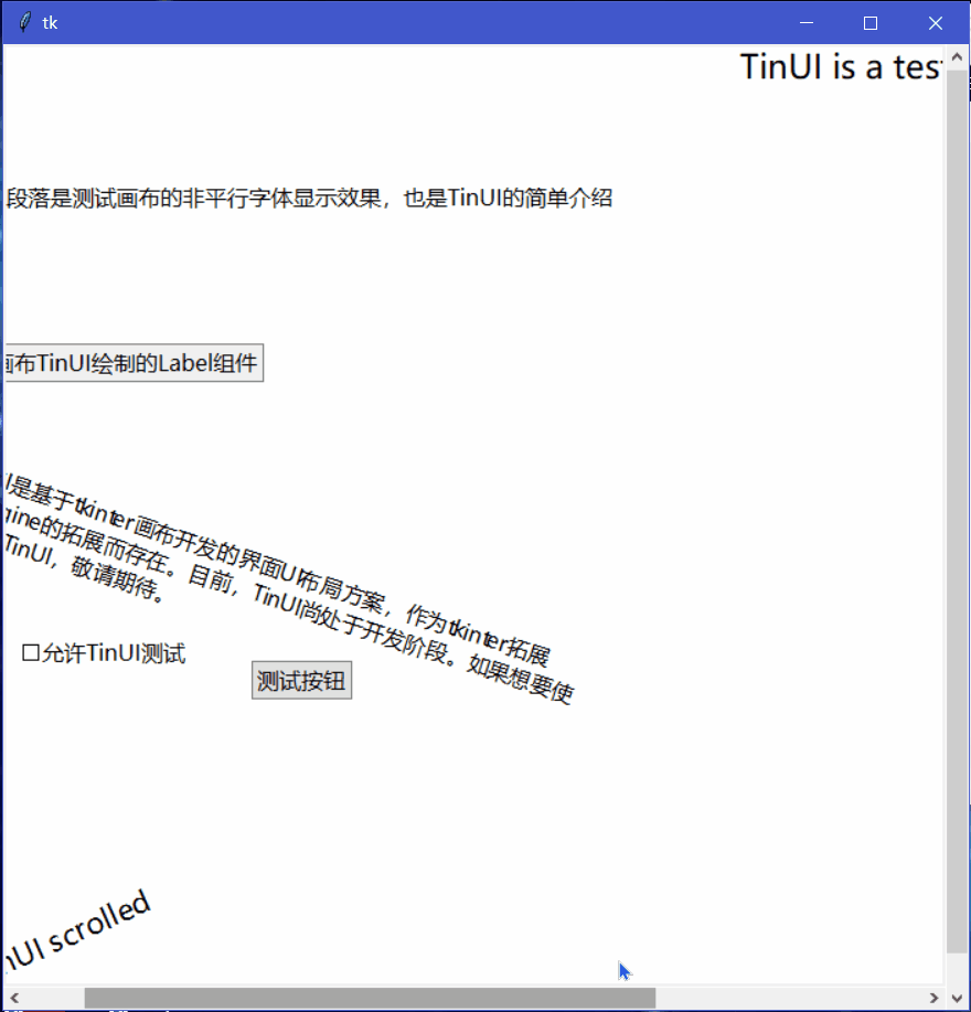
效果
测试代码
def test(event):
a.title('TinUI Test')
b.add_paragraph((50,150),'这是TinUI按钮触达的事件函数回显,此外,窗口标题也被改变、首行标题缩进减小')
b.coords(m,100,0)
def test1(event):
pass
def test2(event):
pass
a=Tk()
a.geometry('700x700+5+5')
b=TinUI(a,bg='white')
b.pack(fill='both',expand=True)
m=b.add_title((600,0),'TinUI is a test project for futher tin using')
m1=b.add_title((0,680),'test TinUI scrolled',size=2,angle=24)
b.add_paragraph((20,290),''' TinUI是基于tkinter画布开发的界面UI布局方案,作为tkinter拓展和TinEngine的拓展而存在。目前,TinUI尚处于开发阶段。如果想要使用完整的TinUI,敬请期待。''',
angle=-18)
b.add_paragraph((20,100),'下面的段落是测试画布的非平行字体显示效果,也是TinUI的简单介绍')
b.add_button((250,450),'测试按钮',command=test)
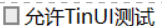
b.add_checkbutton((80,430),'允许TinUI测试',command=test1)
b.add_label((10,220),'这是由画布TinUI绘制的Label组件')
a.mainloop()
最终效果
2021-8-3新样式

提供更好的视觉效果,同时增加样式参数,具体查看github上的代码。
2022-1-20新样式
更新默认配色、增加新的样式参数,修复标识符点击无效的BUG。
2022-4-16新样式

圆角标识符、使用绘制标识文本(√是绘制出来的)。
2022-5-29新改进
改小了标识符的尺寸比例。
2022-12-10新样式

优化标识符。
github项目
TinUI的github项目地址
结语
TinUI将会把虚拟控件和真是句柄控件结合起来
tkinter创新