Vue好看的组件库:Element
文章目录
-
-
-
- 1、什么是Element
- 2、Element快速入门
- 3、Element布局
-
- 3.1、 Layout 局部
- 3.2、容器布局
-
-
1、什么是Element
Element:是饿了么公司前端开发团队提供的一套基于 Vue 的网站组件库,用于快速构建网页
Element 提供了很多组件(组成网页的部件)供我们使用。例如 超链接、按钮、图片、表格等等~
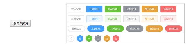
如下图左边的是我们编写页面看到的按钮,上图右边的是 Element 提供的页面效果,效果一目了然。
我们学习 Element 其实就是学习怎么从官网拷贝组件到我们自己的页面并进行修改,官网网址是
https://element.eleme.cn/#/zh-CN
进入官网能看到如下页面

接下来直接点击 组件 ,页面如下
2、Element快速入门
使用流程:
-
创建页面,并在页面引入Element 的css、js文件 和 Vue.js
<script src="vue.js">script> <script src="element-ui/lib/index.js">script> <link rel="stylesheet" href="element-ui/lib/theme-chalk/index.css"> -
.创建Vue核心对象
Element 是基于 Vue 的,所以使用Element时必须要创建 Vue 对象
<script> new Vue({ el:"#app" }) script> -
官网复制Element组件代码
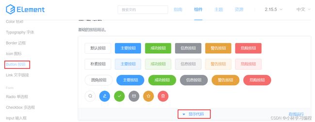
在左菜单栏找到 Button 按钮 ,然后找到自己喜欢的按钮样式,点击 显示代码 ,在下面就会展示出对应的代码,将这些代码拷贝到我们自己的页面即可。
代码演示:
DOCTYPE html>
<html lang="en">
<head>
    <meta charset="UTF-8">
    <meta name="viewport" content="width=device-width, initial-scale=1.0">
    <title>容器布局title>
    <script src="../js/vue.js">script>
    <link rel="stylesheet" href="../element-ui/lib/theme-chalk/index.css">
    <script src="../element-ui/lib/index.js">script>


head>
<body>
    <div id="div">
        <el-row>
            <el-button>默认按钮el-button>
            <el-button type="primary">主要按钮el-button>
            <el-button type="success">成功按钮el-button>
            <el-button type="info">信息按钮el-button>
            <el-button type="warning">警告按钮el-button>
            <el-button type="danger">危险按钮el-button>
        el-row>

        <el-row>
            <el-button plain>朴素按钮el-button>
            <el-button type="primary" plain>主要按钮el-button>
            <el-button type="success" plain>成功按钮el-button>
            <el-button type="info" plain>信息按钮el-button>
            <el-button type="warning" plain>警告按钮el-button>
            <el-button type="danger" plain>危险按钮el-button>
        el-row>

        <el-row>
            <el-button round>圆角按钮el-button>
            <el-button type="primary" round>主要按钮el-button>
            <el-button type="success" round>成功按钮el-button>
            <el-button type="info" round>信息按钮el-button>
            <el-button type="warning" round>警告按钮el-button>
            <el-button type="danger" round>危险按钮el-button>
        el-row>

        <el-row>
            <el-button icon="el-icon-search" circle>el-button>
            <el-button type="primary" icon="el-icon-edit" circle>el-button>
            <el-button type="success" icon="el-icon-check" circle>el-button>
            <el-button type="info" icon="el-icon-message" circle>el-button>
            <el-button type="warning" icon="el-icon-star-off" circle>el-button>
            <el-button type="danger" icon="el-icon-delete" circle>el-button>
        el-row>
    div>
body>
<script>
    new Vue({
        el:"#div"
    });
script>
html>
3、Element布局
Element 提供了两种布局方式,分别是:
- Layout 布局
- Container 布局容器
3.1、 Layout 局部
通过基础的 24 分栏,迅速简便地创建布局。也就是默认将一行分为 24 栏,根据页面要求给每一列设置所占的栏数。
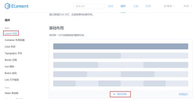
在左菜单栏找到 Layout 布局 ,然后找到自己喜欢的按钮样式,点击 显示代码 ,在下面就会展示出对应的代码,显示出的代码中有样式,有html标签。将样式拷贝我们自己页面的 head 标签内,将html标签拷贝到 标签内。
整体页面代码如下:
DOCTYPE html>
<html lang="en">
<head>
    <meta charset="UTF-8">
    <meta name="viewport" content="width=device-width, initial-scale=1.0">
    <title>基础布局title>
    <script src="../js/vue.js">script>
    <script src="../element-ui/lib/index.js">script>
    <link rel="stylesheet" href="../element-ui/lib/theme-chalk/index.css">
    <style>
        .el-row {
            margin-bottom: 20px;
            &:last-child {
                margin-bottom: 0;
            }
        }
        .el-col {
            border-radius: 4px;
        }
        .bg-purple-dark {
            background: #99a9bf;
        }
        .bg-purple {
            background: #d3dce6;
        }
        .bg-purple-light {
            background: #e5e9f2;
        }
        .grid-content {
            border-radius: 4px;
            min-height: 36px;
        }
        .row-bg {
            padding: 10px 0;
            background-color: #f9fafc;
        }
    style>

head>
<body>
    <div id="div">
        <el-row>
            <el-col :span="24"><div class="grid-content bg-purple-dark">div>el-col>
        el-row>
        <el-row>
            <el-col :span="12"><div class="grid-content bg-purple">div>el-col>
            <el-col :span="12"><div class="grid-content bg-purple-light">div>el-col>
        el-row>
        <el-row>
            <el-col :span="8"><div class="grid-content bg-purple">div>el-col>
            <el-col :span="8"><div class="grid-content bg-purple-light">div>el-col>
            <el-col :span="8"><div class="grid-content bg-purple">div>el-col>
        el-row>
        <el-row>
            <el-col :span="6"><div class="grid-content bg-purple">div>el-col>
            <el-col :span="6"><div class="grid-content bg-purple-light">div>el-col>
            <el-col :span="6"><div class="grid-content bg-purple">div>el-col>
            <el-col :span="6"><div class="grid-content bg-purple-light">div>el-col>
        el-row>
        <el-row>
            <el-col :span="4"><div class="grid-content bg-purple">div>el-col>
            <el-col :span="4"><div class="grid-content bg-purple-light">div>el-col>
            <el-col :span="4"><div class="grid-content bg-purple">div>el-col>
            <el-col :span="4"><div class="grid-content bg-purple-light">div>el-col>
            <el-col :span="4"><div class="grid-content bg-purple">div>el-col>
            <el-col :span="4"><div class="grid-content bg-purple-light">div>el-col>
        el-row>

    div>
body>
<script>
    new Vue({
        el:"#div"
    });
script>
html>
3.2、容器布局
用于布局的容器组件,方便快速搭建页面的基本结构:
如下图是官网提供的 Container 布局容器实例:

该效果代码中包含了样式、页面标签、模型数据。将里面的样式