BootStrap使用心得
BootStrap官网
1.什么是BootStrap?优点是什么?
Bootstrap 是一个用于快速开发 Web 应用程序和网站的前端框架。Bootstrap 是基于 HTML、CSS、JAVASCRIPT 的。
优点:BootStrap是响应式布局,使得开发者可以方便的让网页无论在台式机、平板设备、手机上都获得最佳的体验。
Bootrastp的下载使用
下载地址: https://v3.bootcss.com/getting-started/#download
在html页面引入
<html>
<head>
<title>Bootstrap 模板title>
<meta name="viewport" content="width=device-width, initial-scale=1.0">
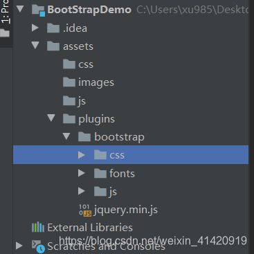
<link href="assets/plugins/bootstrap/css/bootstrap.min.css" type="text/css" rel="stylesheet">
head>
<body>
<h1>Hello, world!h1>
<script src="assets/plugins/jquery.min.js">script>
<script src="assets/plugins/bootstrap/js/bootstrap.min.js">script>
body>
html>
Bootstrap网格系统
详见: https://v3.bootcss.com/css/
什么是网格系统?
简单来说网格系统就是可以让页面布局更简单,可以兼容移动端、PC端。
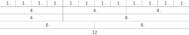
响应式网格系统随着屏幕或视口(viewport)尺寸的增加,系统会自动分为最多 12 列。
Bootstrap 网格系统是如何工作的:
- 行必须放置在 .container class 内,以便获得适当的对齐(alignment)和内边距(padding)。
- 使用行来创建列的水平组。
- 内容应该放置在列内,且唯有列可以是行的直接子元素。
- 预定义的网格类,比如 .row 和 .col-xs-4,可用于快速创建网格布局。LESS 混合类可用于更多语义布局。
- 列通过内边距(padding)来创建列内容之间的间隙。该内边距是通过 .rows 上的外边距(margin)取负,表示第一列和最后一列的行偏移。
- 网格系统是通过指定您想要横跨的十二个可用的列来创建的。例如,要创建三个相等的列,则使用三个 .col-xs-4。
代码例子:
<html>
<head>
    <title>Bootstrap 模板title>
    <meta name="viewport" content="width=device-width, initial-scale=1.0">

    <link href="assets/plugins/bootstrap/css/bootstrap.min.css" type="text/css" rel="stylesheet">


head>
<body>

<div class="container">
    <div class="row">
        <div class="col-md-6" >左边div>
        <div class="col-md-6" >右边div>
    div>
div>


<script src="assets/plugins/jquery.min.js">script>

<script src="assets/plugins/bootstrap/js/bootstrap.min.js">script>
body>
html>
媒体查询
媒体查询是非常别致的"有条件的 CSS 规则"。它只适用于一些基于某些规定条件的 CSS。如果满足那些条件,则应用相应的样式。
Bootstrap 中的媒体查询允许您基于视口大小移动、显示并隐藏内容。下面的媒体查询在 LESS 文件中使用,用来创建 Bootstrap 网格系统中的关键的分界点阈值。
/* 超小设备(手机,小于 768px) /
/ Bootstrap 中默认情况下没有媒体查询 */
/* 小型设备(平板电脑,768px 起) */
@media (min-width: @screen-sm-min) { … }
/* 中型设备(台式电脑,992px 起) */
@media (min-width: @screen-md-min) { … }
/* 大型设备(大台式电脑,1200px 起) */
@media (min-width: @screen-lg-min) { … }
我们有时候也会在媒体查询代码中包含 max-width,从而将 CSS 的影响限制在更小范围的屏幕大小之内。
@media (max-width: @screen-xs-max) { … }
@media (min-width: @screen-sm-min) and (max-width: @screen-sm-max) { … }
@media (min-width: @screen-md-min) and (max-width: @screen-md-max) { … }
@media (min-width: @screen-lg-min) { … }
媒体查询有两个部分,先是一个设备规范,然后是一个大小规则。在上面的案例中,设置了下列的规则:
让我们来看下面这行代码:
@media (min-width: @screen-sm-min) and (max-width: @screen-sm-max) { … }
对于所有带有 min-width: @screen-sm-min 的设备,如果屏幕的宽度小于 @screen-sm-max,则会进行一些处理。
例子:
<html>
<head>
    <title>Bootstrap 模板title>
    <meta name="viewport" content="width=device-width, initial-scale=1.0">

    <link href="assets/plugins/bootstrap/css/bootstrap.min.css" type="text/css" rel="stylesheet">


    <style>
        @media screen and (max-width: 480px){
            .my_div{
                border: 1px solid yellow;
            }
        }
    style>
head>
<body>


<div class="my_div">
    Hello 媒体查询
div>


<script src="assets/plugins/jquery.min.js">script>

<script src="assets/plugins/bootstrap/js/bootstrap.min.js">script>
body>
html>
bootstrap表格
详见 https://www.runoob.com/bootstrap/bootstrap-tables.html
bootstrap字体
使用字体图标
如需使用图标,只需要简单地使用下面的代码即可:
<span class="glyphicon glyphicon-search">span>
即通过css样式引入字体样式
其它字体图标库
FontAwesome:http://fontawesome.dashgame.com/
LineAwesome:https://icons8.com/line-awesome
SocialIcons:http://www.socicon.com/chart.php
阿里巴巴矢量图标库:http://www.iconfont.cn/