【手把手陪你学Python】用pyecharts库画水球图
水球图是什么?
水球图是一种可用于展示单个百分比数据的动态图表
第一步 载入pyecharts库
from pyecharts.charts import Liquid, Grid   #首次使用需先安装,执行命令pip install pyecharts
from pyecharts import options as opts
from pyecharts.commons.utils import JsCode
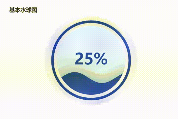
第二步 绘制基本水球图
pic1 = (
    Liquid()
    .add("", [0.25], center = ['50%', '50%'], is_outline_show = True, outline_border_distance = 10, shape = 'circle')
    .set_global_opts(title_opts = opts.TitleOpts(title = '基本水球图', pos_top = '15%', pos_left = '20%'))
)
pic1.render_notebook()
| 部分参数 | 主要用途 |
|---|---|
| center | 指定水球处于画布的位置 |
| is_outline_show | 指定是否显示边框 |
| outline_border_distance | 指定外沿边框宽度 |
| shape | 指定水球的外形,可选’ circle’, ‘rect’, ‘roundRect’, ‘triangle’, ‘diamond’, ‘pin’, ‘arrow’ |
| pos_top/pos_left | 指定图表标题处于画布的位置 |
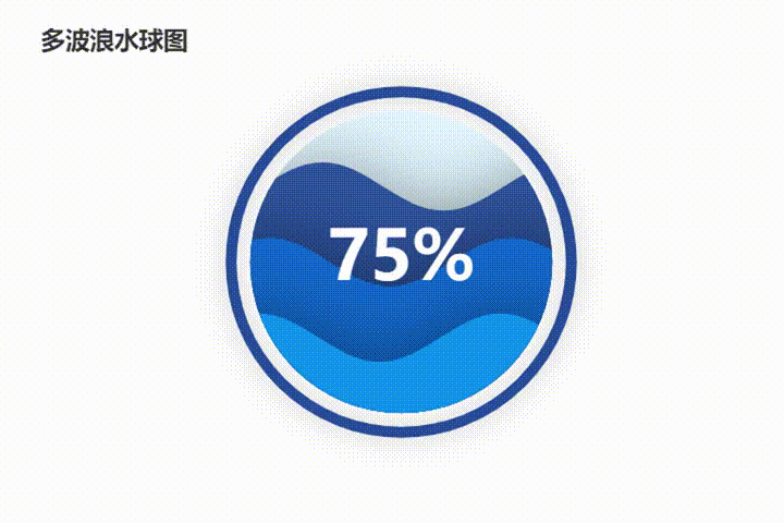
(选做)第二步 绘制多波浪水球图
pic2 = (
    Liquid()
    .add("", [0.75, 0.5, 0.25], center = ['50%', '50%'], is_outline_show = True, outline_border_distance = 10, shape = 'circle')
    .set_global_opts(title_opts = opts.TitleOpts(title = '多波浪水球图', pos_top = '15%', pos_left = '20%'))
)
pic2.render_notebook()
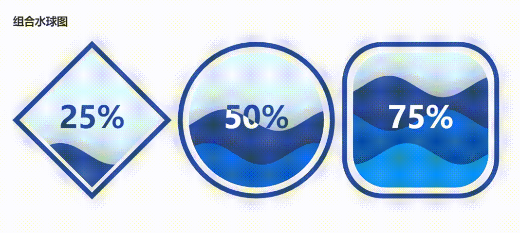
(选做)第三步 绘制组合水球图
pic3 = (
    Liquid()
    .add("", [0.25], center = ['20%', '50%'], is_outline_show = True, outline_border_distance = 10, shape = 'diamond')
    .set_global_opts(title_opts = opts.TitleOpts(title = '组合水球图', pos_top = '15%', pos_left = '5%'))
)

pic4 = (
    Liquid()
    .add("", [0.5, 0.25], center = ['50%', '50%'], is_outline_show = True, outline_border_distance = 10, shape = 'circle')
)

pic5 = (
    Liquid()
    .add("", [0.75, 0.5, 0.25], center = ['80%', '50%'], is_outline_show = True, outline_border_distance = 10, shape = 'roundRect')
)

grid = Grid() .add(pic3, grid_opts = opts.GridOpts()) .add(pic4, grid_opts = opts.GridOpts()) .add(pic5, grid_opts = opts.GridOpts())

grid.render_notebook()
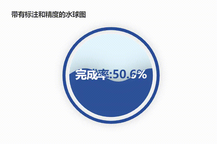
(选做)第四步 绘制带有标注和精度的水球图
对于政府统计工作而言,百分比一般会保留一位小数,且可能需要注明统计指标名称,因此可绘制带有文本标注和数据精度的水球图
pic6 = (
    Liquid()
    .add("", [0.506], center = ['50%', '50%'], is_outline_show = True, outline_border_distance = 10, shape = 'circle',
        label_opts = opts.LabelOpts(font_size = 30, formatter=JsCode("""function (param) {return ('完成率:' + Math.floor(param.value * 10000) / 100) + '%';}"""), position = "inside"))
    .set_global_opts(title_opts = opts.TitleOpts(title = '带有标注和精度的水球图', pos_top = '15%', pos_left = '20%'))
)
pic6.render_notebook()