html5水滴动画,纯css3水滴元素动画特效
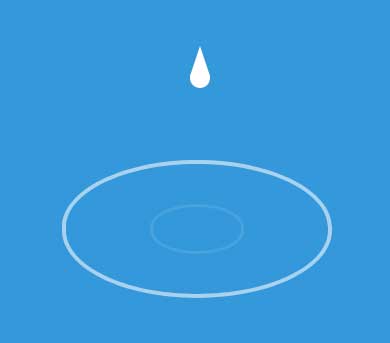
css3 animation属性绘制水滴落下波纹动画,网页水滴元素动画特效。
使用方法:
1、head引入css文件
body {
background-color: #3498DB;
overflow: hidden;
}
div {
margin: 175px auto;
}
.drop {
position: relative;
width: 20px;
height: 20px;
top: -30px;
margin: 0 auto;
background: #FFF;
-moz-border-radius: 20px;
-webkit-border-radius: 20px;
border-radius: 20px;
-moz-animation-name: drip;
-webkit-animation-name: drip;
animation-name: drip;
-moz-animation-timing-function: cubic-bezier(1,0,.91,.19);
-webkit-animation-timing-function: cubic-bezier(1,0,.91,.19);
animation-timing-function: cubic-bezier(1,0,.91,.19);
-moz-animation-duration: 2s;
-webkit-animation-duration: 2s;
animation-duration: 2s;
-moz-animation-iteration-count: infinite;
-webkit-animation-iteration-count: infinite;
animation-iteration-count: infinite;
}
.drop:before {
content: "";
position: absolute;
width: 0;
height: 0;
border-left: 10px solid transparent;
border-right: 10px solid transparent;
border-bottom: 30px solid rgba(255,255,255,1);
top: -22px;
}
.wave {
position: relative;
opacity: 0;
top: 0;
width: 2px;
height: 1px;
border: #FFF 7px solid;
-moz-border-radius: 300px / 150px;
-webkit-border-radius: 300px / 150px;
border-radius: 300px / 150px;
-moz-animation-name: ripple;
-webkit-animation-name: ripple;
animation-name: ripple;
-moz-animation-delay: 2s;
-webkit-animation-delay: 2s;
animation-delay: 2s;
-moz-animation-duration: 2s;
-webkit-animation-duration: 2s;
animation-duration: 2s;
-moz-animation-iteration-count: infinite;
-webkit-animation-iteration-count: infinite;
animation-iteration-count: infinite;
}
.wave:after {
content: "";
position: absolute;
opacity: 0;
top: -5px;
left: -5px;
width: 2px;
height: 1px;
border: #FFF 5px solid;
-moz-border-radius: 300px / 150px;
-webkit-border-radius: 300px / 150px;
border-radius: 300px / 150px;
-moz-animation-name: ripple-2;
-webkit-animation-name: ripple-2;
animation-name: ripple-2;
-moz-animation-duration: 2s;
-webkit-animation-duration: 2s;
animation-duration: 2s;
-moz-animation-iteration-count: infinite;
-webkit-animation-iteration-count: infinite;
animation-iteration-count: infinite;
}
@keyframes ripple {
from {
opacity: 1;
}
to {
width: 600px;
height: 300px;
border-width: 1px;
top: -100px;
opacity: 0;
}
}
@keyframes ripple-2 {
0% {
opacity: 1;
}
50% {
opacity: 0;
}
100% {
width: 200px;
height: 100px;
border-width: 1px;
top: 100px;
left: 200px;
}
}
@keyframes drip {
to {
top: 190px;
}
}
2、body引入HTML代码
注:此资源非帝国CMS模板/特效/源码,需要帝国CMS整站模板源码的小伙伴,请移步 帝国CMS模板,感谢支持!