45 Excellent Blog Designs
Designing a blog is easy. Whatever engine you are using and whatever style you prefer, you’ll always find a number of templates you can apply to your weblog in seconds. No styling is necessary, no playing with colors is needed and no mind jogging about content presentation is required. However, not every weblog should look like a typical blog. After all, not every blogger wants his or her site to look exactly like hundreds of other ones. In fact, there is a small bunch of creative, outstanding and individually designed from scratch blogs.
In this post we didn’t try to showcase some eye-candy (although sometimes eye-candy is indeed offered); the designs listed below were selected for their attention to small details. Pretty and colourful header-graphics doesn’t make a good blog. The blog needs a solid visual structure, a profound hierarchy of site elements; it also has to be able to build some kind of a bridge between the content and its presentation. To do this, you need to think about precision, minimalism and sound use of illustration. These criteria were the ones we’ve used to select the designs listed below. All these aspects make the designs we’ve selected look… well, not always beautiful, but outstanding, almost excellent in their own kind. Mostly it’s the idea the designers used to make the weblog as usable as possible - not the implementation of this idea - which we’ve been after.
Below you’ll find 45 excellent blog designs which impress with creative approaches and attention to details; hopefully you’ll find new ideas you can develop further in your own designs.
Notice that the screenshots we’ve provided may give you a wrong impression about the whole design of the sites; in doubt you should take a closer look at headers, footers, comment-areas, site structure and further site elements. Please also notice that you can click on screenshots to get to the sites from which the screenshots have been taken.
We’ve missed something? Definitely! Let us know in the comments!
Weblogs powered by Django
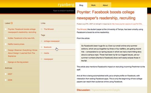
Ryan Berg (Django)
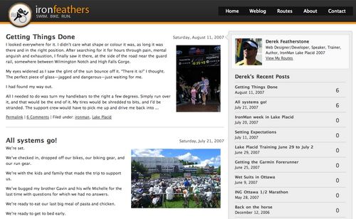
Derek Featherstone (Django)
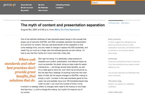
Jeff Croft (Django)
Andy Hume (Django)
Weblogs powered by ExpressionEngine
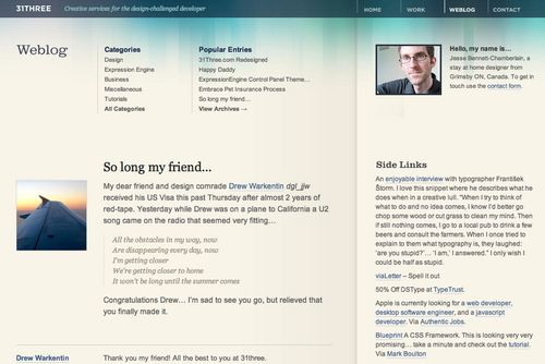
Jesse Bennett-Chamberlain (Expression Engine)
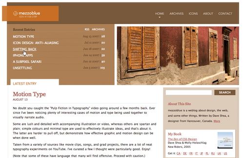
Whitespace in use. The categories and popular entries are listed at the top of the page, not in the sidebar as they usually are.
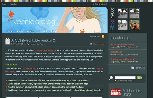
Veerle Pieters
An almost “classic”, well-known design, but still incredibly beautiful. Veerle makes use of a dark layout with quite colourful scheme. The result is impressive - and the position of site elements extremely well thought-out.
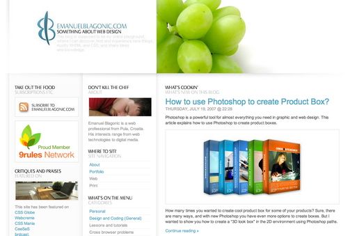
Emanuel Blagonic (Expression Engine)
Weblogs powered by MovableType
Kevin Kornell (Movable Type)
A typical weblog doesn’t look like an illustrated magazine. Kevin Kornell’s blog does. This one makes use of an “oldie”-style.
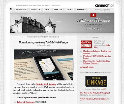
Cameron Moll
Dave Shea (Movable Type)
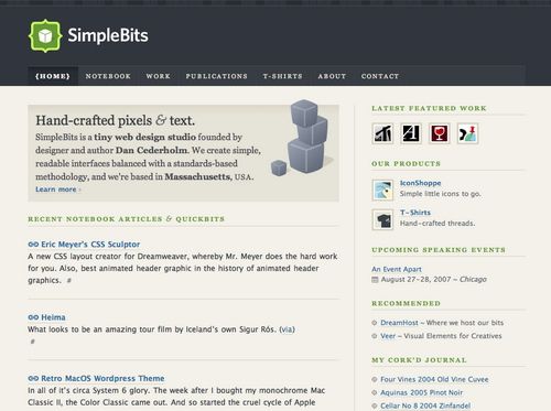
Dan Cederholm (Movable Type)
Weblogs powered by Textpattern
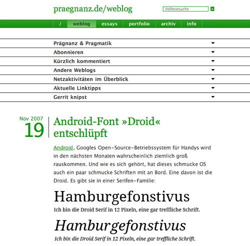
Praegnanz.de (Textpattern)
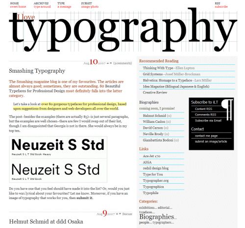
A minimalistic approach with clean web-typography.
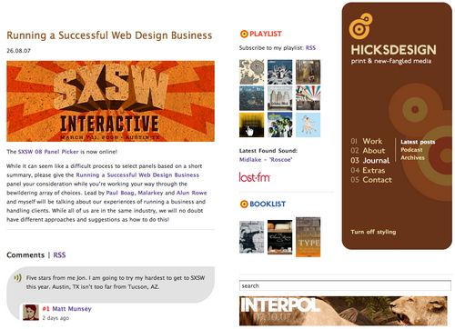
Hicksdesign (Textpattern)
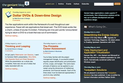
Geniant (Textpattern)
Blogs powered by Wordpress
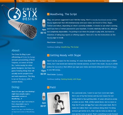
Circle Six (Wordpress)
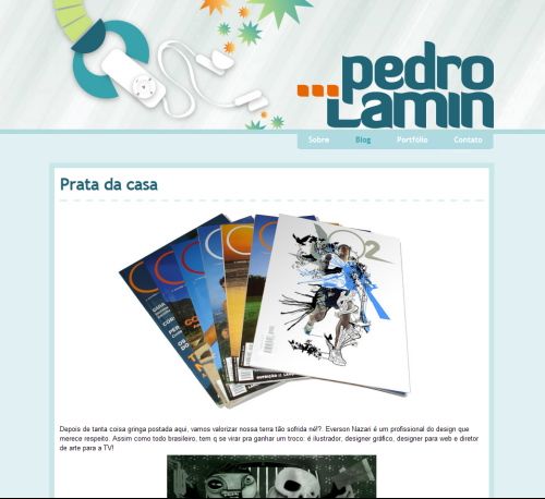
Pedro Lamin (Wordpress)
Fresh and clean design, lacking almost everything - there is even no navigation in blog categories.
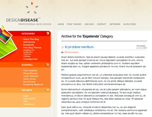
Design Disease (Wordpress)
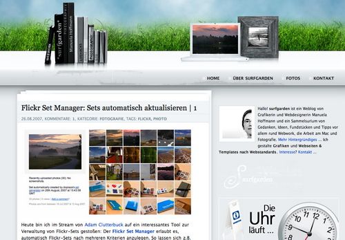
Surfgarden (Wordpress)
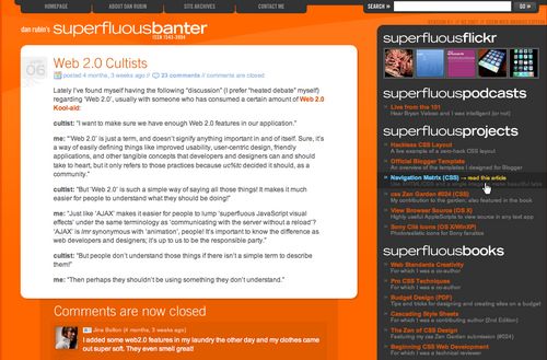
Dan Rubin (Wordpress)
NorthxEast (Wordpress)
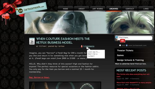
Larissa Meek (Wordpress)
Matt (Wordpress)
A Business-Design. Look at the information sections on the left side of the layout.
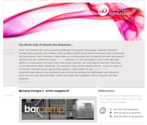
Agenturblog (Wordpress)
Ben Gillbanks (Wordpress)
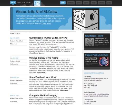
Rik Catlow (Wordpress)
FreelanceSwitch (Wordpress)
John Boardley (Wordpress)
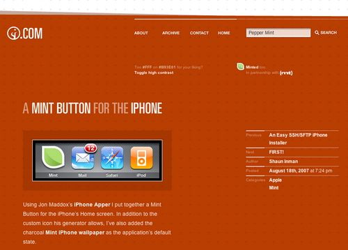
Shaun Inman (Wordpress custom PHP-Framework. Thanks, Shaun)
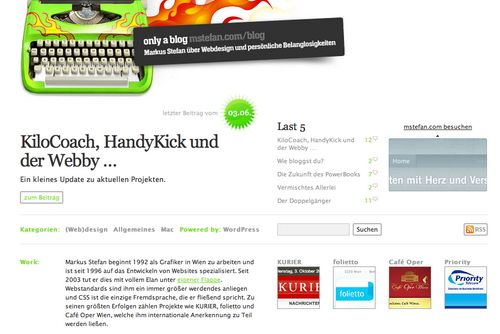
Mstefan.com (Wordpress)
Screenz (Wordpress)
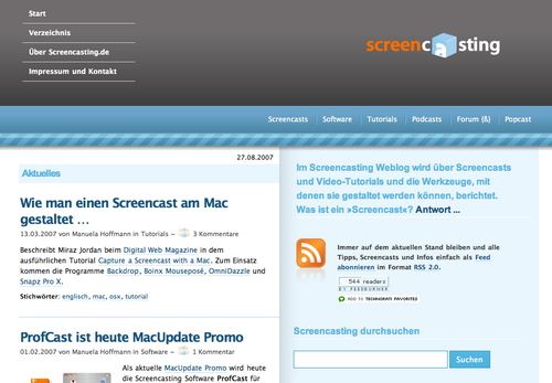
Screencasting (Wordpress)
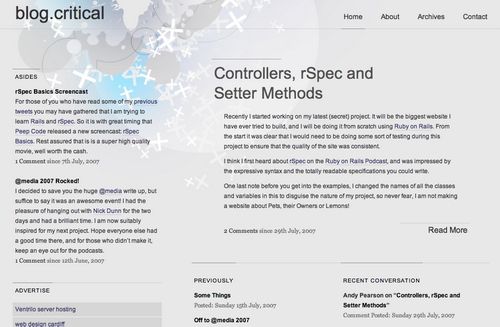
Blog.Critical (Wordpress)
Wan Zafran (Wordpress)
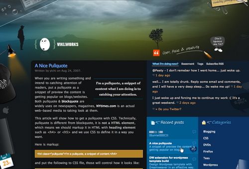
Viki (Wordpress)
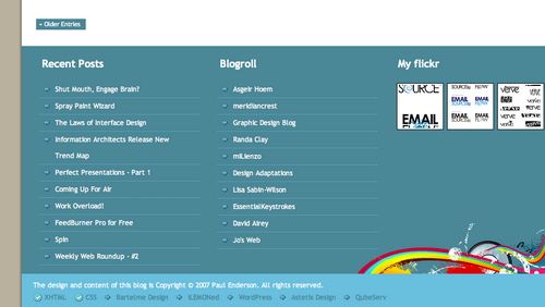
Extensive use of visual elements prevails; it might be a nice idea, but the content should prevail.
Nick La (Wordpress)
Playful design with dozens of swirls, curves and artistic elements.
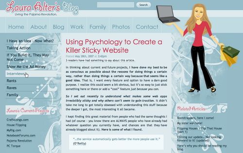
Laura Alter (Wordpress)
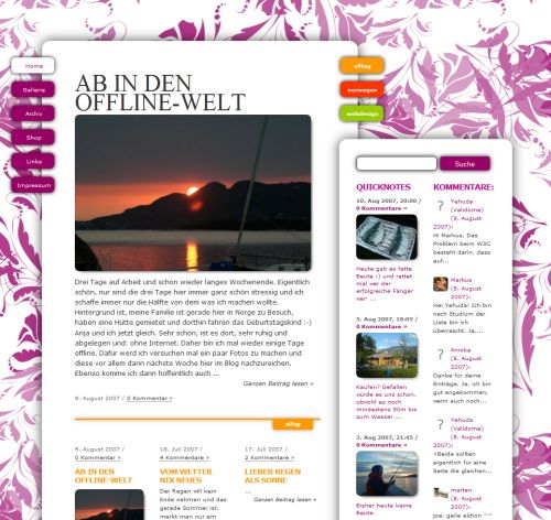
Markus Zeeh (Wordpress)
Playful flower-images and ornaments seem to be trends.
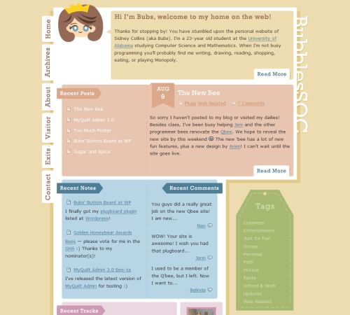
Sidney Collins (Wordpress)
Roman Leinwather (Wordpress)
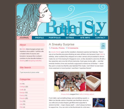
Bottled Sky (Wordpress)
Probably not the most gorgeous layout ever made, but well-structured. The use of colors communicates the idea of the site.
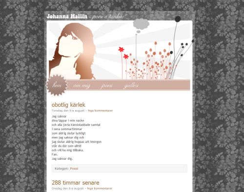
Johanna Hallin (Wordpress)
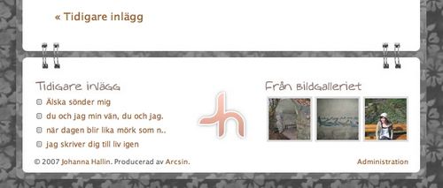
Cabana (Wordpress)
Sometimes it is an interesting approach to use a “thin” layout, although it should rather be an exception.
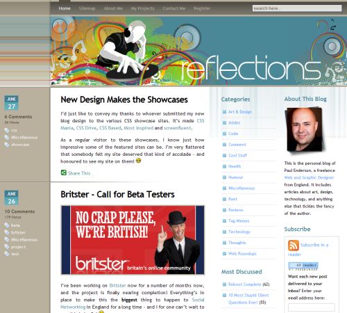
Reflections (Wordpress)
Further Weblogs
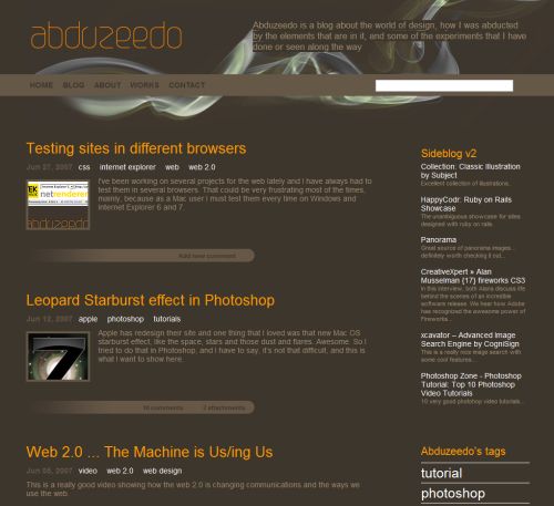
Abduzeedo (Drupal)
Stylish, readable and clean. The site doesn’t look like blog at all - at least at the first glance.
Jonathan Snook (CakePHP)
Even more inspiration!
Apart from numerous galleries of CSS-based designs you might find useful the following showcases of weblogs designed on specific plattforms.
- Textpattern sites
Gallery of very well designed Textpattern-sites as well as the list of sites based upon Textpattern (sorted by country). - Django sites
A growing showcase of websites powered by Django. Almost 300 entries. - Expression Engine Showcase
A gallery of 200 sites powered by Expression Engine. 15 categories.
