android layout_weight详解
The popular Android OS uses layouts to display
Views on the screen. A
View is a widget that has an appearance on the screen. Examples of widgets are radio buttons, labels, edit boxes, etc.
The appearance and sequence of Views can be ordered and one of the ways to do that is through the use of the LayoutParam layout_weight. This is an often overlooked, extremely powerful, but also tricky feature of layouts.
The Android developers website (developer.android.com) defines layout_weightas follows:
Indicates how much of the extra space in the [ViewGroup] will be allocated to the view associated with these LayoutParams.
This definition does not help us very much, especially because it is only true under specific circumstances as we see below. Let’s have a look at some examples. In the first example we want to split the display in half vertically with the following layout:
<br />
<?xml version="1.0" encoding="utf-8"?><br />
<LinearLayout xmlns:android="http://schemas.android.com/apk/res/android"<br />
    android:orientation="vertical"<br />
    android:layout_width="match_parent"<br />
    android:layout_height="match_parent"><br />
    <LinearLayout<br />
        android:background="#0000FF"<br />
        android:layout_height="match_parent"<br />
        android:layout_width="match_parent" /><br />
    <LinearLayout<br />
        android:background="#00FF00"<br />
        android:layout_height="match_parent"<br />
        android:layout_width="match_parent" /><br />
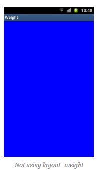
Of course the split does not work because the layout_height of the firstLinearLayout is set to match_parent causing it to take up all available space and leaving no room for the second LinearLayout. Changing the layout_height towrap_content will not help because the LinearLayouts have 0 heights making them invisible.
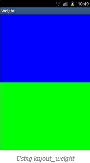
At this point we can show what layout_weight can do. Have a look at this, changed, piece of code and the resulting screenshot below:
<br />
<?xml version="1.0" encoding="utf-8"?><br />
<LinearLayout xmlns:android="http://schemas.android.com/apk/res/android"<br />
    android:orientation="vertical"<br />
    android:layout_width="match_parent"<br />
    android:layout_height="match_parent"><br />
    <LinearLayout<br />
        android:background="#0000FF"<br />
        android:layout_height="match_parent"<br />
        android:layout_width="match_parent"<br />
        android:layout_weight="1" /><br />
    <LinearLayout<br />
        android:background="#00FF00"<br />
        android:layout_height="match_parent"<br />
        android:layout_width="match_parent"<br />
        android:layout_weight="1" /><br />
</LinearLayout><br />

By setting a layout_weight for the two inner LinearLayouts we can tell the parent layout to divide the available space between its children. In this example, we have set the two layout_weight values of the child layouts to the same value, and they will be given an equal part of the available space.
Setting a layout_weight means that the default value of this attribute is changed from 0. Assigning a value higher than zero will split up the rest of the available space in the parent View, according to the value of each View‘s layout_weightand its ratio to the overall layout_weight specified in the current layout for this and other View elements.
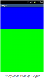
To give an example: in the above example we have two LinearLayouts. If thelayout_weight of each of the two LinearLayouts is set to 1, the remaining width in the parent layout will be split equally between them (as we have seen above). If the first one has a layout_weight of 1 and the second has a layout_weight of 2, then the total weight is three and one third of the remaining space will be given to the first, and two thirds to the second, see the screenshot below.

The divide is one third and two third but, still not exactly what we want. Take a close look at the code. We want the first LinearLayout to occupy two third of the screen. Its layout_weight is set to 2. What we see is that it only occupies one third of the screen. This is the tricky bit of using layout_weight.
The problems are the circumstances it is used in. In this case it is used withlayout_height set to match_parent. In some (!) cases this keeps Android from interpreting the layout_weights correctly. In this case, a vertical layout of view elements, the solution is setting layout_heights to 0dp. With a horizontal layout of view elements layout_width should be set to 0dp.
<br />
<?xml version="1.0" encoding="utf-8"?><br />
<LinearLayout xmlns:android="http://schemas.android.com/apk/res/android"<br />
    android:orientation="vertical"<br />
    android:layout_width="match_parent"<br />
    android:layout_height="match_parent"><br />
    <LinearLayout<br />
        android:background="#0000FF"<br />
        android:layout_height="0dp"<br />
        android:layout_width="match_parent"<br />
        android:layout_weight="2" /><br />
    <LinearLayout<br />
        android:background="#00FF00"<br />
        android:layout_height="0dp"<br />
        android:layout_width="match_parent"<br />
        android:layout_weight="1" /><br />
</LinearLayout><br />

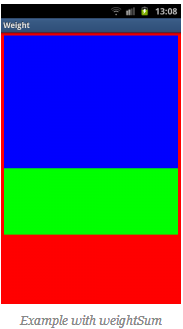
In the above examples the total weight of a View element is calculated by adding all the weights of its children. This can be overridden by adding a weightSum to the parent layout. This provides us with even more control over things. The children LinearLayouts can be specified to take their respective screen parts (two fourth and one fourth) and the parent LinearLayout will take the rest (the remaining one fourth):
<br />
<?xml version="1.0" encoding="utf-8"?><br />
<LinearLayout xmlns:android="http://schemas.android.com/apk/res/android"<br />
    android:orientation="vertical"<br />
    android:layout_width="match_parent"<br />
    android:layout_height="match_parent"<br />
    android:background="#FF0000"<br />
    android:weightSum="4"<br />
    android:padding="5dp"> <!-- to show what the parent is --><br />
    <LinearLayout<br />
        android:background="#0000FF"<br />
        android:layout_height="0dp"<br />
        android:layout_width="match_parent"<br />
        android:layout_weight="2" /><br />
    <LinearLayout<br />
        android:background="#00FF00"<br />
        android:layout_height="0dp"<br />
        android:layout_width="match_parent"<br />
        android:layout_weight="1" /><br />
</LinearLayout><br />

As a conclusion let’s have another look at a potential gotcha when usinglayout_weights. First switch to a horizontal LinearLayout. This contains twoTextViews, each with a layout_width set to 1, but with text of very different lengths in each:
<br />
<?xml version="1.0" encoding="utf-8"?><br />
<LinearLayout xmlns:android="http://schemas.android.com/apk/res/android"<br />
    android:orientation="horizontal"<br />
    android:layout_width="match_parent"<br />
    android:layout_height="match_parent"><br />
    <TextView<br />
        android:layout_height="wrap_content"<br />
        android:text="small"<br />
        android:layout_width="wrap_content"<br />
        android:layout_weight="1" /><br />
    <TextView<br />
        android:layout_height="wrap_content"<br />
        android:text="A very very long text that needs to wrap."<br />
        android:layout_width="wrap_content"<br />
        android:layout_weight="1" /><br />
</LinearLayout><br />

As with the vertical layout the result is not what we expect. This time because of the specified
layout_width
. When calculating the layout, Android calculates the width of the two text controls first and the remaining space is then divided between them equally. Because the second
TextView
is wider, due to its longer text, it appears to be taking up most of the space. As seen earlier the solution is simple, using
0dp
for
layout_width
:
<br />
<?xml version="1.0" encoding="utf-8"?><br />
<LinearLayout xmlns:android="http://schemas.android.com/apk/res/android"<br />
    android:orientation="horizontal"<br />
    android:layout_width="match_parent"<br />
    android:layout_height="match_parent"><br />
    <TextView<br />
        android:layout_height="wrap_content"<br />
        android:text="small"<br />
        android:layout_width="0dp"<br />
        android:layout_weight="1" /><br />
    <TextView<br />
        android:layout_height="wrap_content"<br />
        android:text="A very very long text that needs to wrap."<br />
        android:layout_width="0dp"<br />
        android:layout_weight="1" /><br />
</LinearLayout><br />

原文地址:http://www.chess-ix.com/2012/01/17/the-use-of-layout_weight-with-android-layouts/
官网地址:http://developer.android.com/guide/topics/ui/layout/linear.html
原文详细介绍了关于layout_weight的神奇魅力,本人喜欢原文就没有进行翻译,如果看了又不懂的可以互相讨论一下
