CSS3 Border-radius
扯几句先
一起来看看CSS3中制作圆角的属性border-radius的具体用法。在CSS2中,大家都碰到过圆角的制作。当时,对于圆角的制作,我们都需要使用多张圆角图片做为背景,分别应用到每个角上,我应用最多的就是在需要圆角的元素标签中加四个空标签,然后在每个空标签中应用一个圆角的背景位置,然后在对这几个应用了圆角的标签进行定位到相应的位置,具体实现过程我就不在多讲,只看方法就知道烦死人。
如今CSS3中的border-radius出现后,让我们没有那么多的烦恼了,首先制作圆角图片的时间是省了,而且其还有多个优点:其一减少网站的维护的工作量,少了对图片的更新制作,代码的替换等等;其二、提高网站的性能,少了对图片进行http的请求,网页的载入速度将变快;其三增加视觉美观性。既然border-radius有这么多好处,我们就从他的语法,属性和属性值等方面来看其如何应用,又是如何制作圆角,还有就是除了制作圆角他还能制作什么?有这么多,那我们就开始吧:
语法
取值
<length>: 由浮点数字和单位标识符组成的长度值。不可为负值。
1、border-radius: [ <length>{1,4} ]; //这里只有一个值,那么top-left、top-right、bottom-right、bottom-left四个值相等
2、border-radius:[ <length>{1,4} ] [ <length>{1,4} ] ; //这里设置两个值,那么top-left等于bottom-right,并且取第一个值;top-right等于bottom-left,并且取第二个值
3、border-radius:[ <length>{1,4} ] [ <length>{1,4} ] [ <length>{1,4} ];//如果有三个值,其中第一个值是设置top-left;而第二个值是top-right和bottom-left并且他们会相等,第三个值是设置bottom-right
4、border-radius:[ <length>{1,4} ] [ <length>{1,4} ] [ <length>{1,4} ] [ <length>{1,4} ];//如果有四个值,其中第一个值是设置top-left;而第二个值是top-right,第三个值bottom-right,第四个值是设置bottom-left
前面,我们主要看了border-radius的缩写格式,其实border-radius和border属性一样,还可以把各个角单独拆分出来,也就是以下四种写法,这里我规纳一点,他们都是先Y轴在X轴,具体看下面:
这里说一下,各角拆分出来取值方式:<length> <length>中第一个值是圆角水平半径,第二个值是垂直半径,如果第二个值省略,那么其等于第一个值,这时这个角就是一个四分之一的圆角,如果任意一个值为0,那么这个角就不是圆角。
Mozilla(Firefox, Flock等浏览器)
WebKit (Safari, Chrome等浏览器)
Opera浏览器:
其拆分开来的格式相应需要加上-moz和-webkit,上面的代码其实就等价于下面的代码:
.
3、border-radius设置三个值,此时top-left取第一个值,top-right等于bottom-left并且他们取第二个值,bottom-right取第三个值
4、border-radius设置四个值,此时top-left取第一个值,top-right取第二个值,bottom-right取第三个值.bottom-left取第四个值

上面四个实例都是水平和垂直半径相等情况下border-radius的应用,下面我们来看几个水平和垂直半径值不一样的实例:
border-radius: 水平 / 垂直:只设置一个水平和一个垂直半径时,那么水平半径分别指定了元素个四个角的水平半径值,同样垂直半径指定了元素的垂直半径值,此时四个角具有相同的效果,因为他们具有相同的值
一起来看看CSS3中制作圆角的属性border-radius的具体用法。在CSS2中,大家都碰到过圆角的制作。当时,对于圆角的制作,我们都需要使用多张圆角图片做为背景,分别应用到每个角上,我应用最多的就是在需要圆角的元素标签中加四个空标签,然后在每个空标签中应用一个圆角的背景位置,然后在对这几个应用了圆角的标签进行定位到相应的位置,具体实现过程我就不在多讲,只看方法就知道烦死人。
如今CSS3中的border-radius出现后,让我们没有那么多的烦恼了,首先制作圆角图片的时间是省了,而且其还有多个优点:其一减少网站的维护的工作量,少了对图片的更新制作,代码的替换等等;其二、提高网站的性能,少了对图片进行http的请求,网页的载入速度将变快;其三增加视觉美观性。既然border-radius有这么多好处,我们就从他的语法,属性和属性值等方面来看其如何应用,又是如何制作圆角,还有就是除了制作圆角他还能制作什么?有这么多,那我们就开始吧:
语法
border-radius : none | <length>{1,4} [/ <length>{1,4} ]?
取值
<length>: 由浮点数字和单位标识符组成的长度值。不可为负值。
说明
border-radius是一种缩写方法。如果“/”前后的值都存在,那么“/”前面的值设置其水平半径,“/”后面值设置其垂直半径。如果没有“/”,则水平和垂直半径相等。另外其四个值是按照top-left、top-right、bottom-right、bottom-left的顺序来设置的其主要会有下面几种情形出现:1、border-radius: [ <length>{1,4} ]; //这里只有一个值,那么top-left、top-right、bottom-right、bottom-left四个值相等
2、border-radius:[ <length>{1,4} ] [ <length>{1,4} ] ; //这里设置两个值,那么top-left等于bottom-right,并且取第一个值;top-right等于bottom-left,并且取第二个值
3、border-radius:[ <length>{1,4} ] [ <length>{1,4} ] [ <length>{1,4} ];//如果有三个值,其中第一个值是设置top-left;而第二个值是top-right和bottom-left并且他们会相等,第三个值是设置bottom-right
4、border-radius:[ <length>{1,4} ] [ <length>{1,4} ] [ <length>{1,4} ] [ <length>{1,4} ];//如果有四个值,其中第一个值是设置top-left;而第二个值是top-right,第三个值bottom-right,第四个值是设置bottom-left
前面,我们主要看了border-radius的缩写格式,其实border-radius和border属性一样,还可以把各个角单独拆分出来,也就是以下四种写法,这里我规纳一点,他们都是先Y轴在X轴,具体看下面:
border-top-left-radius: <length>  <length>   //左上角
border-top-right-radius: <length>  <length>  //右上角
border-bottom-right-radius:<length>  <length>  //右下角
border-bottom-left-radius:<length>  <length>   //左下角
这里说一下,各角拆分出来取值方式:<length> <length>中第一个值是圆角水平半径,第二个值是垂直半径,如果第二个值省略,那么其等于第一个值,这时这个角就是一个四分之一的圆角,如果任意一个值为0,那么这个角就不是圆角。
版本问题
Mozilla(Firefox, Flock等浏览器)
  -moz-border-radius-topleft: //左上角
  -moz-border-radius-topright: //右上角
  -moz-border-radius-bottomright: //右下角
  -moz-border-radius-bottomleft: //左下角

   等价于:

  -moz-border-radius: //简写
WebKit (Safari, Chrome等浏览器)
  -webkit-border-top-left-radius:  //左上角
  -webkit-border-top-right-radius:  //右上角
  -webkit-border-bottom-right-radius:  //右下角
  -webkit-border-bottom-left-radius:  // 左下角

   等价于:

  -webkit-border-radius:  //简写
Opera浏览器:
  border-top-left-radius: //左上角
  border-top-right-radius: //右上角
  border-bottom-right-radius: //右下角
  border-bottom-left-radius: //左下角

  等价于:

  border-radius: //简写
其拆分开来的格式相应需要加上-moz和-webkit,上面的代码其实就等价于下面的代码:
  -moz-border-radius-topleft: <length> <length> //左上角
  -moz-border-radius-topright: <length> <length> //右上角
  -moz-border-radius-bottomright: <length> <length> //右下角
  -moz-border-radius-bottomleft: <length> <length> //左下角
  -webkit-border-top-left-radius:  <length> <length> //左上角
  -webkit-border-top-right-radius:  <length> <length> //右上角
  -webkit-border-bottom-right-radius: <length> <length> //右下角
  -webkit-border-bottom-left-radius:  <length> <length> // 左下角
  border-top-left-radius: <length> <length> //左上角
  border-top-right-radius: <length> <length> //右上角
  border-bottom-right-radius: <length> <length> //右下角
  border-bottom-left-radius: <length> <length> //左下角
几个示例来说事
HTML code
<div class="demo"></div>
.demo {
  border-radius: 10px;
}
其等价于:

.demo{
 border-top-left-radius: 10px;
 border-top-right-radius: 10px;
 border-bottom-right-radius: 10px;
 border-bottom-left-radius: 10px;
}
.
demo {
  border-radius: 10px 20px;
}

等价于:

.demo {
  border-top-left-radius: 10px;
  border-bottom-right-radius: 10px;
  border-top-right-radius: 20px;
  border-bottom-left-radius: 20px;
}
3、border-radius设置三个值,此时top-left取第一个值,top-right等于bottom-left并且他们取第二个值,bottom-right取第三个值
.demo {
  border-radius: 10px 20px 30px;
}

等价于

.demo {
  border-top-left-radius: 10px;
  border-top-right-radius: 20px;
  border-bottom-left-radius: 20px;
  border-bottom-right-radius: 30px;
}
4、border-radius设置四个值,此时top-left取第一个值,top-right取第二个值,bottom-right取第三个值.bottom-left取第四个值
.demo {
  border-radius:10px 20px 30px 40px;
}

等价于

.demo {
 border-top-left-radius: 10px;
 border-top-right-radius: 20px;
 border-bottom-right-radius: 30px;
 border-bottom-left-radius: 40px;

}
从上面四个实例中我们可以看出border-radius和border取值非常相似,我们border遵循TRBL原则(从上边右边下边左边分别对应1、2,3,4四个值),只不过border-radius换成了左上角(top-left)对就值1,右上角(top-right)对应值2,右下角(bottom-right)对应值3,左下角(bottom-left)对应值4.
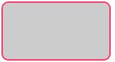
注:如无特殊声明,本文实例所有基本代码格式如上所示,只在该元素上添加border-radius属性设置。
.demo {
  border-radius: 10px 15px 20px 30px / 20px 30px 10px 15px;
}
这种写法我们前面有提到过,“/”前是指圆角的水平半径,而“/”后是指圆角的垂直半径,他们两都遵循TRBL的顺序原则。为了能让大家更清楚理解,我们把上面代码换成如下:
.demo {
  border-top-left-radius: 10px 20px;
  border-top-right-radius: 15px 30px;
  border-bottom-right-radius: 20px 10px;
  border-bottom-left-radius: 30px 15px;
}
上面四个实例都是水平和垂直半径相等情况下border-radius的应用,下面我们来看几个水平和垂直半径值不一样的实例:
border-radius: 水平 / 垂直:只设置一个水平和一个垂直半径时,那么水平半径分别指定了元素个四个角的水平半径值,同样垂直半径指定了元素的垂直半径值,此时四个角具有相同的效果,因为他们具有相同的值
.demo {
  border-radius: 10px / 20px;
}

等价于:

.demo {
  border-top-left-radius: 10px 20px;
  border-top-right-radius: 10px 20px;
  border-bottom-right-radius: 10px 20px;
  border-bottom-left-radius: 10px 20px;
}
border-radius: 水平1 水平2 / 垂直1 垂直2:
设置了两个水平值和两个垂直值,此时我们top-left和bottom-right具有相同的水平和垂直半径,也就是其中的水平1和垂直1;而top-right和bottom-left也具有相同的水平和垂直半径值,也就是水平2和垂直2,我们他拆分出来就是:
border-top-left-radius: 水平1  垂直1;
border-bottom-right-radius: 水平1  垂直1;
border-top-right-radius: 水平2  垂直2;
border-bottom-left-radius: 水平2  垂直2;
具体我们来看下面的实例:
.demo {
  border-radius: 10px 20px / 20px 10px;
}

等价于:

.demo {
  border-top-left-radius: 10px 20px;
  border-bottom-right-radius: 10px 20px;
  border-top-right-radius: 20px 10px;
  border-bottom-left-radius: 20px 10px;
}
.demo {
  border-radius: 10px 20px 30px / 50px 60px;
}

等价于:

.demo {
  border-top-left-radius: 10px 50px;
  border-top-right-radius: 20px 60px;
  border-bottom-left-radius: 20px 60px;
  border-bottom-right-radius: 30px 50px;
}
我们从上面等价代码中可以知道,不管他们怎么取值,“/”前后各自按TRBL顺序取值。那么到此,border-radius的一些用法就介绍完了。