DevExpress之ChartControl
| Chart Control |
The DevExpress WinForms Charts Suite provides over 60 different 2D and 3D chart types, ranging from simple bar and pie charts, to complex financial charts such as stock and candle stick charts. DevExpress WinForms Charts also give you the flexibility to bind to any datasource that supports the IList or IEnumerable interface. And with the built-in Charts Wizard, you can configure a chart of any complexity quickly and easily at design time.
Click on a tile below to learn more about our comprehensive WinForms Charts Suite.
| START HERE | LEARN MORE | HOW TO | REFERENCE |
| Getting Started | Concepts | Examples | Included Components |
| Fundamental Concepts | Visual Elements | Code Central | |
| Training Videos | End-User Capabilities | Demos in Installation | |
| Design-Time Features |
| Getting Started |
This document gives you a quick overview of what resources you need to review first to get started with the XtraCharts Suite. These examples demonstrate the basic functionality of XtraCharts, and provide you with the step-by-step instructions on how to create simple and advanced charting applications in MS Visual Studio.
For basic information on how to use the XtraCharts Suite, please refer to the Fundamentals section.
To quickly get started with XtraCharts, we suggest that you review the following tutorials.
- Lesson 1 - Create a Chart using the Wizard
- Lesson 2 - Create a Simple Unbound Chart
- Lesson 3 - Bind Chart Series to Data
- Lesson 4 - Use the Series Template for Auto-Created Series
In addition to the lessons listed above, we have prepared a lot of online videos to help you become familiar with XtraCharts. They will be of particular interest to those developers who recently started working with Visual Studio .NET, or have not yet had an opportunity to see XtraCharts in action. In general, these online demos show how to replicate the steps that are described in the corresponding lessons, and also demonstrate some additional features.
XtraCharts online videos are available on the DevExpress Channel website.
第一课 使用向导创建图表(Chart)
| Lesson 1 - Create a Chart using the Wizard |
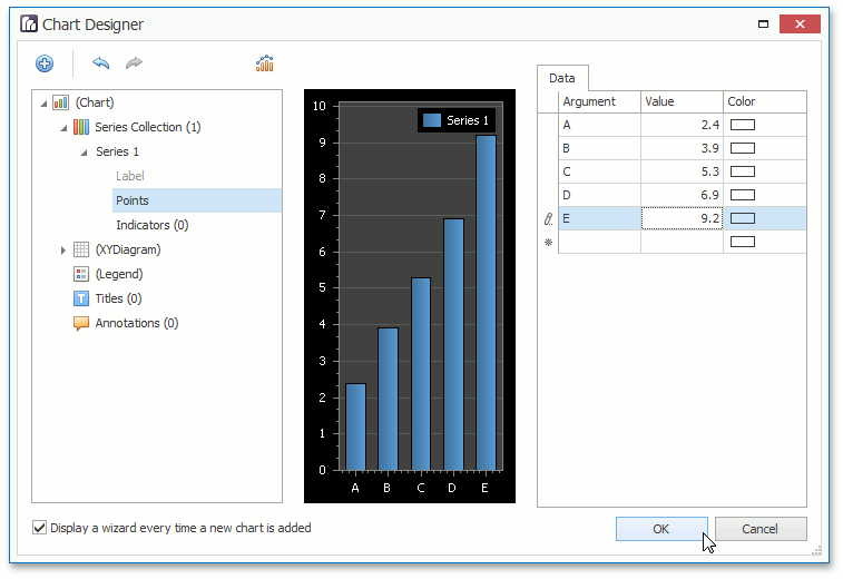
This tutorial introduces the Chart Wizard, which allows you and your end-users to create and customize a chart of any level of complexity from scratch. In this example, we'll use the Wizard to create a simple unbound chart. However, note that if your chart'sChartControl.DataSource is defined, the Wizard also provides a complete set of data-related settings, so that you can use it to perform even the most complex data binding tasks.
By default, the Wizard is automatically invoked each time a ChartControl is dropped from the toolbox, (if the "Display a wizard every time a new chart is added" option on the Wizard's status bar is enabled). And, you can quickly run the Wizard for your chart, by clicking its smart tag, and from its actions list, choosing the Run Wizard... command.
Then, proceed with the Wizard's steps, to construct the chart.
根据向导进行操作,完成图表的构建。
-
On the first Chart Type page, choose the Bar chart type. The type specified at this step is not absolute, and you will have the option to change it in anotherSeries page, because the chart type (thediagram type) is determined by the view type of the series it displays.
-
第一页是Chart Type(图表类型)页,选择Bar chart(长条图)。本教程中向导选择的图表类型是特定的,你自己开发时可以选择任意一种图表类型,也可以随时更改图表的类型。
-
Switch to the next Appearance page. Here, you can choose the look-and-feel for your chart by specifying itspalette and choosing its specificstyle. For details on this, refer toAppearance Customization.
-
翻看接下来的Appearance(外观)页。你可以为图表选择特定外观,方法是设定Palette(调色板)并选择Style(样式)。
-
The next Series page is where you actually determine the type of your chart. It depends on which view type has the first visible series in the chart's collection. And, in order to combine multiple series of different types within the same chart, their view types must be compatible. For details on this, refer to Combining Different Series Views.
-
Series(序列)页面是你真正设计你的图表类型的地方。它取决于在图表集合中哪一种View type(视图类型)有第一个可见series(序列)。为了对一个图表综合使用多种系列不同类型,他们的视图类型必须兼容。 译者注:序列就是一组数字。
-
-
On this page, after you have created a series of the required types, ensure that theirvalue scale types are defined appropriately. Because declaring an accurate scale type series points'values is crucial for getting the correct output. The argument scale types are defined automatically, by default.
-
创建需要类型的序列后,确保他们的值类型正确定义了。因为要想得到正确的结果,要求点集序列必须准确的值类型。自变量的值类型会自动设为默认值。
To learn about other options available on this tab, refer to The Wizard's Structure: The Construction Page Group.
-
The next Data page provides options for populating the series with points. This can be either donemanually (by specifyingarguments and their values for each point) or - if your chart'sdata source is defined -automatically (by specifying the data bindings for your series). For details on this, refer toProviding Data.
-
数据页提供点序列生成的设置。点序列既可以手动设置(通过为每一个点设置Argument(自变量)和Value(因变量)),也可以通过定义图表的data source数据源属性自动设置(通过绑定序列定义数据)
-
-
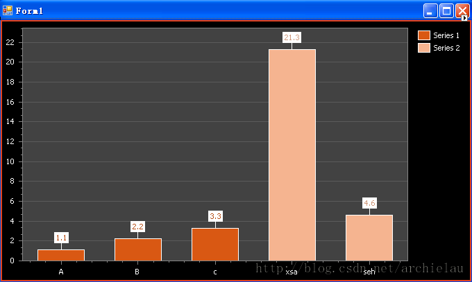
At this step, the chart's construction is finished, so you can click Finish to see the result.
-
图表构建完成,单击Finish查看结果。
The pages in the next Presentation group allow you to adjust the appearance of the chart and its elements, and are detailed in the following document:The Wizard's Structure: The Presentation Page Group.
-------------------------------------------------------------------------------------------------------------------------------------| Lesson 2 - Create a Simple Unbound Chart |
第二课 创建简单图表
This example demonstrates how to construct a chart at design time within Visual Studio with manually created and populated series.
To create a simple unbound chart, do the following.
本例演示如何使用Visual Studio在设计时构建图表,并通过手动方式创建和构造数据。
- Create a Chart and Add Series to it
- Customize the Chart
-
Start MS Visual Studio (2010 or 2012), and create a new Windows Forms Application or open an existing one. 启动MS Visual Studio,创建窗口应用程序或者打开一个已经存在的项目
-
From the DX.13.1: Data & Analytics toolbox tab, drop the ChartControl onto the form.
-
从DX:Data&Analysis工具栏页拖动ChartControl到窗口上。(我自己用的是10.2)
Note that after you drop the Chart, the Chart Wizard may be invoked (if its "Display a wizard every time a new chart is added" option is enabled). In this example, we don't need to use the Wizard, so clickCancel to close its window.本例不需要向导,选择Cancel关闭向导窗口。
-
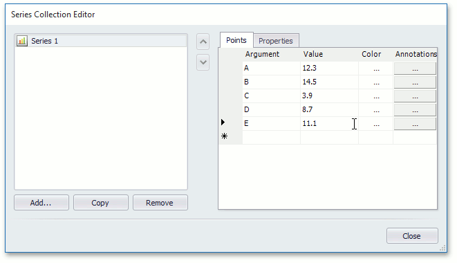
To add a new series to the chart, click the chart's smart tag, and in its actions list, click theSeries... link. 单击图表的智能标签动作列表中的Series...链接给图表添加新的序列 Then, in the invoked Series Collection Editor, click Add.... 在激活的序列集合编辑器Series Collection Editor中,单击Add... 。
-
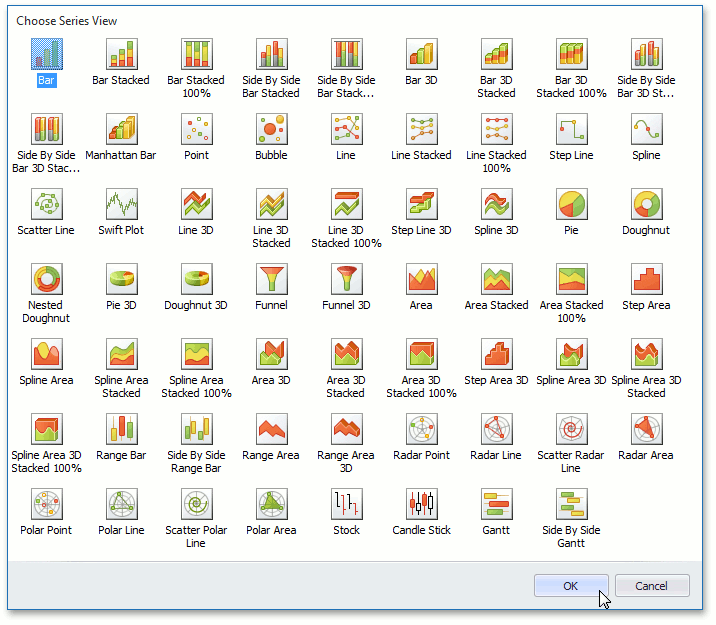
In the Series View Types dialog, specify the view type of the series being created.
Note that the view type of the first visible series in the chart's collection determines itsdiagram type.
For example, choose the Bar series, for the chart to get the XY-type. 在Series View Type序列类型对话框中,指定将要创建的序列的视图类型 。 注意图表集合中第一列可见序列的视图类型决定了最终的图类型。
-
XtraCharts automatically detects the data type of series arguments. This means that you don't need to specify the SeriesBase.ArgumentScaleType property before providing data for a chart, because it is set to Auto by default. Just make sure the default value of the SeriesBase.ValueScaleType property meets your requirements for some view types. Otherwise, select another value scale type (e.g., for the Bar series view). Note
NoteThe available view types are listed in 2D Chart Types and 3D Chart Types.
-
XtraCharts 自动确定序列的自变量的数据类型。也就是说在给图表提供数据之前不需要指定 SeriesBase .ArgumentScaleType属性,因为默认被设置为 Auto。只要保证默认的value参变量SeriesBase.ValueScaleType属性满足你的视图类型需要就行,否则选择另外一种值类型。
-
You can perform this in the Properties tab of the dialog.在Properties属性页进行操作
-
To manually add points to your series, switch back to the Points tab. Although, some series view types may require more than one value for each point's argument (e.g., inBubble or Stock series), it's more typical for a point to have only an argument and value pair, which correspond to the point's X and Y coordinates along the appropriateaxes.
-
In your chart, you can create as many different series as required. Moreover, you can combine series of different view types within the same chart,if these view types are compatible. For example, add a Spline series.
-
你可以创建任意数量的序列,而且可以在同一个Chart上综合不同的视图类型,只要这些视图相容,如添加一个Spline样条曲线序列。
To apply the changes and quit the dialog, click Close. Now, your chart has two different series, populated with points. It now looks like in the following image.
应用设置并退出对话框,单击Close。现在图表上有两种不同类型的序列。
- Customize the Legend定制图例
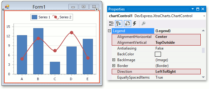
By default, the chart's legend is shown in the top-right corner of the chart. To change the legend position, expand theChartControl.Legend property, and set its Legend.AlignmentHorizontal property to Center, Legend.AlignmentVertical to TopOutside, and Legend.Direction to LeftToRight. 默认图例在 右 上角,要改变位置,展开ChartControl.Legend属性,并设置Legend.AlignmentHorizontal属性为Center中心,Legend.AlignmentVertical为TopOutside,Legend.Direction 为LeftToRight
- Add a Constant Line添加横线
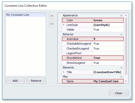
To highlight a value across any axis, a Constant Line can be drawn through it. To do this, expand the ChartControl.Diagram property, and then its IXYDiagram2D.AxisY property in the Properties window. And click the ellipsis button for itsAxis2D.ConstantLines property.
Then, in the Constant Line Collection Editor, click Add to create a constant line, specify itsConstantLine.AxisValue property, and adjust its remaining options. 在横线编辑器中,单击Add添加创建横线,指定横线的ConstantLine.AxisValue属性,调整到合适选项。
-
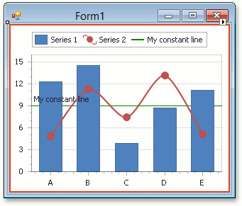
The result is illustrated in the following image.
- Display Series in Different Panes在不同面板展示
You can show each series (or group of series) in a separate pane. To do this, select the Spline series on a diagram. Then, In the Properties grid, expand the SeriesBase.View property and invoke the drop-down menu for the XYDiagramSeriesViewBase.Pane property, and click New pane.
The result is illustrated in the following image.
In addition, you can adjust the axes visibility in the panes, and create secondary axes as well.
- Customize the Crosshair Cursor定制十字准线光标
By default, a crosshair cursor is automatically displayed on a chart control at runtime. You can enable (disable) the crosshair cursor both at the level of a chart control using theChartControl.CrosshairEnabled property, and at the level of a chart series via theSeriesBase.CrosshairEnabled property.
To demonstrate the second approach, let's disable a crosshair label for the Bar series.
To do this, invoke the Series Collection Editor via the chart's smart tag. Then, locate theSeriesBase.CrosshairEnabled property in the Series1's Properties tab and set it tofalse.
Note that you can also get access to this property via the Properties grid.
Run the application and make sure a crosshair label appears only for the Spline series.
Let's show crosshair axis lines and crosshair axis labels on a chart.
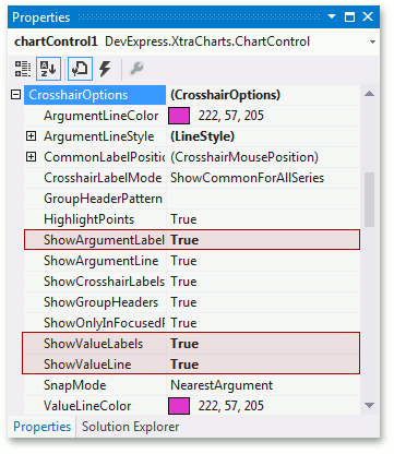
To accomplish this, locate the CrosshairOptions object in the Properties grid and set its CrosshairOptions.ShowArgumentLine, CrosshairOptions.ShowValueLine, CrosshairOptions.ShowArgumentLabels, CrosshairOptions.ShowValueLabels properties to true as shown below:
Run the application to see the result.
----------------------------------------------------------------------------------------------------------------------------------------------------------------
| Lesson 3 - Bind Chart Series to Data |
第三课 绑定数据到图表序列
This tutorial demonstrates how to bind a chart to an external data source, manually add a series to the chart, and adjust its data bindings. This means that it is possible to provide an individual data source for each series.
指南演示了如何绑定图表到外部数据源,手动添加序列到图表并调整数据绑定。也就是说,可以为每种序列提供独立的数据源。
To learn how to manually bind a chart's series to data, do the following.
手动绑定图表的序列到数据,按如下步骤进行
- Create a Chart and Bind it to Data
- Specify a Series Data Source
- Populate with Data at Design and Runtime
- Customize the Chart
- Get the Result
-
Start MS Visual Studio (2010 or 2012) and create a new Windows Forms Application or open an existing one.启动VS新建Windows 窗体应用程序或打开已经存在的程序。
-
From the DX.13.1: Data & Analytics toolbox tab, drop the ChartControl onto the form.拖动ChartControl到窗体
-
In this instance, the Chart Wizard may be invoked (if its "Display a wizard every time a new chart is added" option is enabled). In this example, we don't need to use the wizard, so click theCancel button to close the Wizard and manually customize the chart.本实例中,Chart 向导或许被激活,这里不需要,所以单击Cancel取消关闭向导,并手动定制图表。
-
 Note
NoteFor the chart to occupy all the available space on the form, click the chart's smart tag, and in its actions list, clickDock in Parent Container
要使图表占据窗体的可用空白空间,单击Chart的智能标签,在行为列表中单击Dock in Parent Container.
-
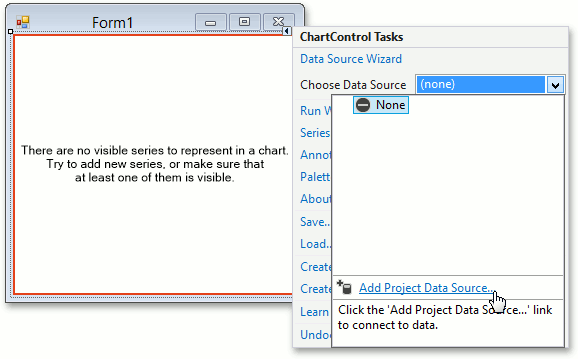
To define a data source for the chart, click its smart tag, and in its actions list, expand theChoose Data Source drop-down list and click on Add Project Data Source... link. 要添加图表的数据源,单击智能标签,行为列表下展开Choose Data Source选择数据源下拉列表,单击Add Project Data Source。。。添加项目数据源链接
-
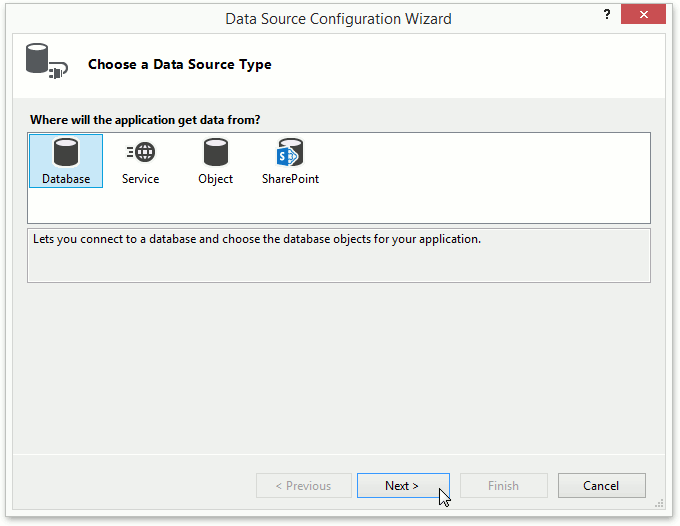
The Data Source Configuration Wizard appears. It allows you to select a data source.出现数据源配置向导,可以选择一个数据源。
-
In the Wizard's first page, select the Database icon and click Next.选择数据库图标,单击Next进入下一步。
-
In the Choose a Database Model page, click Next.在选择数据库模型页,单击Next进入下一步。
-
On the following page, click New Connection... and specify the following path to the Northwind database file - C:\Users\Public\Documents\DXperience 13.1 Demos\Data\nwind.mdb (leave thePassword option blank). 单击New Connection...新建连接。。。并指定Northwind数据库文件目录C:\Users\Public\Documents\DXperience 13.1 Demos\Data\nwind.mdb,Password选项置空。
To proceed, click Next.继续点击Next。
-
Then, the following message appears.
是否拷贝数据库文件到当前工程兵修改连接。
-
 Note
NoteYou can choose between adding the file to your project or leaving it in its original location. For more information on Visual Studio behavior, see the "How to: Manage Local Data Files in Your Project" article in MSDN.
Select No, as this example is not intended to change database data.选择不拷贝。
-
Click Next on the following page to save the created connection string to the configuration file.单击Next保存创建的连接字符串到配置文件。
-
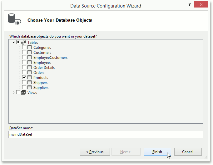
Select the "Products" table as shown below and click Finish.选择Products表,然后单击Finish完成。
As a result, Visual Studio will generate a set of classes for data manipulation within the project. The main ones are:
VS会自动在项目中生成一些数据控制类,主要的有
- nwindDataSet - represents a System.Data.DataSet object (a collection of tables, relationships, and constraints), which contains the Products table from the Northwind database.
- nwindDataSet 表示一个System.Data.DataSet 对象(表、关系、约束的集合),包含了北风数据库的products 表
- productsTableAdapter - represents a TableAdapter object that provides communication between the application and a database. Its methods are used for executing queries and stored procedures, fetching data and filling DataTables in DataSets, and sending data back to the database. It is assigned to the ChartControl.DataAdapter property.
- productTableAdapter表示一个TableAdapter对象,这个对象支持应用程序和数据库通信。它的方法用来执行查询和存储过程,获取数据并填充DataSets里的DataTables,并返回数据到数据库,被关联到ChartControl.DataAdapter属性
- productsBindingSource - represents a System.Windows.Forms.BindingSource component, used to simplify the data binding of the nwindDataSet to the ChartControl. It is assigned to theChartControl.DataSource property.
- productsBindingSource 表示一个System.Windows.Forms.BindingSource组件,用来简化数据绑定到nwindDataSet到ChartControl。被关联到ChartControl.DataSource属性
Now, the chart has been bound to data. The next steps specify which data fields should be used to provide data for the chart's series.
现在,图表已经被绑定了数据。下一步指定哪些数据域应该被使用来提供图表的序列。
-
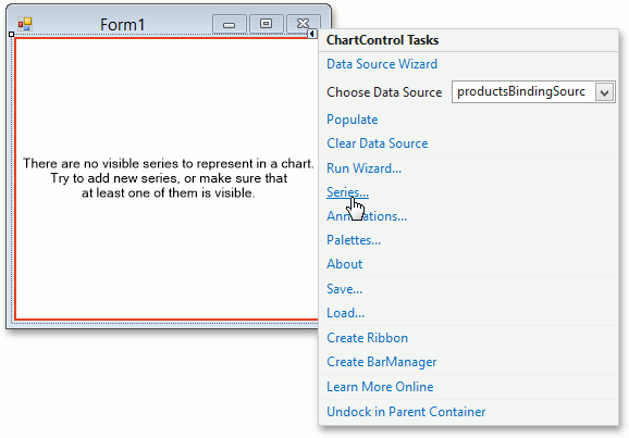
Now, let's add series to the chart. To do this, click the chart's smart tag and in its actions list, choose theSeries... link.给图表添加序列。单击智能标记,动作列表中选择Series...添加序列集到图表。单击图表的智能标签,行为列表选择Series序列...链接
-
In the invoked Series Collection Editor, click Add..., and select theBar view.序列集合编辑器中点击Add。。添加选择Bar 视图。激活的序列集合编辑器中单击添加 。。,选择条形图视图。
 Note
NoteAfter you create a series, the chart displays fake data to give you an idea of what the chart will look like after genuine data is provided.
-
Now switch to the Properties tab on the right of the editor's window and make the following assignments for the Series1 properties:现在转换到编辑窗口右侧的属性页,为序列1属性关联下面两个。
- set the SeriesBase.ArgumentDataMember property to the ProductName data field; 自变量为ProductName产品名称
- and the only value of the SeriesBase.ValueDataMembers property to UnitPrice.因变量为UnitPrice单价
 Note
NoteIn most scenarios, it is unnecessary to specify the Series.DataSource property.大多数情况下,需指定Series.DataSource 属性
-
To limit the number of data points in the series, click the ellipsis button for theSeriesBase.DataFilters property.为了限制序列中的点数,单击SeriesBase.DataFilters属性的省略号按钮
In the invoked Data Filter Collection Editor, click Add, and for the created filtering criterion, set itsDataFilter.ColumnName to CategoryID and DataFilter.Value to 4. And leave the DataFilter.Condition property set to its default value (Equal).在弹出的数据过滤集合编辑器中,单击Add添加。为了创建过滤标准,设置DataFilter.ColumnName为CategoryID ,DataFilter.Value为4,DataFilter.Condition保留默认值(Equal)相等。
-
If you wish to see how the resulting chart will finally look at design time, click its smart tag, and in its actions list, clickPopulate. This will redraw the chart using obtained data.如果想预览设计时图表的最终外观,单击智能标签,在动作列表中单击填充,将使用获得的数据重绘图表。
At runtime, Visual Studio automatically adds the following code to the form's Load event, and normally you don't need to add it manually.运行时,VS自动添加如下代码到窗体的Load载入事件,通常不需要手动添加。
-
C# private void Form1_Load(object sender, EventArgs e) { // TODO: This line of code loads data into the 'nwindDataSet.Products' table. // You can move, or remove it, as needed. this.productsTableAdapter.Fill(this.nwindDataSet.Products); }
VB
-
Now you can adjust the following options.调整如下选项
Adjust the series-view-specific options.调整series
For the created series, it is possible to color each Bar individually. To achieve this, select the series and in theProperties grid, expand its SeriesBase.View property. Among the set of the view-type-specific options, locate and enable theSeriesViewColorEachSupportBase.ColorEach property.对创建的序列,可能需要独立指定每一个条状图的颜色。为获得这种效果,选择序列集,在属性格网张展开SeriesBase.View属性。定位到SeriesViewColorEachSupportBase.ColorEach属性。Then, for the series, expand its SeriesBase.LegendPointOptions property, and set the PointOptions.PointView to ArgumentAndValues.对每一序列集,展开SeriesBase.LegendPointOptions属性,设置PointOptions.PointView to ArgumentAndValues自变量因变量(参数函数值)
Adjust the legend.
Now, each data point is represented in the chart's legend by a separate item, displaying a pair of point arguments and their values. To better position the legend, select it, and in theProperties grid, set its Legend.Direction to LeftToRight, Legend.AlignmentHorizontal to Center, and Legend.AlignmentVertical to BottomOutside.Add a chart title.
To create a title for your chart, select it, and in the Properties grid, click the ellipsis button for theChartControl.Titles property. Then, in the invoked collection editor click Add, and for the created title, set its Title.Text and other options.Adjust the series point labels.
To show the series labels, enable the SeriesBase.LabelsVisibility property.Adjust the crosshair cursor options.
By default, crosshair cursor labels are displayed on a chart. You can disable (enable) a crosshair cursor both at the level of a chart via theChartControl.CrosshairEnabled property and at the level of a chart series using theSeriesBase.CrosshairEnabled property.
To show crosshair cursor axis lines and crosshair cursor value labels, set the CrosshairOptions.ShowArgumentLine, CrosshairOptions.ShowValueLine and CrosshairOptions.ShowValueLabels properties to true.
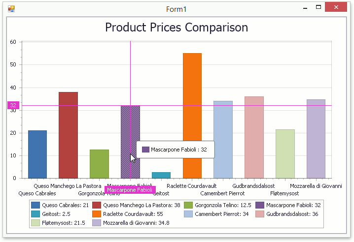
The result is illustrated in the following image.
-------------------------------------------------------------------------------------------------------------------------------------
| Lesson 4 - Use the Series Template for Auto-Created Series |
第4课 使用序列模板自动创建序列
This tutorial demonstrates how to create a chart bound to data, so that all series are auto-created based on a commontemplate, which specifies universal options for all series. This is possible when the data for all series (their names, along with points' arguments and values) is stored in the samedata table.
Note that in this scenario, the view type and certain other settings will be the same for all series.
In this example, we'll bind a chart to the "GSP" table in the GSP database (the gsp.mdb file is shipped with the installation of the XtraCharts Suite). This table contains the Gross State Product (GSP) statistics for certain US regions.
To bind a chart to data using series templates, do the following.
- Create Data Objects and Bind a ChartControl
- Specify a Series Data Member and Adjust a Series Template
- Populate with Data at Runtime (Optional)
- Customize the Chart
- Get the Result
-
Start MS Visual Studio (2010 or 2012) and create a new Windows Forms Application or open an existing one.
-
Drop the ChartControl onto the form.
Note that after you drop the chart control, the Chart Wizard may be invoked (if its "Display a wizard every time a new chart is added" option is enabled). In this example, we don't need to use the Wizard, so clickCancel to close its window.
-
For the chart to occupy all the available space on the form, click the chart's smart tag, and in its actions list, clickDock in Parent Container.
-
To create a data source for a chart, select it and click its smart tag. In the invoked actions list, expand theChoose Data Source drop-down selector and click the Add Project Data Source... link.
Then proceed through the following steps suggested by the invoked Data Source Configuration Wizard.
-
In the first step, choose the Database icon and click Next.
-
In the Choose a Database Model page, click Next.
-
On the following page, click New Connection... and specify the following path to the GSP database file - C:\Users\Public\Documents\DXperience 13.1 Demos\Data\gsp.mdb (leave thePassword option blank).
Click Next to proceed.
-
Then, the following message appears.
 Note
NoteYou can choose between adding the file to your project or leaving it in its original location. For more information on Visual Studio behavior, see the "How to: Manage Local Data Files in Your Project" article in MSDN.
Select No, as this example is not intended to change database data.
-
On the following page, you are asked whether or not the created connection string should be saved to the configuration file of your project.
Leave the default setting and click Next.
-
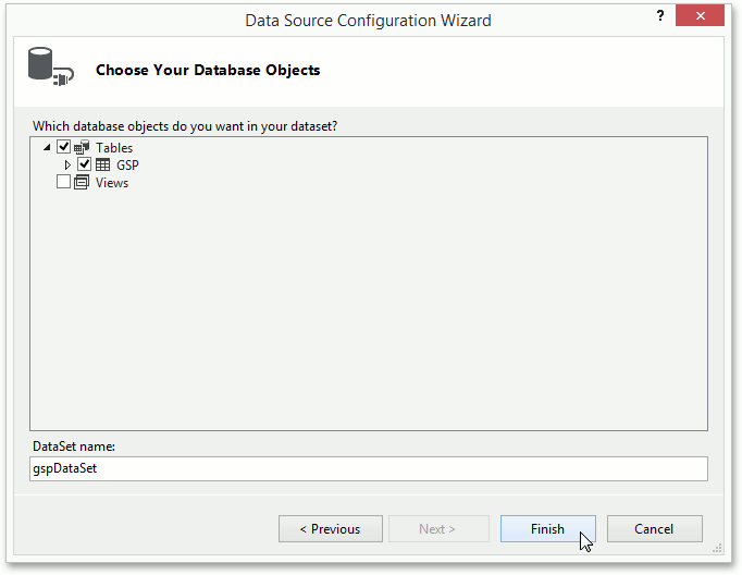
The final page allows you to choose tables, which should be obtained from the database.
Select the "GSP" table and click Finish.
After performing the above steps, Visual Studio generates a set of classes that support ADO.NET architecture, some of which are then auto-assigned to the appropriate properties of your chart control. In particular:
- gspDataSet (a System.Data.DataSet object that is a collection of possibly inter-related tables) containing thegspDataTable;
- gSPBindingSource (a System.Windows.Forms.BindingSource component, which provides data in the chart's dataset) is auto-assigned to theChartControl.DataSource property;
- gSPTableAdapter (TableAdapter object, which contains methods to get and post data from the specified table in the database) is auto-assigned to theChartControl.DataAdapter property;
This means that the chart has been successfully bound to the data source. The next steps explain how to assign its data fields to the chart's series template.
-
Now, let's specify a data field for as many series to be auto-created as there are records in this field. To do this, set theChartControl.SeriesDataMember property to Year.
Note that series names (as they will appear in the Legend) will correspond to this field's values.
-
Now, adjust the series' template, which is accessed via the chart's ChartControl.SeriesTemplate property.
In particular, you are required to define data fields where series obtain information for their pointarguments and values.
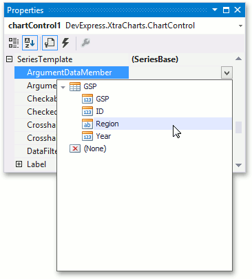
To accomplish this, set the SeriesBase.ArgumentDataMember property to Region.
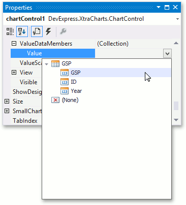
Then set the only value of the SeriesBase.ValueDataMembers property to GSP.
Note that some series view types may require more than one value for each argument (such as Stock or Bubble series). In such cases, multiple data members should be specified for theSeriesBase.ValueDataMembers collection.
Now, the chart possesses complete information about the data source and its data members. However, it still doesn't show the real data at design time. To populate your chart with genuine data, click the chart's smart tag and clickPopulate.
MS Visual Studio automatically adds the following code to the form's Load event, and normally you don't need to add it manually.
-
To populate a DataTable object with data from the database, the correspondingTableAdapter's Fill method can be used. In this example, the chart'sDataTable is populated with data using the Fill method of thegSPTableAdapter object. The form's Load event is used to handle data loading.
 C#VB
C#VB
private void Form1_Load(object sender, EventArgs e) {
    // TODO: This line of code loads data into the 'gspDataSet.GSP' table.
    // You can move or remove it as needed.
    this.gSPTableAdapter.Fill(this.gspDataSet.GSP);
}
Private Sub Form1_Load(ByVal sender As System.Object, _
ByVal e As System.EventArgs) Handles MyBase.Load
    ' TODO: This line of code loads data into the 'gspDataSet.GSP' table.
    ' You can move or remove it as needed.
    Me.gSPTableAdapter.Fill(Me.gspDataSet.GSP)
End Sub
C# private void Form1_Load(object sender, EventArgs e) { // TODO: This line of code loads data into the 'gspDataSet.GSP' table. // You can move or remove it as needed. this.gSPTableAdapter.Fill(this.gspDataSet.GSP); }
VB Private Sub Form1_Load(ByVal sender As System.Object, _ ByVal e As System.EventArgs) Handles MyBase.Load ' TODO: This line of code loads data into the 'gspDataSet.GSP' table. ' You can move or remove it as needed. Me.gSPTableAdapter.Fill(Me.gspDataSet.GSP) End Sub
Finally, you can specify optional properties, which will be applied to all the auto-created series.
- Adjust the series name template.
By default, the name for every auto-created series (as it appears in the Legend) is obtained from an appropriate data field. However, you may wish to add some prefixes or postfixes to these names, which can be done via theSeriesNameTemplate.BeginText and SeriesNameTemplate.EndText properties. For this instance, set the SeriesNameTemplate.BeginText property to "GSP in ".
-
Adjust the crosshair cursor options.
By default, crosshair cursor labels are displayed on a chart. You can disable (enable) a crosshair cursor both at the level of a chart via theChartControl.CrosshairEnabled property and at the level of a chart series, using theSeriesBase.CrosshairEnabled property.
To show crosshair cursor axis lines, set the CrosshairOptions.ShowArgumentLine and CrosshairOptions.ShowValueLine properties to true.
Run the project and view the result.
