H5+CSS3简单动画 知识点 汇总
乱入几个:
1.h5的一个语义化标签
figure :用于规定独立的流内容(图像 图表 照片 代码等)
figcapition:与figure配套使用,用于标签定义figure元素标题
2.媒体查询:
通过不同的媒体类型和条件定义样式规则 ;媒体查询大部分媒体特性都接受min和max 用于表示“大于等于”或“小于等于”:width: min-width;max-width
媒体查询可以用在@media和import规则上,也可以用在HTML和XML中。
@media screen and (width:800px){...}
@import url(example.css) screen and (width:800px);
<link media="screen and (width:800px)" rel="stylesheet" href="example.css">
正题:
--page1 --
css属性
property,duration,timing-function,delay
| transition-property | 规定设置过渡效果的 CSS 属性的名称。 |
| transition-duration | 规定完成过渡效果需要多少秒或毫秒。 |
| transition-timing-function | 规定速度效果的速度曲线。 (Linear,ease,ease-in,ease-out,ease-in-out) |
| transition-delay | 定义过渡效果何时开始。 |
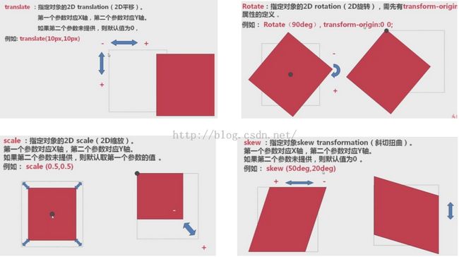
Transform :用于元素的变形处理 属性: translate,Rotate,scale,skew (平移 旋转,缩放,斜切)
--page 2 -
-
新建帧
animation:所有动画属性的简写属性,除了 animation-play-state 属性。
-webkit-animation: myfirst 2s linear 1s infinite both;
-webkit-animation-name: myfirst;
-webkit-animation-duration: 5s;
-webkit-animation-timing-function: linear;
-webkit-animation-delay: 2s;
-webkit-animation-iteration-count: infinite;
-webkit-animation-direction: alternate;
-webkit-animation-play-state: running;
-
@-wbkit-keyframes myfirst {
}
-常用参考手册-
| 属性 | 描述 | CSS |
|---|---|---|
| @keyframes | 规定动画。 | 3 |
| animation | 所有动画属性的简写属性,除了 animation-play-state 属性。 | 3 |
| animation-name | 规定 @keyframes 动画的名称。 | 3 |
| animation-duration | 规定动画完成一个周期所花费的秒或毫秒。默认是 0。 | 3 |
| animation-timing-function | 规定动画的速度曲线。默认是 "ease"。 | 3 |
| animation-delay | 规定动画何时开始。默认是 0。 | 3 |
| animation-iteration-count | 规定动画被播放的次数。默认是 1。 | 3 |
| animation-direction | 规定动画是否在下一周期逆向地播放。默认是 "normal"。 | 3 |
| animation-play-state | 规定动画是否正在运行或暂停。默认是 "running"。 | 3 |
| animation-fill-mode | 规定对象动画时间之外的状态。 | 3 |
animation-timing-function:<single-animation-timing-function>[,<single-animation-timing-function>]*
<single-animation-timing-function> = ease | linear | ease-in | ease-out | ease-in-out | step-start | step-end | steps(<integer>[, [ start | end ] ]?) | cubic-bezier(<number>,<number>, <number>, <number>)
默认值:ease
适用于:所有元素,包含伪对象:after和:before
继承性:无
动画性:否
计算值:指定值
媒体:视觉
取值:
animation-fill-mode:
animation-fill-mode:none | forwards | backwards | both [ , none | forwards | backwards | both ]*
默认值:none
适用于:所有元素,包含伪对象:after和:before
继承性:无
取值:
说明:
检索或设置对象动画时间之外的状态
-
如果提供多个属性值,以逗号进行分隔。
-
对应的脚本特性为animationFillMode。
animation-direction
animation-direction:normal | alternate [ , normal | alternate ]*
默认值:normal
适用于:所有元素,包含伪对象:after和:before
继承性:无
取值:
说明:
检索或设置对象动画在循环中是否反向运动
-
如果提供多个属性值,以逗号进行分隔。
-
对应的脚本特性为animationDirection。
-------------------------------------------------------------------
乱入几个:
1.h5的一个语义化标签
figure :用于规定独立的流内容(图像 图表 照片 代码等)
figcapition:与figure配套使用,用于标签定义figure元素标题
2.媒体查询:
通过不同的媒体类型和条件定义样式规则 ;媒体查询大部分媒体特性都接受min和max 用于表示“大于等于”或“小于等于”:width: min-width;max-width
媒体查询可以用在@media和import规则上,也可以用在HTML和XML中。
@media screen and (width:800px){...}
@import url(example.css) screen and (width:800px);
<link media="screen and (width:800px)" rel="stylesheet" href="example.css">
正题:
--page1 --
css属性
property,duration,timing-function,delay
| transition-property | 规定设置过渡效果的 CSS 属性的名称。 |
| transition-duration | 规定完成过渡效果需要多少秒或毫秒。 |
| transition-timing-function | 规定速度效果的速度曲线。 (Linear,ease,ease-in,ease-out,ease-in-out) |
| transition-delay | 定义过渡效果何时开始。 |
Transform :用于元素的变形处理 属性: translate,Rotate,scale,skew (平移 旋转,缩放,斜切)
--page 2 -
-
新建帧
animation:所有动画属性的简写属性,除了 animation-play-state 属性。
-webkit-animation: myfirst 2s linear 1s infinite both;
-webkit-animation-name: myfirst;
-webkit-animation-duration: 5s;
-webkit-animation-timing-function: linear;
-webkit-animation-delay: 2s;
-webkit-animation-iteration-count: infinite;
-webkit-animation-direction: alternate;
-webkit-animation-play-state: running;
-
@-wbkit-keyframes myfirst {
}
-常用参考手册-
| 属性 | 描述 | CSS |
|---|---|---|
| @keyframes | 规定动画。 | 3 |
| animation | 所有动画属性的简写属性,除了 animation-play-state 属性。 | 3 |
| animation-name | 规定 @keyframes 动画的名称。 | 3 |
| animation-duration | 规定动画完成一个周期所花费的秒或毫秒。默认是 0。 | 3 |
| animation-timing-function | 规定动画的速度曲线。默认是 "ease"。 | 3 |
| animation-delay | 规定动画何时开始。默认是 0。 | 3 |
| animation-iteration-count | 规定动画被播放的次数。默认是 1。 | 3 |
| animation-direction | 规定动画是否在下一周期逆向地播放。默认是 "normal"。 | 3 |
| animation-play-state | 规定动画是否正在运行或暂停。默认是 "running"。 | 3 |
| animation-fill-mode | 规定对象动画时间之外的状态。 | 3 |
animation-timing-function:<single-animation-timing-function>[,<single-animation-timing-function>]*
<single-animation-timing-function> = ease | linear | ease-in | ease-out | ease-in-out | step-start | step-end | steps(<integer>[, [ start | end ] ]?) | cubic-bezier(<number>,<number>, <number>, <number>)
默认值:ease
适用于:所有元素,包含伪对象:after和:before
继承性:无
动画性:否
计算值:指定值
媒体:视觉
取值:
animation-fill-mode:
animation-fill-mode:none | forwards | backwards | both [ , none | forwards | backwards | both ]*
默认值:none
适用于:所有元素,包含伪对象:after和:before
继承性:无
取值:
说明:
检索或设置对象动画时间之外的状态
-
如果提供多个属性值,以逗号进行分隔。
-
对应的脚本特性为animationFillMode。
animation-direction
animation-direction:normal | alternate [ , normal | alternate ]*
默认值:normal
适用于:所有元素,包含伪对象:after和:before
继承性:无
取值:
说明:
检索或设置对象动画在循环中是否反向运动
-
如果提供多个属性值,以逗号进行分隔。
-
对应的脚本特性为animationDirection。
-------------------------------------------------------------------
2.理解CSS3 transform 中的Matrix(矩阵)
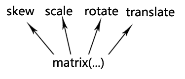

那ax+cy+e的意义是什么?
记住了,ax+cy+e为变换后的水平坐标,bx+dy+f表示变换后的垂直位置。
又迷糊了?不急,一个简单例子就明白了。
假设矩阵参数如下:
transform: matrix(1, 0, 0, 1, 30, 30); /* a=1, b=0, c=0, d=1, e=30, f=30 */
现在,我们根据这个矩阵偏移元素的中心点,假设是(0, 0),即x=0, y=0。
于是,变换后的x坐标就是ax+cy+e = 1*0+0*0+30 =30, y坐标就是bx+dy+f = 0*0+1*0+30 =30.
于是,中心点坐标从(0, 0)变成了→(30, 30)。对照上面有个(30, 30)的白点图,好好想象下,原来(0,0)的位置,移到了白点的(30, 30)处,怎么样,是不是往右下方同时偏移了30像素哈!!
实际上transform: matrix(1, 0, 0, 1, 30, 30);就等同于transform: translate(30px, 30px);. 注意:translate,rotate等方法都是需要单位的,而matrix方法e, f参数的单位可以省略。