【python可视化系列】python数据可视化利器--pyecharts
【python可视化系列】python数据可视化利器--pyecharts
echarts官网
一、前言
echarts是什么?下面是来自官方的介绍:
ECharts,缩写来自Enterprise Charts,商业级数据图表,Echarts 是百度开源的一个数据可视化纯Javascript(JS) 库。主要用于数据可视化,可以流畅的运行在PC和移动设备上,兼容当前绝大部分浏览器(IE6/7/8/9/10/11,chrome,firefox,Safari等),底层依赖轻量级的Canvas类库ZRender,提供直观,生动,可交互,可高度个性化定制的数据可视化图表。创新的拖拽重计算、数据视图、值域漫游等特性大大增强了用户体验,赋予了用户对数据进行挖掘、整合的能力。
支持折线图(区域图)、柱状图(条状图)、散点图(气泡图)、K线图、饼图(环形图)、雷达图(填充雷达图)、和弦图、力导向布局图、地图、仪表盘、漏斗图、事件河流图等12类图表,同时提供标题,详情气泡、图例、值域、数据区域、时间轴、工具箱等7个可交互组件,支持多图表、组件的联动和混搭展现。
二、用法及安装
使用echarts还是需要一定的前端知识,这里介绍一个python包–pyecharts,利用几行代码轻松生成echarts风格的图表。pyecharts 是一个用于生成 Echarts 图表的类库。实际上就是 Echarts 与 Python 的对接。
1、安装:
pip install pyecharts
2、通用配置项
xyAxis:直角坐标系中的 x、y 轴(Line、Bar、Scatter、EffectScatter、Kline)
dataZoom:dataZoom 组件 用于区域缩放,从而能自由关注细节的数据信息,或者概览数据整体,或者去除离群点的影响。(Line、Bar、Scatter、EffectScatter、Kline、Boxplot)
legend:图例组件。图例组件展现了不同系列的标记(symbol),颜色和名字。可以通过点击图例控制哪些系列不显示。
label:图形上的文本标签,可用于说明图形的一些数据信息,比如值,名称等。
lineStyle:带线图形的线的风格选项(Line、Polar、Radar、Graph、Parallel)
grid3D:3D笛卡尔坐标系组配置项,适用于 3D 图形。(Bar3D, Line3D, Scatter3D)
axis3D:3D 笛卡尔坐标系 X,Y,Z 轴配置项,适用于 3D 图形。(Bar3D, Line3D, Scatter3D)
visualMap:是视觉映射组件,用于进行『视觉编码』,也就是将数据映射到视觉元素(视觉通道)
markLine&markPoint:图形标记组件,用于标记指定的特殊数据,又标记线和标记点两种。(Bar、Line、Kline)
tooltip:提示框组件,用于移动或点击鼠标时弹出数据内容
3、图表详细
Bar(柱状图/条形图)
Bar3D(3D 柱状图)
Boxplot(箱形图)
EffectScatter(带有涟漪特效动画的散点图)
Funnel(漏斗图)
Gauge(仪表盘)
Geo(地理坐标系)
Graph(关系图)
HeatMap(热力图)
Kline(K线图)
Line(折线/面积图)
Line3D(3D 折线图)
Liquid(水球图)
Map(地图)
Parallel(平行坐标系)
Pie(饼图)
Polar(极坐标系)
Radar(雷达图)
Sankey(桑基图)
Scatter(散点图)
Scatter3D(3D 散点图)
ThemeRiver(主题河流图)
WordCloud(词云图)
用户自定义
Grid 类:并行显示多张图
Overlap 类:结合不同类型图表叠加画在同张图上
Page 类:同一网页按顺序展示多图
Timeline 类:提供时间线轮播多张图
四、示例
因篇幅原因,这里只给出了每种图表类型的示例(代码 + 生成图表),目的是为了引起读者的兴趣。
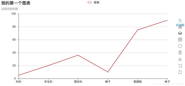
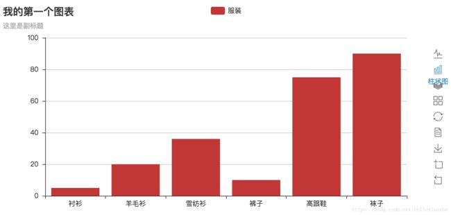
1、我的第一个图表
# encoding: utf-8
# 例子一
from pyecharts import Bar
bar = Bar("我的第一个图表", "这里是副标题")
bar.add("服装", ["衬衫", "羊毛衫", "雪纺衫", "裤子", "高跟鞋", "袜子"], [5, 20, 36, 10, 75, 90],is_more_utils=True)
bar.show_config()
bar.render()
http://localhost:63342/PycharmProjects/Attempt_new/try_echarts/render.html
Tips:
可以按右边的下载按钮将图片下载到本地: add()
主要方法,用于添加图表的数据和设置各种配置项: show_config()
打印输出图表的所有配置项: render()
默认将会在根目录下生成一个 render.html 的文件,支持 path 参数,设置文件保存位置,如 render(r"e:my_first_chart.html"),文件用浏览器打开。
默认的编码类型为 UTF-8,在 Python3 中是没什么问题的,Python3 对中文的支持好很多。但是在 Python2 中,编码的处理是个很头疼的问题,暂时没能找到完美的解决方法,目前只能通过文本编辑器自己进行二次编码,我用的是 Visual Studio Code,先通过 Gbk 编码重新打开,然后再用 UTF-8 重新保存,这样用浏览器打开的话就不会出现中文乱码问题了。
基本上所有的图表类型都是这样绘制的:
chart_name = Type() 初始化具体类型图表。
add() 添加数据及配置项。
render() 生成 .html 文件。
2、 Bar(柱状图/条形图)
# 2.1
import sys
reload(sys)
sys.setdefaultencoding('utf-8')
v1 = [1.1, 4.9, 7.0, 23.2, 25.6, 76.7, 120.6, 162.2, 32.6, 20.0, 6.4, 3.3]  # 初始化第一组要展示的数据
v2 = [5.8, 5.9, 9.0, 26.4, 28.7, 100.7, 195.6, 182.2, 48.7, 18.8, 6.0, 5.7]  # 初始化第二组要展示的数据
attr = ["Jan", "Feb", "Mar", "Apr", "May", "Jun", "Jul", "Aug", "Sep", "Oct", "Nov", "Dec"] # 指定X轴刻度名字
from pyecharts import Bar
bar =Bar("标记线和标记点示例","副标题:展示每一维度数据的最小,最大,平均值")
bar.add("商家A", attr, v1,mark_line=["min","average", "max"])
bar.add("商家B", attr, v2, mark_line=["min","average", "max"])
bar.render()

# 2.2
# encoding: utf-8
from pyecharts import Bar
v1 = [1.1, 4.9, 7.0, 23.2, 25.6, 76.7, 120.6, 162.2, 32.6, 20.0, 6.4, 3.3]  # 初始化第一组要展示的数据
v2 = [5.8, 5.9, 9.0, 26.4, 28.7, 100.7, 195.6, 182.2, 48.7, 18.8, 6.0, 5.7]  # 初始化第二组要展示的数据
attr = ["Jan", "Feb", "Mar", "Apr", "May", "Jun", "Jul", "Aug", "Sep", "Oct", "Nov", "Dec"] # 指定X轴刻度名字
bar =Bar("x 轴和 y 轴交换","副标题:展示每一维度数据的最小,最大,平均值")
bar.add("商家A", attr, v1,mark_line=["min","average", "max"])
bar.add("商家B", attr, v2, mark_line=["min","average", "max"],is_convert=True)
bar.render()

再来介绍个新功能,如果想在一个网页内按顺序展示多个图的话,推荐使用 Page() 类。
使用步骤
1 、引入 Page
2、使用 Page.add() 增加图
3、使用 Page.render() 渲染网页
显示 多个图
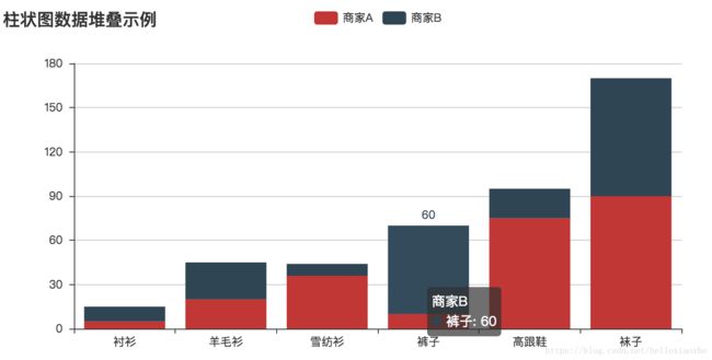
3、柱状图数据堆叠示例
# encoding: utf-8
import sys
reload(sys)
sys.setdefaultencoding('utf-8')
# 柱状图数据堆叠示例
from pyecharts import Bar, Scatter3D
from pyecharts import Page
page = Page()         # step 1
# bar
attr = ["衬衫", "羊毛衫", "雪纺衫", "裤子", "高跟鞋", "袜子"]
v1 = [5, 20, 36, 10, 75, 90]
v2 = [10, 25, 8, 60, 20, 80]
bar = Bar("柱状图数据堆叠示例")
bar.add("商家A", attr, v1, is_stack=True)
bar.add("商家B", attr, v2, is_stack=True)
page.add(bar)         # step 2
page.render()        # step 3
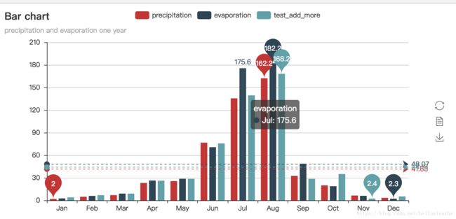
4、蒸发量和降水量对比柱状图
# encoding: utf-8
from pyecharts import Bar
#attr = ["{}month".format(i) for i in range(1, 13)]  # 指定X轴刻度名字
attr = ["Jan", "Feb", "Mar", "Apr", "May", "Jun", "Jul", "Aug", "Sep", "Oct", "Nov", "Dec"] # 指定X轴刻度名字
v1 = [2.0, 4.9, 7.0, 23.2, 25.6, 76.7, 135.6, 162.2, 32.6, 20.0, 6.4, 3.3]  # 初始化第一组要展示的数据
v2 = [2.6, 5.9, 9.0, 26.4, 28.7, 70.7, 175.6, 182.2, 48.7, 18.8, 6.0, 2.3]  # 初始化第二组要展示的数据
v3 = [4.0, 6.9, 9.0, 26.2, 28.6, 75.7, 139.6, 168.2, 28.6, 35.0, 2.4, 5.3]  # 初始化第er组要展示的数据
bar = Bar("Bar chart", "precipitation and evaporation one year")  # 设置图标的名字和标题
bar.add("precipitation", attr, v1, mark_line=["average"], mark_point=["max", "min"])   # 设置第一组要展示数据的方面(原始护甲,平均值,最大值和最小值)设定图例
bar.add("evaporation", attr, v2, mark_line=["average"], mark_point=["max", "min"])     # 设置第二组
bar.add("test_add_more", attr, v3, mark_line=["average"], mark_point=["max", "min"])    # 设置第三组
bar.render(path="test_bar.html")  # 设置要输出的html页面的保存路径和名字htest_bar.html,默认值保存为为当前目录下render.html
#def render(self,path="render.html",template_name="simple_chart.html",object_name="chart",**kwargs):
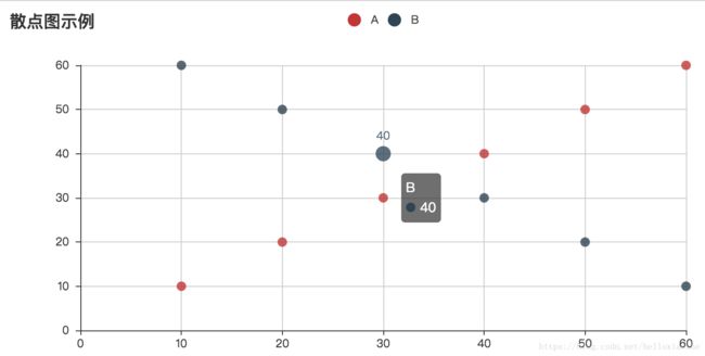
5、散点图:
# 4.1、Scatter(散点图)
from pyecharts import Scatter
v1 =[10, 20, 30, 40, 50, 60]
v2 =[10, 20, 30, 40, 50, 60]
scatter =Scatter("散点图示例")
scatter.add("A", v1, v2)
scatter.add("B", v1[::-1], v2)
scatter.show_config()
scatter.render()
5.2 EffectScatter(带有涟漪特效动画的散点图)
# 4.2
from pyecharts import EffectScatter
v1 =[10, 20, 30, 40, 50, 60]
v2 =[25, 20, 15, 10, 60, 33]
es =EffectScatter("动态散点图示例")
es.add("effectScatter", v1, v2)
es.render()

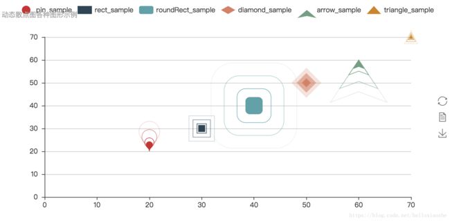
# 5.3动态散点图各种图形示例
from pyecharts import EffectScatter
es =EffectScatter("", "动态散点图各种图形示例")
es.add("pin_sample", [20], [20], symbol_size=20, effect_scale=3.5, effect_period=3, symbol="pin")
es.add("rect_sample", [30], [30], symbol_size=12, effect_scale=4.5, effect_period=4,symbol="rect")
es.add("roundRect_sample", [40], [40], symbol_size=30, effect_scale=5.5, effect_period=5,symbol="roundRect")
es.add("diamond_sample", [50], [50], symbol_size=10, effect_scale=6.5, effect_brushtype='fill',symbol="diamond")
es.add("arrow_sample", [60], [60], symbol_size=16, effect_scale=5.5, effect_period=3,symbol="arrow")
es.add("triangle_sample", [70], [70], symbol_size=6, effect_scale=4.5, effect_period=3,symbol="triangle")
es.show_config()
es.render()
6、漏斗图
# Funnel(漏斗图)
from pyecharts import Funnel
attr =["衬衫", "羊毛衫", "雪纺衫", "裤子", "高跟鞋", "袜子"]
value =[20, 40, 60, 80, 100, 120]
funnel =Funnel("漏斗图示例")
funnel.add("商品", attr, value, is_label_show=True, label_pos="inside", label_text_color="#fff")
funnel.render()

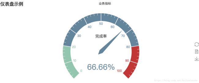
7、仪表盘
#4 Gauge(仪表盘)
from pyecharts import Gauge
gauge =Gauge("仪表盘示例")
gauge.add("业务指标", "完成率", 66.66)
gauge.show_config()
gauge.render()
8、地图可视化
# 8.1 地图可视化
# -*- coding:utf-8 -*-
from pyecharts import Geo
data = [(u'广州', 80), (u'漳州', 180)]
geo = Geo("全国主要城市空气质量", "data from pm2.5")
attr, value = geo.cast(data)
geo.add("city", attr, value, visual_range=[0, 200], maptype='china', visual_text_color="#fff",
        symbol_size=10, is_visualmap=True)
geo.show_config()
geo.render()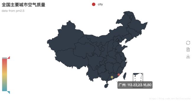
python地图可视化可能遇到问题,请参见【python可视化系列】关于 pyecharts 的 'No coordinate is specified for' 报错解决
8.2、地图例子
from pyecharts import Geo
data =[(u"北京", 9), (u"鄂尔多斯", 12), (u"招远", 12), (u"舟山", 12), (u"齐齐哈尔", 14), (u"盐城", 15)]
geo =Geo("全国主要城市空气质量", "data from pm2.5", title_color="#fff", title_pos="center", width=1200, height=600, background_color='#404a59')
attr, value =geo.cast(data)
geo.add("", attr, value, type="effectScatter", is_random=True, effect_scale=5)
geo.show_config()
geo.render()
9、Graph(关系图)
# encoding: utf-8
from pyecharts import Graph
nodes =[{"name": "结点1", "symbolSize": 10}, {"name": "结点2", "symbolSize": 20}, {"name": "结点3", "symbolSize": 30},
        {"name": "结点4", "symbolSize": 40}, {"name": "结点5", "symbolSize": 10}, {"name": "结点6", "symbolSize": 40},
        {"name": "结点7", "symbolSize": 30}, {"name": "结点8", "symbolSize": 20}]
links =[]
p=0
for i in nodes:
    if (p % 2 == 1):
        continue
    p += 1
    for j in nodes:

        links.append({"source": i.get('name'), "target": j.get('name')})
graph = Graph("关系图-环形布局示例")
graph.add("", nodes, links, is_label_show=True, repulsion=8000, layout='circular', label_text_color=None)
graph.show_config()
graph.render()
10、微博转发关系图
# encoding: utf-8
#微博转发关系图
from pyecharts import Graph
import json
with open("jsonweibo.json", "r") as f:
    j =json.load(f)
    nodes, links, categories, cont, mid, userl =j
    graph =Graph("微博转发关系图", width=1200, height=600)
    graph.add("", nodes, links, categories, label_pos="right", repulsion=50, is_legend_show=False, line_curve=0.2, label_text_color=None)
    graph.show_config()
    graph.render()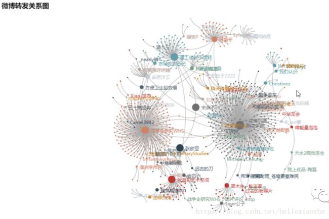
11、折线图-阶梯图示例
#11.1 Line(折线/阶梯图)
from pyecharts import Line
attr =["衬衫", "羊毛衫", "雪纺衫", "裤子", "高跟鞋", "袜子"]
v1 =[5, 20, 36, 10, 10, 100]
v2 =[55, 60, 16, 20, 15, 80]
line =Line("折线图示例")
line.add("商家A", attr, v1, mark_point=["average"])
line.add("商家B", attr, v2, is_smooth=True, mark_line=["max", "average"])
line.show_config()
line.render()
line =Line("折线图-阶梯图示例")
line.add("商家A", attr, v1, is_step=True, is_label_show=True)
line.show_config()
line.render()
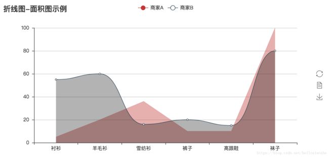
11.2、折线图/面积图示例
# 8、Line(折线图/面积图)
from pyecharts import Line
attr =["衬衫", "羊毛衫", "雪纺衫", "裤子", "高跟鞋", "袜子"]
v1 =[5, 20, 36, 10, 10, 100]
v2 =[55, 60, 16, 20, 15, 80]
line =Line("折线图-面积图示例")
line.add("商家A", attr, v1, is_fill=True, line_opacity=0.2, area_opacity=0.4, symbol=None)
line.add("商家B", attr, v2, is_fill=True, area_color='#000', area_opacity=0.3, is_smooth=True)
line.show_config()
line.render()
12、水球图示例
# 12.1、Line(水球图示例)
from pyecharts import Liquid
liquid =Liquid("水球图示例")
liquid.add("Liquid", [0.6])
liquid.show_config()
liquid.render()

12.2、水球图示例二
from pyecharts import Liquid
liquid =Liquid("水球图示例")
liquid.add("Liquid", [0.6, 0.5, 0.4, 0.3], is_liquid_outline_show=False)
liquid.show_config()
liquid.render()

12.3、水球图示例:
from pyecharts import Liquid
liquid =Liquid("水球图示例")
liquid.add("Liquid", [0.6, 0.5, 0.4, 0.3], is_liquid_animation=False, shape='diamond')
liquid.show_config()
liquid.render()

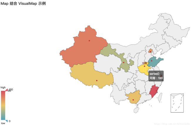
13、Map 结合 VisualMap 示例
from pyecharts import Map
value =[155, 10, 66, 78, 33, 80, 190, 53, 49.6]
attr =["福建", "山东", "北京", "上海", "甘肃", "新疆", "河南", "广西", "西藏"]
map=Map("Map 结合 VisualMap 示例", width=1200, height=600)
map.add("", attr, value, maptype='china', is_visualmap=True, visual_text_color='#000')
map.show_config()
map.render()
14、省级地图示例
# encoding: utf-8
import sys
reload(sys)
sys.setdefaultencoding('utf-8')
from pyecharts import Map
value =[20, 190, 253, 77, 65]
attr =['许昌市', '郑州市', '开封市', '漯河市', '信阳市市']
map=Map("河南地图示例", width=1200, height=600)
map.add("", attr, value, maptype=u'河南', is_visualmap=True, visual_text_color='#000')
map.show_config()
map.render()

15、 Parallel(平行坐标系)
# encoding: utf-8
import sys
reload(sys)
sys.setdefaultencoding('utf-8')
#10 Parallel(平行坐标系)
from pyecharts import Parallel
c_schema =[ {"dim": 0, "name": "data"}, {"dim": 1, "name": "AQI"}, {"dim": 2, "name": "PM2.5"}, {"dim": 3, "name": "PM10"}, {"dim": 4, "name": "CO"}, {"dim": 5, "name": "NO2"}, {"dim": 6, "name": "CO2"}, {"dim": 7, "name": "等级", "type": "category", "data": ['优', '良', '轻度污染', '中度污染', '重度污染', '严重污染']}]
data =[ [1, 91, 45, 125, 0.82, 34, 23, "良"], [2, 65, 27, 78, 0.86, 45, 29, "良"], [3, 83, 60, 84, 1.09, 73, 27, "良"],
        [4, 109, 81, 121, 1.28, 68, 51, "轻度污染"], [5, 106, 77, 114, 1.07, 55, 51, "轻度污染"],
        [6, 109, 81, 121, 1.28, 68, 51, "轻度污染"], [7, 106, 77, 114, 1.07, 55, 51, "轻度污染"],
        [8, 89, 65, 78, 0.86, 51, 26, "良"], [9, 53, 33, 47, 0.64, 50, 17, "良"], [10, 80, 55, 80, 1.01, 75, 24, "良"],
        [11, 117, 81, 124, 1.03, 45, 24, "轻度污染"], [12, 99, 71, 142, 1.1, 62, 42, "良"], [13, 95, 69, 130, 1.28, 74, 50, "良"],
        [14, 116, 87, 131, 1.47, 84, 40, "轻度污染"]]
parallel =Parallel("平行坐标系-用户自定义指示器")
parallel.config(c_schema=c_schema)
parallel.add("parallel", data)
parallel.show_config()
parallel.render()

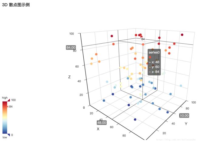
16、3D散点图示例:
# encoding: utf-8
# 3D 散点图示例
# scatter3D
import random
from pyecharts import Bar, Scatter3D
from pyecharts import Page
page = Page()         # step 1
data = [[random.randint(0, 100), random.randint(0, 100), random.randint(0, 100)] for _ in range(80)]
range_color = ['#313695', '#4575b4', '#74add1', '#abd9e9', '#e0f3f8', '#ffffbf',
               '#fee090', '#fdae61', '#f46d43', '#d73027', '#a50026']
scatter3D = Scatter3D("3D 散点图示例", width=1200, height=600)
scatter3D.add("", data, is_visualmap=True, visual_range_color=range_color)
page.add(scatter3D)  # step 2
page.render()        # step 3
17、饼状图示例:
# encoding: utf-8
from pyecharts import Pie
attr =["衬衫", "羊毛衫", "雪纺衫", "裤子", "高跟鞋", "袜子"]
v1 =[11, 12, 13, 10, 10, 10]
pie =Pie("饼图示例")
pie.add("", attr, v1, is_label_show=True)
pie.show_config()
pie.render()

17.2、饼图-玫瑰图示例
# encoding: utf-8
from pyecharts import Pie
attr =["衬衫", "羊毛衫", "雪纺衫", "裤子", "高跟鞋", "袜子"]
v1 =[11, 12, 13, 10, 10, 10]
v2 =[19, 21, 32, 20, 20, 33]
pie =Pie("饼图-玫瑰图示例", title_pos='center', width=900)
pie.add("商品A", attr, v1, center=[25, 50], is_random=True, radius=[30, 75], rosetype='radius')
pie.add("商品B", attr, v2, center=[75, 50], is_random=True, radius=[30, 75], rosetype='area', is_legend_show=False, is_label_show=True)
pie.show_config()
pie.render()

18、Polar(极坐标系)
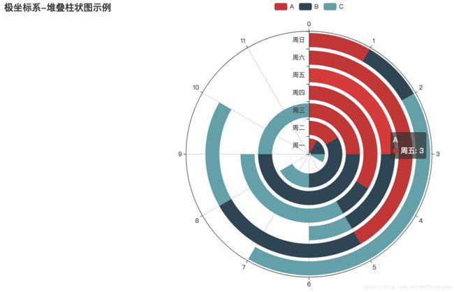
18.1、极坐标系-堆叠柱状图示例
# encoding: utf-8
#12 Polar(极坐标系)
from pyecharts import Polar
radius =['周一', '周二', '周三', '周四', '周五', '周六', '周日']
polar =Polar("极坐标系-堆叠柱状图示例", width=1200, height=600)
polar.add("A", [1, 2, 3, 4, 3, 5, 1], radius_data=radius, type='barRadius', is_stack=True)
polar.add("B", [2, 4, 6, 1, 2, 3, 1], radius_data=radius, type='barRadius', is_stack=True)
polar.add("C", [1, 2, 3, 4, 1, 2, 5], radius_data=radius, type='barRadius', is_stack=True)
polar.show_config()
polar.render()
18.2、极坐标系-堆叠柱状图示例
from pyecharts import Polar
radius =['周一', '周二', '周三', '周四', '周五', '周六', '周日']
polar =Polar("极坐标系-堆叠柱状图示例", width=1200, height=600)
polar.add("", [1, 2, 3, 4, 3, 5, 1], radius_data=radius, type='barAngle', is_stack=True)
polar.add("", [2, 4, 6, 1, 2, 3, 1], radius_data=radius, type='barAngle', is_stack=True)
polar.add("", [1, 2, 3, 4, 1, 2, 5], radius_data=radius, type='barAngle', is_stack=True)
polar.show_config()
polar.render()

19、Radar(雷达图)
#13 Radar(雷达图)
from pyecharts import Radar
schema =[ ("销售", 6500), ("管理", 16000), ("信息技术", 30000), ("客服", 38000), ("研发", 52000), ("市场", 25000)]
v1 =[[4300, 10000, 28000, 35000, 50000, 19000]]
v2 =[[5000, 14000, 28000, 31000, 42000, 21000]]
radar =Radar()
radar.config(schema)
radar.add("预算分配", v1, is_splitline=True, is_axisline_show=True)
radar.add("实际开销", v2, label_color=["#4e79a7"], is_area_show=False)
radar.show_config()
radar.render()

19.2、雷达图示例
from pyecharts import Radar
value_bj =[ [55, 9, 56, 0.46, 18, 6, 1], [25, 11, 21, 0.65, 34, 9, 2], [56, 7, 63, 0.3, 14, 5, 3], [33, 7, 29, 0.33, 16, 6, 4]]
value_sh =[ [91, 45, 125, 0.82, 34, 23, 1], [65, 27, 78, 0.86, 45, 29, 2], [83, 60, 84, 1.09, 73, 27, 3], [109, 81, 121, 1.28, 68, 51, 4]]
c_schema=[{"name": "AQI", "max": 300, "min": 5}, {"name": "PM2.5", "max": 250, "min": 20},
          {"name": "PM10", "max": 300, "min": 5}, {"name": "CO", "max": 5}, {"name": "NO2", "max": 200},
          {"name": "SO2", "max": 100}]
radar =Radar()
radar.config(c_schema=c_schema, shape='circle')
radar.add("北京", value_bj, item_color="#f9713c", symbol=None)
radar.add("上海", value_sh, item_color="#b3e4a1", symbol=None)
radar.show_config()
radar.render()

20、词云图1:
#WordCloud(词云图)
from pyecharts import WordCloud
name =['Sam S Club', 'Macys', 'Amy Schumer', 'Jurassic World', 'Charter Communications', 'Chick Fil A',
                'Planet Fitness', 'Pitch Perfect', 'Express', 'Home', 'Johnny Depp', 'Lena Dunham', 'Lewis Hamilton',
                'KXAN', 'Mary Ellen Mark', 'Farrah Abraham', 'Rita Ora', 'Serena Williams', 'NCAA baseball tournament',
                'Point Break']
value =[10000, 6181, 4386, 4055, 2467, 2244, 1898, 1484, 1112, 965, 847, 582, 555, 550, 462, 366, 360, 282, 273, 265]
wordcloud =WordCloud(width=1300, height=620)
wordcloud.add("词云名字", name, value, word_size_range=[20, 100])
wordcloud.show_config()
wordcloud.render()

20.2、词云图2:
#WordCloud(词云图)
from pyecharts import WordCloud
name =['Sam S Club', 'Macys', 'Amy Schumer', 'Jurassic World', 'Charter Communications', 'Chick Fil A',
                'Planet Fitness', 'Pitch Perfect', 'Express', 'Home', 'Johnny Depp', 'Lena Dunham', 'Lewis Hamilton',
                'KXAN', 'Mary Ellen Mark', 'Farrah Abraham', 'Rita Ora', 'Serena Williams', 'NCAA baseball tournament',
                'Point Break']
value =[10000, 6181, 4386, 4055, 2467, 2244, 1898, 1484, 1112, 965, 847, 582, 555, 550, 462, 366, 360, 282, 273, 265]
wordcloud =WordCloud(width=1300, height=620)
wordcloud.add("", name, value, word_size_range=[30, 100], shape='diamond')
wordcloud.show_config()
wordcloud.render()

21、折线图示例:
# 折线图示例
from pyecharts import Line
attr =['周一', '周二', '周三', '周四', '周五', '周六', '周日',]
line =Line("折线图示例")
line.add("最高气温", attr, [11, 11, 15, 13, 12, 13, 10], mark_point=["max", "min"], mark_line=["average"])
line.add("最低气温", attr, [1, -2, 2, 5, 3, 2, 0], mark_point=["max", "min"], mark_line=["average"], yaxis_formatter="°C")
line.show_config()
line.render()

22、嵌套饼图
from pyecharts import Pie
pie =Pie("饼图示例", title_pos='center', width=1000, height=600)
pie.add("", ['A', 'B', 'C', 'D', 'E', 'F'], [335, 321, 234, 135, 251, 148], radius=[40, 55],is_label_show=True)
pie.add("", ['H', 'I', 'J'], [335, 679, 204], radius=[0, 30], legend_orient='vertical', legend_pos='left')
pie.show_config()
pie.render()

23、饼图再嵌套
import random
from pyecharts import Pie
attr =['A', 'B', 'C', 'D', 'E', 'F']
pie =Pie("饼图示例", width=1000, height=600)
pie.add("", attr, [random.randint(0, 100) for _ in range(6)], radius=[50, 55], center=[25, 50],is_random=True)
pie.add("", attr, [random.randint(20, 100) for _ in range(6)], radius=[0, 45], center=[25, 50],rosetype='area')
pie.add("", attr, [random.randint(0, 100) for _ in range(6)], radius=[50, 55], center=[65, 50],is_random=True)
pie.add("", attr, [random.randint(20, 100) for _ in range(6)], radius=[0, 45], center=[65, 50],rosetype='radius')
pie.show_config()
pie.render()

24、各类电影中"好片"所占的比例
from pyecharts import Pie
pie =Pie('各类电影中"好片"所占的比例', "数据来着豆瓣", title_pos='center')
pie.add("", ["剧情", ""], [25, 75], center=[10, 30], radius=[18, 24], label_pos='center', is_label_show=True, label_text_color=None, )
pie.add("", ["奇幻", ""], [24, 76], center=[30, 30], radius=[18, 24], label_pos='center', is_label_show=True, label_text_color=None, legend_pos='left')
pie.add("", ["爱情", ""], [14, 86], center=[50, 30], radius=[18, 24], label_pos='center', is_label_show=True, label_text_color=None)
pie.add("", ["惊悚", ""], [11, 89], center=[70, 30], radius=[18, 24], label_pos='center', is_label_show=True, label_text_color=None)
pie.add("", ["冒险", ""], [27, 73], center=[90, 30], radius=[18, 24], label_pos='center', is_label_show=True, label_text_color=None)
pie.add("", ["动作", ""], [15, 85], center=[10, 70], radius=[18, 24], label_pos='center', is_label_show=True, label_text_color=None)
pie.add("", ["喜剧", ""], [54, 46], center=[30, 70], radius=[18, 24], label_pos='center', is_label_show=True, label_text_color=None)
pie.add("", ["科幻", ""], [26, 74], center=[50, 70], radius=[18, 24], label_pos='center', is_label_show=True, label_text_color=None)
pie.add("", ["悬疑", ""], [25, 75], center=[70, 70], radius=[18, 24], label_pos='center', is_label_show=True, label_text_color=None)
pie.add("", ["犯罪", ""], [28, 72], center=[90, 70], radius=[18, 24], label_pos='center', is_label_show=True, label_text_color=None, is_legend_show=True, legend_top="center")
pie.show_config()
pie.render()

参考:https://www.sohu.com/a/158701638_609198