VIS-002 3 Python数据可视化:柱状图与图例(legend)
下面展示如何利用Python生成柱状图(多个变量)以及图例
以每条街道20分钟内行驶过的汽车数量为例
import matplotlib.pyplot as plt
import pandas as pd
import numpy as np

group= 6
car = (112,101, 95, 123, 97,111)
bus= (45, 52, 66, 55, 50,39)
index = np.arange(group)#通过下标index统计排列
width = 0.35
s1 = plt.bar(index,car , width, alpha=0.66, color='blue', label='Car')#设置柱状图的对象、宽度、透明度、颜色以及标签
s2 = plt.bar(index, bus, width, alpha=0.66, color='orange', label='Bus')
plt.title("交通工具统计")
plt.ylabel("数量")#设置y轴坐标
plt.xticks(index + width, ('Street26', 'Street36', 'Street55', 'Street57', 'Street68','Street82'))#设置x轴上数据的名称
plt.legend()#设置图例
plt.show()#显示
只需要几行简单的代码即可搞定,运行结果如下:
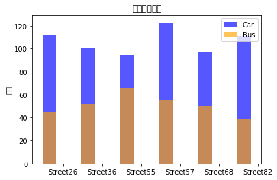
似乎不太美观
不妨让Car和Bus的柱状图分开排列,只需改变一下起始位置
import matplotlib.pyplot as plt
import pandas as pd
import numpy as np

group= 6
car = (112,101, 95, 123, 97,111)
bus= (45, 52, 66, 55, 50,39)
index = np.arange(group)
width = 0.35
s1 = plt.bar(index,car , width, alpha=0.66, color='blue', label='Car')
s2 = plt.bar(index + width, bus, width, alpha=0.66, color='orange', label='Bus')#为了使柱状图不重合加上一定的宽度
plt.title("交通工具统计")
plt.ylabel("数量")
plt.xticks(index + width, ('Street26', 'Street36', 'Street55', 'Street57', 'Street68','Street82'))
plt.legend()
plt.show()
#PS:可以在legend中设置图例显示位置
#'best'         : 自适应(loc=0)
#'upper right'  :右上(loc=1)
#'upper left'   : 左上(loc=2)
#'lower left'   : 左下(loc=3)
#'lower right'  : 右下(loc=4)
#'right'        : 靠右(loc=5)
#'center left'  : 中心靠左(loc=6)
#'center right' : 中心靠右(loc=7)
#'lower center' : 中心靠下(loc=8)
#'upper center' : 中心靠上(loc=9)
#'center'       : 中心(loc=10)