前端布局之——水平垂直居中
前端垂直居中布局
前端页面的居中是平常开发中比较常见的布局,以下将从水平居中、垂直居中、水平垂直居中三个角度分析不同的布局方法。
水平居中
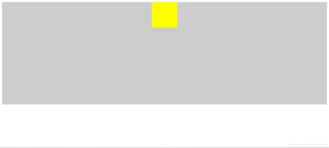
法一:行内元素水平居中
html:


css:
.container {
  text-align: center;
  width: 100%;
  height: 400px;
  background: #ccc;
}

.container .box {
  width: 100px;
  height: 100px;
  background: yellow;
  display: inline-block;
}
示意图:

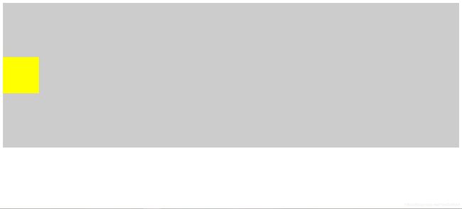
法二:margin实现水平居中
html:


css:
.container {
  width: 100%;
  height: 400px;
  background: #ccc;
}

.container .box {
  width: 100px;
  height: 100px;
  background: yellow;
  margin: 0 auto;
}
示意图:
法三:flex弹性布局(可实现多个块级元素水平居中)
html:


css:
.container {
  width: 100%;
  height: 400px;
  background: #ccc;
  display: flex;
  justify-content: center;
}

.container .box {
  width: 100px;
  height: 100px;
  background: yellow;
  margin-left: 10px;
}

.container .box:first-child {
  margin-left: 0;
}
示意图:
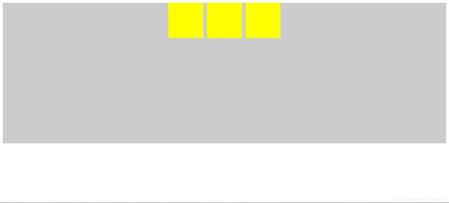
注意:flex布局会将margin包含在内,并且上面的场景通过text-align: center;同样可以做到,也就是方法一。
垂直居中
法一:行内元素垂直居中
html:


css:
.container {
  width: 100%;
  height: 400px;
  line-height: 400px;
  background: #ccc;
}

.container .box {
  width: 100px;
  height: 100px;
  background: yellow;
  display: inline-block;
  vertical-align: middle;
}
演示图:

注:line-height只能在父元素中设置。
法二:通过padding实现垂直居中
html:


css:
.container {
  width: 100%;
  height: 400px;
  background: #ccc;
}

.container .box {
  width: 100px;
  height: 100px;
  padding: 150px 0;
}

.container .box .box2 {
  width: 100px;
  height: 100px;
  background: yellow;
}
演示图:

注:单单通过margin是不行的。
法三:vertical-align属性来实现垂直居中
html:


css:
.container {
  width: 100%;
  height: 400px;
  background: #ccc;
  display: table;
}

.container .box {
  display: table-cell;
  vertical-align: middle;
}

.container .box2 {
  width: 100px;
  height: 100px;
  background: yellow;
}
演示图:

法四:flex实现垂直居中
html:


css:
.container {
  width: 100%;
  height: 400px;
  background: #ccc;
  display: flex;
  align-items: center;
}

.container .box {
  width: 100px;
  height: 100px;
  background: yellow;
}
演示图:

法五:将一个全高度的伪元素放置在容器内,然后设置文本垂直对齐
html:


css:
.container {
  width: 100%;
  height: 400px;
  background: #ccc;
}

.container:before {
  content: '';
  display: inline-block;
  height: 100%;
  width: 0%;
  vertical-align: middle;
}

.container .box {
  width: 100px;
  height: 100px;
  background: yellow;
  display: inline-block;
  vertical-align: middle;
}
示意图:

法六:绝对定位实现垂直居中(元素高度已知)
html:


css:
.container {
  width: 100%;
  height: 400px;
  background: #ccc;
  position: relative;
}

.container .box {
  width: 100px;
  height: 100px;
  background: yellow;
  position: absolute;
  top: 50%;
  margin-top: -50px;
}
示意图:

法七:绝对定位搭配transform实现垂直居中(元素高度未知)
html:


css:
.container {
  width: 100%;
  height: 400px;
  background: #ccc;
  position: relative;
}

.container .box {
  width: 100px;
  height: 100px;
  background: yellow;
  position: absolute;
  top: 50%;
  transform: translateY(-50%);
}
演示图:
法八:flex通过flex-direction: column;实现垂直居中
css:
.container {
  width: 100%;
  height: 400px;
  background: #ccc;
  display: flex;
  flex-direction: column;
  justify-content: center;
}

.container .box {
  width: 100px;
  height: 100px;
  background: yellow;
}
演示图:

水平垂直居中
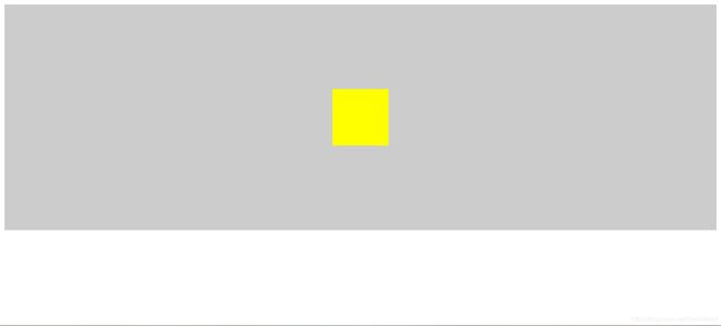
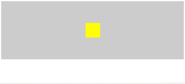
法一:行内元素text-align搭配line-height(父级元素高度已知,子元素宽高度可未知)
html:


css:
.container {
  width: 100%;
  height: 400px;
  line-height: 400px;
  background: #ccc;
  text-align: center;
}

.container .box {
  width: 100px;
  height: 100px;
  background: yellow;
  display: inline-block;
  vertical-align: middle;
}
演示图:

法二:绝对定位实现水平垂直居中(需要知道子元素的宽高)
html:


css:
.container {
   width: 100%;
   height: 400px;
   background: #ccc;
   position: relative;
 }

.container .box {
  width: 100px;
  height: 100px;
  background: yellow;
  position: absolute;
  top: 50%;
  left: 50%;
  margin-top: -50px;
  margin-left: -50px;
}
演示图:
法三:绝对定位实现水平垂直居中(不需要知道子元素的宽高)
html:


css:
.container {
  width: 100%;
  height: 400px;
  background: #ccc;
  position: relative;
}

.container .box {
  width: 100px;
  height: 100px;
  background: yellow;
  position: absolute;
  top: 50%;
  left: 50%;
  transform: translate(-50%, -50%);
}
演示图:

法四:通过父元素使用display: table子元素使用vertical-align: middle实现水平垂直居中
html:


css:
.container {
  width: 100%;
  height: 400px;
  background: #ccc;
  display: table;
}

.container .box {
  text-align: center;
  display: table-cell;
  vertical-align: middle;
}

.container .box2 {
  width: 100px;
  height: 100px;
  background: yellow;
  display: inline-block;
  vertical-align: middle;
}
演示图:

**法五:借助伪元素实现水平垂直居中(需要知道父元素的高度) **
html:


css:
.container {
  text-align: center;
  width: 100%;
  height: 400px;
  background: #ccc;
}

.container:before {
  content: '';
  display: inline-block;
  height: 100%;
  width: 0%;
  vertical-align: middle;
}

.container .box {
  width: 100px;
  height: 100px;
  background: yellow;
  display: inline-block;
  vertical-align: middle;
}
演示图:
法六:通过父元素使用display: table子元素使用vertical-align: middle实现水平垂直居中(水平居中采用margin)
html:


css:
.container {
  width: 100%;
  height: 400px;
  background: #ccc;
  display: table;
}

.container .box {
  display: table-cell;
  vertical-align: middle;
}

.container .box2 {
  width: 100px;
  height: 100px;
  background: yellow;
  margin: 0 auto;
}
演示图:

法七:table-cell嵌套两层用法
html:


css:
.container {
  width: 400px;
  height: 400px;
  background: #ccc;
  display: table-cell;
  vertical-align: middle;
}

.container .box {
  width: 100px;
  height: 100px;
  background: yellow;
  margin: 0 auto;
}
演示图:

注:这种方法其实和上面中的两种方法基本一样,只不过只嵌套两层不支持父级元素宽度或者高度为百分比的情况,同时不支持父级元素脱离文档流。
法八:绝对定位加四边定位为0,margin 为 auto(子元素高度未知时无效)
html:


css:
.container {
  width: 100%;
  height: 400px;
  background: #ccc;
  position: relative;
}

.container .box {
  width: 100px;
  height: 100px;
  background: yellow;
  position: absolute;
  top: 0;
  bottom: 0;
  left: 0;
  right: 0;
  margin: auto;
}
演示图:

法九:flex布局实现水平垂直居中
html:


css:
.container {
  width: 100%;
  height: 400px;
  background: #ccc;
  display: flex;
  justify-content: center;
  align-items: center;
}

.container .box {
  width: 100px;
  height: 100px;
  background: yellow;
}
演示图:

法十:利用grid布局,划分成3x3栅格,第二行第二列格子垂直水平居中
html:


css:
.container {
  width: 300px;
  height: 300px;
  background: #ccc;
  display: grid;
  grid-template-columns: repeat(3, 1fr);
  grid-template-rows: repeat(3, 1fr);
}

.container .box {
  width: 100px;
  height: 100px;
  background: yellow;
  grid-row-start: 2;
  grid-column-start: 2;
}
演示图:

法十一:利用flex或grid布局结合 margin: auto;
html:


css:
.container {
  width: 100%px;
  height: 400px;
  background: #ccc;
  display: flex;
  /* display: grid; */
}

.container .box {
  width: 100px;
  height: 100px;
  background: yellow;
  margin: auto;
}
演示图:
