Android UI 常用控件讲解
前言
Android系统提供了种类繁多的控件,很多的用法都很简单。但是由于控件的多样性,偶尔也容易忘记控件的一些细节问题。因此,本文将总结、讲解一些常用控件的用法和技巧。本文的内容包括:CheckBox、RadioButton、ToggleButton、Switch、ProgressBar、SeekBar、RatingBar、Spinner、ImageButton。
CheckBox
基本用法
XML代码:
id="@+id/checkbox_normal"
    android:layout_width="wrap_content"
    android:layout_height="wrap_content"
    android:checked="true"
    android:text="是否选中"/>
设置监听器:
normalCheckBox.setOnCheckedChangeListener(new CompoundButton.OnCheckedChangeListener() {
    @Override
    public void onCheckedChanged(CompoundButton buttonView, boolean isChecked) {
        if(isChecked){
            Toast.makeText(getActivity(),"选中:"+buttonView.getText().toString(),
                    Toast.LENGTH_SHORT).show();
        }else{
            Toast.makeText(getActivity(),"取消选中",Toast.LENGTH_SHORT).show();
        }
    }
});
自定义样式
首先,我们应该准备两张图片,并放入相应的drawable文件夹中。这两张图片分别对应CheckBox未选中时和选中时的外观。在本例中,分别是ic_check_box.png和ic_check_box_outline_blank.png。
然后,在drawable文件夹下新建一个selector资源,本例中命名为check_box_drawable.xml,XML代码如下:
<selector xmlns:android="http://schemas.android.com/apk/res/android">

    <item android:state_checked="true"
        android:drawable="@drawable/ic_check_box"/>

    <item android:state_checked="false"
        android:drawable="@drawable/ic_check_box_outline_blank"/>

    <item android:drawable="@drawable/ic_check_box_outline_blank"/>
selector>接着,在styles.xml文件中增加一个style,代码如下:
<style name="MyCheckBoxStyle" parent="@android:style/Widget.CompoundButton.CheckBox">
    <item name="android:button">@drawable/check_box_drawable
style>
最后,设置CheckBox的style属性,就可以成功应用自定义风格了,代码如下:
id="@+id/checkbox_style"
    android:layout_width="wrap_content"
    android:layout_height="wrap_content"
    style="@style/MyCheckBoxStyle"
    android:text="是否选中"/>
效果截图:

RadioButton
一般而言,RadioButton需要配合RadioGroup共同使用。同一个RadioGroup中的RadioButton只能被选中一个,这也就实现了单选的功能。
基本用法
XML代码:
id="@+id/radio_group_normal"
    android:layout_width="match_parent"
    android:layout_height="wrap_content"
    android:orientation="horizontal"
    android:checkedButton="@id/radio_button_apple">
    id="@+id/radio_button_apple"
        android:layout_width="wrap_content"
        android:layout_height="wrap_content"
        android:text="苹果"/>
    id="@+id/radio_button_banana"
        android:layout_width="wrap_content"
        android:layout_height="wrap_content"
        android:layout_marginLeft="8dp"
        android:text="香蕉"/>
RadioGroup继承自LinearLayout,因此可以通过orientation属性设置布局方式(横向/纵向)。此外,通过RadioGroup的checkedButton属性可以设置默认选中的RadioButton。
设置监听:
normalRadioGroup.setOnCheckedChangeListener(new RadioGroup.OnCheckedChangeListener() {
    @Override
    public void onCheckedChanged(RadioGroup group, int checkedId) {
        switch (checkedId){//checkedId是触发这一方法的RadioButton的Id属性
            case R.id.radio_button_apple:
                //do something
                break;
            case R.id.radio_button_banana:
                //do something
                break;
                default:break;
        }
    }
});注意,应该为RadioGroup设置监听,而不是为RadioButton设置监听。
RadioGroup的常用方法
//获取被选中的RadioButton的Id属性
public int getCheckedRadioButtonId();

//清除RadioButton的选中状态
public void clearCheck();

//选中指定Id的RadioButton
public void check(int id);注意,clearCheck也会触发OnCheckedChangeListener#onCheckedChanged方法,因此执行相关逻辑的时候应该判断相应Id的RadioButton是否是选中状态。
自定义样式
RadioButton自定义样式的方法和CheckBox相同,同样遵循以下4步:
- 准备两张图片分别作为RadioButton选中/未选中时的外观,并放入相应drawable文件夹中。
- 在drawable文件下新建selector资源,并为选中/未选中状态配置相应的图片。
- 在styles.xml文件中新增style,并使用第二步中新建的selector资源作为
android:button属性的值。 - 在XML文件中设置RadioButton的style属性,使用第三步中新增的自定义风格。
效果截图:

ToggleButton
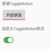
ToggleButton是多状态按钮,具有开/关两个状态,可以在任意API版本中使用,和Switch相比外观要丑一点。
基本用法
XML代码:
"@+id/toggle_button_normal"
    android:layout_width="wrap_content"
    android:layout_height="wrap_content"
    android:textOn="开启状态"
    android:textOff="关闭状态"
    android:checked="true"/>
关键属性:
android:textOn:处于开启状态时显示的文字
android:textOff:处于关闭状态时显示的文字
android:checked:是否处于开启状态
android:disabledAlpha:控件不可用时的透明度
设置监听:
normalToggleBtn.setOnCheckedChangeListener(new CompoundButton.OnCheckedChangeListener() {
    @Override
    public void onCheckedChanged(CompoundButton buttonView, boolean isChecked) {
        if(isChecked){
            Toast.makeText(getActivity(),"当前为开启状态",Toast.LENGTH_SHORT).show();
        }else{
            Toast.makeText(getActivity(),"当前为关闭状态",Toast.LENGTH_SHORT).show();
        }
    }
});
自定义样式
首先,我们应该准备两张图片,并放入相应的drawable文件夹中。这两张图片分别对应ToggleButton开启时和未开启时的外观。在本例中,分别是ic_toggle_on.png和ic_toggle_off.png。
然后,在drawable文件夹下新建一个selector资源,本例中命名为toggle_button_drawable.xml,XML代码如下:
<selector xmlns:android="http://schemas.android.com/apk/res/android">

    <item android:state_checked="true"
        android:drawable="@drawable/ic_toggle_on"/>

    <item android:state_checked="false"
        android:drawable="@drawable/ic_toggle_off"/>

    <item android:drawable="@drawable/ic_toggle_off"/>
selector>
最后,设置ToggleButton的button、background、textOn和textOff属性,代码如下:
"@+id/toggle_button_style"
    android:layout_width="wrap_content"
    android:layout_height="wrap_content"
    android:button="@drawable/toggle_button_drawable"
    android:background="#00000000"
    android:textOn="@null"
    android:textOff="@null"
    android:checked="true" />
效果截图:
Switch
Switch是开关按钮,和ToggleButton相似,也有开启/关闭两个状态,但是UI更加美观。不过Switch要在Android 4.0(API 14)及以上才能使用,使用它的兼容版本SwitchCompat可以兼容至API 7。同时,SwitchCompat可以在低版本保持Switch在MaterialDesign风格下的外观。
基本用法
XML代码:
"@+id/switch_normal"
    android:layout_width="wrap_content"
    android:layout_height="wrap_content"
    android:checked="true" />
关键属性:
android:textOn:处于开启状态时显示的文字
android:textOff:处于关闭状态时显示的文字
android:showText:是否显示文字[API 21及以上可用]
android:checked:是否处于开启状态
android:switchMinWidth:开关的最小宽度
android:thumb:开关的滑块图案
android:track:开关的轨道图案
设置监听:
normalSwitch.setOnCheckedChangeListener(new CompoundButton.OnCheckedChangeListener() {
    @Override
    public void onCheckedChanged(CompoundButton buttonView, boolean isChecked) {
        if(isChecked){
            Toast.makeText(getActivity(),"开关已开启",Toast.LENGTH_SHORT).show();
        }else{
            Toast.makeText(getActivity(),"开关已关闭",Toast.LENGTH_SHORT).show();
        }
    }
});
自定义样式
Switch的外观由两部分决定,即轨道(track)和滑块(thumb)。同时,Switch在开启和关闭状态下,track和thumb又分别有两种状态。换句话说,我们至少需要准备四张图片,才能满足自定义样式的需求。通过观察可知track为圆角矩形,thumb为圆形,因此可以通过shape来进行绘制。这样更加方便,同时也可以适配各种分辨率。
首先,在drawable文件夹下新建四个shape资源,分别代表上述所说的四种场景:
关闭状态下的track(track_gray.xml):
<shape xmlns:android="http://schemas.android.com/apk/res/android">
    <size android:height="10dp"/>
    <corners android:radius="12dp"/>
    <solid android:color="#aaa"/>
shape>
开启状态下的track(track_blue.xml):
<shape xmlns:android="http://schemas.android.com/apk/res/android">
    <size android:height="10dp"/>
    <corners android:radius="12dp"/>
    <solid android:color="#ff0099cc"/>
shape>
关闭状态下的thumb(thumb_gray.xml):
<shape xmlns:android="http://schemas.android.com/apk/res/android"
    android:shape="oval">
    <size android:width="20dp"
        android:height="20dp"/>
    <solid android:color="#fff"/>
    <stroke android:width="1dp"
        android:color="#aaa"/>
shape>
开启状态下的track(thumb_blue.xml):
<shape xmlns:android="http://schemas.android.com/apk/res/android"
    android:shape="oval">
    <size android:height="20dp"
        android:width="20dp"/>
    <solid android:color="#fff"/>
    <stroke android:width="1dp"
        android:color="#ff0099cc"/>
shape>然后,在drawable下新建两个selector资源,分别用作Switch的track和thumb资源:
thumb资源(switch_thumb_drawable.xml):
<selector xmlns:android="http://schemas.android.com/apk/res/android">

    <item android:state_checked="true"
        android:drawable="@drawable/thumb_blue"/>

    <item android:state_checked="false"
        android:drawable="@drawable/thumb_gray"/>

    <item android:drawable="@drawable/thumb_gray"/>
selector>
track资源(switch_track_drawable.xml):
<selector xmlns:android="http://schemas.android.com/apk/res/android">

    <item android:state_checked="true"
        android:drawable="@drawable/track_blue"/>

    <item android:state_checked="false"
        android:drawable="@drawable/track_gray"/>

    <item android:drawable="@drawable/track_gray"/>
selector>
最后,为Switch设置track和thumb属性即可:
android:id="@+id/switch_style"
android:layout_width="wrap_content"
android:layout_height="wrap_content"
android:thumb="@drawable/switch_thumb_drawable"
android:track="@drawable/switch_track_drawable"
android:switchMinWidth="20dp"
android:textOff=""
android:textOn=""
android:checked="true" /> 注意,增加switchMinWidth、textOn、textOff属性是为了兼容低版本(API 21以下)的Switch外观。根本原因在于API 21时Switch的外观发生了巨大的变化(Material Design风格)。
自定义SwitchCompat风格
SwitchCompat作为兼容低版本的控件,可以在API 7及以上保持统一的外观,这无疑是很意义的。同时,只需要为SwitchCompat设置合适的Theme属性,就可以轻松地改变控件整体风格。
首先,在styles.xml文件中新增一个style,代码如下:
<style name="SwitchCompatStyle" parent="Theme.AppCompat.Light">
    -- 开启状态下滑块的颜色以及轨道的颜色(30%透明度的该颜色) -->
    <item name="colorControlActivated">#ff0099ccitem>
    <item name="colorSwitchThumbNormal">#ffffffitem>-- 关闭状态下滑块的颜色 -->
    <item name="android:colorForeground">#aaaitem>-- 关闭状态下轨道的颜色(30%透明度的该颜色) -->
style>
然后,为SwitchCompat设置Theme属性即可,代码如下:
.support.v7.widget.SwitchCompat
    android:layout_width="wrap_content"
    android:layout_height="wrap_content"
    android:theme="@style/SwitchCompatStyle"
android:checked="true" /> 综上,建议使用SwitchCompat,这可以保证控件在各个系统版本都呈现相同的Material Design风格,同时也可以方便地改变控件的样式。
效果截图:

小技巧: CheckBox,RadioButton,ToggleButton,Switch和SwitchCompat都可以通过toggle方法快速切换当前的选中状态。此外,还可以通过performClick方法主动触发 OnClickListener。这两个方法的原型如下:
public void toggle ();//切换控件当前选中状态
public boolean performClick ();//触发控件的OnClickListener
ProgressBar
ProgressBar是进度条,用于精确或不精确地指示进度,主要有水平长条形、环形两种外观。系统也为ProgressBar提供了多种风格,主要有两种使用方式:
1.使用@android:style的形式为ProgressBar设置风格
- @android:style/Widget.ProgressBar
- @android:style/Widget.ProgressBar.Horizontal
- @android:style/Widget.ProgressBar.Inverse
- @android:style/Widget.ProgressBar.Large
- @android:style/Widget.ProgressBar.Large.Inverse
- @android:style/Widget.ProgressBar.Small
- @android:style/Widget.ProgressBar.Small.Inverse
使用方式如下:
"wrap_content"
    android:layout_height="wrap_content"
    android:progress="45"
    android:max="100"
    style="@android:style/Widget.ProgressBar.Horizontal"/>
2.使用?android:attr的形式为ProgressBar设置风格
- ?android:attr/progressBarStyle
- ?android:attr/progressBarStyleHorizontal
- ?android:attr/progressBarStyleInverse
- ?android:attr/progressBarStyleLarge
- ?android:attr/progressBarStyleLargeInverse
- ?android:attr/progressBarStyleSmall
- ?android:attr/progressBarStyleSmallInverse
- ?android:attr/progressBarStyleSmallTitle
使用方式如下:
"wrap_content"
    android:layout_height="wrap_content"
    android:progress="45"
    android:max="100"
style="?android:attr/progressBarStyleHorizontal"/> 小提示:经过测试,发现使用第二种方式的ProgressBar整体UI效果更好。在Android 5.0(API 21)及以上呈现Material Design风格,在API 21及以下则呈现另外的风格(更丑)。
关键属性:
android:indeterminate:是否启用不精确模式(在这一模式下不会显示具体进度)
android:indeterminateBehavior:不精确模式下进度达到最大时的行为 [repeat/cycle]
android:progress:当前的主进度值(常用的就是这个进度值)
android:secondaryProgress:当前的二级进度值(常见的应用场景是作为播放视频时的缓冲进度)
android:max:进度最大值 [默认为100]
关键方法:
//增加或减少主进度值(取决于diff的正负)
public synchronized final void incrementProgressBy(int diff);
//增加或减少二级进度值(取决于diff的正负)
public synchronized final void incrementSecondaryProgressBy(int diff);
效果截图:

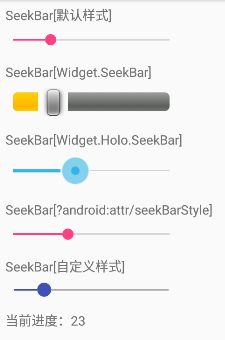
SeekBar
SeekBar是滑动条,典型的应用就是系统的音量滑动条、亮度滑动条。
基本用法
系统已经提供了几种SeekBar风格,主要有两种使用方式:
1.使用@android:style的形式为SeekBar设置风格
- @android:style/Widget.SeekBar
- @android:style/Widget.Holo.SeekBar
使用方式如下:
"@+id/seek_bar_style_normal"
    android:layout_width="200dp"
    android:layout_height="wrap_content"
    style="@android:style/Widget.SeekBar"
    android:max="100"/>
2.使用?android:attr的形式为SeekBar设置风格
- ?android:attr/seekBarStyle
使用方式如下:
"@+id/seek_bar_style_attr"
    android:layout_width="200dp"
    android:layout_height="wrap_content"
    style="?android:attr/seekBarStyle"
    android:max="100"/>
第二种方式会根据当前系统和主题调整SeekBar的外观。此外,测试过程中发现SeekBar的默认样式(不设置style属性)可以在各个系统版本下保持Material Design风格外观,不过并没有在足够多的设备上测试过。
关键属性:
android:progress:当前进度值
android:max:最大进度值
android:thumb:滑块样式
android:progressDrawable:轨道样式
android:thumbTint:滑块颜色 [API 21及以上可用]
android:progressTint:进度条颜色 [API 21及以上可用]
android:progressBackgroundTint:轨道背景颜色 [API 21及以上可用]
设置监听:
defaultSeekBar.setOnSeekBarChangeListener(new SeekBar.OnSeekBarChangeListener() {
    @Override
    public void onProgressChanged(SeekBar seekBar, int progress, boolean fromUser) {//进度发生变化时触发
        Log.i(TAG,"当前进度:"+progress);
    }
    @Override
    public void onStartTrackingTouch(SeekBar seekBar) {//开始滑动时触发
        Toast.makeText(getActivity(),"开始滑动",Toast.LENGTH_SHORT).show();
    }
    @Override
    public void onStopTrackingTouch(SeekBar seekBar) {//停止滑动时触发
        Toast.makeText(getActivity(),"停止滑动",Toast.LENGTH_SHORT).show();
    }
});
自定义样式
除了使用系统提供的样式外,我们也可以自定义SeekBar的样式。SeekBar是由滑块和轨道两部分组成的,我们只需要为这两部分准备好相应的资源就行了。在本例中,直接使用XML绘图作为图像资源。
首先,在drawable文件夹下新建两个shape资源,分别代表普通状态下的滑块和按压状态下的滑块。
普通状态下的滑块(seekbar_thumb_normal.xml):
<shape xmlns:android="http://schemas.android.com/apk/res/android"
    android:shape="oval">
    <size android:width="15dp" android:height="15dp"/>
    <solid android:color="#3F51B5" />
shape>
按压状态下的滑块(seekbar_thumb_pressed.xml):
<shape xmlns:android="http://schemas.android.com/apk/res/android"
    android:shape="oval">
    <size android:width="15dp" android:height="15dp"/>
    <solid android:color="#3F51B5"/>
    <stroke android:width="6dp" android:color="#AF3F51B5"/>
shape>然后,在drawable文件夹下新建一个selector资源,作为SeekBar的thumb资源(seekbar_thumb_drawable.xml)。代码如下:
<selector xmlns:android="http://schemas.android.com/apk/res/android">

    <item android:state_pressed="true"
        android:drawable="@drawable/seekbar_thumb_pressed"/>

    <item android:state_pressed="false"
        android:drawable="@drawable/seekbar_thumb_normal"/>

    <item android:drawable="@drawable/seekbar_thumb_normal"/>
selector>接着,在drawable文件下新建一个layer-list资源,作为SeekBar的progressDrawable资源(seekbar_progress_drawable.xml)。代码如下:
<layer-list xmlns:android="http://schemas.android.com/apk/res/android">

    <item android:id="@android:id/background">
        <shape android:shape="line">
            <stroke android:width="2dp" android:color="#aaa"/>
            <corners android:radius="1dp"/>
        shape>
    item>

    <item android:id="@android:id/progress">
        <clip>
            <shape android:shape="line">
                <stroke android:width="2dp" android:color="#3F51B5"/>
                <corners android:radius="1dp"/>
            shape>
        clip>
    item>

    <item android:id="@android:id/secondaryProgress">
        <clip>
            <shape android:shape="line">
                <stroke android:width="2dp" android:color="#AF3F51B5"/>
                <corners android:radius="1dp"/>
            shape>
        clip>
    item>
layer-list>注意:上面每个item的id属性一定不要写错,这样系统才能正确应用这些资源。
最后,还需要为SeekBar设置thumb和progressDrawable属性,代码如下:
"@+id/seek_bar_style_custom"
    android:layout_width="200dp"
    android:layout_height="wrap_content"
    android:progress="20"
    android:max="100"
    android:thumb="@drawable/seekbar_thumb_drawable"
    android:progressDrawable="@drawable/seekbar_progress_drawable"/>
效果截图:
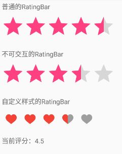
RatingBar
RatingBar是星级评分控件,可以通过直观的交互方式接受用户反馈。
基本用法
XML代码:
<RatingBar
    android:id="@+id/rating_bar_normal"
    android:layout_width="wrap_content"
    android:layout_height="wrap_content"
    android:numStars="5"
    android:stepSize="0.5"
    android:rating="4.5"
    android:isIndicator="false"/>
关键属性:
android:numStars:星星的数量(最大评分)
android:stepSize:步长(最小的评分单位) [浮点型]
android:rating:当前评分 [浮点型]
android:isIndicator:是否为指示器(如果为true,RatingBar将不具备交互能力,只用于展示)
设置监听
normalRatingBar.setOnRatingBarChangeListener(new RatingBar.OnRatingBarChangeListener() {
    @Override
    public void onRatingChanged(RatingBar ratingBar, float rating, boolean fromUser) {
        //当评分改变时该方法会触发
        Log.i(TAG,"当前评分:"+rating);
    }
});
自定义样式
除了使用系统提供的样式外,我们也可以为RatingBar自定义样式。
首先,我们需要准备两张图片,分别对应填充时的“星星”和未填充时的“星星”,并放入相应的drawable文件夹中。当然,这里所说的“星星”只是一种代称,实际上我们可以选用任何图形。在本例中,分别为ic_star_red.png和ic_star_gray.png。
然后,在drawable文件下新建一个layer-list资源,作为RatingBar的progressDrawable资源(ratingbar_progress_drawable.xml)。代码如下:
<layer-list xmlns:android="http://schemas.android.com/apk/res/android">

    <item android:id="@android:id/background"
        android:drawable="@drawable/ic_star_gray"/>

    <item android:id="@android:id/secondaryProgress"
        android:drawable="@drawable/ic_star_gray"/>

    <item android:id="@android:id/progress"
        android:drawable="@drawable/ic_star_red"/>
layer-list>注意:上面每个item的id属性一定不要写错,这样系统才能正确应用这些资源。另外,虽然secondaryProgress对应着填充到一半的星星,但是同样使用未填充的星星作为图片资源。
最后,还需要为RatingBar设置progressDrawable属性,代码如下:
<RatingBar
    android:id="@+id/rating_bar_style"
    android:layout_width="wrap_content"
    android:layout_height="wrap_content"
    android:minHeight="40dp"
    android:maxHeight="40dp"
    android:numStars="5"
    android:stepSize="0.5"
    android:rating="3.5"
    android:isIndicator="false"
android:progressDrawable="@drawable/ratingbar_progress_drawable"/>可以看到,这里还为RatingBar设置了minHeight和maxHeight属性,这可以保证RatingBar不会占用过大的空间。当然,这两个属性应该根据使用的图片大小进行调整,才能获得最好的效果。
小提示:在为RatingBar自定义样式时,“星星”之间的距离取决于所用图片四周的间距。
效果截图:
Spinner
Spinner是下拉选择框,一般情况下都是使用Adapter动态加载数据。此外,也可以选择以对话框的形式展示内容。
基本用法
XML代码:
<Spinner
    android:id="@+id/spinner_normal"
    android:layout_width="wrap_content"
    android:layout_height="wrap_content" />
设置Adapter:
final String[] normalItems={"选项一","选项二","选项三"};
final ArrayAdapter normalAdapter=new ArrayAdapter<>(getActivity(),
        android.R.layout.simple_spinner_item,normalItems);
//为下拉列表项设置布局
normalAdapter.setDropDownViewResource(android.R.layout.simple_spinner_dropdown_item);
normalSpinner.setAdapter(normalAdapter); 如果Spinner展示的内容比较简单,使用ArrayAdapter作为适配器即可,同时使用系统提供的布局资源(android.R.layout.simple_spinner_item和android.R.layout.simple_spinner_dropdown_item)。
设置监听器:
normalSpinner.setOnItemSelectedListener(new AdapterView.OnItemSelectedListener() {
    @Override
    public void onItemSelected(AdapterView parent, View view, int position, long id) {
        Log.i(TAG,"当前选中项:"+normalItems[position]);
    }
    @Override
    public void onNothingSelected(AdapterView parent) {
        Log.i(TAG,"当前未选中任何项");
    }
});
关键属性:
android:entries:需要引用一个数组资源,用于静态展示数据(这种情况下就不需要使用适配器了)
android:dropDownHorizontalOffset:下拉列表在水平方向的偏移量
android:dropDownVerticalOffset:下拉列表在垂直方向的偏移量
android:dropDownWidth:下拉列表的宽度
android:gravity:当前选中项的对齐方式
android:popupBackground:下拉列表的背景(可以是颜色或XML资源[如shape])
android:spinnerMode:列表展示方式(对话框或下拉菜单) [dialog|dropdown]
android:prompt:在对话框展示形式下的标题(只能引用资源,否则会报错)
自定义样式
如果需要展示的数据比较复杂,比如同时包含图片和文字,我们就应该实现自己的适配器,以实现Spinner的自定义样式。本例选择继承BaseAdapter。
实体类:
public class Book {
    private String name;
    private int imageRes;//图片资源

    public Book(String name, int imageRes) {
        this.name = name;
        this.imageRes = imageRes;
    }
    public String getName() {
        return name;
    }
    public void setName(String name) {
        this.name = name;
    }
    public int getImageRes() {
        return imageRes;
    }
    public void setImageRes(int imageRes) {
        this.imageRes = imageRes;
    }
}
自定义Adapter:
public class StyleSpinnerAdapter extends BaseAdapter {
    private Context context;
    private List itemList;

    public StyleSpinnerAdapter(Context context, List itemList) {
        this.context = context;
        this.itemList = itemList;
    }

    @Override
    public int getCount() {
        return itemList.size();
    }
    @Override
    public Object getItem(int position) {
        return itemList.get(position);
    }
    @Override
    public long getItemId(int position) {
        return position;
    }
    @Override
    public View getView(int position, View convertView, ViewGroup parent) {
        LayoutInflater inflater=LayoutInflater.from(context);
        Book book=itemList.get(position);
        ViewHolder holder=null;
        if(convertView==null){
            convertView=inflater.inflate(R.layout.spinner_item,parent,false);
            holder=new ViewHolder();
            holder.bookImage=convertView.findViewById(R.id.book_image);
            holder.bookNameView=convertView.findViewById(R.id.book_name);
            convertView.setTag(holder);
        }else{
            holder= (ViewHolder) convertView.getTag();
        }
        holder.bookImage.setImageResource(book.getImageRes());
        holder.bookNameView.setText(book.getName());

        return convertView;
    }

    static class ViewHolder{//复用机制
        ImageView bookImage;
        TextView bookNameView;
    }
}
设置Adapter:
final List bookList=new ArrayList<>();
bookList.add(new Book("《小王子》",R.mipmap.ic_launcher));
bookList.add(new Book("《资本论》",R.mipmap.ic_launcher));
bookList.add(new Book("《三体》",R.mipmap.ic_launcher));

StyleSpinnerAdapter styleAdapter=new StyleSpinnerAdapter(getActivity(),bookList);
styleSpinner.setAdapter(styleAdapter);
效果截图:

ImageButton
ImageButton是图像按钮,属于ImageView的子类。和Button不同的是,ImageButton只能显示图片。
基本用法
XML代码:
<ImageButton
    android:layout_width="wrap_content"
    android:layout_height="wrap_content"
android:src="@mipmap/ic_launcher" />通过android:src属性为ImageButton指定图像资源即可。需要注意,ImageButton默认会有一层灰色的背景(和普通的Button一致)。如果我们不需要背景,可以将背景指定为透明色,如下:
"wrap_content"
    android:layout_height="wrap_content"
    android:background="@android:color/transparent"
android:src="@mipmap/ic_launcher" /> 此外,通过android:src为ImageButton指定资源后,显示的图片大小将始终是原图大小。改变android:layout_width和android:layout_height只会改变整个ImageButton的大小,并不会影响显示的图片大小。当然,如果指定的宽高小于图片的实际大小,图片将无法完整显示。
自定义样式
通过为android:src属性指定selector资源,可以自定义ImageButton在不同状态下的外观。
首先,我们需要准备两张图片,分别对应按下状态和未按下状态,并放入相应的drawable文件夹。在本例中,分别为ic_heart_pressed.png和ic_heart_normal.png。
然后,在drawable文件下新建一个selector资源,作为ImageButton的src资源(image_button_drawable.xml)。代码如下:
<selector xmlns:android="http://schemas.android.com/apk/res/android">

    <item android:state_pressed="true"
        android:drawable="@drawable/ic_heart_pressed"/>

    <item android:state_pressed="false"
        android:drawable="@drawable/ic_heart_normal"/>

    <item android:drawable="@drawable/ic_heart_normal"/>
selector>最后,为ImageButton设置android:src属性即可:
"wrap_content"
    android:layout_height="wrap_content"
    android:background="@android:color/transparent"
android:src="@drawable/image_button_drawable" /> 小提示:如果不为ImageButton指定src,而是将selector资源指定给background属性,也可以实现上述效果。
和ImageView的异同
ImageButton虽然继承自ImageView,但是两者还是有不少区别的:
- 通过src指定图像资源时,ImageView会根据width和height缩放图像,ImageButton则始终显示原图大小。
- 通过src指定
.9格式的图像资源时,两者都不会生效。 - 通过src或background指定selector资源时,ImageView必须设置
android:clickable属性为true才能生效。
效果截图:

更多博客
《Android UI 与文本相关的控件》:包括TextView、EditText、AutoCompleteTextView和MultiAutoCompleteTextView。
demo下载地址
https://github.com/CodingEnding/UISystemDemo [ 持续更新中 ]
参考资料
http://blog.csdn.net/qq_34763699/article/details/54954394
http://blog.csdn.net/u012760183/article/details/51719944
http://blog.csdn.net/qq_28057577/article/details/52225870
http://www.jcodecraeer.com/a/anzhuokaifa/androidkaifa/2015/0105/2264.html
http://blog.csdn.net/qq_27376951/article/details/51810829