机器学习(一)- 基础库matplotlib的使用
(本人用的jupyter,所以以下格式是以jupyter格式书写的)
可视化库matpltlib:
一、折线图绘制
import pandas as pd
unrate = pd.read_csv('unrate.csv') # 读取
print (type(unrate['DATE'][0]))
unrate['DATE'] = pd.to_datetime(unrate['DATE']) #将字符串转化成时间类型
print (unrate.head(12))
输出:

import matplotlib.pyplot as plt
#%matplotlib inline
#Using the different pyplot functions, we can create, customize, and display a plot. For example, we can use 2 functions to :
plt.plot() # 画图操作,如果没有传参数,则什么都不画
plt.show()# 图像显示
first_twelve = unrate[0:12]
plt.plot(first_twelve['DATE'], first_twelve['VALUE']) #(x,y)
plt.show()
这里可以看出,我们横坐标不好看,下面将对其进行处理:
plt.plot(first_twelve['DATE'], first_twelve['VALUE'])
plt.xticks(rotation=45) # 修改坐标书写方式,这里表示选择45度
#print help(plt.xticks)
plt.show()
但我们的图表的横纵坐标还不能清除的表达出表的意思,下面变为其添加标题:
plt.plot(first_twelve['DATE'], first_twelve['VALUE'])
plt.xticks(rotation=90)
plt.xlabel('Month') # 横坐标标签
plt.ylabel('Unemployment Rate')
plt.title('Monthly Unemployment Trends, 1948') #表的标题
plt.show()
二、子图操作
相关函数:
add_subplot(4,1,x) #添加子图,4,1表示4行1列

添加子图:
#add_subplot(first,second,index) first means number of Row,second means number of Column.

import matplotlib.pyplot as plt
fig = plt.figure() # 默认画图区间,创建画图域
ax1 = fig.add_subplot(3,2,1) # 添加子图,3,2表示3*2的区间,1表示这个子图在区间的位置
ax2 = fig.add_subplot(3,2,2)
ax2 = fig.add_subplot(3,2,6)
plt.show()
import numpy as np
fig = plt.figure()
fig = plt.figure(figsize=(3, 3)) # 指定画图域的长和宽的大小
ax1 = fig.add_subplot(2,1,1)
ax2 = fig.add_subplot(2,1,2)

ax1.plot(np.random.randint(1,5,5), np.arange(5))
# np.random.randint(1,5,5) 这是numpy的一个方法,第三个参数为产生随机数的个数
ax2.plot(np.arange(10)*3, np.arange(10))
plt.show()
为一个表添加多个对象,以便于比较:
unrate['MONTH'] = unrate['DATE'].dt.month # 取出unrate['DATE']中的月份,并添加到新列
unrate['MONTH'] = unrate['DATE'].dt.month
fig = plt.figure(figsize=(6,3))

# 在一个图中画多条折线,c表示颜色,可以使用rgb
plt.plot(unrate[0:12]['MONTH'], unrate[0:12]['VALUE'], c='red')
plt.plot(unrate[12:24]['MONTH'], unrate[12:24]['VALUE'], c='blue')

plt.show()
fig = plt.figure(figsize=(10,6))
colors = ['red','blue','green','orange','black']
for i in range(5):
    start_index = i*12
    end_index = (i+1)*12
    subset = unrate[start_index:end_index]
    plt.plot(subset['MONTH'],['VALUE'],c=colors[i])
plt.show()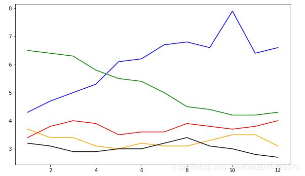
显示每个对象表示的含义:
fig = plt.figure(figsize=(10,6))
colors = ['red', 'blue', 'green', 'orange', 'black']
for i in range(5):
    start_index = i*12
    end_index = (i+1)*12
    subset = unrate[start_index:end_index]
    label = str(1948 + i) # 标签
    plt.plot(subset['MONTH'], subset['VALUE'], c=colors[i], label=label)
    # label表示当前线的含义
# 要显示label,还需要执行legend(),并传入参数loc来地位label标签位置
# print help(plt.legend) 可以以查看参数
plt.legend(loc='best')
plt.show()
完善一下图:
fig = plt.figure(figsize=(10,6))
colors = ['red', 'blue', 'green', 'orange', 'black']
for i in range(5):
    start_index = i*12
    end_index = (i+1)*12
    subset = unrate[start_index:end_index]
    label = str(1948 + i)
    plt.plot(subset['MONTH'], subset['VALUE'], c=colors[i], label=label)
plt.legend(loc='upper left')
# 添加横纵坐标意思
plt.xlabel('Month, Integer')
plt.ylabel('Unemployment Rate, Percent')
# 图表标题
plt.title('Monthly Unemployment Trends, 1948-1952')

plt.show()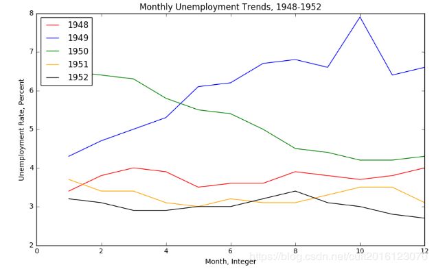
三、条形图与散点图
import pandas as pd
reviews = pd.read_csv('fandango_scores.csv')
cols = ['FILM', 'RT_user_norm', 'Metacritic_user_nom', 'IMDB_norm', 'Fandango_Ratingvalue', 'Fandango_Stars']
norm_reviews = reviews[cols]
print (norm_reviews)
产生树状图:
import matplotlib.pylot as plt
from numpy import arange

num_cols = ['RT_user_norm', 'Metacritic_user_nom', 'IMDB_norm', 'Fandango_Ratingvalue', 'Fandango_Stars']

bar_heights = norm_reviews.ix[0,num_cols].values # 纵坐标
print (bar_heights)

bar_positions = arange(5) + 0.75 # 横坐标
print (bar_positions)

fig,ax = plt.subplots()
# fig为图片变量,ax为m*n的坐标变量(数组),分别指向相应生成字图的坐标
'''
# 相当于:
fig=plt.figure() # 创建画图区域
ax=fig.add_subplot()
'''
ax.bar(bar_positions, bar_heights, 0.5) # 最后一个参数为条形的宽度

plt.show()
注:.ix使用在链接中可以找到:http://pandas.pydata.org/pandas-docs/stable/indexing.html#ix-indexer-is-deprecated
此处的含义就是希望从num_cols 这些列的索引中获取第0元素。

接下来完善树状图:
import matplotlib.pyplot as plt
from numpy import arange

num_cols = ['RT_user_norm', 'Metacritic_user_nom', 'IMDB_norm', 'Fandango_Ratingvalue', 'Fandango_Stars']
bar_heights = norm_reviews.ix[0, num_cols].values
bar_positions = arange(5) + 0.75
tick_positions = range(1,6)
fig, ax = plt.subplots()
# fig为图片变量,ax为m*n的坐标变量(数组),分别指向相应生成字图的坐标
ax.bar(bar_positions, bar_heights, 0.5)
ax.set_xticks(tick_positions) # 横坐标格数
ax.set_xticklabels(num_cols, rotation=45) # 标签名及位置

ax.set_xlabel('Rating Source')
ax.set_ylabel('Average Rating')
ax.set_title('Average User Rating For Avengers: Age of Ultron (2015)')
plt.show()
这里我们还可以改变条形图的方向:
import matplotlib.pyplot as plt
from numpy import arange
num_cols = ['RT_user_norm', 'Metacritic_user_nom', 'IMDB_norm', 'Fandango_Ratingvalue', 'Fandango_Stars']

bar_widths = norm_reviews.ix[0, num_cols].values
bar_positions = arange(5) + 0.75
tick_positions = range(1,6)
fig, ax = plt.subplots()
# fig为图片变量,ax为m*n的坐标变量(数组),分别指向相应生成字图的坐标
ax.barh(bar_positions, bar_widths, 0.5)

# 通过这里改变条形图画法
ax.set_yticks(tick_positions)
ax.set_yticklabels(num_cols)
ax.set_ylabel('Rating Source')
ax.set_xlabel('Average Rating')
ax.set_title('Average User Rating For Avengers: Age of Ultron (2015)')
plt.show()
我们也可以通过plt.subplots()画散点图:
fig,ax = plt.subplots()
# fig为图片变量,ax为m*n的坐标变量(数组),分别指向相应生成字图的坐标
# 画点
ax.scatter(norm_reviews['Fandango_Ratingvalue'],norm_reviews['RT_user_norm'])
ax.set_xlabel('Fandango')
ax.set_ylabel('Rotten Tomatoes')
plt.show()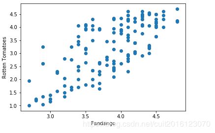
同时,我们也可以在同一区域画两个图表:
# 这里和上面fig,ax=plt.subplot()功能相似
fig = plt.figure(figsize=(5,10))
ax1 = fig.add_subplot(2,1,1)# 添加图
ax2 = fig.add_subplot(2,1,2)
ax1.scatter(norm_reviews['Fandango_Ratingvalue'], norm_reviews['RT_user_norm'])
ax1.set_xlabel('Fandango')
ax1.set_ylabel('Rotten Tomatoes')
ax2.scatter(norm_reviews['RT_user_norm'], norm_reviews['Fandango_Ratingvalue'])
ax2.set_xlabel('Rotten Tomatoes')
ax2.set_ylabel('Fandango')
plt.show()
四、组形图和盒图
先求出每个值的个数:
import pandas as pd
import matplotlib.pyplot as plt
reviews = pd.read_csv('fandango_scores.csv')
cols = ['FILM', 'RT_user_norm', 'Metacritic_user_nom', 'IMDB_norm', 'Fandango_Ratingvalue']
norm_reviews = reviews[cols]
fandango_distribution = norm_reviews['Fandango_Ratingvalue'].value_counts()
# 计算每个值的个数
fandango_distribution = fandango_distribution.sort_index()
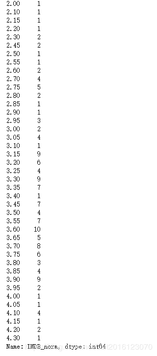
imdb_distribution = norm_reviews['IMDB_norm'].value_counts()
imdb_distribution = imdb_distribution.sort_index()
print(fandango_distribution)
print(imdb_distribution)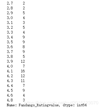
利用hist画图,hist表示我们所画的图带有bins结构:
fig, ax = plt.subplots()
# hist表示我们所画的图带有bins结构,默认bins、
ax.hist(norm_reviews['Fandango_Ratingvalue'])# 默认bins是10
#ax.hist(norm_reviews['Fandango_Ratingvalue'],bins=20)
#ax.hist(norm_reviews['Fandango_Ratingvalue'], range=(4, 5),bins=20)
# range指定起始区间和结束区间
plt.show()
画多个图进行比较:
fig = plt.figure(figsize=(5,20))
ax1 = fig.add_subplot(4,1,1)
ax2 = fig.add_subplot(4,1,2)
ax3 = fig.add_subplot(4,1,3)
ax4 = fig.add_subplot(4,1,4)
ax1.hist(norm_reviews['Fandango_Ratingvalue'], bins=20, range=(0, 5))
ax1.set_title('Distribution of Fandango Ratings')
ax1.set_ylim(0, 50)# 指定y轴区间

ax2.hist(norm_reviews['RT_user_norm'], 20, range=(0, 5))
ax2.set_title('Distribution of Rotten Tomatoes Ratings')
ax2.set_ylim(0, 50)

ax3.hist(norm_reviews['Metacritic_user_nom'], 20, range=(0, 5))
ax3.set_title('Distribution of Metacritic Ratings')
ax3.set_ylim(0, 50)

ax4.hist(norm_reviews['IMDB_norm'], 20, range=(0, 5))
ax4.set_title('Distribution of IMDB Ratings')
ax4.set_ylim(0, 50)

plt.show()
画四分图(盒图),先将数据分为4分,画出1/4、2/4、3/4处的值:
fig, ax = plt.subplots()
ax.boxplot(norm_reviews['RT_user_norm'])
ax.set_xticklabels(['Rotten Tomatoes'])
ax.set_ylim(0, 5)
plt.show()
也可以一次性画多个四分图:
num_cols = ['RT_user_norm', 'Metacritic_user_nom', 'IMDB_norm', 'Fandango_Ratingvalue']
fig, ax = plt.subplots()
ax.boxplot(norm_reviews[num_cols].values)
ax.set_xticklabels(num_cols, rotation=90)
ax.set_ylim(0,5)
plt.show()
五、matplotlib细节设置
隐藏图标边框:
import pandas as pd
import matplotlib.pyplot as plt

women_degrees = pd.read_csv('percent-bachelors-degrees-women-usa.csv')

fig, ax = plt.subplots()
ax.plot(women_degrees['Year'], women_degrees['Biology'], c='blue', label='Women')
ax.plot(women_degrees['Year'], 100-women_degrees['Biology'], c='green', label='Men')
ax.tick_params(bottom="off", top="off", left="off", right="off")

for key,spine in ax.spines.items():
    spine.set_visible(False)
# End solution code.
ax.legend(loc='upper right')
plt.show()
改变线条粗细:
#Setting Line Width
cb_dark_blue = (0/255, 107/255, 164/255)
cb_orange = (255/255, 128/255, 14/255)
fig = plt.figure(figsize=(12, 12))
for sp in range(0,4):
ax = fig.add_subplot(2,2,sp+1)
# Set the line width when specifying how each line should look.
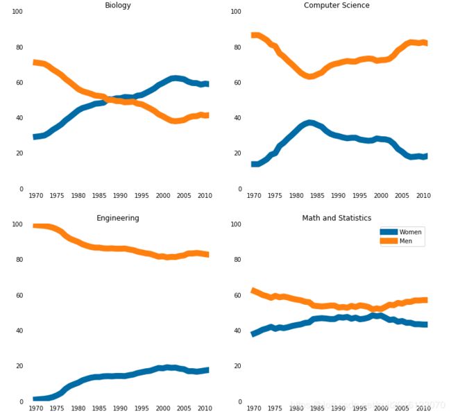
ax.plot(women_degrees['Year'], women_degrees[major_cats[sp]], c=cb_dark_blue, label='Women', linewidth=10)
ax.plot(women_degrees['Year'], 100-women_degrees[major_cats[sp]], c=cb_orange, label='Men', linewidth=10)# 此处linewidth为设置先天粗细
for key,spine in ax.spines.items():
spine.set_visible(False)
ax.set_xlim(1968, 2011)
ax.set_ylim(0,100)
ax.set_title(major_cats[sp])
ax.tick_params(bottom="off", top="off", left="off", right="off")
plt.legend(loc='upper right')
plt.show()
在线条上添加标签:
fig = plt.figure(figsize=(18, 3))

for sp in range(0,6):
    ax = fig.add_subplot(1,6,sp+1)
    ax.plot(women_degrees['Year'], women_degrees[stem_cats[sp]], c=cb_dark_blue, label='Women', linewidth=3)
    ax.plot(women_degrees['Year'], 100-women_degrees[stem_cats[sp]], c=cb_orange, label='Men', linewidth=3)
    for key,spine in ax.spines.items():
        spine.set_visible(False)
    ax.set_xlim(1968, 2011)
    ax.set_ylim(0,100)
    ax.set_title(stem_cats[sp])
    ax.tick_params(bottom="off", top="off", left="off", right="off")

    if sp == 0:
        ax.text(2005, 87, 'Men')# 前两个参数表示标签位置
        ax.text(2002, 8, 'Women')
    elif sp == 5:
        ax.text(2005, 62, 'Men')
        ax.text(2001, 35, 'Women')
plt.show()