ggplot2--饼状图
原文出处:http://blog.csdn.net/bone_ace/article/details/47455363
原始图样:
library(ggplot2)
dt = data.frame(A = c(2, 7, 4, 10, 1), B = c('B','A','C','D','E'))
p = ggplot(dt, aes(x = "", y = A, fill = B)) +
  geom_bar(stat = "identity") +
  coord_polar(theta = "y")   ## 把柱状图折叠成饼图(极坐标)
p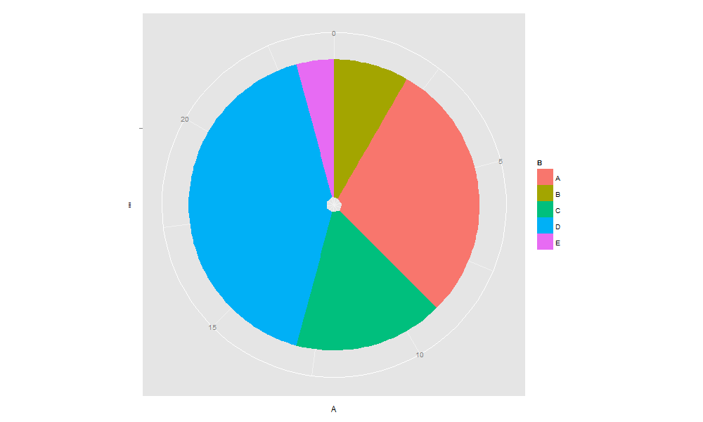
如何去除饼图中心的杂点:
library(ggplot2)
dt = data.frame(A = c(2, 7, 4, 10, 1), B = c('B','A','C','D','E'))
p = ggplot(dt, aes(x = "", y = A, fill = B)) +
  geom_bar(stat = "identity", width = 1) +    ## width >= 1 时中心的杂点将消失
  coord_polar(theta = "y")
p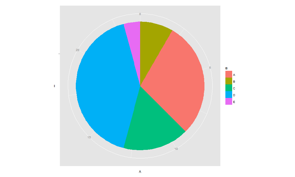
如何去除饼图旁边的标签:
library(ggplot2)
dt = data.frame(A = c(2, 7, 4, 10, 1), B = c('B','A','C','D','E'))
p = ggplot(dt, aes(x = "", y = A, fill = B)) +
  geom_bar(stat = "identity", width = 1) +
  coord_polar(theta = "y") +
  labs(x = "", y = "", title = "")   ## 将标签设为空
p
如何去掉左上角多出来的一横线:
library(ggplot2)
dt = data.frame(A = c(2, 7, 4, 10, 1), B = c('B','A','C','D','E'))
p = ggplot(dt, aes(x = "", y = A, fill = B)) +
  geom_bar(stat = "identity", width = 1) +
  coord_polar(theta = "y") +
  labs(x = "", y = "", title = "") +
  theme(axis.ticks = element_blank())   ## 把左上角多出来的“小胡子”去掉
p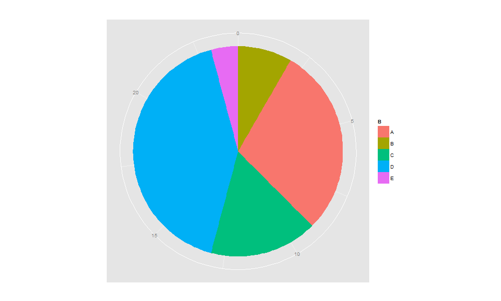
如何去掉图例的标题,并将图例放到上面:
library(ggplot2)
dt = data.frame(A = c(2, 7, 4, 10, 1), B = c('B','A','C','D','E'))
p = ggplot(dt, aes(x = "", y = A, fill = B)) +
  geom_bar(stat = "identity", width = 1) +
  coord_polar(theta = "y") +
  labs(x = "", y = "", title = "") +
  theme(axis.ticks = element_blank()) +
  theme(legend.title = element_blank(), legend.position = "top")   ## 将图例标题设为空,并把土方放在上方
p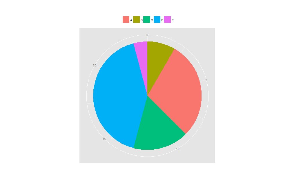
如何对图例的标签加上百分比:
library(ggplot2)
dt = data.frame(A = c(2, 7, 4, 10, 1), B = c('B','A','C','D','E'))

myLabel = as.vector(dt$B)   ## 转成向量,否则图例的标签可能与实际顺序不一致
myLabel = paste(myLabel, "(", round(dt$A / sum(dt$A) * 100, 2), "%)        ", sep = "")   ## 用 round() 对结果保留两位小数

p = ggplot(dt, aes(x = "", y = A, fill = B)) +
  geom_bar(stat = "identity", width = 1) +
  coord_polar(theta = "y") +
  labs(x = "", y = "", title = "") +
  theme(axis.ticks = element_blank()) +
  theme(legend.title = element_blank(), legend.position = "top") +
  scale_fill_discrete(breaks = dt$B, labels = myLabel)   ## 将原来的图例标签换成现在的myLabel
p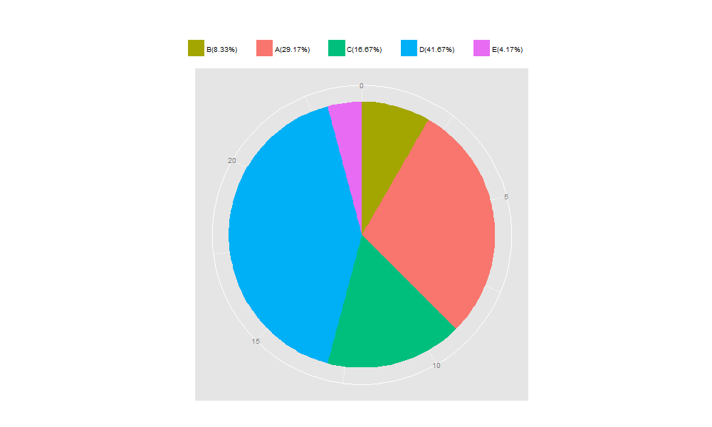
如何让饼图的小块按顺时针从大到小的顺序显示:
library(ggplot2)
dt = data.frame(A = c(2, 7, 4, 10, 1), B = c('B','A','C','D','E'))

dt = dt[order(dt$A, decreasing = TRUE),]   ## 用 order() 让数据框的数据按 A 列数据从大到小排序
myLabel = as.vector(dt$B)
myLabel = paste(myLabel, "(", round(dt$A / sum(dt$A) * 100, 2), "%)        ", sep = "")

p = ggplot(dt, aes(x = "", y = A, fill = B)) +
  geom_bar(stat = "identity", width = 1) +
  coord_polar(theta = "y") +
  labs(x = "", y = "", title = "") +
  theme(axis.ticks = element_blank()) +
  theme(legend.title = element_blank(), legend.position = "top") +
  scale_fill_discrete(breaks = dt$B, labels = myLabel)
p
如何去掉白色外框上的数字:
library(ggplot2)
dt = data.frame(A = c(2, 7, 4, 10, 1), B = c('B','A','C','D','E'))

dt = dt[order(dt$A, decreasing = TRUE),]   ## 用 order() 让数据框的数据按 A 列数据从大到小排序
myLabel = as.vector(dt$B)
myLabel = paste(myLabel, "(", round(dt$A / sum(dt$A) * 100, 2), "%)        ", sep = "")

p = ggplot(dt, aes(x = "", y = A, fill = B)) +
  geom_bar(stat = "identity", width = 1) +
  coord_polar(theta = "y") +
  labs(x = "", y = "", title = "") +
  theme(axis.ticks = element_blank()) +
  theme(legend.title = element_blank(), legend.position = "top") +
  scale_fill_discrete(breaks = dt$B, labels = myLabel) +
  theme(axis.text.x = element_blank())   ## 白色的外框即是原柱状图的X轴,把X轴的刻度文字去掉即可
p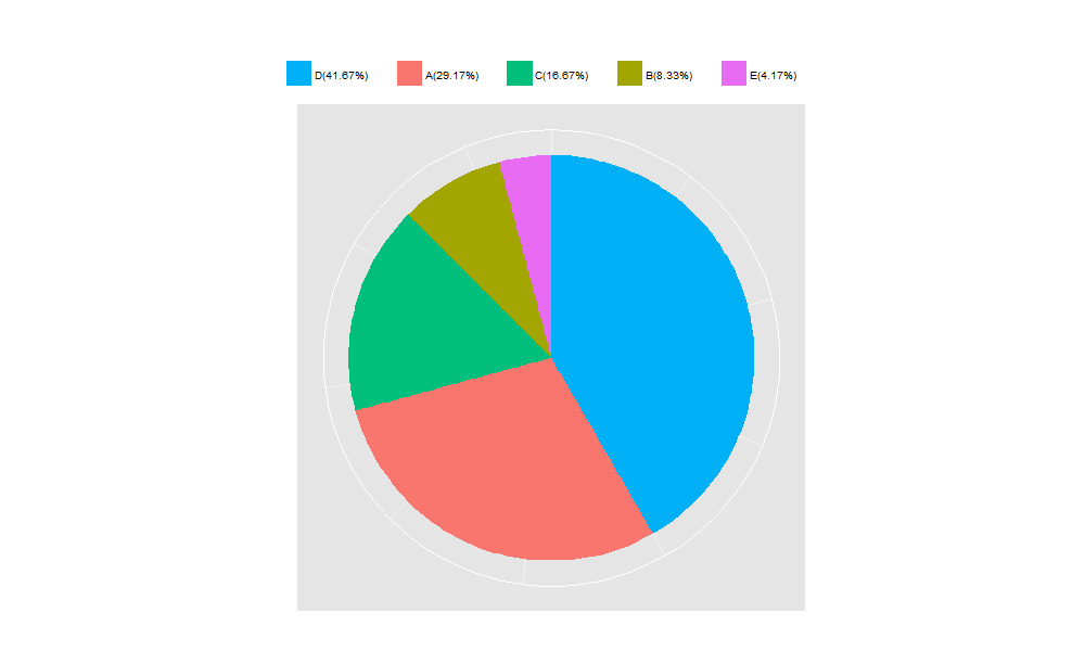
如何在图中加百分比:
library(ggplot2)
dt = data.frame(A = c(2, 7, 4, 10, 1), B = c('B','A','C','D','E'))

dt = dt[order(dt$A, decreasing = TRUE),]
myLabel = as.vector(dt$B)
myLabel = paste(myLabel, "(", round(dt$A / sum(dt$A) * 100, 2), "%)", sep = "")

p = ggplot(dt, aes(x = "", y = A, fill = B)) +
  geom_bar(stat = "identity", width = 1) +
  coord_polar(theta = "y") +
  labs(x = "", y = "", title = "") +
  theme(axis.ticks = element_blank()) +
  theme(legend.title = element_blank(), legend.position = "top") +
  scale_fill_discrete(breaks = dt$B, labels = myLabel) +
  theme(axis.text.x = element_blank()) +
  geom_text(aes(y = A/2 + c(0, cumsum(A)[-length(A)]), x = sum(A)/20, label = myLabel), size = 5)   ## 在图中加上百分比:x 调节标签到圆心的距离, y 调节标签的左右位置
p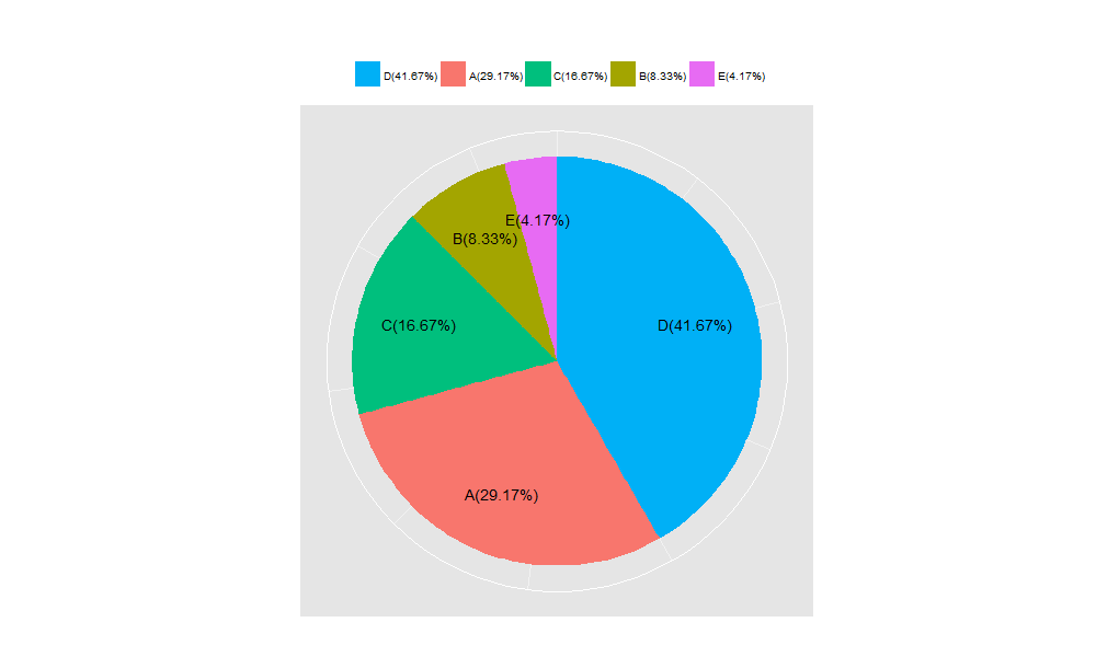
如何生成饼环:
library(ggplot2)
dt = data.frame(A = c(2, 7, 4, 10, 1), B = c('B','A','C','D','E'))

dt = dt[order(dt$A, decreasing = TRUE),]
myLabel = as.vector(dt$B)
myLabel = paste(myLabel, "(", round(dt$A / sum(dt$A) * 100, 2), "%)", sep = "")

p = ggplot(dt, aes(x = "", y = A, fill = B)) +
  geom_bar(stat = "identity", width = 0.2) +    ## 当width < 1 时饼图将变成饼环
  coord_polar(theta = "y") +
  theme_bw() +
  labs(x = "", y = "", title = "") +
  theme(axis.ticks = element_blank()) +
  theme(legend.position = "none") +
  theme(axis.text.x = element_blank()) +
  geom_text(aes(y = A/2 + c(0, cumsum(A)[-length(A)]), x = sum(A)/24.5, label = myLabel), size = 5)
p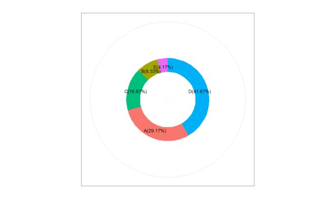
如何去掉饼环之外的框框和中间的坐标线:
library(ggplot2)
dt = data.frame(A = c(2, 7, 4, 10, 1), B = c('B','A','C','D','E'))

dt = dt[order(dt$A, decreasing = TRUE),]
myLabel = as.vector(dt$B)
myLabel = paste(myLabel, "(", round(dt$A / sum(dt$A) * 100, 2), "%)", sep = "")

p = ggplot(dt, aes(x = "", y = A, fill = B)) +
  geom_bar(stat = "identity", width = 0.2) +
  coord_polar(theta = "y") +
  theme_bw() +
  labs(x = "", y = "", title = "") +
  theme(axis.ticks = element_blank()) +
  theme(legend.position = "none") +
  theme(axis.text.x = element_blank()) +
  geom_text(aes(y = A/2 + c(0, cumsum(A)[-length(A)]), x = sum(A)/24.5, label = myLabel), size = 5) +
  theme(panel.grid=element_blank()) +    ## 去掉白色圆框和中间的坐标线
  theme(panel.border=element_blank())   ## 去掉最外层正方形的框框
p
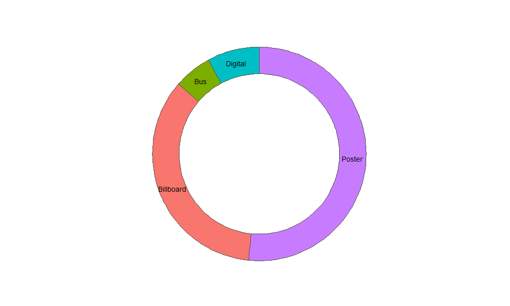
饼环的另外一种画法(geom_rect()):
library(ggplot2)

ad = data.frame(type = c("Poster", "Billboard", "Bus", "Digital"),n = c(529, 356, 59, 81))
ad$fraction = ad$n / sum(ad$n)
ad$ymax = cumsum(ad$fraction)
ad$ymin = c(0, head(ad$ymax, n = -1))

ggplot(data = ad, aes(fill = type, ymax = ymax, ymin = ymin, xmax = 4, xmin = 3)) +
  geom_rect(colour = "grey30", show_guide = FALSE) +
  coord_polar(theta = "y") +
  labs(x = "", y = "", title = "") +
  xlim(c(0, 4)) +
  theme_bw() +
  theme(panel.grid=element_blank()) + ## 去掉白色外框
  theme(axis.text=element_blank()) + ## 把图旁边的标签去掉
  theme(axis.ticks=element_blank()) + ## 去掉左上角的坐标刻度线
  theme(panel.border=element_blank()) + ## 去掉最外层的正方形边框
  geom_text(aes(x = 3.5, y = ((ymin+ymax)/2), label = type))