jquery 的表格操作
Table of content
- Introduction
- Background
- Using JQuery dataTables plugin
- Configure default UI features
- Configure sorting
- Search/filter configuration
- Handling DataTable events
- Integration with remote/server-side pages
- Ajax Data source
- Server-side processing
- Additional plugins
- Row grouping
- Drag and drop
- Editing table data
- Expandable rows
- Column filter
- Conclusion
Introduction
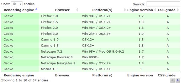
Let us assume that you have a plain HTML table in your web page - something like the one shown in the figure below:
This is a standard HTML table you are probably always using in your web applications no matter what server-side technology you are using. How much effort will you need to add some standard features to this table like ordering by columns, filtering by keyword, pagination, and changing the number of items that will be shown per page? The resulting table would look like this:
If you you are using the jQuery DataTables plug-in, the answer is one line. This line of code is shown below:
$("table#myTableId").dataTable();
If you take the ID of the table from the HTML source and call the dataTable() function, all the mentioned features will be automatically added and they will be fully functional.jQuery DataTables takes the plain HTML table and dynamically injects all elements you see in the figure above and attaches event handlers to them that manage all the interactions with the user.
jQuery DataTables is an excellent jQuery plug-in that enables you to quickly and easily enhance your tables. In this article, you will see an overview of the jQuery DataTables features.
Background
The goal of this article is to present how you can configure jQuery DataTables to add various features. As an example, I never use standard configuration - whenever I initialize a DataTable, I change the style to the jQuery UI standard style, and replace the default pagination that contains just the previous and next buttons with pagination that contains page numbers. This configuration is shown in the following code:
$("#myTable").dataTable({
             bJQueryUI: true,
             sPaginationType: "full_numbers"
});
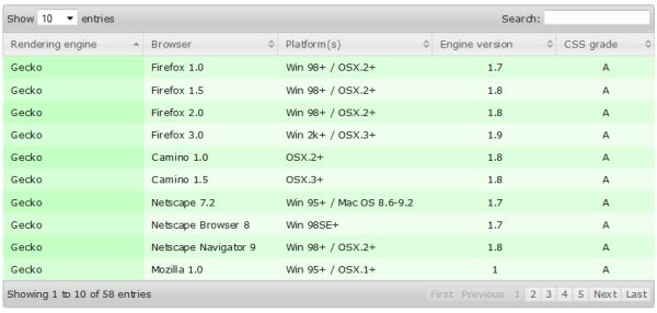
The result of the initialization call is shown in the following figure:
As you can see, with just two additional parameters, we get a lot of improvements. In the following sections, you will find some configuration options that might be useful to you.
Using the jQuery DataTables plug-in
In this section, we will see an overview of the DataTables configuration properties. For a detailed description, you can see the DataTables site, but this article can be used as a single point of reference. I will set links to the detailed documentation in some parts of the article so you can see more details if you want.
Configure the default UI features
The jQuery DataTables plug-in can be configured by passing the various options in the initialization call. In this section, we will see some of the configuration parameters.
Enable/Disable default features
The default functionalities can be easily disabled if some of them are not required. The following listing shows configuration that can be used in order to disable default features:
$('#example').dataTable( {
    "bPaginate": false,
    "bLengthChange": false,
    "bFilter": false,
    "bSort": false,
    "bInfo": false,
    "bAutoWidth": false,
    "asStripClasses": null //To remove "odd"/"event" zebra classes
} );
Configure default behavior
You can configure the default look of the enhanced table. There are a lot of options that can be passed to the DataTable's initialization function to configure the following properties:
- Changing the Show XXXX items per page drop-down - by default, in the drop-down list are placed 10, 25, 50, and 100 items. You can put any other value if you pass a
LengthMenuarray where you can set labels that will be shown in the menu and values that will be sent when an item is selected. - Define initial pagination settings - you can set in the DataTable's initialization call what will be the initial page that should be displayed using the
iDisplayStartparameter (default 0), and how much rows will be initially displayed per page using theiDisplayLengthparameter (default 10), - Configuring labels - you can change all labels that are used in the table by setting the
oLanguageparameter. You can either define separate labels or load them from the file defined in the sUrl parameter (useful for the internationalization option). As an example you can efine text that will be shown when there are no records in the table, using thesZeroRecordsparameter in theoLanguageproperty. Other labels that can be configured are shown in the example below. - State saving - state of the table (current page, filter condition) can be stored in the browser cookie so it can be restored when the user comes back to the page. You can also set the cookie duration in the
iCookieDurationparameter. - Scrolling - you can set the dimensions when horizontal and vertical scrollers should appear, in the
sScrollXandsScrollYparameters. Another interesting parameter isbScrollInfinite(default false) that disables pagination and loads the next page when the user scrolls down. - Customize filter text box - you can change the look of the filter text box if you set the
oSearchparameter. In the property of the object, you can set the text that will be initially placed in the filter text box and whether Regular Expression or smart filtering should be used.
$('#example').dataTable( {
        "aLengthMenu": [[10, 25, 50, -1], [10, 25, 50, "All"]],
        iDisplayLength: 25,
        iDisplayStart: 3,
        "oLanguage": {
            "sUrl": "media/language/de_DE.txt",
            "sZeroRecords": "There are no records that match your search criterion",
            "sLengthMenu": "Display _MENU_ records per page",
            "sInfo": "Displaying _START_ to _END_ of _TOTAL_ records",
            "sInfoEmpty": "Showing 0 to 0 of 0 records",
            "sInfoFiltered": "(filtered from _MAX_ total records)"
        },
        sPagination: "full_numbers",
        bStateSave: true,
        sScorollX: "300px",
        sScrollY: "200px"
        bScrollInfinite:true, //this property disables pagination
        oSearch: { "sSearch": "Type here...", "bRegex": false, "bSmart": false }
} );
Customize generated elements (DOM positioning)
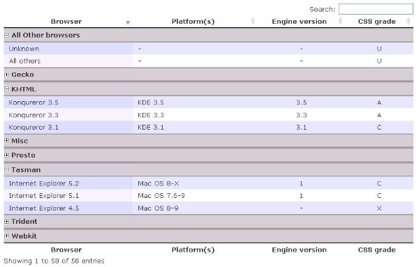
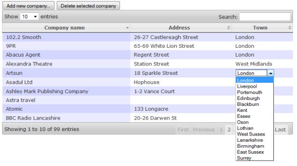
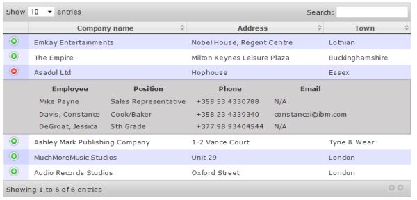
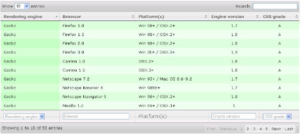
The DataTables plug-in automatically adds the length drop-down and a search text box above the table, and information and paging elements below the table. This is default DOM positioning. However, you can customize this DOM and even put some of your DOM elements in the table if you set the In this configuration, the information text "Showing X of XXX entries" will be rendered first and wrapped in the Once DataTables is initialized, you can use standard jQuery to modify these elements if needed. As an example, you can put a custom title in the table using the following script: In the initialization call, will be added an empty You can customize the sorting behavior of the plug-in. You can disable sorting using the An example is shown in the following listing: In this example, sorting is enabled, the rows will always be sorted by column 1 in asc order, and initially will be sorted by columns 2 ascending and 3 in descending order. In There are several parameters that can be used in order to customize search/filter functionality. An example is shown in the following listing: In this example, text in the search/filter text box is empty, Regular Efiltering is not used while smart filtering is used. In the column definitions is defined that a content of the column 0 will not be used for searching/filtering. The DataTables plug-in enables you to setup individual column filtering in the table. When individual column filtering is used, filters for each column are added in the header or footer of the table. You can find lots of examples on the DataTables site showing how filtering can be implemented; see multi-column filtering using text boxes or dropdown lists. However, the easiest way to implement individual column filtering is to use the DataTables Column filter add-on for DataTables. This add-on enables you to define custom filters via configuration parameters placed in the initialization call. An example of the DataTables Column filter usage is shown below: This plug-in enables you to filter by numbers, texts, date ranges, and numeric ranges. See the Column filter add-on for DataTables to find more details about the configuration. You might need to track some of the DataTables events (such as when table is redrawn) to perform some custom action. Example of attaching event handler that is called each time table is redrawn is shown in the following listing: In this example, each time table is refreshed function will show alert box(you will add some custom code instead). There are lot of event handlers that might be usefull for you - some of them are: Also you can bind your functions to various events such as filtering, changing page, or sorting as it is shown in the following example: In this example By default, DataTables uses the rows found in the Also, there are two other articles where I have explained how you can load table data in your ASP.NET MVC or J2EE web application (source code is included). In this section, we will see the two most commonly used modes: AJAX and server-side processing mode. The DataTables plugin can use a JSON object downloaded from the server side in order to populate a table. To initialize the DataTables plug-in in the AJAX source mode, you need to put the URL of the JSON file that will be used to populate the table data in the In the AJAX data source mode, you can leave The format of the data source on the server side can be ether two dimensional matrix (array of arrays) or array of objects. An example of a two dimensional matrix is shown below: A matrix in the The JSON object contains an array This configuration defines that the property engine should be placed in column 0, browser in column 1, etc. Note that if you use a two dimensional matrix (array of arrays) as a format, you do not need to define these binding rules. See a live example at the DataTables site. If you do not have a flat structure for the objects in the Sometimes you might want to set the ID and classes of the rows that will be bound to the DataTable, and you might want to get these information form the AJAX source. The fields Instead of loading all rows from a single URL, you can configure the plug-in to send requests to the server side and take only information that should be displayed according to the current state of the table. To configure the plug-in, you will need to set the Instead of loading all data at once, the plug-in will send information about the current page, the number of items that should be shown, filtering condition, column ordering, etc., and it will expect that the server side page will return the appropriate data in JSON format. In this mode, the plug-in only handles interaction with the user, and all processing is done on the server side. The following figure shows an example of AJAX calls that are sent by the plug-in to the server-side each time the table needs to be refreshed. Response that is returned by the server must contain information about the total number of records, the number of currently filtered records, and the cells that should be displayed. An example of the JSON response that should be provided to DataTables is: Values that the server returns to the DataTables plug-in are: See a live example on the DataTables site. I have shown you in the previous sections how you can use and configure the basic DataTables plugin. However, there are a lot of additional plug-ins and features that do not come as standard functionalities, but can be easily integrated into the basic plug-in. This section will explain some of them. The DataTables plug-in does not allow you to perform row grouping by default. However, you can find code in the DataTables site that enables groping. As an alternative, you can use the DataTables row grouping plug-in that can be configured to group table rows using the values in the columns. An example of the call is: This call will group table rows using the values in the first column and hide this column after grouping is done. Similar to DataTables, the row grouping plug-in can also be customized. The following example shows some settings of the row grouping plug-in: In this example, the row grouping plug-in will enable the user to expand/collapse groups; initially the groups "Other Browsers" and "Trident" will be expanded, grouping will be performed using column 2 instead of the default column 0, grouping will be done by letters instead of the full text in the cell, and the column that will be used in grouping will not be hidden. Also, row grouping plugin enables you to expand/collapse particular groups - example is shown in the following figure: See the row grouping add-on for DataTables to find more details about the configuration. The row/column reordering using drag'n'drop is not a standard feature in DataTables but it can be implemented. You can change the order of columns using the column reordering plug-in for DataTables. An example of the initialization code is: See a live example on the DataTables site for more details. There is no official plug-in that enables row reordering using the D'n'D, however you can find a few code examples proposed on the DataTable forums for D'n'D. You can find code on the DataTables site where you can see how to implement inline editing of cells in the table using the jEditable plug-in. As an alternative, you can use the DataTables CRUD plug-in that enables editing cells, deleting rows, and adding new records in the table. An example of a fully editable DataTable is shown in the following figure: An example of initialization of the editable plug-in is shown in the following listing: There are a lot of configuration properties that can be used in order to configure CRUD functionalities. An example is shown below: In this configuration are defined server-side URLs that will be called when the user actually edits, deletes, or adds a new record. Also, in each of the columns is defined a different editor. The first column is read only, the second one uses the default setting (inline text box), the third uses a text area instead of text box, while the other two columns use drop-down lists. The fourth column will load values for the items that will be displayed in the list from the server-side page defined in the The DataTables plug-in enables you to expand each row and show additional data in the "sub-row" that will be opened below the current row. An example is shown in the following figure: You can see examples on the DataTables site where it is shown how you can put additional data taken from the hidden columns in the current table, or in another CodeProject article where I have shown how you can take more details using AJAX calls (ASP.NET MVC implementation). The DataTables plug-in enables you to combine two or more fields in the data source or to format values in the data source before they are shown in the cell. In the In this example, each cell in column 0 will be displayed as a combination of the data cells 0 and 3, and cells in column 1 are wrapped into a The column filter plug-in is an additional plug-in that simplifies configuration of the individual column filters that are applied on table columns. This plug-in will add elements that can be used for filtering individual columns (instead of the global search box). Example of the individual column filtering is shown on the following figure: In the following listing is shown a sample of the column filter plug-in configuration: In the configuration shown in the example, it is defined that individual column filter elements should be placed before the heading row that contains the names of the columns. Also, for each column is defined what kind of filtering will be used. The DataTables plug-in comes with a number of additional plug-ins that adds more functionalities to the basic DataTables plug-in. Some of the interesting plug-ins are: You can find other plug-ins on the DataTables plug-ins page. In this article is shown an overview of the features of the DataTables plug-in. You can find more information and details about the configuration on the jQuery DataTables site. There are much more features that can be configured using this plug-in; however, one article is not enough to describe all the possibilities of the plug-in. If you have any questions, please use the DataTables forum because there you will find a large community with probably all the answers to your questions. I have not included code examples here because you can find all the necessary live examples on the jQuery DataTables site. There are other articles that might be useful if you are integrating the DataTables plug-in in your ASP.NET or Java applications. Here are a few: sDom parameter in the initialization call. In the sDom parameter, you can place the letters i, l, t, p, f that will be interpreted as Information text (i), Length change drop-down (l), Table containing data (t), Pagination links (p), and Filtering input text box. The DataTables plug-in will generate these elements in the order in the sDom parameter. Also, you can wrap these elements in the additional DIVs with classes if you wrap them in the sDom parameter using the <"class-name" ..... > syntax. The DataTables plug-in will generate a starting tag when it finds the ">" symbol. An example of a changed DOM is shown below:
![]() Collapse
| Copy Code
Collapse
| Copy Code
$('#example').dataTable( {
"sDom": '<"top"i><"title">lt<"bottom"pf>'
} );
DIV tag with class "top" (this is the <"top"i> part of the sDom settings). After the information text will be rendered an empty DIV tag with class "title" (this is <"title"> part of the sDom settings). After this DIV will be rendered the length change drop-down (l), then the table with data (t). After the table will be rendered a DIV with class "bottom" where will be placed pagination links (p), and filtering text box (f) (this is the <"bottom"pf> part of the sDom settings). You can find a live example of DOM positioning on the DataTables site with more options and detailed explanations.![]() Collapse
| Copy Code
Collapse
| Copy Code
$('#example div.title').text("This is a table title");
tag as it is defined in the configuration; hence, you can use this jQuery code to put the text in this DIV and style it to look like a title.Configure sorting
bSort parameter, and define the sort order of the columns using the aaSorting (example is on the DataTables site) and aaSortingFixed parameters. Additionally for each column you can set the following properties:
bSortable - defines whether sorting will be enabled on the columnasSorting - defines what sorting orders will be applied when user clicks on the heading - see live example on the DataTables sitesSortingDataType - defines the type of column that will be used for sorting (e.g., "dom-text", "dom-select", or "dom-checkbox")sType - type of the column, e.g., 'string', 'numeric', 'date', or 'html' (by default)iDataSort - defines what column will be actually used for sorting instead of the one that is selected; useful if you want to sort by a hidden column![]() Collapse
| Copy Code
Collapse
| Copy Code
$('#example').dataTable( {
"bSort": true,
"aaSorting": [[2,'asc'], [3,'desc']], //[] will not perform initial sorting
"aaSortingFixed": [[1,'asc']],
"aoColumns": [
{ "bSortable": false },//Disable sorting on this column
null,
{ "asSorting": [ "asc" ] },//Allow only "asc" sorting in the column 2
null,
{ "sSortDataType": "dom-text", "sType": "numeric" },
{ "iDataSort": 6 }//Use column 6 to perform sorting
null
]
} );
aoColumns is defined that column 0 cannot be sorted, column 2 allows only ascending sort order, column 4 contains numeric data, and when the user clicks on column 5, rows will be sorted by column 6 instead.Search/Filter configuration
![]() Collapse
| Copy Code
Collapse
| Copy Code
$('#example').dataTable({
"bFilter": true,
"oSearch":{
"sSearch":"",
"bRegex": false,
"bSmart": true },
"aoColumns":[
{"bSearchable": false },//Disable search on this column
null,
null,
null
]}
);
Individual column filtering
![]() Collapse
| Copy Code
Collapse
| Copy Code
$("#example").dataTable().columnFilter();
Handling DataTable events
![]() Collapse
| Copy Code
Collapse
| Copy Code
$('#example').dataTable( {
"fnDrawCallback": function() {
alert( 'DataTables has redrawn the table' );
}
} );
![]() Collapse
| Copy Code
Collapse
| Copy Code
$('#example')
.bind('sort', function () { eventFired( 'Sort' ); })
.bind('filter', function () { eventFired( 'Filter' ); })
.bind('page', function () { eventFired( 'Page' ); })
.dataTable();
eventFired function can show alert, put message in the log, or perform some custom action. You can see a live example on the DataTables site. Integration with remote/server-side pages
of the table. However, it can be configured to use other data sources. As an example, TBODY can be left empty and the DataTables plug-in can be configured to load rows via an AJAX call. On the DataTables site, you can see live examples showing how you can load a table using an AJAX source, full server-side processing, and cross domain JSONP call (these are PHP examples).
AJAX data source
sAjaxSource parameter:![]() Collapse
| Copy Code
Collapse
| Copy Code
$('#example').dataTable( {
"sAjaxSource": '/ajax/sources/arrays.txt'
} );
as blank and the plug-in will load rows from the URL placed in the sAjaxSource parameter.
![]() Collapse
| Copy Code
Collapse
| Copy Code
{ "aaData":[ ["1","a1","a2","a3"],
["2","b1","b2","b3"],
["3","c1","c2","c3"]
] }
aaData property will be directly mapped to the table columns. If you use an array of objects, the file on the server side should be a JSON file in the following format:![]() Collapse
| Copy Code
Collapse
| Copy Code
{
"aaData": [
{
"engine": "Trident",
"browser": "Internet Explorer 4.0",
"platform": "Win 95+",
"version": "4",
"grade": "X"
},
{
"engine": "Trident",
"browser": "Internet Explorer 5.0",
"platform": "Win 95+",
"version": "5",
"grade": "C"
}
}
aaData with objects that will be displayed in the table. In order to define how the properties in the array should be mapped to the columns of the table, you need to define a mapping in the aoColumns parameter:![]() Collapse
| Copy Code
Collapse
| Copy Code
$('#example').dataTable( {
"sAjaxSource": "sources/objects.txt",
"aoColumns": [
{ "mDataProp": "engine" },
{ "mDataProp": "browser" },
{ "mDataProp": "platform" },
{ "mDataProp": "version" },
{ "mDataProp": "grade" }
]
} );
aaData array, you can map these hierarchical structures to a flat row structure - see live examples on the DataTables site with mapping to nested sub-objects and sub-arrays.![]() Collapse
| Copy Code
Collapse
| Copy Code
"aaData": [
{
"DT_RowId": "row_7",
"DT_RowClass": "gradeA",
"0": "Gecko",
"1": "Firefox 1.0",
"2": "Win 98+ / OSX.2+",
"3": "1.7",
"4": "A"
}]
DT_RowId and DT_RowClass do not need to be mapped - the plug-in will automatically use them as ID and class attributes of the TR row (see live example).Server-side processing mode
bServerSide parameter to true.![]() Collapse
| Copy Code
Collapse
| Copy Code
$('#example').dataTable( {
"bServerSide": true,
"sAjaxSource": "../server_side/scripts/server_processing.php"
} );
![]() Collapse
| Copy Code
Collapse
| Copy Code
{ "sEcho":"1",
"iTotalRecords":97,
"iTotalDisplayRecords":3,
"aaData":[ ["1","a1","a2","a3"],
["2","b1","b2","b3"],
["3","c1","c2","c3"]
]
}
sEcho - An integer value that is used by DataTables for synchronization purposes. On each call sent to the server-side page, the DataTables plug-in sends the sequence number in the sEcho parameter. The same value has to be returned in the response because DataTables uses this for synchronization and matching requests and responses.iTotalRecords - The integer value that represents the total unfiltered number of records that exist on the server-side and that might be displayed if no filter is applied. This value is used only for display purposes; when the user types in a keyword in the search text box, DataTables shows a "Showing 1 to 10 of 23 entries (filtered from 51 total entries)" message. In this case, the iTotalRecords value returned in the response equals 51.iTotalDisplayedRecords - The integer value that represents the number of records that match the current filter. If the user does not enter any value in the search text box, this value should be the same as the iTotalRecords value. The DataTables plug-in uses this value to determine how many pages will be required to generate pagination - if this value is less or equal than the current page size, the pagination buttons will be disabled. When the user types in a keyword in the search text box, DataTables shows a "Showing 1 to 10 of 23 entries (filtered from 51 total entries)" message. In this case, the iTotalDisplayedRecords value returned in the response equals 23.aaData - A two-dimensional array that represents the cell values that will be shown in the table. When DataTables receives data, it will populate the table cells with values from the aaData array. The number of columns in the two dimensional array must match the number of columns in the HTML table (even the hidden ones), and the number of rows should be equal to the number of items that can be shown on the current page (e.g., 10, 25, 50, or 100 - this value is selected in the "Show XXX entries" drop-down).Additional features/plug-ins
Row grouping
![]() Collapse
| Copy Code
Collapse
| Copy Code
$("#example").dataTable().rowGrouping();
![]() Collapse
| Copy Code
Collapse
| Copy Code
$('#example').dataTable()
.rowGrouping({ bExpandableGrouping: true,
asExpandedGroups: ["Other Browsers", "Trident"],
iGroupingColumnIndex: 2,
sGroupBy: "letter",
bHideGroupingColumn: false
});
Drag'n'Drop reordering
![]() Collapse
| Copy Code
Collapse
| Copy Code
$('#example').dataTable( {
"sDom": 'Rlfrtip'
} );
Editing table data
![]() Collapse
| Copy Code
Collapse
| Copy Code
$('#example').dataTable().makeEditable();
![]() Collapse
| Copy Code
Collapse
| Copy Code
$('#example').dataTable()
.makeEditable({
sUpdateURL: "UpdateData.php",
sAddURL: "AddData.php",
sDeleteURL: "DeleteData.php",
aoColumns: [
null,
{
},
{
type: 'textarea'
},
{
type: 'select',
onblur: 'cancel',
submit: 'Ok',
loadurl: 'EngineVersionList.php',
sUpdateURL: "CustomUpdateEngineVersion.php"
},
{
type: 'select',
onblur: 'submit',
data: "{'':'Please select...', 'A':'A','B':'B','C':'C'}"
}
]
});
loadurl parameter, and it will post the edited values to the column specific sUpdateURL parameter instead of the global editing URL defined in sUpdateURL. The select lists that are used for editing of the cells in the fifth column have list items that are defined locally in the data parameter. There are a lot of additional settings you can find on the DataTables CRUD site.Expandable rows
Custom cell format
aoColumns settings, you can define a custom fnRender function that takes an oObj parameter (containing all the data fields in the current row), and return a string that will be placed in the cell. A code example is shown in the following listing:![]() Collapse
| Copy Code
Collapse
| Copy Code
$('#example').dataTable( {
"aoColumns": [
{ "fnRender": function ( oObj ) {
return oObj.aData[0] +'-'+ oObj.aData[3];
} },
{ "fnRender": function ( oObj ) {
return '' + oObj.aData[1] +'';
} },
null,
null,
null,
null
]
} );
SPAN tag with class "my-cell". This setting is useful if you need to generate a link in the table and you have URL, text, and title tags in separate fields in the data source. Column filter
![]() Collapse
| Copy Code
Collapse
| Copy Code
$('#example').dataTable()
.columnFilter({
sPlaceHolder: "head:before",
aoColumns: [ {
type: "select",
values: [ 'Gecko', 'Trident', 'KHTML',
'Misc', 'Presto', 'Webkit', 'Tasman']
},
{ type: "text" },
{ type: "number" },
{ type: "date-range" },
{ type: "number-range" }
]
});
Additional plug-ins
Conclusion
License
你可能感兴趣的:(jquery,datatables,sorting,table,initialization,filter,other)

