版本记录
| 版本号 | 时间 |
|---|---|
| V1.0 | 2018.08.24 |
前言
如果你细看了我前面写的有关动画的部分,就知道前面介绍了
CoreAnimation、序列帧以及LOTAnimation等很多动画方式,接下来几篇我们就以动画示例为线索,进行动画的讲解。相关代码已经上传至GitHub - 刀客传奇。感兴趣的可以看我写的前面几篇。
1. 动画示例(一) —— 一种外扩的简单动画
2. 动画示例(二) —— 一种抖动的简单动画
3. 动画示例(三) —— 仿头条一种LOTAnimation动画
4. 动画示例(四) —— QuartzCore之CAEmitterLayer下雪❄️动画
5. 动画示例(五) —— QuartzCore之CAEmitterLayer烟花动画
6. 动画示例(六) —— QuartzCore之CAEmitterLayer、CAReplicatorLayer和CAGradientLayer简单动画
开始
写作环境:Swift 4, iOS 11, Xcode 9。
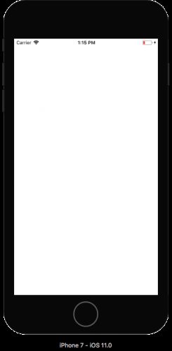
首先新建立一个工程,花一点时间浏览项目。 有一个ViewController有一个名为CustomImageView的UIImageView子类,还有一个SDWebImage方法调用来加载图像。 初始项目已经具有视图和图像加载逻辑。
Build并运行。 片刻之后,您应该看到一个简单的图像显示如下:

本文的目的就是将根据该图像的下载过程给出动态加载的一个圆圈的动画。
您可能会注意到,当您第一次运行应用程序时,应用程序似乎暂停几秒钟因为图像正在下载,然后图像会显示在屏幕上。 当然,目前还没有环形进度指示器 - 这就是你在这个CAShapeLayer教程中需要创建的内容!
您将在两个不同的阶段创建此动画:
- 1)Circular progress - 环形进度。 首先,您将绘制环形进度指示器并根据下载进度进行更新。
- 2)Expanding circular image - 扩展圆形图像。 其次,您将通过展开的圆形窗口显示下载的图像。
Creating the Circular Indicator - 创建环形指示器
想一想进度指示器的基本设计。 该指示器最初为空以显示0%的进度,然后在下载图像时逐渐填充。 使用CAShapeLayer实现这一点非常简单,其路径path为圆形。
您可以使用CAShapeLayer属性strokeStart和strokeEnd控制形状轮廓或stroke的开始和结束位置。 通过改变strokeEnd在0和1之间,您可以适当填写stroke以显示下载进度。
我们来试试吧。 使用iOS \ Source \ Cocoa Touch Class template创建一个新文件。 将其命名为CircularLoaderView并将其设置为UIView的子类,如下所示:

单击Next,然后单击Create。 UIView的这个新子类将包含所有新的动画代码。
打开CircularLoaderView.swift并将以下属性添加到类的顶部:
let circlePathLayer = CAShapeLayer()
let circleRadius: CGFloat = 20.0
circlePathLayer表示圆形路径,而circleRadius表示圆形路径的半径。
接下来,在circleRadius下面添加以下初始化代码以配置形状图层:
override init(frame: CGRect) {
  super.init(frame: frame)
  configure()
}

required init?(coder aDecoder: NSCoder) {
  super.init(coder: aDecoder)
  configure()
}

func configure() {
  circlePathLayer.frame = bounds
  circlePathLayer.lineWidth = 2
  circlePathLayer.fillColor = UIColor.clear.cgColor
  circlePathLayer.strokeColor = UIColor.red.cgColor
  layer.addSublayer(circlePathLayer)
  backgroundColor = .white
}
两个初始化程序都调用configure()。 configure()将circlePathLayer设置为具有与视图bounds匹配的frame,2个点宽度的线,清晰填充颜色和红色stroke颜色。 接下来,它将形状图层添加为视图自身图层的子图层,并将视图的backgroundColor设置为白色,以便在图像加载时屏幕的其余部分被消隐。
1. Adding the Path - 添加路径
现在您已经配置了layer,是时候设置它的路径了。 首先在configure()下面添加以下helper方法:
func circleFrame() -> CGRect {
  var circleFrame = CGRect(x: 0, y: 0, width: 2 * circleRadius, height: 2 * circleRadius)
  let circlePathBounds = circlePathLayer.bounds
  circleFrame.origin.x = circlePathBounds.midX - circleFrame.midX
  circleFrame.origin.y = circlePathBounds.midY - circleFrame.midY
  return circleFrame
}
在这个简单的方法中,您可以计算CGRect以包含指示器的路径。 将边界矩形设置为宽度,高度等于2 * circleRadius,并将其放置在视图的中心。 之所以编写一个单独的方法来处理这个简单的操作,是因为你需要在每次视图大小更改时重新计算circleFrame。
接下来,在circleFrame()下面添加以下方法来创建路径:
func circlePath() -> UIBezierPath {
  return UIBezierPath(ovalIn: circleFrame())
}
这简单地返回由circleFrame()限定的圆形UIBezierPath。 由于circleFrame()返回一个正方形,因此在这种情况下,“椭圆形”将以圆形展现。
由于图层没有autoresizingMask属性,因此您将覆盖layoutSubviews以适当地响应视图大小的更改。
通过添加以下代码覆盖layoutSubviews():
override func layoutSubviews() {
  super.layoutSubviews()
  circlePathLayer.frame = bounds
  circlePathLayer.path = circlePath().cgPath
}
你在这里调用circlePath(),因为frame的更改也应该触发重新计算路径。
打开CustomImageView.swift。 将以下属性添加到类的顶部:
let progressIndicatorView = CircularLoaderView(frame: .zero)
此属性是您刚刚创建的CircularLoaderView类的实例。
接下来,将以下内容添加到init(coder:),就在let url...之前:
addSubview(progressIndicatorView)

addConstraints(NSLayoutConstraint.constraints(
  withVisualFormat: "V:|[v]|", options: .init(rawValue: 0),
  metrics: nil, views: ["v": progressIndicatorView]))
addConstraints(NSLayoutConstraint.constraints(
  withVisualFormat: "H:|[v]|", options: .init(rawValue: 0),
  metrics: nil, views:  ["v": progressIndicatorView]))
progressIndicatorView.translatesAutoresizingMaskIntoConstraints = false
在此处,您可以将进度指示器视图添加为自定义图像视图的子视图。 然后添加两个布局约束以确保进度指示器视图保持与图像视图相同的大小。 最后,将translatesAutoresizingMaskIntoConstraints设置为false,以便自动调整遮罩不会干扰Auto Layout引擎。
Build并运行您的项目,你会看到一个红色的空心圆圈如下所示:
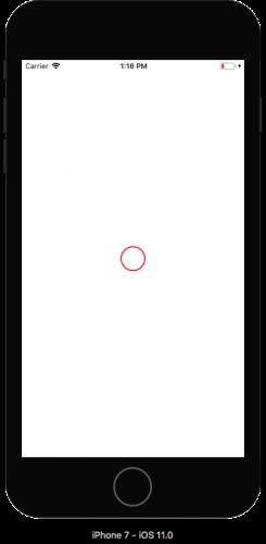
真棒! 您的进度指示器将显示在屏幕上。
2. Modifying the Stroke Length - 修改Stroke长度
打开CircularLoaderView.swift并在文件中的其他属性的正下方添加以下行:
var progress: CGFloat {
  get {
    return circlePathLayer.strokeEnd
  }
  set {
    if newValue > 1 {
      circlePathLayer.strokeEnd = 1
    } else if newValue < 0 {
      circlePathLayer.strokeEnd = 0
    } else {
      circlePathLayer.strokeEnd = newValue
    }
  }
}
在这里,您创建一个computed property - 即没有任何支持变量的属性 - 具有自定义setter和getter。 getter只返回circlePathLayer.strokeEnd,setter验证输入介于0和1之间,并相应地设置图层的strokeEnd属性。
在configure()的顶部添加以下行以初始化首次运行的progress:
progress = 0
构建并运行您的项目,你应该只看到一个空白的白色屏幕。 相信我! 这是个好消息!将progress设置为0依次将strokeEnd设置为0,这意味着不绘制形状图层的任何部分。
与指示器有关的唯一事情是更新图像下载回调的进度。
打开CustomImageView.swift并使用以下内容替换注释Update progress here:
self?.progressIndicatorView.progress = CGFloat(receivedSize) / CGFloat(expectedSize)
在这里,您可以通过将receivedSize除以expectedSize来计算进度。
注意:您会注意到该块使用弱引用self - 这是为了避免引用循环。
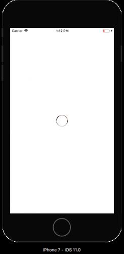
构建并运行您的项目。 你会看到进度指示器开始像这样移动:

即使您没有自己添加任何动画代码,CALayer也会轻松检测到图层上的任何可动画属性,并在其更改时平滑地动画。
Creating the Reveal Animation - 创建显示动画
显示阶段逐渐在窗口中以扩展的圆环形状显示图像。
打开CircularLoaderView.swift并添加如下方法:
func reveal() {
  // 1
  backgroundColor = .clear
  progress = 1
  // 2
  circlePathLayer.removeAnimation(forKey: "strokeEnd")
  // 3
  circlePathLayer.removeFromSuperlayer()
  superview?.layer.mask = circlePathLayer
}
这是一个重要的方法,所以让我们逐步讨论:
- 1)清除视图的背景颜色,以便不再隐藏视图后面的图像,并将
progress设置为1。 - 2)您删除了·strokeEnd·属性的任何挂起的隐式动画,否则可能会干扰显示动画。
- 3)您从其
superLayer中删除circlePathLayer并将其分配给superView的图层蒙版,以便通过圆形蒙版“孔”可以看到图像。 这使您可以重用现有图层并避免重复代码。
现在你需要从某个地方调用reveal()。 使用以下内容将CustomImageView.swift中的Reveal image here注释替换成如下:
if let error = error {
  print(error)
}
self?.progressIndicatorView.reveal()
build并运行。 图像下载后,您会看到它通过一个小环部分显示:
您可以在背景看到您的图像了。
Expanding Rings - 扩展圆环
您的下一步是向内和向外扩展此环。 您可以使用两个独立的同心UIBezierPath执行此操作,但只需一条Bezier路径即可以更高效的方式执行此操作。
怎么样? 您只需通过更改path属性来增加圆的半径以向外扩展,同时通过更改lineWidth属性来增加线的宽度以使环更粗并向内扩展。 最终,两个值都增长到足以显示下面的整个图像。
打开CircularLoaderView.swift并将以下代码添加到reveal()的末尾:
// 1
let center = CGPoint(x: bounds.midX, y: bounds.midY)
let finalRadius = sqrt((center.x*center.x) + (center.y*center.y))
let radiusInset = finalRadius - circleRadius
let outerRect = circleFrame().insetBy(dx: -radiusInset, dy: -radiusInset)
let toPath = UIBezierPath(ovalIn: outerRect).cgPath

// 2
let fromPath = circlePathLayer.path
let fromLineWidth = circlePathLayer.lineWidth

// 3
CATransaction.begin()
CATransaction.setValue(kCFBooleanTrue, forKey: kCATransactionDisableActions)
circlePathLayer.lineWidth = 2*finalRadius
circlePathLayer.path = toPath
CATransaction.commit()

// 4
let lineWidthAnimation = CABasicAnimation(keyPath: "lineWidth")
lineWidthAnimation.fromValue = fromLineWidth
lineWidthAnimation.toValue = 2*finalRadius
let pathAnimation = CABasicAnimation(keyPath: "path")
pathAnimation.fromValue = fromPath
pathAnimation.toValue = toPath

// 5
let groupAnimation = CAAnimationGroup()
groupAnimation.duration = 1
groupAnimation.timingFunction = CAMediaTimingFunction(name: kCAMediaTimingFunctionEaseInEaseOut)
groupAnimation.animations = [pathAnimation, lineWidthAnimation]
circlePathLayer.add(groupAnimation, forKey: "strokeWidth")
这可能看起来像很多代码,但你在这里做的很简单:
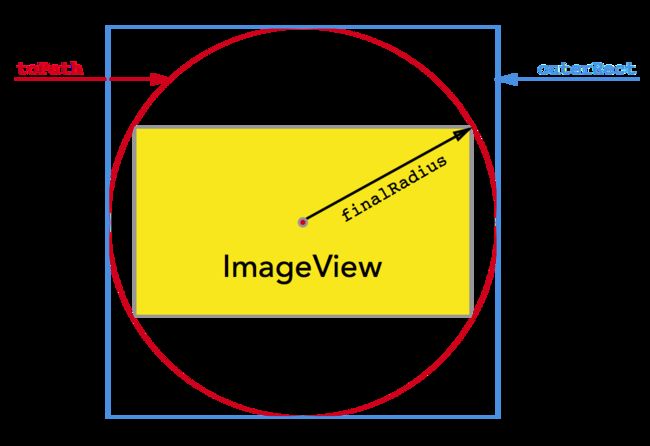
- 1)您可以确定可以完全包围图像视图的圆的半径,并使用它来计算完全bound此圆的
CGRect。toPath表示CAShapeLayer掩码的最终形状,如下所示:
2)您可以设置
lineWidth和path的初始值以匹配图层的当前值。3)您将
lineWidth和path设置为其最终值。 这可以防止它们在动画完成时跳回其原始值。 通过将kCATransactionDisableActions设置为true的CATransaction中的此更改进行封装,可以禁用图层的隐式动画。4)您创建两个
CABasicAnimation实例:一个用于path,另一个用于lineWidth。lineWidth必须增加两倍于半径增加的速度,以使圆圈向内和向外扩展。5)您将两个动画添加到
CAAnimationGroup,并将动画组添加到图层。
构建并运行您的项目。 一旦图像完成下载,您将看到揭示动画启动:
请注意,一旦完成了显示动画,圆圈的一部分就会保留在屏幕上。 要解决此问题,请将以下扩展添加到实现animationDidStop(_:finished :)的CircularLoaderView.swift的末尾:
extension CircularLoaderView: CAAnimationDelegate {
  func animationDidStop(_ anim: CAAnimation, finished flag: Bool) {
    superview?.layer.mask = nil
  }
}
此代码删除父图层上的蒙版,完全删除圆圈。
最后,在reveal()的底部,在circlePathLayer.add(groupAnimation,forKey:“strokeWidth”)行的正上方添加以下行:
groupAnimation.delegate = self
这将分配代理,以便调用animationDidStop(_:finished :)。
构建并运行您的项目。 现在,您将看到动画的完整效果:

恭喜,您已经完成了圆形图像加载动画的制作!
从这里,您可以进一步调整动画的时间,曲线和颜色,以满足您的需求和个人设计美学。 一种可能的改进是使用kCALineCapRound作为shape layer的lineCap属性来舍入循环进度指示器的末端。
源码
1. CustomImageView
import UIKit

class CustomImageView: UIImageView {

  let progressIndicatorView = CircularLoaderView(frame: .zero)

  required init?(coder aDecoder: NSCoder) {
    super.init(coder: aDecoder)

    addSubview(progressIndicatorView)

    addConstraints(NSLayoutConstraint.constraints(
      withVisualFormat: "V:|[v]|", options: .init(rawValue: 0),
      metrics: nil, views: ["v": progressIndicatorView]))
    addConstraints(NSLayoutConstraint.constraints(
      withVisualFormat: "H:|[v]|", options: .init(rawValue: 0),
      metrics: nil, views:  ["v": progressIndicatorView]))
    progressIndicatorView.translatesAutoresizingMaskIntoConstraints = false

    let url = URL(string: "https://koenig-media.raywenderlich.com/uploads/2015/02/mac-glasses.jpeg")
    sd_setImage(with: url, placeholderImage: nil, options: .cacheMemoryOnly, progress:
      { [weak self] receivedSize, expectedSize, _ in
        self?.progressIndicatorView.progress = CGFloat(receivedSize) / CGFloat(expectedSize)
      }) { [weak self] _, error, _, _ in
        if let error = error {
          print(error)
        }
        self?.progressIndicatorView.reveal()
    }
  }

}
2. CircularLoaderView
import UIKit

class CircularLoaderView: UIView {
  let circlePathLayer = CAShapeLayer()
  let circleRadius: CGFloat = 20.0

  var progress: CGFloat {
    get {
      return circlePathLayer.strokeEnd
    }
    set {
      if newValue > 1 {
        circlePathLayer.strokeEnd = 1
      } else if newValue < 0 {
        circlePathLayer.strokeEnd = 0
      } else {
        circlePathLayer.strokeEnd = newValue
      }
    }
  }

  override init(frame: CGRect) {
    super.init(frame: frame)
    configure()
  }

  required init?(coder aDecoder: NSCoder) {
    super.init(coder: aDecoder)
    configure()
  }

  func configure() {
    circlePathLayer.frame = bounds
    circlePathLayer.lineWidth = 2
    circlePathLayer.fillColor = UIColor.clear.cgColor
    circlePathLayer.strokeColor = UIColor.red.cgColor
    layer.addSublayer(circlePathLayer)
    backgroundColor = .white

    progress = 0
  }

  func circleFrame() -> CGRect {
    var circleFrame = CGRect(x: 0, y: 0, width: 2 * circleRadius, height: 2 * circleRadius)
    let circlePathBounds = circlePathLayer.bounds
    circleFrame.origin.x = circlePathBounds.midX - circleFrame.midX
    circleFrame.origin.y = circlePathBounds.midY - circleFrame.midY
    return circleFrame
  }

  func circlePath() -> UIBezierPath {
    return UIBezierPath(ovalIn: circleFrame())
  }

  override func layoutSubviews() {
    super.layoutSubviews()
    circlePathLayer.frame = bounds
    circlePathLayer.path = circlePath().cgPath
  }

  func reveal() {
    // 1
    backgroundColor = .clear
    progress = 1
    // 2
    circlePathLayer.removeAnimation(forKey: "strokeEnd")
    // 3
    circlePathLayer.removeFromSuperlayer()
    superview?.layer.mask = circlePathLayer

    // 1
    let center = CGPoint(x: bounds.midX, y: bounds.midY)
    let finalRadius = sqrt((center.x*center.x) + (center.y*center.y))
    let radiusInset = finalRadius - circleRadius
    let outerRect = circleFrame().insetBy(dx: -radiusInset, dy: -radiusInset)
    let toPath = UIBezierPath(ovalIn: outerRect).cgPath

    // 2
    let fromPath = circlePathLayer.path
    let fromLineWidth = circlePathLayer.lineWidth

    // 3
    CATransaction.begin()
    CATransaction.setValue(kCFBooleanTrue, forKey: kCATransactionDisableActions)
    circlePathLayer.lineWidth = 2*finalRadius
    circlePathLayer.path = toPath
    CATransaction.commit()

    // 4
    let lineWidthAnimation = CABasicAnimation(keyPath: "lineWidth")
    lineWidthAnimation.fromValue = fromLineWidth
    lineWidthAnimation.toValue = 2*finalRadius
    let pathAnimation = CABasicAnimation(keyPath: "path")
    pathAnimation.fromValue = fromPath
    pathAnimation.toValue = toPath

    // 5
    let groupAnimation = CAAnimationGroup()
    groupAnimation.duration = 1
    groupAnimation.timingFunction = CAMediaTimingFunction(name: kCAMediaTimingFunctionEaseInEaseOut)
    groupAnimation.animations = [pathAnimation, lineWidthAnimation]

    groupAnimation.delegate = self

    circlePathLayer.add(groupAnimation, forKey: "strokeWidth")
  }
}

extension CircularLoaderView: CAAnimationDelegate {
  func animationDidStop(_ anim: CAAnimation, finished flag: Bool) {
    superview?.layer.mask = nil
  }
}
后记
本篇主要讲述了基于CAShapeLayer图像加载过程的简单动画,感兴趣的给个赞或者关注~~~
