设置自定义的中文字体
#用下载好的字体文件设置字体,从而正确在中显示中文
myfont = matplotlib.font_manager.FontProperties(fname="Droid Sans Fallback.ttf")#同一目录下,不同目录改用绝对路径
mpl.rcParams['axes.unicode_minus'] = False
导入csv文件
#-*-coding:utf-8-*-
import numpy as np
import pandas as pd
from pandas import Series,DataFrame
data_train = pd.read_csv("/home/gg5d/下载/train.csv")
matplotlib()作图,注意title()、xlabel()、ylabel()中设置字体的参数为fontproperties,legend()设置字体参数为prop
import matplotlib.pyplot as plt
fig = plt.figure()
fig.set(alpha=0.2)
fig.set_size_inches(18,10)
plt.subplot2grid((2,3),(0,0))             # 在一张大图里分列几个小图
data_train.Survived.value_counts().plot(kind='bar')# 柱状图
plt.title(u"获救情况 (1为获救)",fontproperties=myfont) # 标题
plt.ylabel(u"人数",fontproperties=myfont)

plt.subplot2grid((2,3),(0,1))
data_train.Pclass.value_counts().plot(kind="bar")
plt.ylabel(u"人数",fontproperties=myfont)
plt.title(u"乘客等级分布",fontproperties=myfont)

plt.subplot2grid((2,3),(0,2))
plt.scatter(data_train.Survived, data_train.Age)
plt.ylabel(u"年龄",fontproperties=myfont)                         # 设定纵坐标名称
plt.grid(b=True, which='major', axis='y')
plt.title(u"按年龄看获救分布 (1为获救)",fontproperties=myfont)


plt.subplot2grid((2,3),(1,0), colspan=2)
data_train.Age[data_train.Pclass == 1].plot(kind='kde')
data_train.Age[data_train.Pclass == 2].plot(kind='kde')
data_train.Age[data_train.Pclass == 3].plot(kind='kde')
plt.xlabel(u"年龄",fontproperties=myfont)# plots an axis lable
plt.ylabel(u"密度",fontproperties=myfont)
plt.title(u"各等级的乘客年龄分布",fontproperties=myfont)
plt.legend((u'头等舱', u'2等舱',u'3等舱'),loc='best',prop=myfont)# sets our legend for our graph.
#注意legend函数设字体的参数跟title函数的不一样

plt.subplot2grid((2,3),(1,2))
data_train.Embarked.value_counts().plot(kind='bar')
plt.title(u"各登船口岸上船人数",fontproperties=myfont)
plt.ylabel(u"人数",fontproperties=myfont)
plt.show()
结果如图:
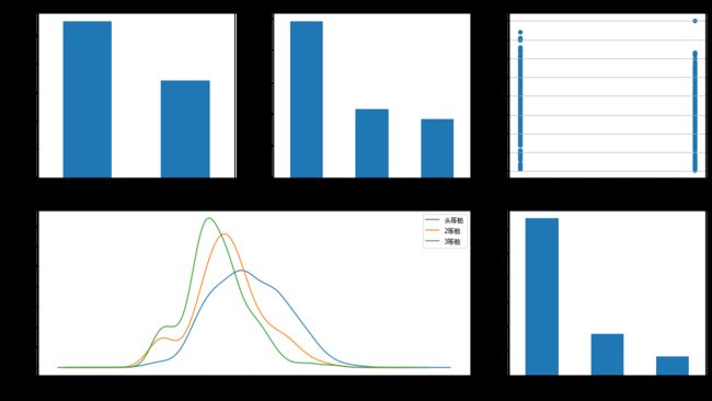
图片.png