1. 饼状图
import matplotlib.pyplot as plt

plt.figure(figsize=(9,6))  # fig的宽高

# The slices will be ordered and plotted counter-clockwise.
labels = [u'直接访问', u'外部链接', u'搜索引擎']
sizes = [160, 130, 110] # sum(sizes)不一定是100,会自动按照百分比调整
colors = ['yellowgreen', 'gold', 'lightskyblue']

#explode 爆炸出来
explode = (0.05, 0.0, 0.0)  # 间距

patches, l_texts, p_texts = plt.pie(sizes, explode=explode, labels=labels, colors=colors, labeldistance=0.8,
        autopct='%3.1f%%', shadow=True, startangle=90, pctdistance=0.6)

# plt.axis('equal') # 设置x,y轴刻度一致,这样饼图才能是圆的
plt.legend()

"""
# 设置labels和百分比文字大小
for t in l_texts:
    t.set_size(20)

for t in p_texts:
    t.set_size(20)
"""
plt.show()

output_2_0.png
2. 柱状图
import numpy as np
from matplotlib import pyplot as plt

plt.figure(figsize=(9,6))

n = 12
X = np.arange(n)+1
# numpy.random.uniform(low=0.0, high=1.0, size=None), normal
# uniform 均匀分布;normal 正态分布
Y1 = (1-X/float(n+1)) * np.random.uniform(0.5, 1.0, n)
Y2 = (1-X/float(n+1)) * np.random.uniform(0.5, 1.0, n)

# bar and barh
width = 0.5
plt.bar(X, Y1, width=width, facecolor='g', edgecolor='white')
# plt.bar(X+width, Y2, width=width, facecolor='r', edgecolor='white')
plt.bar(X, -Y2, width=width, facecolor='#ff9999', edgecolor='white') # -Y表示y轴负半轴
# plt.barh(X, Y2, height=width, facecolor='#ff9999', edgecolor='white') # barh表示横向


for x,y in zip(X,Y1):
    # x+0.1: 向x轴正向偏移0.1
    plt.text(x+0.4, y+0.05, '%.2f' % y, ha='center', va= 'bottom')

for x,y in zip(X,-Y2):
    plt.text(x+0.4, y-0.15, '%.2f' % y, ha='center', va= 'bottom')


plt.ylim(-1,+1) # y轴正负半轴对称
plt.show()

output_4_0.png
3. 散点图
from matplotlib import pyplot as plt
import numpy as np

plt.figure(figsize=(9,6))

n = 1024

# rand 和 randn
X = np.random.randn(1,n)
Y = np.random.randn(1,n)

T = np.arctan2(Y,X)

# alpha: 透明度
plt.scatter(X,Y, s=75, c=T, alpha=.4, marker='o')

#plt.xlim(-1.5,1.5), plt.xticks([])
#plt.ylim(-1.5,1.5), plt.yticks([])

plt.show()

output_6_0.png
4. 概率分布
from matplotlib import pyplot as plt
import numpy as np

mu = 0 # 均值
sigma = 4 # 标准差
x = mu + sigma*np.random.randn(10000)

fig,(ax0,ax1)=plt.subplots(ncols=2, figsize=(9,6))

# 概率密度
ax0.hist(x, 40, normed=1, histtype='bar', facecolor='g', alpha=0.75)
ax0.set_title('pdf')

# 累计密度
ax1.hist(x, 20, normed=1, histtype='bar', rwidth=0.8, cumulative=True)
ax1.set_title('cdf')

plt.show()

output_8_0.png
5.组合图
# ref : http://matplotlib.org/examples/pylab_examples/scatter_hist.html

import numpy as np
import matplotlib.pyplot as plt

# the random data
x = np.random.randn(1000)
y = np.random.randn(1000)

# 定义子图区域
left, width = 0.1, 0.65
bottom, height = 0.1, 0.65
bottom_h = left_h = left + width + 0.02

rect_scatter = [left, bottom, width, height]
rect_histx = [left, bottom_h, width, 0.2]
rect_histy = [left_h, bottom, 0.2, height]

plt.figure(1, figsize=(6, 6))

# 根据子图区域来生成子图
axScatter = plt.axes(rect_scatter)
axHistx = plt.axes(rect_histx)
axHisty = plt.axes(rect_histy)

# no labels
#axHistx.xaxis.set_ticks([])
#axHisty.yaxis.set_ticks([])

# now determine nice limits by hand:
N_bins=20
xymax = np.max([np.max(np.fabs(x)), np.max(np.fabs(y))])
binwidth = xymax/N_bins
lim = (int(xymax/binwidth) + 1) * binwidth
nlim = -lim

# 画散点图,概率分布图
axScatter.scatter(x, y)
axScatter.set_xlim((nlim, lim))
axScatter.set_ylim((nlim, lim))

bins = np.arange(nlim, lim + binwidth, binwidth)
axHistx.hist(x, bins=bins)
axHisty.hist(y, bins=bins, orientation='horizontal')

# 共享刻度
axHistx.set_xlim(axScatter.get_xlim())
axHisty.set_ylim(axScatter.get_ylim())

plt.show()

output_10_0.png
# ref http://matplotlib.org/examples/showcase/integral_demo.html
import numpy as np
import matplotlib.pyplot as plt

def func(x):
    return (x - 3) * (x - 5) * (x - 7) + 85

a, b = 2, 9  # integral limits
x = np.linspace(0, 10)
y = func(x)

# 画线
fig, ax = plt.subplots()
plt.plot(x, y, 'r', linewidth=2)
plt.ylim(ymin=0)

# 画阴影区域
xf = x[np.where((x>a)&(x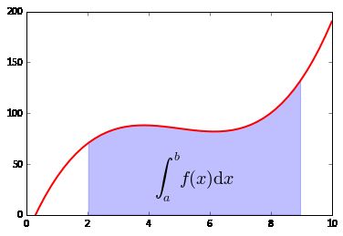
output_11_0.png
6. 三维数据图
import numpy as np
import matplotlib.pyplot as plt

fig = plt.figure(figsize=(9,6),facecolor='white')

# Number of ring
n = 50
size_min = 50
size_max = 50*50

# Ring position
P = np.random.rand(n,2)

# Ring colors R,G,B,A
C = np.ones((n,4)) * (0,0,0,1)
# Alpha color channel goes from 0 (transparent) to 1 (opaque)
C[:,3] = np.linspace(0,1,n)

# Ring sizes
S = np.linspace(size_min, size_max, n)

# Scatter plot
plt.scatter(P[:,0], P[:,1], s=S, lw = 0.5,
                  edgecolors = C, facecolors='None')

plt.xlim(0,1), plt.xticks([])
plt.ylim(0,1), plt.yticks([])

plt.show()

output_13_0.png
from mpl_toolkits.mplot3d import Axes3D
import numpy as np
import matplotlib.pyplot as plt

fig = plt.figure(figsize=(9,6))
ax = fig.add_subplot(111,projection='3d')

z = np.linspace(0, 6, 1000)
r = 1
x = r * np.sin(np.pi*2*z)
y = r * np.cos(np.pi*2*z)

ax.plot(x, y, z, label=u'螺旋线', c='r')
ax.legend()

# dpi每英寸长度的点数
plt.savefig('3d_fig.png',dpi=200)
plt.show()

output_14_0.png
3d画图种类很多,可参考:http://matplotlib.org/mpl_toolkits/mplot3d/tutorial.html
其他种类图可参考:http://matplotlib.org/gallery.html
7. 美化
import seaborn as sns
print(plt.style.available) #ggplot, bmh, dark_background, fivethirtyeight, grayscale
#plt.style.use('bmh')
['seaborn-pastel', 'seaborn-dark', 'seaborn-whitegrid', 'grayscale', 'seaborn-dark-palette', 'seaborn-paper', 'seaborn-bright', 'seaborn-deep', 'classic', 'fivethirtyeight', 'ggplot', 'seaborn-ticks', 'seaborn-poster', 'seaborn', 'seaborn-colorblind', 'seaborn-muted', 'dark_background', 'seaborn-talk', 'bmh', 'seaborn-white', 'seaborn-darkgrid', 'seaborn-notebook']
8. 多种组合
1
import matplotlib.ticker as mtick
from matplotlib.font_manager import FontProperties
a=[1228.3,3.38,63.8,0.07,0.16,6.74,1896.18]  #数据
b=[0.12,-12.44,1.82,16.67,6.67,-6.52,4.04]
l=[i for i in range(7)]
fmt='%.2f%%'
yticks = mtick.FormatStrFormatter(fmt)  #设置百分比形式的坐标轴
lx=[u'粮食',u'棉花',u'油料',u'麻类',u'糖料',u'烤烟',u'蔬菜']

fig = plt.figure()
ax1 = fig.add_subplot(111)
ax1.plot(l, b,'or-',label=u'增长率');
ax1.yaxis.set_major_formatter(yticks)
for i,(_x,_y) in enumerate(zip(l,b)):
    plt.text(_x,_y,b[i],color='black',fontsize=10,)  #将数值显示在图形上
ax1.legend(loc=1)
ax1.set_ylim([-20, 30]);
ax1.set_ylabel('增长率');
plt.legend({'size':8})  #设置中文
ax2 = ax1.twinx() # this is the important function
plt.bar(l,a,alpha=0.3,color='blue',label=u'产量')
ax2.legend(loc=2)
ax2.set_ylim([0, 2500])  #设置y轴取值范围
plt.legend(prop={'size':8},loc="upper left")
plt.xticks(l,lx)
plt.show()

下载.png
2
fig = plt.figure()
ax1 = fig.add_subplot(111)
lns1 = ax1.plot(years, yields, label='数量(万吨)')
ax2 = ax1.twinx()
lns2 = ax2.plot(years, money, '--', label='金额(万美元)')
lns = lns1 + lns2
labs = [l.get_label() for l in lns]
# ax1.set_ylabel('数量(万吨)')
# ax2.set_ylabel('金额(万美元)')
ax1.set_ylim(0, 1000)
ax2.set_ylim(0, 200000)
ax1.legend(lns, labs, loc=7)
ax1.set_xlabel("年份")
# plt.savefig('a.png')
plt.show()

下载 (1).png