Color
Color is a great way to impart vitality, provide visual continuity, communicate status information, give feedback in response to user actions, and help people visualize data. Look to the system’s color scheme for guidance when picking app tint colors that look great individually and in combination, on both light and dark backgrounds.
颜色是给予活力的很好的方式,提供连续性的视觉,传递状态信息,给予用户操作反馈,帮助用户标识数据。看下系统颜色组合指南,当选择app的颜色让它看起来独立和协调,不论在浅色和深色背景下。
Use color judiciously for communication.The power of color to call attention to important information is heightened when used sparingly. For example, a red triangle that warns people of a critical problem becomes less effective when red is used elsewhere in an app for noncritical reasons.
为传达信息明智地选择颜色。当谨慎地使用时,颜色唤起对重要信息的关注的能力会被提升。例如,一个红色三角形警告用户一个严重问题,当红色被用在app的其他地方,为了不严重的利用会变得不起作用。
Use complementary colors throughout your app.The colors in your app should work well together, not conflict or distract. If pastels are essential to your app’s style, for example, use a coordinating set of pastels.
贯穿你的app使用互补的颜色。颜色在你的app应该一起协同地很好,没有冲突或者令人疑惑。如果蜡笔对于你的app风格是必须的,例如,使用协调的蜡笔集合。
In general, choose a limited color palette that coordinates with your app logo.Subtle use of color is a great way to communicate your brand.
一般,选择一个限定的调色板,与你的app logo协调。精妙的使用颜色是一种很好的方式凸显你的品牌。
Consider choosing a key color to indicate interactivity throughout your app.In Notes, interactive elements are yellow. In Calendar, interactive elements are red. If you define a key color that denotes interactivity, make sure other colors don’t compete with it.
贯穿你的app考虑使用一个关键颜色来表达交互性。在Notes,交互原色是黄色的。在Calendar,交互元素是红色的。如果你定义一个关键颜色表示交互,确保其他颜色不与它冲突。
Avoid using the same color for interactive and noninteractive elements.If interactive and noninteractive elements have the same color, it’s hard for people to know where to tap.
避免使用相同的颜色既用于交互元素又用于非交互元素。如果交互和非交互元素又相同的颜色,用户很难知道点击哪里。
Consider how artwork and translucency affect nearby colors.
考虑插图和半透明怎么影响附近的颜色。
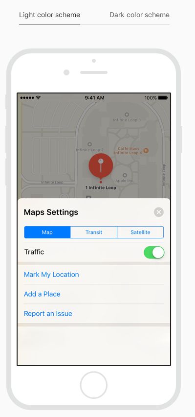
Variations in artwork sometimes warrant changes to nearby colors in order to maintain visual continuity and prevent interface elements from becoming overpowering or underwhelming. Maps, for example, displays a light color scheme when using map mode but switches to a dark color scheme when satellite mode is activated. Colors can also appear different when placed behind a translucent element, or when applied to a translucent element, such as a toolbar.
在插图的变更时需要对附近颜色做出改变,为了维护视觉延续和阻止界面元素变得压倒性的或者没有映像。地图,例如,当使用地图模式显示一个亮色组合,但是当卫星模式被激活转换到一个暗色组合。颜色也能表现不同当放在一个半透明的元素,或者当应用到一个半透明的元素,例如工具条。
Test your app’s color scheme under a variety of lighting conditions.Lighting varies significantly both indoors and outdoors, based on room ambiance, time of day, the weather, and more. Colors you see on your computer won’t always look the same when your app is used in the real world. Always preview your app under multiple lighting conditions, including outdoors on a sunny day, to see how colors appear. If necessary, adjust colors to provide the best possible viewing experience in the majority of use cases.
在不同的光照条件下测试你的颜色方案。光照对于在市内和室外,基于房间氛围,一日的时间,天气,和更多有不同的意义。当你的app在现实世界被使用,颜色不会一直看起来和你在电脑使用相同。永远在多种光照条件下预览你的app,包括在一个大阳天的室外,看看颜色怎么呈现。如果必要,在大多数用例中改变颜色来提供一个最佳的浏览体验。
Consider how the True Tone display affects color.The True Tone display uses ambient light sensors to automatically adjust the white point of the display to adapt to the lighting conditions of the current environment. Apps that focus primarily on reading, photos, video, and gaming can strengthen or weaken this effect by specifying a white point adaptivity style. For developer guidance, seeInformation Property List Key Reference.
考虑True Tone显示影像颜色。True Tone显示使用周围光亮感应器来自动调整显示白点来适应当前的光照条件。主要关注在reading, photos, video, and gaming的app可以加强或减弱设置了特定的白点自适应风格的效果。For developer guidance, seeInformation Property List Key Reference.
Be aware of colorblindness.Many colorblind people, for example, find it difficult to distinguish red from green (and either color from gray), or blue from orange. Avoid using these color combinations as the only way to distinguish between two states or values. For example, instead of using red and green circles to indicate offline and online, you could use a red square and a green circle. Some image-editing software includes tools that can help you proof for colorblindness.
考虑色盲。许多色盲用户,例如,被发现很难分辨红色和绿色(和区分其他颜色和灰色),或者区分蓝色和橘色。避免使用这些颜色组合作为分辨两种状态或者值的唯一方式。例如,取代使用红色和绿色的圈来表明掉线和在线,你可以使用一个红色的正方形和一个绿色圆圈。一些图像编辑软件包括工具来帮助你辨别色盲。
Consider how your use of color might be perceived in other countries and cultures.In some cultures, for example, red communicates danger. In others, red has positive connotations. Make sure the colors in your app send the appropriate message.
考虑怎么使用颜色能被其他国家和文化感知。在一些文化,例如,红色传达危险。在其他地方,红色有积极的含义。确保在你的app颜色传达合适的信息。
Use sufficient color contrast ratios.Insufficient contrast in your app makes content hard to read for everyone. Icons and text might blend with the background, for example. An online color contrast calculator can help you accurately analyze the color contrast in your app, to ensure that it meets optimal standards. Strive for a minimum contrast ratio of 4.5:1, although 7:1 is preferred because it meets more stringent accessibility standards.
使用充分的颜色对比度。在你的app中不充分的对比的内容会使人难以阅读。图标和文本也许和背景混合,例如。一个在线颜色对比计算器可以帮助你准确分析在你app里的颜色对比,为了保证它满足可选的标准。追求至少4.5:1的比例,尽管更推荐7:1因为它满足更多严厉的可访问性标准。
Color Management
Apply color profiles to your images.The default color space on iOS is Standard RGB (sRGB). To ensure that colors are correctly matched to this color space, make sure your images include embedded color profiles.
应用颜色配置到你的图片。iOS初始颜色库是标准RGB(sRGB)。为了保证颜色是正确匹配这个颜色空间,确保图片包括内置的颜色配置文件。
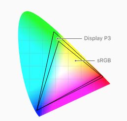
Use wide color to enhance the visual experience on compatible displays.Wide color displays support a P3 color space, which can produce richer, more saturated colors than sRGB. As a result, photos and videos that use wide color are more lifelike, and visual data and status indicators that use wide color are more impactful. When appropriate, use the Display P3 color profile at 16 bits per pixel (per channel) and export images in .png format. Note that a wide color display is needed to design wide color images and select P3 colors.
在兼容的显示上使用宽阔的颜色范围来增强视觉体验。宽阔的颜色显示支持一个P3颜色空间,可以产生比sRGB更丰富,更饱和的颜色。结果,照片和影像使用宽阔的颜色会更生动,可视化数据和状态指示器使用更丰富的颜色会更令人映像深刻。合适时,在16位每像素(每channel)使用Display P3 color profile,用.png格式导出图片。记住,设计更多颜色图片和选择P3颜色需要更宽广的颜色显示。
Provide color space-specific image and color variations when the experience calls for it.In general, P3 colors and images tend to appear as expected on sRGB devices. Occasionally, however, it may be hard to differentiate between two very similar P3 colors when they appear on an sRGB devices. Gradients that use colors in the P3 spectrum can also sometimes appear clipped on sRGB devices. To avoid these issues, you can provide distinct images and colors in the asset catalog of your Xcode project to ensure visual fidelity on both wide color and sRGB devices.
当体验需要提供特定颜色空间的图片和不同颜色。一般,P3颜色和图像倾向于显示得和sRGB设备期望的一样。偶尔,然而,很难在一个sRGB设备里区分两种相似的P3颜色。在P3光谱渐变使用颜色有时在sRGB设备看起来被省略。为了避免这些事件,你可以在你的Xcode project提供不同的图片和颜色在资产目录来保证视觉保真度,不论宽色域和sRGB设备上。
Preview your app’s colors on actual sRGB and wide color displays.Make adjustments as needed to ensure an equally great visual experience on both types of displays.
预览你的app颜色在真实的sRGB和宽色域显示器。做出必要的调整来确保在所有类型显示器上有相同的视觉体验。
TIPOn Macs with wide color displays, you can use the system color picker to select and preview P3 colors, and to compare them with sRGB colors.


