注,有疑问 加QQ群..[174225475].. 共同探讨进步
有偿求助请 出门左转 door , 合作愉快
在日常作图中,柱形图就像白开水,没有特异之处,却处处责任担当
今天我们就尝试通过R来展示各种柱形图
数据准备
> xs <- c(17.0,4.6,22,10.2,19.6)
> qw <- c(37.2,33,6,14.8,19.8)
> jk <- c(24.2,28,7,39.2,5.4)
> nf <- letters[1:5]
> (dt1 <- data.table::data.table(nf,xs,qw,jk))
   nf   xs   qw   jk
1:  a 17.0 37.2 24.2
2:  b  4.6 33.0 28.0
3:  c 22.0  6.0  7.0
4:  d 10.2 14.8 39.2
5:  e 19.6 19.8  5.4
> library(reshape2)
> (dt2 <- melt(dt1,id.vars=c('nf')))
   nf variable value
1   a       xs  17.0
2   b       xs   4.6
3   c       xs  22.0
4   d       xs  10.2
......
簇状柱形图1
> library(ggplot2)
> ggplot(dt2,aes(x=nf,y=value,fill=variable))+
  geom_bar(stat='identity',position='dodge',alpha=.5)+
  geom_text(aes(x=rep(1:5,3)+rep(c(-0.3,0,0.3),each=5),
                y=value+2,label=value),size=3,col='darkgray')+
  labs(title='Bar with Dodge',x='',y='')+
  theme(legend.position = 'top',
        legend.justification = 'right',
        legend.key.height = unit(0.1,'cm'),
        axis.ticks.x = element_blank(),
        axis.ticks.y = element_blank(),
        axis.text.y = element_blank(),
        panel.background = element_blank())+
  scale_fill_grey(start = 0,end=0.6)

bar_dg
簇状柱形图2
wuzhong1 <- rep(c('indx1','indx2'),3)
puxi1 <- rep(c('NRI','NTI','PD'),each=2)
value1 <- c(0.00021,0.00060,-0.00054,-0.00190,0.00041,0.00150)
df1 <- data.frame(wuzhong1,puxi1,value1)

library(ggplot2)
ggplot(df1,aes(puxi1,value1,fill=wuzhong1))+
  geom_bar(stat = 'identity',position = 'dodge')+
  labs(title='谱系多样性指数',y='',x='')+
  geom_text(aes(x=seq(0.7,by=0.5,length.out = 6),
    y=ifelse(value1>0,value1+0.0003,value1-0.0003),
                label=value1),size=3,col='darkgray')+
  theme(legend.position = 'top',
        legend.justification = 'left',
        legend.key.height = unit(0.1,'cm'),
        panel.background = element_blank(),
        axis.ticks.y = element_blank(),
        axis.text.y = element_blank(),
        axis.ticks.x = element_blank())+
  scale_fill_manual(values = c('black','darkgray'))

bar_dg2
堆积柱形图
library(data.table)
xs <- c(17.0,4.6,22,10.2,19.6)
qw <- c(37.2,33,6,14.8,19.8)
jk <- c(24.2,28,7,39.2,5.4)
nf <- letters[1:5]
(dt1 <- data.table(nf,xs,qw,jk))
(dt2 <- melt(dt1,id.vars=c('nf')))
dt2 <- dt2[order(nf,-variable)]
dt2[,dui_y:=cumsum(value)-value/2,by=.(nf)]
dt2

library(ggplot2)
ggplot(dt2,aes(x=nf,y=value,fill=variable))+
  geom_bar(stat='identity',position='stack',alpha=.5)+
  geom_text(aes(y=dui_y,label=value),size=3,col='white')+
  labs(title='Bar with Stack',x='',y='')+
  theme(legend.justification = 'right',
        legend.position = 'top',
        legend.key.height = unit(0.1,'cm'),
        panel.background = element_blank(),
        axis.ticks = element_blank(),
        axis.text.y = element_blank())+
  scale_fill_grey(start = 0.6,end=0)

bar_st
百分比堆积柱形图
dt2[,per1:=cumsum(value/sum(value))-(value/sum(value))/2,by=nf]
ggplot(dt2,aes(x=nf,y=value,fill=variable))+
  geom_bar(stat='identity',position='fill',alpha=.5)+
  geom_text(aes(y=per1,label=variable),col='white',size=3)+
  labs(title='Bar with Fill',x='',y='')+
  theme(legend.position = 'none',
        panel.background = element_blank(),
        axis.ticks = element_blank(),
        axis.text.y = element_blank())+
  scale_fill_grey(start=0.6,end=0)

bar_fil
分面柱形图 - 纵向
> ggplot(dt2,aes(x=nf,y=value,fill=nf))+
  geom_bar(stat='identity',position='stack',alpha=.5)+
  geom_text(aes(x=nf,y=value/2,label=value),col='white',size=3)+
  labs(title='Bar with Stack in facets',x='',y='')+
  theme(panel.background = element_blank(),
        legend.position = 'none',
        axis.text.y = element_blank(),
        axis.ticks.y = element_blank())+
  scale_fill_grey(start=0.6,end=0)+
  facet_grid(variable~.)

bar_fct
分面柱形图 - 横向
事实上,人眼球的左右移动能力优于上下移动能力,导致人类视觉的横向阅读速度和接受能力优于纵向,so 我们来做个横向展示
ggplot(dt2,aes(x=nf,y=value,fill=nf))+
  geom_bar(stat='identity',position='stack',alpha=.5)+
  labs(title='Bar with Stack in facets',x='',y='')+
  geom_text(aes(x=nf,y=value*0.5,label=value),size=3,col='white')+
  theme(legend.position = 'none',
        #legend.justification = 'left',
        legend.key.height = unit(0.1,'cm'),
        axis.ticks.x = element_blank(),
        axis.ticks.y = element_blank(),
        axis.text.x = element_blank(),
        panel.background = element_blank()
        )+
  scale_fill_grey(start = 0,end=0.5)+
  facet_grid(.~variable)+
  coord_flip()

bar_fct3.png
简单柱形图的横纵向比较
library(vcd)
(df1 <- data.frame(table(Arthritis$Improved)))
    Var1 Freq
1   None   42
2   Some   14
3 Marked   28
ggplot(df1,aes(x=reorder(Var1,Freq),y=Freq,fill=reorder(Var1,Freq)))+
     geom_bar(stat = 'identity')+
     geom_text(aes(y=Freq+2,label=Freq),
                             col='black',size=4)+
     labs(title='Barplot1',x='',y='')+
     theme(panel.background = element_blank(),
           legend.position = 'none',
           axis.ticks.y = element_blank(),
           axis.text.y = element_blank())+
  scale_fill_grey(start=0.6,end=0)

sim_bar1
ggplot(df1,aes(x=reorder(Var1,Freq),y=Freq))+
  geom_bar(stat = 'identity')+
  geom_text(aes(y=Freq*3/4,label=Freq),
            col='white',size=4)+
  labs(title='Vertical Barplot',x='',y='')+
  theme(panel.background = element_blank(),
        legend.position = 'none',
        axis.ticks.x = element_blank(),
        axis.text.x = element_blank())+
  coord_flip()
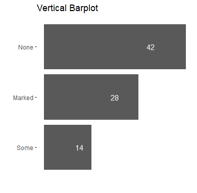
sim_bar2
简单柱形图的 x坐标轴标签顺序修改
value1 <- c(-0.6034,-2.5413,0.2555)
id1 <- c('<=-0.1042','<=-0.9138','>-0.1042')
df1 <- data.frame(id1,value1)
        id1  value1
1 <=-0.1042 -0.6034
2 <=-0.9138 -2.5413
3  >-0.1042  0.2555

ggplot(df1)+
  geom_bar(aes(id1,value1,fill=id1),stat = 'identity')+
  geom_text(aes(id1,ifelse(value1>0,value1+0.1,value1-0.1),
                label=value1),size=3,col='#595959')+
  geom_hline(yintercept = 0,col='#595959')+
  labs(title='跨省',x='',y='')+
  scale_fill_grey(start = 0.6,end=0)+
  theme(panel.background = element_blank(),
        legend.position = 'none',
        axis.ticks.y = element_blank(),
        axis.ticks.x = element_blank(),
        axis.text.y = element_blank())
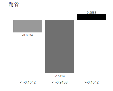
scl_limit1.png
ggplot(df1)+
  geom_bar(aes(id1,value1,fill=id1),stat = 'identity')+
  geom_text(aes(id1,value1/2,
                label=value1),size=3,col='#595959')+
  geom_hline(yintercept = 0,col='#595959')+
  labs(title='跨省',x='',y='')+
  scale_x_discrete(limits=c('<=-0.9138','<=-0.1042','>-0.1042'))+
  scale_fill_grey(start = 0.6,end=0)+
  theme(panel.background = element_blank(),
        legend.position = 'none',
        axis.ticks.y = element_blank(),
        axis.ticks.x = element_blank(),
        axis.text.y = element_blank())

scl_limit2.png
x,y轴标签值修改
value1 <- c(-0.6034,-2.5413,0.2555)
id2 <- factor(c(1,2,3))
df1 <- data.frame(value1,id2)
str(df1)
'data.frame':   3 obs. of  2 variables:
 $ value1: num  -0.603 -2.541 0.256
 $ id2   : Factor w/ 3 levels "1","2","3": 1 2 3

library(ggplot2)
ggplot(df1)+
  geom_bar(aes(id2,value1),stat = 'identity')

labl1.png
ggplot(df1)+
  geom_bar(aes(id2,value1,fill=id2),stat = 'identity')+
  geom_text(aes(id2,value1/2,
                label=value1),size=3,col='white')+
  geom_hline(yintercept = 0,col='#595959')+
  labs(title='跨省',x='',y='')+
  scale_x_discrete(limits = c(2,1,3),
                   labels=c('<=-0.1042','<=-0.9138','>-0.1042'))+
  scale_fill_grey(start = 0.6,end=0)+
  theme(panel.background = element_blank(),
        legend.position = 'none',
        axis.ticks.y = element_blank(),
        axis.ticks.x = element_blank(),
        axis.text.y = element_blank())

labl2.png
Reference:
- 高级绘图ggplot2
- ggplot2绘制Excel所有图
- ggplot2 legend : Easy steps to change the position and the appearance of a graph legend in R software