1.mpg数据框
数据框是变量(列)和观测(行)的矩形集合。mpg是ggplot2的内置数据框。
拿到一个数据首先就要观察它!忘了谁说的反正好有道理。
Fuel economy data from 1999 and 2008 for 38 popular models of car
234 行x 11列
1.manufacturer:生产商 15个
2.model:型号 38个
3.displ:引擎排量-L 35个,单位为升,小数
4.year:出厂年份
5.cly:汽缸数 4,5,6,8
6.trans:变速方式:10个
7.dry:驱动方式 f r 4
8.cty :每加仑汽油能跑的公里数(城市)21个,整数
9.hwy:燃油效率:每加仑汽油能跑的公里数(高速路)单位英里/加仑,燃油效率高说明省油。 27个,整数。
10.fl:燃油类型,五个 p r e d c
11.class:车型 七个 compact midsize suv 2seater minivan pickup subcompact
关于mpg:
(1)如何查看行列数和变量类型
mpg
(2)如何查看每列的含义
?mpg #查看帮助文档
(3)如何查看每列的非重复值及每个值的重复次数
#用dplyr包的distinct函数
p<-mpg
library(dplyr)
distinct(p,manufacturer) #manufacturer替换为其他列名。仅显示非重复值,不显示重复次数。
count(p,manufacturer) #显示出现次数
2.入门级绘图模板
ggplot(data = ) +
3.图形映射属性
基础作图
ggplot(data = mpg) +
       geom_point(mapping = aes(x = displ, y = hwy))
(1)颜色color
ggplot(data = mpg) +
  geom_point(mapping = aes(x = displ, y = hwy, color = class))
(2)大小size
ggplot(data = mpg) +
  geom_point(mapping = aes(x = displ, y = hwy, size = class))
警告信息:Warning: Using size for a discrete variable is not advised.
discrete variable--离散型变量(因子、字符、逻辑值)
变量按其数值表现是否连续,分为连续变量和离散变量。离散变量指变量值可以按一定顺序一一列举,通常以整数位取值的变量。如职工人数、工厂数、机器台数等。
--来自百度百科
(3)透明度和形状
# 将车型class映射给透明度
ggplot(data = mpg) +
  geom_point(mapping = aes(x = displ, y = hwy, alpha = class))
# 将车型class映射给形状
ggplot(data = mpg) +
  geom_point(mapping = aes(x = displ, y = hwy, shape = class))
警告信息
Warning messages: 1: The shape palette can deal with a maximum of 6 discrete values because more than 6 becomes difficult to discriminate; you have 7. Consider specifying shapes manually if you must have them. 2: Removed 62 rows containing missing values (geom_point).
自动分配形状只能显示6种,缺失62行是因为suv车型没有被分配到形状,未曾显示。用count(mpg,class)可以查看class为suv的确实是62个。

(4)手动设置图形属性
例:所有点设为蓝色
(注意:color="blue"在aes()外)
ggplot(data = mpg) +
  geom_point(mapping = aes(x = displ, y = hwy), color = "blue")
手动设置需要设为有意义的值。
颜色:字符串,blue,red等
大小:单位mm
形状:数字编号表示
- 空心形状 0-14 color边框
- 实心形状 15-20 color填充
-
填充形状 21-24 color边框,和fill填充

(5)stroke-轮廓(笔者补充)
适用于散点图,21-24号形状
ggplot(data = mpg) +
      geom_point(mapping = aes(x = displ, y = hwy, stroke = 3),shape=21)
5.分面
(1)依据单个变量分面 facet_wrap()
ggplot(data = mpg) +
  geom_point(mapping = aes(x = displ, y = hwy)) +
  facet_wrap(~ class, nrow = 2) #分两行展示
nrow指定分面后显示几行
ncol指定分面后显示几列
注意~分面依据必须是离散型变量。
(2)依据两个变量分面 facet_grid()
ggplot(data = mpg) +
  geom_point(mapping = aes(x = displ, y = hwy)) +
  facet_grid(drv ~ cyl)
不需要指定nrow和ncol。
(3)不想在行或列维度中分面,用.代替变量名
ggplot(data = mpg) +
  geom_point(mapping = aes(x = displ, y = hwy)) +
  facet_grid(. ~ cyl)
6.几何对象
也就是图的不同类型,如点图、折线图、直方图等。
(1)理解分组
将一个图形属性映射为一个离散型变量,ggplot2就会自动对数据进行分组来绘制多个几何对象。这种形式是隐式分组,不需要添加图例和区分特征。
ggplot(data = mpg) +
  geom_smooth(mapping = aes(x = displ, y = hwy))
将线性映射为drv(驱动方式,d,f,4)就会自动变成三条线型不同的线。
将颜色映射为drv,就会自动变成三条颜色不用的线。
#分组
ggplot(data = mpg) +
  geom_smooth(mapping = aes(x = displ, y = hwy, group = drv))
#隐式分组-线型
ggplot(data = mpg) +
  geom_smooth(
    mapping = aes(x = displ, y = hwy, linetype = drv),
  )
#隐式分组-颜色
ggplot(data = mpg) +
  geom_smooth(
    mapping = aes(x = displ, y = hwy, color = drv),
    show.legend = FALSE  #不显示图例
  )
(2)同一张图显示多个几何对象--局部映射和全局映射
--这里涉及到图层啦。
局部映射-映射只对改图层有效
有多个几何对象时,映射语句要重复多次,又丑又麻烦。
ggplot(data = mpg) +
  geom_point(mapping = aes(x = displ, y = hwy)) +
  geom_smooth(mapping = aes(x = displ, y = hwy))
全局映射--对所有图层生效
ggplot(data = mpg, mapping = aes(x = displ, y = hwy)) +
  geom_point() +
  geom_smooth()
局部映射与全局映射冲突时,服从局部映射。
例如:
ggplot(data = mpg, mapping = aes(x = displ, y = hwy)) +
  geom_point(mapping = aes(color = class)) +
  geom_smooth(data = filter(mpg, class == "subcompact"), se = FALSE)
如果出现报错,请library(dplyr) 或library(tidyverse)
Error in class == "subcompact" : comparison (1) is possible only for atomic and list types
这个报错是因为filter函数出自dplyr包,不加载就不能用~
ps:关于se=FALSE
se是standard error的缩写,se参数为拟合曲线添加标准误差带,也就是那个灰不啦叽的灰色背景带,默认是TRUE。
7.统计变换
(1)关于diamonds数据集 (笔者补充)
ggplot2内置数据集,包含53940颗钻石的信息。
carat:克拉
cut:切割质量
color:颜色等级
clarity:纯净度等级
depth:深度比例
table:钻石顶部相对于最宽点的宽度
price:价格
"x" "y" "z" :长宽深
↑以上来自帮助文档?diamonds
(2)统计变换函数和几何对象函数
统计变换:绘图时用来计算新数据的算法叫做统计变换stat
geom_bar做出的图纵坐标为count,是计算的新数据。
geom_bar的默认统计变换是stat_count,stat_count会计算出两个新变量-count(计数)和prop(proportions,比例)。
每个几何对象函数都有一个默认的统计变换,每个统计变换函数都又一个默认的几何对象。
用几何对象函数geom_bar作直方图,默认统计变换是stat_count,
ggplot(data = diamonds) +
  geom_bar(mapping = aes(x = cut))
用统计变换函数stat_count做计数统计图,默认几何对象是直方图。
ggplot(data = diamonds) +
  stat_count(mapping = aes(x = cut))
这两个代码做出的图片结果是一致的。两种方法没有优劣之分。
(3)显示使用某种统计变换的原因
- 覆盖默认的统计变换
直方图默认的统计变换是stat_count,也就是统计计数。当需要直接用原表格的数据作图时就会需要覆盖默认的。
demo <- tribble(
  ~cut,         ~freq,
  "Fair",       1610,
  "Good",       4906,
  "Very Good",  12082,
  "Premium",    13791,
  "Ideal",      21551
) #新建表格并赋值给demo

ggplot(data = demo) +
  geom_bar(mapping = aes(x = cut, y = freq), stat = "identity") #覆盖默认的统计变换,使用identity。
- 覆盖从统计变换生成变量到图形属性的默认映射
直方图默认的y轴是x轴的计数。此例子中x轴是是五种cut(切割质量),直方图自动统计了这五种质量的钻石的统计计数,当你不想使用计数,而是想显示各质量等级所占比例的时候就需要用到prop。
ggplot(data = diamonds) +
  geom_bar(mapping = aes(x = cut, y = ..prop.., group = 1))
这里group=1的意思是把所有钻石作为一个整体,显示五种质量的钻石所占比例体现出来。如果不加这一句,就是每种质量的钻石各为一组来计算,那么比例就都是100%,显示五根大黑柱子,实在是丑出新高度。
- 在代码中强调统计变换
以stat_summary为例。
ggplot(data = diamonds) +
  stat_summary(
    mapping = aes(x = cut, y = depth),
    fun.ymin = min,
    fun.ymax = max,
    fun.y = median
  )
(小洁碎碎念:stat_summary的默认几何图形是geom_pointrange,而这个geom_pointrange默认的统计变换却是identity,如果你不知道其中猫腻,就会发现他俩代码竟然不可逆。。。一夫多妻的节奏呀。)
因此要用几何对象函数重复这个图形,则需要指定stat_summary。
ggplot(data = diamonds) +
  geom_pointrange(
    mapping = aes(x = cut, y = depth),
    stat = "summary",
    fun.ymin = min,
    fun.ymax = max,
    fun.y = median
  )
8.位置调整-position
在直方图中,颜色映射是由color和fill之分的,表示边框和填充。如果要设置无填充(也就是透明),则fill=NA。NA在数据框里表示空值。
(1)直方图之堆叠式-fill
堆叠式就是在基础条形图上添加第三个变量,将这个变量映射给fill,就会在每个条形中分出不同颜色且不同比例的矩形。
ggplot(data = diamonds) +
  geom_bar(mapping = aes(x = cut,fill=clarity))
除了映射的方式以外,position参数设置位置调整功能。position="fill"也可以设置,但这样设置的每组堆叠条形具有相同的高度。
ggplot(data = diamonds) +
  geom_bar(mapping = aes(x = cut, fill = clarity), position = "fill")
笔者补充:感觉这种堆叠方式并不如设置fill映射,因为他突出的是比例,每组之间数值的差异被忽略了。
(2)直方图之对象直接显示-identity
ggplot(data = diamonds, mapping = aes(x = cut, fill = clarity)) +
  geom_bar(alpha = 1/5, position = "identity")
ggplot(data = diamonds, mapping = aes(x = cut, colour = clarity)) +
  geom_bar(fill = NA, position = "identity")
书中23页identity设置透明度和无填充的图是错的!
正确的是这样

(3)直方图之并列式-dodge
ggplot(data = diamonds) +
  geom_bar(mapping = aes(x = cut, fill = clarity), position = "dodge")
(4)散点图之扰动-jitter
书中翻译为抖动,我认为扰动更精确。
以mpg的displ和hwy散点图为例
ggplot(data = mpg) +
  geom_point(mapping = aes(x = displ, y = hwy))
在这个例子中,数据有234行,图中却只有126个点。这就是因为有些点是重叠的,图上虽然显示一个点,但其实是好几个点重叠成了一个。
jitter可以为点添加随机扰动,使重叠的点分散开。
position参数设为jitter的快速实现:geom_jitter()
除了geom_jitter外,geom_point也可以展示重叠点,会根据重叠点的个数调整大小。
(5)stack-堆叠
ggplot(series, aes(time, value, group = type)) +
  geom_line(aes(colour = type), position = "stack") +
  geom_point(aes(colour = type), position = "stack")

 ggplot(series, aes(time, value, group = type)) +
  geom_line(aes(colour = type)) +
  geom_point(aes(colour = type))
设置position_stack(上)和不设置(下)的区别:

9.坐标系
(1)coord_flip翻转坐标系
ggplot(data = mpg, mapping = aes(x = class, y = hwy)) +
  geom_boxplot() +
  coord_flip()
(2)coord_quickmap
为地图设置长宽比
此处需要加载maps包,否则会报错。
library(maps)
#如果报错则:install.packages("maps")
#library(maps)
nz <- map_data("nz")

ggplot(nz, aes(long, lat, group = group)) +
  geom_polygon(fill = "white", colour = "black")

ggplot(nz, aes(long, lat, group = group)) +
  geom_polygon(fill = "white", colour = "black") +
  coord_quickmap()
geom_polygon 是多边形图
(3)coord_polar 极坐标系
bar <- ggplot(data = diamonds) +
  geom_bar(
    mapping = aes(x = cut, fill = cut),
    show.legend = FALSE,
    width = 1
  ) +
  theme(aspect.ratio = 1) +
  labs(x = NULL, y = NULL)
bar + coord_flip()
bar + coord_polar()
ps:习题中涉及的
(1)关于饼图/牛眼图/圆圈图
ggplot(mpg, aes(x = factor(1), fill = drv)) +
  geom_bar()
ggplot(mpg, aes(x = factor(1), fill = drv)) +
  geom_bar(width = 1) +
  coord_polar(theta = "y")
要点:
- 不分组,只有一个因子型变量drv。
- 如果作图不设置width,饼图中间会出现一个白色圈圈。经测试发现width等于几在图上并没有区别,但是不设置却不行。
-
theta是角度的意思。如果不设置这个参数就会得到牛眼图哈哈哈哈哈哈。
 作者取名叫牛眼图
多圆圈图
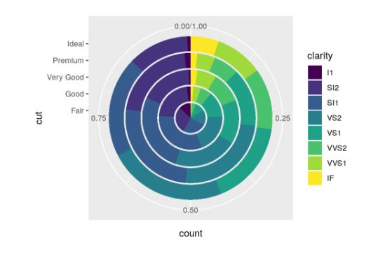
ggplot(data = diamonds) +
  geom_bar(mapping = aes(x = cut, fill = clarity), position = "fill") +
  coord_polar(theta = "y")
(2)第三题
geom_abline:添加线条
coord_fixed:保证横纵坐标的标尺一致,线条呈45°角
10.完整的绘图模板
ggplot(data = ) +
  (
    mapping = aes(),
    stat = ,
    position =
  ) +
   +
图形构建的过程
(1)数据集
(2)统计变换
(3)几何对象
(4)映射fill
(5)放置
(6)映射x/y

友情链接:
生信技能树公益视频合辑:学习顺序是linux,r,软件安装,geo,小技巧,ngs组学!
B站链接:https://m.bilibili.com/space/338686099
YouTube链接:https://m.youtube.com/channel/UC67sImqK7V8tSWHMG8azIVA/playlists
生信工程师入门最佳指南:https://mp.weixin.qq.com/s/vaX4ttaLIa19MefD86WfUA
学徒培养:https://mp.weixin.qq.com/s/3jw3_PgZXYd7FomxEMxFmw
资料大全:https://mp.weixin.qq.com/s/QcES9u1vYh-l6LMXPgJIlA