运用Taro实现多端导航栏/tabbar实例 (H5 + 小程序 + React Native)
最近一直在捣鼓taro开发,虽说官网介绍支持编译到多端,但是网上大多数实例都是H5、小程序,很少有支持RN端。恰好Taro是基于React技术,想着之前也做过一些react项目,如是抱着好奇深究了一番,采坑了不少,尤其是编译到RN时样式问题。

如上图:分别在H5、小程序、RN端运行效果
◆ Taro引入阿里字体图标Iconfont
在进行下文介绍之前,先简单介绍下taro字体图标的使用,如果你项目中有引入Taro-UI,直接使用taro-ui图标即可
详情看 taro-ui图标
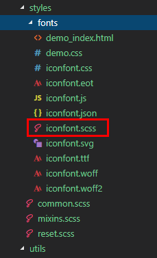
下载好阿里字体图标后,复制fonts文件夹到项目下,如下图放在:styles目录下,并将iconfont.css复制一份改为iconfont.scss
引入: import './styles/fonts/iconfont.scss'
在h5、小程序下 这种写法即可:
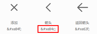
不过为了兼容RN,只能通过Unicode方式这样写:
如果是通过变量传递: let back = '\ue84c'
◆ 自定义导航栏Navbar
在项目根目录App.js里面 配置navigationStyle,将其设置为custom,此时就进入自定义导航栏模式
class App extends Component {
    config = {
        pages:
            'pages/index/index',
            ...
        ],
        window: {
            backgroundTextStyle: 'light',
            navigationBarBackgroundColor: '#fff',
            navigationBarTitleText: 'Taro',
            navigationBarTextStyle: 'black',
            navigationStyle: 'custom'
        },
        ...
    }

    ...
}
在components目录下新建导航栏Navbar组件
import Taro from '@tarojs/taro' import { View, Text, Input, Image } from '@tarojs/components' import classNames from "classnames"; import './index.scss' export default class NavBar extends Taro.Component { // 默认配置 static defaultProps = { isBack: false, leftIcon: '\ue84c', title: ' ', background: '#6190e8', color: '#fff', center: false, search: false, searchStyle: '', fixed: false, headerRight: [], } constructor(props) { super(props) this.state = { searchText: '', } } ... render() { const { isBack, leftIcon, title, background, color, center, search, searchStyle, fixed, height, headerRight } = this.props const { searchText } = this.state let weapp = false if (process.env.TARO_ENV === 'weapp') { weapp = true } return (); } } {/* 返回 */} {isBack && {/* 标题 */} {!search && center && !weapp ?this.handleNavigateBack}> }{leftIcon} : null} {search ? ( this.updateInputText} style={{color: color, ...searchStyle}} /> ) : ({title && ) } {/* 右侧 */}{title} }{headerRight.map((item, index) => ( item.onClick && item.onClick(searchText)}> )) }{item.icon && {item.icon} } {item.text &&{item.text} } {item.img &&} {/* 圆点 */} {!!item.badge && {item.badge} } {!!item.dot &&}
在页面引入组件即可: import NavBar from '@components/navbar'
引入方式有两种:
// index/index.js 首页 import NavBar from '@components/navbar' class Index extends Component { config = { navigationBarTitleText: '首页', usingComponents: { 'navbar2': '../../components/navbar', // 书写第三方组件的相对路径 }, } render () { return ({ /* 方法一 */ } ) } }{ /* 方法二 */ } ...
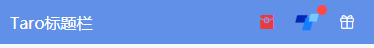
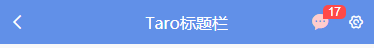
支持自定义背景、颜色、左侧图标、标题居中、搜索框,右侧按钮支持图标/文字/图片,还可以设置样式,红点提示、事件处理
 fixed
    headerRight={[
        {icon: '\ue614', style: {color: '#e93b3d'}},
        {img: require('../../assets/taro.png'), dot: true, onClick: this.handleCallback},
        {icon: '\ue600', style: {marginRight: 10}},
    ]}
/>
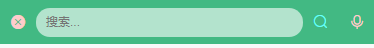
 search
    searchStyle={{
        backgroundColor:'rgba(255,255,255,.6)', borderRadius: Taro.pxTransform(50), color: '#333'
    }}
    headerRight={[
        {icon: '\ue622', style: {color: '#6afff9'}},
        {icon: '\ue63a'},
    ]}
/>
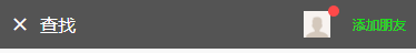
    headerRight={[
        {img: require('../../assets/default-avatar.png'), dot: true},
        {text: '添加朋友', style: {color: '#15e413'}},
    ]}
/>
◆ 自定义底部Tabbar菜单
如果在App.js里面没有配置tabbar,则可以自定义底部,如下图在三端下效果

同样在components目录下新建tabbar组件
import Taro from '@tarojs/taro' import { View, Text } from '@tarojs/components' import classNames from 'classnames' import './index.scss' export default class TabBar extends Taro.Component { // 默认参数配置 static defaultProps = { current: 0, background: '#fff', color: '#999', tintColor: '#6190e8', fixed: false, onClick: () => {}, tabList: [] } constructor(props) { super(props) this.state = { updateCurrent: props.current } } ... render() { const { background, color, tintColor, fixed } = this.props const { updateCurrent } = this.state return (); } } {this.props.tabList.map((item, index) => ( this.updateTabbar.bind(this, index)}> ))}{item.icon} {/* 圆点 */} {!!item.badge &&{item.badge} } {!!item.dot &&} {item.title}
自定义tabbar也支持自定义背景、颜色、图标,点击选项事件返回索引值
this.handleTabbar}
    tabList={[
        {icon: '\ue627', title: '首页', badge: 8},
        {icon: '\ue61e', title: '商品'},
        {icon: '\ue605', title: '个人中心', dot: true},
    ]}
/>
// tabbar事件
handleTabbar = (index) => { this.setState({currentTabIndex: index}) }
emmmm~~~,到这里就介绍差不多了,后续会考虑使用Taro技术开发个h5/小程序/RN端实战项目。
最后附上:
react聊天室实例:https://www.cnblogs.com/xiaoyan2017/p/11106246.html
ReactNative仿微信App实例:https://www.cnblogs.com/xiaoyan2017/p/11441285.html