In the previous installment of Android Layout Tricks, I showed you how to use the
The
This layout renders nicely as we expected and nothing seems wrong with this layout:
A FrameLayout is used to overlay a title on top of an image
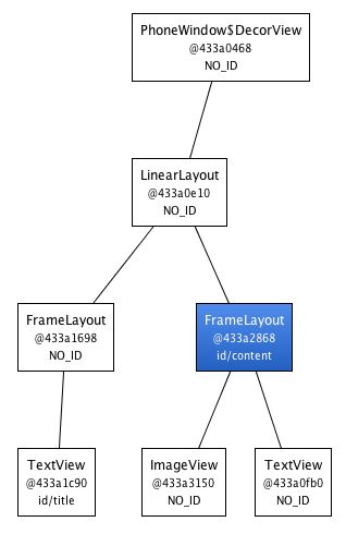
Things get more interesting when you inspect the result with HierarchyViewer. If you look closely at the resulting tree you will notice that the FrameLayout defined in our XML file (highlighted in blue below) is the sole child of another FrameLayout:
A layout with only one child of same dimensions can be removed
Since our FrameLayout has the same dimension as its parent, by the virtue of using the fill_parent constraints, and does not define any background, extra padding or a gravity, it is totally useless. We only made the UI more complex for no good reason. But how could we get rid of this FrameLayout? After all, XML documents require a root tag and tags in XML layouts always represent view instances.
That's where the
With this new version, both the TextView and the ImageView will be added directly to the top-level FrameLayout. The result will be visually the same but the view hierarchy is simpler:
Optimized view hierarchy using the merge tag
Obviously, using
This new layout produces the following result on a device:
Creating a custom view with the merge tag
The source code of OkCancelBar is very simple because the two buttons are defined in an external XML file, loaded using a LayoutInflate. As you can see in the following snippet, the XML layout R.layout.okcancelbar is inflated with the OkCancelBar as the parent:
public class OkCancelBar extends LinearLayout {
    public OkCancelBar(Context context, AttributeSet attrs) {
        super(context, attrs);
        setOrientation(HORIZONTAL);
        setGravity(Gravity.CENTER);
        setWeightSum(1.0f);

        LayoutInflater.from(context).inflate(R.layout.okcancelbar, this, true);

        TypedArray array = context.obtainStyledAttributes(attrs, R.styleable.OkCancelBar, 0, 0);

        String text = array.getString(R.styleable.OkCancelBar_okLabel);
        if (text == null) text = "Ok";
        ((Button) findViewById(R.id.okcancelbar_ok)).setText(text);

        text = array.getString(R.styleable.OkCancelBar_cancelLabel);
        if (text == null) text = "Cancel";
        ((Button) findViewById(R.id.okcancelbar_cancel)).setText(text);

        array.recycle();
    }
}
The two buttons are defined in the following XML layout. As you can see, we use the
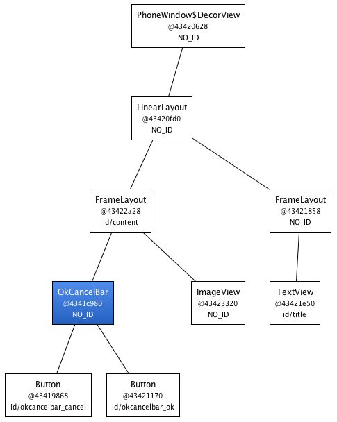
We have created a flexible and easy to maintain custom view that generates an efficient view hierarchy:
The resulting hierarchy is simple and efficient
The
can only be used as the root tag of an XML layout - When inflating a layout starting with a
, you must specify a parent ViewGroup and you must set attachToRoot to true (see the documentation of the inflate() method)
In the next installment of Android Layout Tricks you will learn about ViewStub, a powerful variation of
原文地址:
Android Layout Tricks #3: Optimize by merging


