FreeCodeCamp - Responsive Design with Bootstrap
Use Responsive Design with Bootstrap Fluid Containers
现在让我们回到我们的Cat Photo应用。这次,我们将用流行的响应式框架Bootstrap来美化它。
Bootstrap将会根据你的屏幕的大小来调整HTML元素的大小 —— 强调 响应式设计的概念。
通过响应式设计,你无需再为你的网站设计一个手机版的。它在任何尺寸的屏幕上看起来都会不错。
你仅需要通过添加下列代码到你的HTML开头来将Bootstrap添加到任意应用中:
在此案例中,我们已经帮你把上述代码添加到页面中。
首先,我们需要把所有的HTML内容放在class为container-fluid的div下。
Make Images Mobile Responsive
首先,在已有的图片下方添加一张新的图片。将它的 src属性设置为 /images/running-cat.jpg。
如果图片的尺寸刚好等于我们手机的尺寸,那想必是极好的。
谢天谢地,通过Bootstrap,我们要做的只是给图片添加 img-responsive class属性。这样图片的宽度就能完美地适配你的页面的宽度了。
CatPhotoApp
Click here for cat photos .


Things cats love:
cat nip
laser pointers
lasagna
Top 3 things cats hate:
flea treatment
thunder
other cats
Center Text with Bootstrap
既然我们在使用Bootstrap,我们可以通过居中头部元素来使它看起来更棒。 我们所要做的只是把text-center class属性添加给 h2 元素。
记住:你可以用空格分开多个class来为同一个元素添加多个 class 属性, 就像这样:
your text
CatPhotoApp
Click here for cat photos .


Things cats love:
cat nip
laser pointers
lasagna
Top 3 things cats hate:
flea treatment
thunder
other cats
Create a Bootstrap Button
Bootstrap有它自己的 button 按钮风格, 看起来要比默认的按钮好看得多。
在三只猫咪图片下面创建一个新的 button 元素。给它添加 btn class 属性以及"Like"文本。
CatPhotoApp
Click here for cat photos .


like
Things cats love:
cat nip
laser pointers
lasagna
Top 3 things cats hate:
flea treatment
thunder
other cats
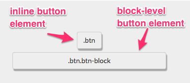
Create a Block Element Bootstrap Button
通常情况下,你的 button 元素仅与它所包含的文本一样宽。通过使其成为块级元素,你的按钮将会伸展并填满页面整个水平空间,任何在它之下的元素都会跟着浮动至该区块的下一行。
这张图阐述了行内元素与块级元素的区别:
注意,这些按钮仍然需要 btn class。
添加Bootstrap的 btn-block class 到你的按钮。
CatPhotoApp
Click here for cat photos .


Like
Things cats love:
cat nip
laser pointers
lasagna
Top 3 things cats hate:
flea treatment
thunder
other cats
Taste the Bootstrap Button Color Rainbow
深蓝色btn-primary是你的应用的主要颜色,被用在那些用户主要采取的操作上。
添加Bootstrap的 btn-primary class 属性到按钮标签上。
注意:这个按钮仍然需要 btn 和 btn-block 属性!
CatPhotoApp
Click here for cat photos .


Like
Things cats love:
cat nip
laser pointers
lasagna
Top 3 things cats hate:
flea treatment
thunder
other cats
Call out Optional Actions with Button Info
Bootstrap自带了一些预定义的按钮颜色。浅蓝色 btn-info被用在那些用户可能会采取的操作上。
在你的 "Like" 按钮下面添加一个文本为 "Info" 的块级Bootstrap按钮,并为其添加 btn-info 和 btn-block class属性。
注意:这些按钮仍然需要 btn 和 btn-block class属性
CatPhotoApp
Click here for cat photos .


Like
Info
Things cats love:
cat nip
laser pointers
lasagna
Top 3 things cats hate:
flea treatment
thunder
other cats
Warn your Users of a Dangerous Action
Bootstrap自带了一些预定义的按钮颜色。红色btn-danger被用来提醒用户该操作具有“破坏性”,例如删除一张猫的图片。
创建一个文本为 "Delete" 的按钮,并且给它添加 class btn-danger。
注意:这些标签仍然需要 btn 与 btn-block class。
CatPhotoApp
Click here for cat photos .


Like
Info
Delete
Things cats love:
cat nip
laser pointers
lasagna
Top 3 things cats hate:
flea treatment
thunder
other cats
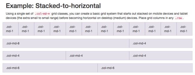
Use the Bootstrap Grid to Put Elements Side By Side
Bootstrap 使用一种响应式网格布局——可轻松实现将多个元素放入一行并指定各个元素的相对宽度的需求。Bootstrap 中大多数的class属性都可以设置于 div 元素中。
下面这张图表显示了 Bootstraps 的12列网格布局是如何起作用的:
an image illustrating Bootstrap's grid system
请注意,在这张图表中,class属性 col-md-* 正被使用。在这里,md 表示 medium (中等的),* 代表一个数字,它指定了这个元素所占的列宽。通过此图表的属性设置可知,在中等大小的屏幕上(例如笔记本电脑),元素的列宽被指定了。
在我们创建的 Cat Photo App 中,将会使用 col-xs-*,其中 xs 是 extra small 缩写(应用于较小的屏幕,比如手机屏幕),* 是你需要填写的数字,代表在一行中,各个元素应该占的列宽。
把 Like, Info 和 Delete 三个按钮一并放入一个 元素中;然后,其中的每一个按钮都需要各自被一个
元素包裹。
当div 元素设置了 class 属性 row 之后,那几个按钮便可嵌入其中。
CatPhotoApp
Click here for cat photos .


Things cats love:
cat nip
laser pointers
lasagna
Top 3 things cats hate:
flea treatment
thunder
other cats
Ditch Custom CSS for Bootstrap
现在,让我们清理一下之前的代码了,以让我们的 Cat Photo 应用看起来更简洁,用 Bootstrap 内置的样式来替换我们之前自定义的样式。
别担心 —— 以后我们会有大把时间来自定义我们的 CSS 样式的 :)
删除 style 元素里的 .red-text, p 和 .smaller-imageCSS声明,这样你的 style 留下的声明就只有 h2 和 thick-green-border。
然后删除包含死链接的 p 元素。 移除 h2 元素的 red-text class 并且用 Bootstrap的 text-primary class替换之。
最后,移除第一个 img 元素的 "smaller -image" class ,替换为 Bootstrap的 img-responsive class。
CatPhotoApp
Click here for cat photos .


Things cats love:
cat nip
laser pointers
lasagna
Top 3 things cats hate:
flea treatment
thunder
other cats
Use Spans for Inline Elements
你可以用 span 标签来创建行内元素。还记得我们是怎样使用 .btn-block来创建填满整行的按钮吗?
这张图展示了 inline 元素与 block-level 块级元素的区别:
通过使用 span 元素,你可以把几个元素放在一起。你甚至可以用此为一个元素的不同部分指定样式。
把 "Things cats love" 中的 "love" 放到 span 标签下。然后为其添加 text-danger class 来使文字变成红色。
举例,"Top 3 things cats hate" 元素的写法如下:
Top 3 things cats hate:
CatPhotoApp


Things cats love:
cat nip
laser pointers
lasagna
Top 3 things cats hate:
flea treatment
thunder
other cats
Create a Custom Heading
让我们来为Cat Photo 应用做一个导航吧,把标题和惬意的猫图片放在同一行。
记住,Bootstrap使用响应式栅格系统,这使得把元素放入行内并为每个元素指定宽度变得很容易。大部分的 Bootstrap的 class 都可以被用在 div 元素上。
这张图展示了 Bootstrap 的12栏栅格布局是如何工作的:
an image illustrating Bootstrap's grid system
注意,在此图示中,我们使用了 col-md-* class 。此处 md 代表中等,* 指定了元素宽度应该占用的栏数。 在这个案例中,我们指定了元素在中等大小的屏幕(如笔记本等)上所占用的栏数。
在此应用中,我们将使用 col-xs-*, xs 意味着非常小(比如非常小的手机屏幕), * 指定了元素宽度应该占用的栏数。
将你的第一张图片和 h2 元素放到同一个 元素下。 将你的
h2 元素放到
下,你的图片放到
下,这样他们就能位于同一行了。
注意现在图片是否与文字大小一致呢?

Things cats love:
cat nip
laser pointers
lasagna
Top 3 things cats hate:
flea treatment
thunder
other cats
Add Font Awesome Icons to our Buttons
Font Awesome 是一个非常方便的图标库。这些图标都是矢量图形,被保存在 .svg 的文件格式中。这些图标就和字体一样,你可以通过像素单位指定它们的大小,它们将会继承其父HTML元素的字体大小。
你可以将 Font Awesome 图标库增添至任何一个应用中,方法很简单,只需要在你的 HTML 头部增加下列代码即可:
不过,我们已经事先在幕后为此页面添加了该功能。(不必重复添加上面这段代码)
i 元素起初一般是让其它元素有斜体(italic)的功能,不过现在一般用来指代图标。你可以将 Font Awesome 中的 class 属性添加到 i 元素中,把它变成一个图标,比如:
你可以通过 Font Awesome 库增加一个 thumbs-up 图标到你的 like 按钮中,方法是在i 元素中增加 class 属性 fa 和 fa-thumbs-up。

Things cats love:
cat nip
laser pointers
lasagna
Top 3 things cats hate:
flea treatment
thunder
other cats
Add Font Awesome Icons to all of our Buttons
Font Awesome 是一个非常方便的图标库。这些图片都是矢量图,以 .svg 文件格式保存。这些图标用起来就像字体一样。你可以使用像素单位来指定他们的大小,它们会继承父级HTML元素的字体大小。
使用 Font Awesome 分别为你的 info 按钮添加 info-circle 图标,为你的 delete 按钮添加 trash 图标。

Things cats love:
cat nip
laser pointers
lasagna
Top 3 things cats hate:
flea treatment
thunder
other cats
Responsively Style Radio Buttons
你还可以将 Bootstrap 的 col-xs-*用在 form 元素中。这样的话,我们的单选按钮就可以均匀地在页面上展开,不需要知道屏幕的分辨率有多宽。
将页面中的两个单选按钮放置于一个 元素中。然后,添加
元素并分别包裹每一个单选按钮。

Things cats love:
cat nip
laser pointers
lasagna
Top 3 things cats hate:
flea treatment
thunder
other cats
Responsively Style Checkboxes
你还可以将 Bootstrap 的 col-xs-*用在 form 元素中。这样我们的复选框就可以均匀地在页面上展开了,不管屏幕的分辨率是多大。
将你所有的复选框都放置于一个 元素中。然后分别把每个按钮都放置于一个
元素中。

Things cats love:
cat nip
laser pointers
lasagna
Top 3 things cats hate:
flea treatment
thunder
other cats
Style Text Inputs as Form Controls
你可以在你的 button 提交按钮上添加 Font Awesome的 fa-paper-plane 图标,方法是在元素中增加
给你表单的文本输入框增加 classform-control 。在你的表单提交按钮中增加 class btn btn-primary 。同样,在这个提交按钮中增加 Font Awesome 的 fa-paper-plane 图标。

Things cats love:
cat nip
laser pointers
lasagna
Top 3 things cats hate:
flea treatment
thunder
other cats
Line up Form Elements Responsively with Bootstrap
现在让我们把 input 元素和提交按钮 button 放到同一行。我们将用和之前一样的方法:通过使用拥有 rowclass 属性的 div 元素和其它在它之内的具有 col-xs-*class 属性的 div 元素。
将你的表单中的 input 文本框和提交按钮 button 放到一个具有 row class 属性的 div 元素中。 将你的 input 放置于 class 为 col-xs-7 的 div元素中。 将你的表单的提交按钮 button 放置于 class 属性为 col-xs-5 的 div 元素中。
这是目前为止我们的 Cat Photo 应用的最后一个挑战了。希望你能够喜欢学习 Font Awesome,Bootstrap和响应式设计!

Things cats love:
cat nip
laser pointers
lasagna
Top 3 things cats hate:
flea treatment
thunder
other cats
Create a Bootstrap Headline
现在,让我们从头开始练习我们的HTML, CSS 和 Bootstrap 技术。
我们将会搭建一个 jQuery playground,它也即将在我们接下来的 jQuery 课程中被投入使用。
首先,创建一个 h3 元素,并且包含文本内容 jQuery Playground 。
在 h3 元素中设置 Bootstrap 的 class 属性 text-primary 为其上色,同时增加 Bootstrap 的 class 属性 text-center 使文本居中显示。
jQuery Playground
House our page within a Bootstrap Container Fluid Div
现在让我们确保页面里所有的内容都是响应式的。
让我们将 h3 元素放置于一个class属性为 container-fluid的 div 元素中。
jQuery Playground
Create a Bootstrap Row
现在将要为我们的内联元素创建一个 Bootstrap 行。
在 h3 标签下创建一个 div 元素,并且带有 class 属性 row。
Split your Bootstrap Row
既然我们已经有了一个 Bootstrap 行,让我们来把它分成两栏来放置我们的元素吧。
在你的行内添加两个 div 元素,每个都具有 col-xs-6 class 属性。
Create Bootstrap Wells
Bootstrap 有一个 class 属性叫做 well,它的作用是为设定的列创造出一种视觉上的深度感(一种视觉上的效果,动手写代码体会一下)。
在你的每一个class为col-xs-6的div 元素中都嵌入一个带有 well class 属性的 div 元素。
Add Elements within your Bootstrap Wells
现在我们已经在行内的每一列都嵌套了好几层 div 元素了。这已经足够了。现在让我们添加 button 元素吧。
在每一个 well div 元素下放置三个 button 元素。
Apply the Default Bootstrap Button Style
Bootstrap 还有一种属于按钮的 class 属性叫做 btn-default 。
为你的每一个 button 元素增加两个 class 属性: btn 和 btn-default 。
Create a Class to Target with jQuery Selectors
并不是每一个 class 属性都是用于 CSS 的。 有些时候我们创建一些 class 只是为了更方便地在jQuery中选中这些元素。
为你的每一个 button 都添加 target class。
jQuery Playground
Add ID Attributes to Bootstrap Elements
回忆一下,我们除了可以给元素增加 class 属性,还可以给你的每个元素增添一个 id 属性。
每一个指定元素的 id 都是唯一的,并且在每个页面中只能使用一次。
现在给我们每个包含 class well 的 div 元素一个唯一的 id。
记住,你可以像这样赋予一个元素 id:
给左边的 well 赋予 id left-well。给右边的 well 赋予 id right-well。
Label Bootstrap Wells
让我们为我们的 wells 都标上它们的 id 吧。
在 left-well 之上,class为 col-xs-6 的 div 元素里面,添加一个文本为 #left-well 的 h4元素。
在 right-well 之上,class为 col-xs-6 的 div 元素里面,添加一个文本为 #right-well 的 h4元素。
Give Each Element a Unique ID
我们也可以使用jQuery并通过每个按钮各自唯一的 id 来标识出它们。
给你的每一个按钮一个唯一的 id ,以 target1 为开始,target6 为结束。
确保 target1 到 target3 在 #left-well 之中,target4 到 target6 则在 #right-well 之中。
Label Bootstrap Buttons
正如我们标注了每个 wells, 我们同样想要标注每一个按钮。
为你的每个 button 元素选择与其 id 选择器相同的文本。
jQuery Playground
#left-well
#target1
#target2
#target3
#right-well
#target4
#target5
#target6
Use Comments to Clarify Code
当我们开始使用jQuery,我们将修改HTML元素,但是实际上我们并不是直接在 HTML 文本中修改。
我们必须确保让每个人都知道,他们不应该直接修改此页面上这些代码。
记住,你可以在 为结束的地方进行评论注释。(像这样, )
请在你的 HTML 顶部加如下一段注释:Only change code above this line. 。
jQuery Playground
#left-well
#target1
#target2
#target3
#right-well
#target4
#target5
#target6
你可能感兴趣的:(FreeCodeCamp - Responsive Design with Bootstrap)
有必要获得WHQL测试认证吗,有什么好处?
什么是WHQL认证?WHQL是MicrosoftWindowsHardwareQualityLab的缩写,中文意思是Windows硬件设备质量实验室,主要是对Windows操作系统的兼容性测试,检验硬件产品和驱动程序在windows系统下的兼容性和稳定性。当某一硬件或软件通过WHQL测试时,制造商可以在其产品包装和广告上使用“DesignedforWindows”标志。该标志可以证明硬件或软件已经
基于架构的软件设计(Architecture-Based Software Design,ABSD)是一种以架构为核心的软件开发方法
ABSD方法与生命周期基于架构的软件设计(Architecture-BasedSoftwareDesign,ABSD)是一种以架构为核心的软件开发方法,强调在开发的各个阶段都要以架构为中心,确保系统的整体结构和质量属性得到有效管理。ABSD方法是一个自顶向下、递归细化的过程,软件系统的架构通过该方法得到细化,直到能产生软件构件和类。ABSD方法的三个基础功能的分解:使用基于模块的内聚和耦合技术,将
FPGA 设计中的 “Create HDL Wrapper“ 和 “Generating Output Products“ 的区别
行者..................
fpga开发
CreateHDLWrapper(创建HDL包装器)目的:为顶层设计模块(通常是BlockDesign/IPIntegrator设计)创建一个HDL包装文件功能:将图形化/框图设计的BlockDesign转换为可综合的HDL代码(Verilog或VHDL)创建一个顶层模块,将所有IP核和连接实例化使用场景:当使用IPIntegrator创建BlockDesign后需要将图形化设计转换为HDL代码以
App Store上架:Guideline 4.3(a) - Design - Spam 申述过审
九月紫
App Store上架 Apple Store 上架 4.3
从六月苹果开展了全球开发大会后,苹果内部对于新系统的生成进行了多次会议,针对新系统和商店app管理进行的升级和管控,导致近期许多开发者遇到过不了审、难过审的问题,今天来讲一下关于4.3垃圾邮件怎么去申述与修改。标题拒审邮件Guideline4.3(a)-Design-Spam排查方向修改申述拒审邮件Guideline4.3(a)-Design-Spam如下:翻译过来是:准则4.3(a)-设计-垃圾
Synopsys 逻辑综合之 MultiBit Flip-Flop 与 ICG
目录一、普通寄存器(1-bitFlip-Flop)二、Multi-BitFlip-Flop是什么?所以Multi-BitFF的做法就是:三、为什么要用Multi-BitFF?1.降低功耗2.减小芯片面积3.布局优化更容易(PhysicalAware)四、在SynopsysDesignCompiler中怎么支持?1.启用Multi-BitFlip-Flop功能:2.与ICG协同优化:3.后端ECO友
计算机专业毕业设计-线上招聘与求职系统的设计与实现-开题报告
苦奢bu咖啡
课程设计 毕业论文 毕业设计 软件开发 开题报告 求职招聘 javaweb
本系统开发采用技术为JSP、Bootstrap、Ajax、Springboot、Java、Tomcat、Maven此文章为开题报告,此系统已开发完成相关文档都很健全,相关的代码+部署+论文+ppt+代码讲解+答辩指导文件都有可私要,为本人亲自指导加编写,禁止任何人抄袭以及各类盈利性传播计算机专业毕业设计任何项目-程序-论文-想单独指导的可以私1、选题的目的和意义。通过开发一个功能全面的线上招聘与求
Spring 生态创新应用:微服务架构设计与前沿技术融合实践
七夜zippoe
# Java spring 微服务 java
在数字化转型的深水区,企业级应用正面临从“单体架构”向“分布式智能架构”的根本性跃迁。Spring生态以其二十年技术沉淀形成的生态壁垒,已成为支撑这场变革的核心基础设施。从2002年RodJohnson发布《ExpertOne-on-OneJ2EEDesignandDevelopment》奠定的理论基础,到如今覆盖从开发到运维全链路的技术矩阵,Spring始终以“简化开发”为初心,构建出适配不同业
自己动手写编译器
JeffWoodNo.1
编译器 hex compiler function branch eclipse
这里不再仅仅是简单的记录一下……直接上手环境目标1:在elicpse平台上使用ant构建ANTLR目标2:在elicpse平台上使用antlride编写ANTLR语法编写实用的C解析器背景调查到底还需不需要自己动手写一个编译器这就是“工具哲学”所谓bootstrap的编译器构造方式。C的核心子集Appendix直接上手环境antlr-for-eclipse,即antlride-2.0-rc4版,在
Flutter SnackBar 控件详细介绍
江上清风山间明月
Flutter flutter SnackBar dart
文章目录FlutterSnackBar控件详细介绍基本特性基本用法1.显示简单SnackBar2.自定义持续时间主要属性高级用法1.带操作的SnackBar2.自定义样式3.浮动式SnackBarSnackBarAction属性实际应用场景注意事项完整示例建议FlutterSnackBar控件详细介绍SnackBar是FlutterMaterialDesign中的一个轻量级消息提示控件,用于向用户
Qt导入ui文件的方法
百口可乐__
Qt- qt ui 开发语言
1.首先对项目Test_0右键点击,添加现有文件。选择要添加的新的Design_5.ui文件。导入新的ui文件。2.打开Test_0.pro文件,会有以下形式的代码,确保其中有导入的ui文件Design_5.ui。FORMS+=a.ui\b.ui\...Design_5.ui确保Test_0.pro文件中有以下代码,用于生成"ui_xxx.h"文件。QT+=widgets3.点击构建,执行qmak
Android 和 IOS 应用程序之间的 UI 设计差异_ios与安卓ui设计规范区别
2301_79985012
程序员 android ios ui
Apple规则内容从一开始就很高兴,这可以帮助客户毫无问题地浏览页面。此外,尽管Android标题放在左侧,但iOS标题通常会被重点关注。MaterialDesign可以被视为平面设计的改进,带有一点拟物化。基本点是制作一个为世界升级但由实际单词动画的UI,以使其对用户/客户直观。对于Android设计,您可以参考材料设计指南、组件和图标。苹果使用“扁平化设计”。它基于三个主题——清晰、顺从和深度
prism项目搭建 wpf_Prism 源码解读1-Bootstrapper和Region的创建
媛源啊
prism项目搭建 wpf
介绍之前也研究过Prism框架但是一直没有深入理解,现在项目上想把一个Winform的桌面应用程序改造成WPF程序,同时我希望程序是可测试可维护架构良好的,Prism的这些设计理念正好符合我的需求,其主要用于WPF和Xamarin,用于构建松耦合,可维护,可测试的应用程序框架,在我看到源码后也深受启发,欢迎大家一起交流探讨。开始我将从官方的Samples的顺序,看介绍中的每个功能是怎么实现的。0、
3-Kafka常用指令
sql2008help
kafka 分布式
Kafka常用指令大全一、Topic管理命令功能示例创建Topic指定分区和副本数kafka-topics.sh--create--bootstrap-serverlocalhost:9092--topictest--partitions3--replication-factor2查看Topic列表列出所有Topickafka-topics.sh--bootstrap-serverlocalhos
swiftui_SwiftUI中的模糊效果
weixin_26638123
python
swiftuiIfyou’vebeenaroundsmartphoneslongenough,youmayremeberiOS7.ItwasahugeupdatetotheiPhone,bringinginnotonlyatoneofnewfeaturesandfunctionality,butalsoafreshnewdesign.ThisupdatetoiOSwasnothinglesstha
十分钟聊明白DDD领域驱动设计
roykingw
java java 架构 DDD 领域驱动
文章目录一、什么是领域?二、领域如何驱动设计?三、如何发挥DDD的价值最后十分钟聊明白DDD领域驱动设计--楼兰关于DDD,大部分朋友应该都听说过。全称DomainDrivenDesign,翻译过来就是领域驱动设计。这个神秘的架构思想,虽然远没有SpringBoot这类框架这么名声在外,但是却经常时不时冒出来,牵动一下大家的神经。美团、阿里每年的技术年会都会有关于DDD的经验分享,而另一方面,又有
【架构-DDD】使用领域驱动设计-互联网未来架构设计之道(一)
Fun肆编程
DDD 架构 系统架构 java 云计算 微服务
文章已收录至https://lichong.work,转载请注明原文链接。ps:欢迎关注公众号“Fun肆编程”或添加我的私人微信交流经验简介互联网后微服务时代,软件质量是一个非常让人头疼的问题,而DDD(Domain-DrivenDesign)被认为是系统老化问题的新希望。众多互联网大厂都在积极推行DDD的落地实践。而对IT程序员,尤其对于高级职位,DDD成了一个越来越重要的技能加分项。但是DDD
用Netty实现的WebSocket服务器代码示例中添加自定义消息处理逻辑
爱吃土豆的马铃薯ㅤㅤㅤㅤㅤㅤㅤㅤㅤ
websocket 服务器 网络协议
一.以下是一个使用Netty框架实现WebSocket服务器的简单代码示例:importio.netty.bootstrap.ServerBootstrap;importio.netty.channel.ChannelFuture;importio.netty.channel.ChannelInitializer;importio.netty.channel.EventLoopGroup;impo
全面分析软考《系统分析师》和《系统架构设计师》论文差异
引言中国计算机技术与软件专业技术资格(水平)考试(简称“软考”)的高级资格认证体系中,论文考试是检验考生综合能力、实践经验与专业素养的终极关卡。它远非单纯的知识点默写,而是对考生在真实项目环境中分析问题、解决问题、总结提炼并清晰表达其专业思想的全面考核。在众多高级资格中,系统分析师(SystemAnalyst,SA)与系统架构设计师(SystemArchitectDesigner,SAD)无疑是软
Mock数据
bemyrunningdog
ant design pro ubuntu linux 运维
目录AntDesignProMock使用指南一、基础配置1.创建Mock文件⚡二、高级功能1.动态数据生成(Mock.js)2.网络延迟模拟3.跨域处理三、联调切换至真实接口1.关闭Mock2.代理到真实后端⚠️四、常见问题解决1.线上部署Mock2.页面刷新404五、最佳实践六、完整示例用户管理模块MockService层调用组件中使用总结流程图AntDesignProMock使用指南基于Umi
AntDesignPro动态路由配置全攻略
bemyrunningdog
前后端
目录AntDesignPro前后端动态路由配置指南(TypeScript+Java)一、整体架构二、Java后端实现1.数据库设计(MySQL)2.实体类定义3.DTO对象4.服务层实现5.控制器三、前端实现(TypeScript)1.定义路由类型2.路由转换器3.应用配置(app.tsx)4.路由加载优化四、权限控制整合1.Java端权限检查2.前端权限整合五、部署优化方案六、生产环境建议七、完
SpringBoot3+Vue3+AntDesign无人机场台管理系统 | 小蚂蚁云
小蚂蚁开源
后端 vue 架构 低代码
项目介绍基于SpringBoot3、SpringSecurity、MybatisPlus、Vue3、TypeScript、Vite、AntDesign、MySQL等技术栈实现的单体前后端分离后台管理系统;后端基于Java语言采用SpringBoot3、SpringSecurity、MybatisPlus、MySQL等主流技术栈,前端基于Vue3、TypeScript、Vite等技术栈实现,采用An
探秘Xtoon Boot DDD:以领域驱动设计重塑微服务架构
探秘XtoonBootDDD:以领域驱动设计重塑微服务架构去发现同类优质开源项目:https://gitcode.com/在软件开发中,尤其是大型复杂系统的构建中,领域驱动设计(Domain-DrivenDesign,简称DDD)是一种被广泛接受的设计方法论。它强调了业务逻辑与系统结构的紧密耦合,帮助开发者更好地理解和表达业务模型。而是一个基于SpringBoot的轻量级框架,旨在简化和加速DDD
wpf使用MaterialDesign
下载materialDesign在文件中引用头文件xmal文件中xmlns:materialDesign="http://materialdesigninxaml.net/winfx/xaml/themes"app.xmal中<ResourceDictionary
(二)MATERIAL DESIGN框架安装和使用
Chen住气*
UI主题框架的Material Design C# ui
在WPF中使用MaterialDesign需要安装MaterialDesignThemes程序包。通过安装该程序包,您将获得MaterialDesign所需的样式和控件,以及相关的资源字典引用。通过NuGet包管理器进行安装的具体步骤如下:打开VisualStudio。在解决方案资源管理器中,右键单击项目名称,选择“管理NuGet程序包”。在NuGet程序包管理器中,选择“浏览”选项卡。在搜索框中
web渗透之指纹识别1
合作小小程序员小小店
网络安全 物联网 网络安全 网络攻击模型 计算机网络
web渗透之指纹识别1前端技术:前端中我们需要掌握一些基础html,javascrip,jquery,bootstrap,前端框架vue.js,vue,angular,React等,在前端中可以利用的东西还是很多的,我们可使用xss配合csrf以及一些攻击漏洞进行弹框,获取cookie,劫持,绕过,跳转,跨域,重定向,重放,控制节点,挂暗链接,甚至隐藏我们的请求等。如果要说怎么在识别中使用,我们可
什么是EDA电子设计自动化
元圆源
自动化 运维
EDA概念电子设计自动化(EDA,ElectronicDesignAutomation),指利用计算机辅助设计(CAD,ComputerAidedDesign)进行超大规模集成电路(VLSI,VeryLargeScaleIntegration)芯片的功能设计、综合、验证、屋里设计等流程。产业链CreatedwithRaphaël2.3.0上游:半导体IP供应商、晶圆厂PDK中游:EDA工具提供商下
mac上python安装pip_Python开发:在mac系统中安装pip
weixin_39793638
mac上python安装pip
pip用来安装python项目的依赖库。大多数比较新的python版本都自带pip,所以先检查下pip是否有安装。终端输入:pip--version如果没有安装pip,那么就用接下来的方式安装pip。--前言安装pip的方式是运行一个python文件,因此请先确保电脑中已经安装有python。因此首先需要将该python文件下载到本地电脑中。方式一:在浏览器中访问https://bootstrap
2、Connecting to Kafka
虾条_花吹雪
Spring for Apache Kafka kafka 分布式 ai
KafkaAdmin-请参阅配置主题ProducerFactory-请参阅发送消息ConsumerFactory-请参阅接收消息从2.5版本开始,每个版本都扩展了KafkaResourceFactory。这允许在运行时通过向引导服务器的配置中添加Supplier来更改引导服务器:setBootstrapServersSupplier(()->…)。所有新连接都将调用此命令以获取服务器列表。消费者和
李工ROBOT架构之硬件驱动或数据存储的详细代码
我将提供基于.NET8.0-windows7.0的半导体可靠性测试机上位机系统的硬件驱动和数据存储模块的详细代码实现。代码将与之前的UI框架(WPF、Prism、MVVM、MaterialDesignThemes、LiveCharts2)无缝集成,涵盖硬件驱动的抽象接口、不同协议(串口、TCP/UDP、Modbus)支持,以及数据存储的CSV、SQLite和MySQL实现。以下内容包含详细的代码示
Bootstrap 表单
wjs2024
开发语言
Bootstrap表单Bootstrap是一个流行的前端框架,它可以帮助开发者快速构建响应式和美观的网页界面。在Bootstrap中,表单是用户与网站交互的重要部分。本文将详细介绍Bootstrap表单的用法、样式和优化技巧。1.Bootstrap表单概述Bootstrap表单提供了丰富的样式和组件,可以帮助开发者轻松实现各种表单需求。以下是一些常见的Bootstrap表单组件:输入框(Input
html
周华华
html
js
1,数组的排列
var arr=[1,4,234,43,52,];
for(var x=0;x<arr.length;x++){
for(var y=x-1;y<arr.length;y++){
if(arr[x]<arr[y]){
&
【Struts2 四】Struts2拦截器
bit1129
struts2拦截器
Struts2框架是基于拦截器实现的,可以对某个Action进行拦截,然后某些逻辑处理,拦截器相当于AOP里面的环绕通知,即在Action方法的执行之前和之后根据需要添加相应的逻辑。事实上,即使struts.xml没有任何关于拦截器的配置,Struts2也会为我们添加一组默认的拦截器,最常见的是,请求参数自动绑定到Action对应的字段上。
Struts2中自定义拦截器的步骤是:
make:cc 命令未找到解决方法
daizj
linux 命令未知 make cc
安装rz sz程序时,报下面错误:
[root@slave2 src]# make posix
cc -O -DPOSIX -DMD=2 rz.c -o rz
make: cc:命令未找到
make: *** [posix] 错误 127
系统:centos 6.6
环境:虚拟机
错误原因:系统未安装gcc,这个是由于在安
Oracle之Job应用
周凡杨
oracle job
最近写服务,服务上线后,需要写一个定时执行的SQL脚本,清理并更新数据库表里的数据,应用到了Oracle 的 Job的相关知识。在此总结一下。
一:查看相关job信息
1、相关视图
dba_jobs
all_jobs
user_jobs
dba_jobs_running 包含正在运行
多线程机制
朱辉辉33
多线程
转至http://blog.csdn.net/lj70024/archive/2010/04/06/5455790.aspx
程序、进程和线程:
程序是一段静态的代码,它是应用程序执行的蓝本。进程是程序的一次动态执行过程,它对应了从代码加载、执行至执行完毕的一个完整过程,这个过程也是进程本身从产生、发展至消亡的过程。线程是比进程更小的单位,一个进程执行过程中可以产生多个线程,每个线程有自身的
web报表工具FineReport使用中遇到的常见报错及解决办法(一)
老A不折腾
web报表 finereport java报表 报表工具
FineReport使用中遇到的常见报错及解决办法(一)
这里写点抛砖引玉,希望大家能把自己整理的问题及解决方法晾出来,Mark一下,利人利己。
出现问题先搜一下文档上有没有,再看看度娘有没有,再看看论坛有没有。有报错要看日志。下面简单罗列下常见的问题,大多文档上都有提到的。
1、address pool is full:
含义:地址池满,连接数超过并发数上
mysql rpm安装后没有my.cnf
林鹤霄
没有my.cnf
Linux下用rpm包安装的MySQL是不会安装/etc/my.cnf文件的,
至于为什么没有这个文件而MySQL却也能正常启动和作用,在这儿有两个说法,
第一种说法,my.cnf只是MySQL启动时的一个参数文件,可以没有它,这时MySQL会用内置的默认参数启动,
第二种说法,MySQL在启动时自动使用/usr/share/mysql目录下的my-medium.cnf文件,这种说法仅限于r
Kindle Fire HDX root并安装谷歌服务框架之后仍无法登陆谷歌账号的问题
aigo
root
原文:http://kindlefireforkid.com/how-to-setup-a-google-account-on-amazon-fire-tablet/
Step 4: Run ADB command from your PC
On the PC, you need install Amazon Fire ADB driver and instal
javascript 中var提升的典型实例
alxw4616
JavaScript
// 刚刚在书上看到的一个小问题,很有意思.大家一起思考下吧
myname = 'global';
var fn = function () {
console.log(myname); // undefined
var myname = 'local';
console.log(myname); // local
};
fn()
// 上述代码实际上等同于以下代码
m
定时器和获取时间的使用
百合不是茶
时间的转换 定时器
定时器:定时创建任务在游戏设计的时候用的比较多
Timer();定时器
TImerTask();Timer的子类 由 Timer 安排为一次执行或重复执行的任务。
定时器类Timer在java.util包中。使用时,先实例化,然后使用实例的schedule(TimerTask task, long delay)方法,设定
JDK1.5 Queue
bijian1013
java thread java多线程 Queue
JDK1.5 Queue
LinkedList:
LinkedList不是同步的。如果多个线程同时访问列表,而其中至少一个线程从结构上修改了该列表,则它必须 保持外部同步。(结构修改指添加或删除一个或多个元素的任何操作;仅设置元素的值不是结构修改。)这一般通过对自然封装该列表的对象进行同步操作来完成。如果不存在这样的对象,则应该使用 Collections.synchronizedList 方
http认证原理和https
bijian1013
http https
一.基础介绍
在URL前加https://前缀表明是用SSL加密的。 你的电脑与服务器之间收发的信息传输将更加安全。
Web服务器启用SSL需要获得一个服务器证书并将该证书与要使用SSL的服务器绑定。
http和https使用的是完全不同的连接方式,用的端口也不一样,前者是80,后
【Java范型五】范型继承
bit1129
java
定义如下一个抽象的范型类,其中定义了两个范型参数,T1,T2
package com.tom.lang.generics;
public abstract class SuperGenerics<T1, T2> {
private T1 t1;
private T2 t2;
public abstract void doIt(T
【Nginx六】nginx.conf常用指令(Directive)
bit1129
Directive
1. worker_processes 8;
表示Nginx将启动8个工作者进程,通过ps -ef|grep nginx,会发现有8个Nginx Worker Process在运行
nobody 53879 118449 0 Apr22 ? 00:26:15 nginx: worker process
lua 遍历Header头部
ronin47
lua header 遍历
local headers = ngx.req.get_headers()
ngx.say("headers begin", "<br/>")
ngx.say("Host : ", he
java-32.通过交换a,b中的元素,使[序列a元素的和]与[序列b元素的和]之间的差最小(两数组的差最小)。
bylijinnan
java
import java.util.Arrays;
public class MinSumASumB {
/**
* Q32.有两个序列a,b,大小都为n,序列元素的值任意整数,无序.
*
* 要求:通过交换a,b中的元素,使[序列a元素的和]与[序列b元素的和]之间的差最小。
* 例如:
* int[] a = {100,99,98,1,2,3
redis
开窍的石头
redis
在redis的redis.conf配置文件中找到# requirepass foobared
把它替换成requirepass 12356789 后边的12356789就是你的密码
打开redis客户端输入config get requirepass
返回
redis 127.0.0.1:6379> config get requirepass
1) "require
[JAVA图像与图形]现有的GPU架构支持JAVA语言吗?
comsci
java语言
无论是opengl还是cuda,都是建立在C语言体系架构基础上的,在未来,图像图形处理业务快速发展,相关领域市场不断扩大的情况下,我们JAVA语言系统怎么从这么庞大,且还在不断扩大的市场上分到一块蛋糕,是值得每个JAVAER认真思考和行动的事情
安装ubuntu14.04登录后花屏了怎么办
cuiyadll
ubuntu
这个情况,一般属于显卡驱动问题。
可以先尝试安装显卡的官方闭源驱动。
按键盘三个键:CTRL + ALT + F1
进入终端,输入用户名和密码登录终端:
安装amd的显卡驱动
sudo
apt-get
install
fglrx
安装nvidia显卡驱动
sudo
ap
SSL 与 数字证书 的基本概念和工作原理
darrenzhu
加密 ssl 证书 密钥 签名
SSL 与 数字证书 的基本概念和工作原理
http://www.linuxde.net/2012/03/8301.html
SSL握手协议的目的是或最终结果是让客户端和服务器拥有一个共同的密钥,握手协议本身是基于非对称加密机制的,之后就使用共同的密钥基于对称加密机制进行信息交换。
http://www.ibm.com/developerworks/cn/webspher
Ubuntu设置ip的步骤
dcj3sjt126com
ubuntu
在单位的一台机器完全装了Ubuntu Server,但回家只能在XP上VM一个,装的时候网卡是DHCP的,用ifconfig查了一下ip是192.168.92.128,可以ping通。
转载不是错:
Ubuntu命令行修改网络配置方法
/etc/network/interfaces打开后里面可设置DHCP或手动设置静态ip。前面auto eth0,让网卡开机自动挂载.
1. 以D
php包管理工具推荐
dcj3sjt126com
PHP Composer
http://www.phpcomposer.com/
Composer是 PHP 用来管理依赖(dependency)关系的工具。你可以在自己的项目中声明所依赖的外部工具库(libraries),Composer 会帮你安装这些依赖的库文件。
中文文档
入门指南
下载
安装包列表
Composer 中国镜像
Gson使用四(TypeAdapter)
eksliang
json gson Gson自定义转换器 gsonTypeAdapter
转载请出自出处:http://eksliang.iteye.com/blog/2175595 一.概述
Gson的TypeAapter可以理解成自定义序列化和返序列化 二、应用场景举例
例如我们通常去注册时(那些外国网站),会让我们输入firstName,lastName,但是转到我们都
JQM控件之Navbar和Tabs
gundumw100
html xml css
在JQM中使用导航栏Navbar是简单的。
只需要将data-role="navbar"赋给div即可:
<div data-role="navbar">
<ul>
<li><a href="#" class="ui-btn-active&qu
利用归并排序算法对大文件进行排序
iwindyforest
java 归并排序 大文件 分治法 Merge sort
归并排序算法介绍,请参照Wikipeida
zh.wikipedia.org/wiki/%E5%BD%92%E5%B9%B6%E6%8E%92%E5%BA%8F
基本思想:
大文件分割成行数相等的两个子文件,递归(归并排序)两个子文件,直到递归到分割成的子文件低于限制行数
低于限制行数的子文件直接排序
两个排序好的子文件归并到父文件
直到最后所有排序好的父文件归并到输入
iOS UIWebView URL拦截
啸笑天
UIWebView
本文译者:candeladiao,原文:URL filtering for UIWebView on the iPhone说明:译者在做app开发时,因为页面的javascript文件比较大导致加载速度很慢,所以想把javascript文件打包在app里,当UIWebView需要加载该脚本时就从app本地读取,但UIWebView并不支持加载本地资源。最后从下文中找到了解决方法,第一次翻译,难免有
索引的碎片整理SQL语句
macroli
sql
SET NOCOUNT ON
DECLARE @tablename VARCHAR (128)
DECLARE @execstr VARCHAR (255)
DECLARE @objectid INT
DECLARE @indexid INT
DECLARE @frag DECIMAL
DECLARE @maxfrag DECIMAL
--设置最大允许的碎片数量,超过则对索引进行碎片
Angularjs同步操作http请求with $promise
qiaolevip
每天进步一点点 学习永无止境 AngularJS 纵观千象
// Define a factory
app.factory('profilePromise', ['$q', 'AccountService', function($q, AccountService) {
var deferred = $q.defer();
AccountService.getProfile().then(function(res) {
hibernate联合查询问题
sxj19881213
sql Hibernate HQL 联合查询
最近在用hibernate做项目,遇到了联合查询的问题,以及联合查询中的N+1问题。
针对无外键关联的联合查询,我做了HQL和SQL的实验,希望能帮助到大家。(我使用的版本是hibernate3.3.2)
1 几个常识:
(1)hql中的几种join查询,只有在外键关联、并且作了相应配置时才能使用。
(2)hql的默认查询策略,在进行联合查询时,会产
struts2.xml
wuai
struts
<?xml version="1.0" encoding="UTF-8" ?>
<!DOCTYPE struts PUBLIC
"-//Apache Software Foundation//DTD Struts Configuration 2.3//EN"
"http://struts.apache