In this part, we will:
- Explore the basic ploting capabilities of Matplotlib for single or multiple lines.
- Add informations to to the plots such as legends, axis labels and titles.
- Save a plot to a file.
- Describle the interaction with Ipython.
- Customize[自定义] Matplotlib, both through configuration files and Python code.
Let's start looking at graph.
First plots with Matplotlib
Here is our first examples.
import matplotlib.pyplot as plt  # import the main Matplotlib submodule for ploting, pyplot
plt.plot([1, 4, 2, 6, 8, 5])  # This code line is the actual plotting command
plt.show()  # This command actually opens the window containing the plot image.
This code gives the output shown in the following screenshot:
It's strongly encouraged to never import like:
fromimport *
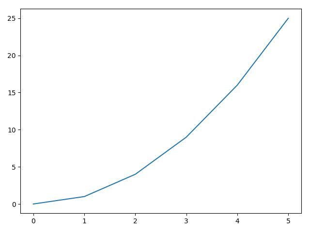
Of course, we can also explicitly specify both the lists:
import matplotlib.pyplot as plt
x = range(6)
plt.plot(x, [xi ** 2 for xi in x])
plt.show()
That result in the following screenshot:
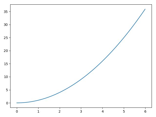
So we can use arrange( to generate a finer range:
import matplotlib.pyplot as plt
import numpy as np
x = np.arange(0.0, 6.0, 0.01)
plt.plot(x, [x**2 for x in x])
plt.show()
Multiline plots
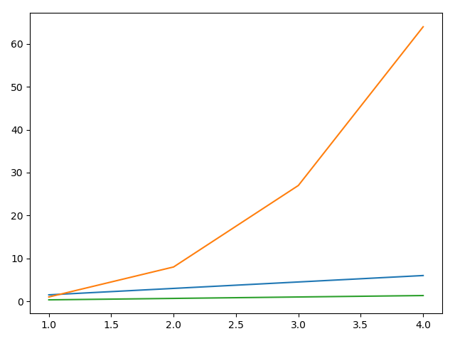
It's fun to plot a line, but it's even more fun when we can plot more than one line on the same figure. This is really easy with Matplotlib as we can simply plot all the lines that we want before calling show(). Have a look at the following code and screenshot:
import matplotlib.pyplot as plt
x = range(1, 5)
plt.plot(x, [xi*1.5 for xi in x])
plt.plot(x, [x**3.0 for x in x])
plt.plot(x, [xi/3.0 for xi in x])
plt.show()
Note how Matplotlib automatically chooses different colors for each line—green for the first line, blue for the second line, and red for the third one (from top to bottom).
Can you tell why a float value was used in line [5]? Try it yourself with an integer one and you'll see. The answer is that if divided by 3 (that is, by using an integer coefficient), the result will also be an integer. So you'll see a line plot like "stairs".
plot() supports another syntax useful in this situation. We can plot multiline figures by passing the X and Y values list in a single plot() call:
import matplotlib.pyplot as plt
x = range(1, 5)
plt.plot(x, [xi*1.5 for xi in x], x, [x**3.0 for x in x], x, [xi/3.0 for xi in x])
plt.show()
The preceding code simply rewrites the previous example with a different syntax.
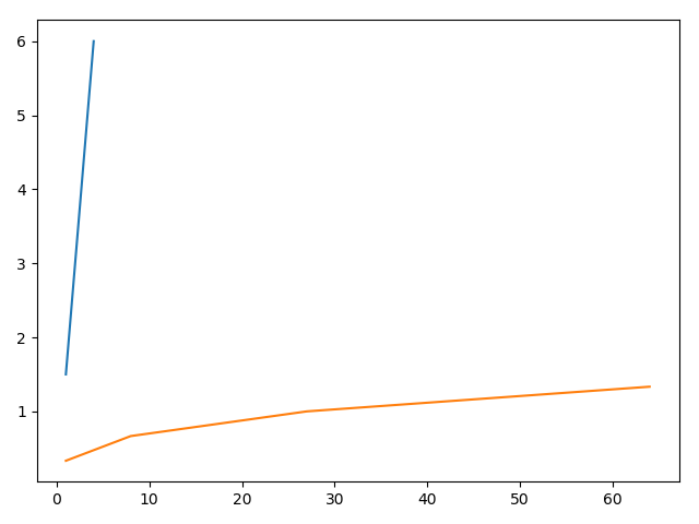
While list comprehensions are a very powerful tool, they can generate a little bit of confusion in these simple examples. So we'd like to show another feature of the arange() function of NumPy:
import matplotlib.pyplot as plt
import numpy as np
x = np.arange(1, 5)
plt.plot(x, x*1.5, x**3.0, x/3.0)
plt.show()
Here, we take advantage of the NumPy array objects returned by arange().
The multiline plot is possible because, by default, the hold property is enabled (consider it as a declaration to preserve all the plotted lines on the current figure instead of replacing them at every plot() call). Try this simple example and see what happens:


